MODULAR TYPE DESIGN WORKSHOP
with the Students of Elisava’s
Master of Visual Design 2024/25
Part I
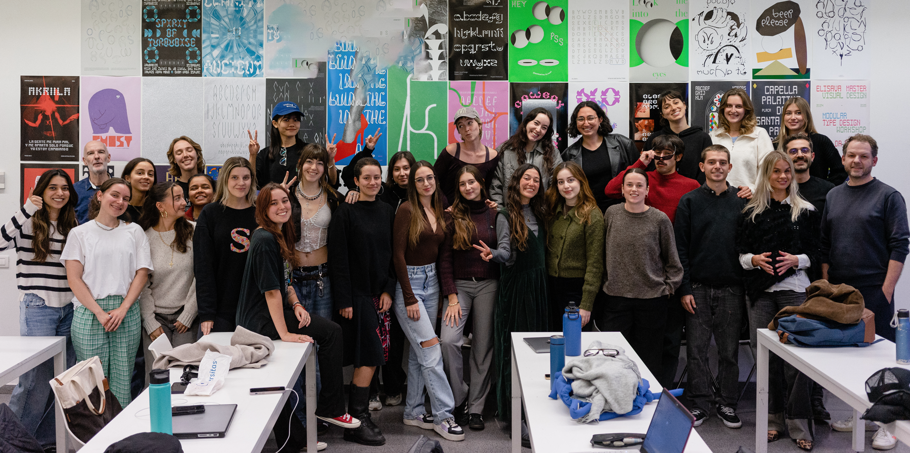
One of my favorite weeks of the year is the week I am spending with the wonderful students of the ELISAVA Master of Visual Design, directed by Marc Panero. I have taught this fun workshop based on the FVS Course Modular Type since 2020, and with every year, it is becoming more fun. Although we just have 5 days, the results are always beyond everyone’s expectations. Get to know a couple of students.
Amaya Crichton

Tell me a bit about yourself: What is your name? Where are you from? How much previous knowledge about type design did you have before participating in my workshop?
I´m Amaya, a Spanish-English graphic designer from Málaga, Spain. I didn’t touch type during my bachelor’s and recently fell head over heels in the last two years, absorbing as much as I can. Nothing formal, just love of the game!
Which part of the workshop did you enjoy most?
The best part for sure was being able to work almost exclusively analogue the entire week. How many times can we just put on music and draw for hours straight? It was satisfying and kind of meditative. We’re not used to that kind of off-screen practice and it was a welcome break < 3
Where did the inspiration for your font come from?
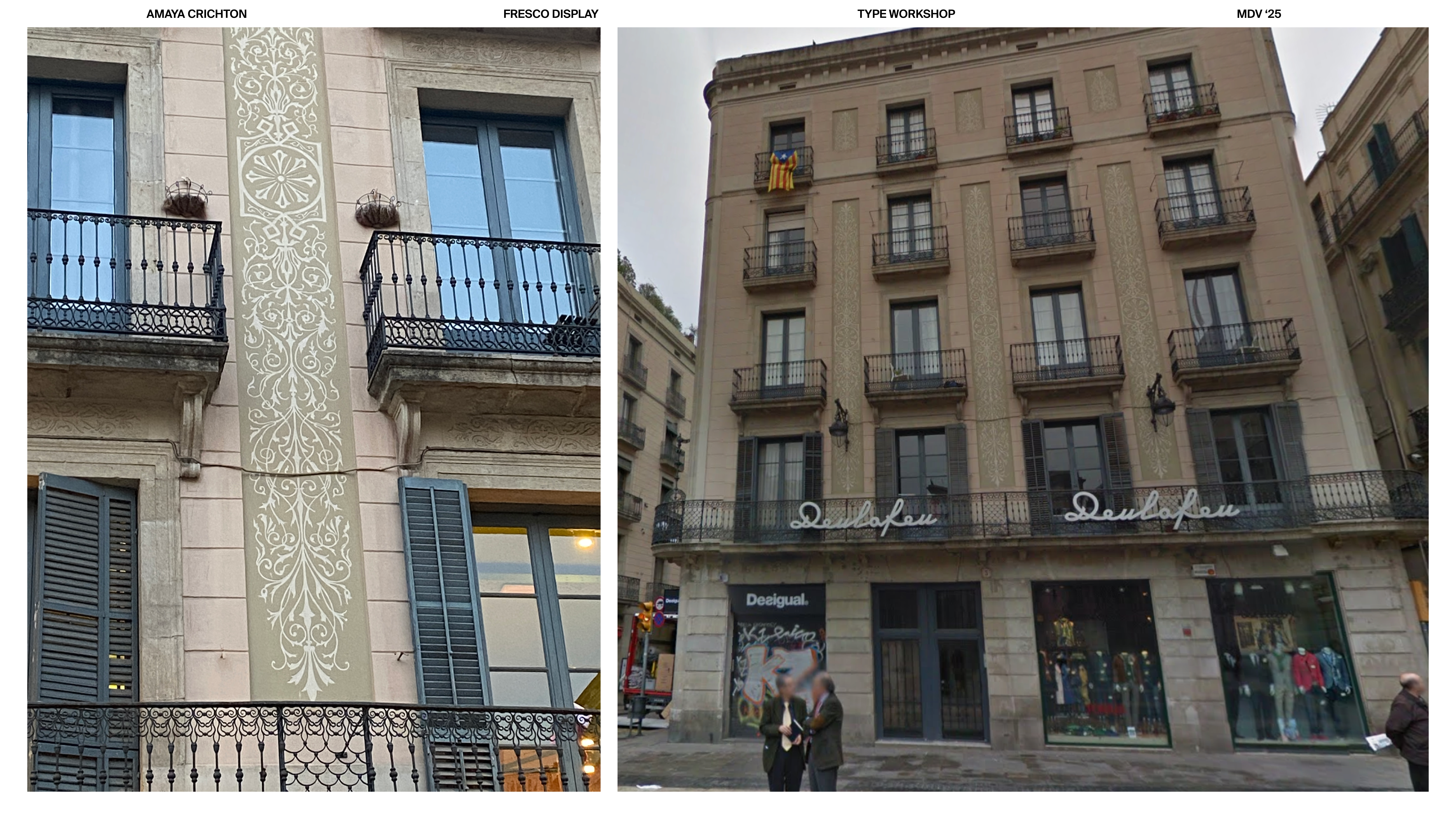
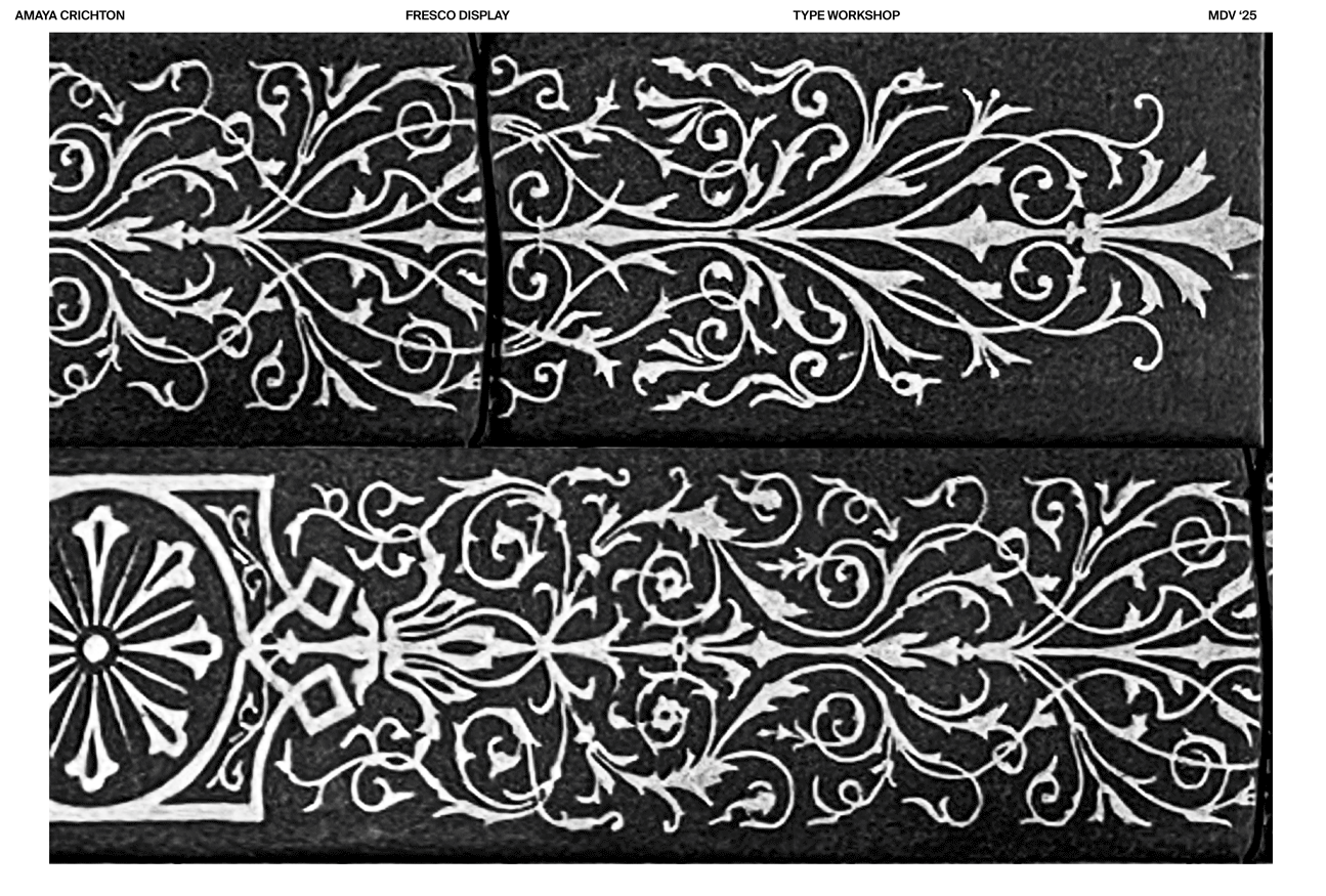
Fresco Display is based on a sgraffito (not a fresco, but too late now!) that traverses the four stories of 3 Placa de San Jaume. I couldn’t not take up the chance to pour over it for ages. And I loved all of it, not just a certain element- so I thought, why don’t I make the whole fresco my system? So I straightened out the photo, upped the contrast, printed it out, and spent the next few days tracing, finding all the letterforms hidden within the intricate and interweaving forms.


Which struggles did you have to overcome?
At the beginning, the hardest thing was finding a whole alphabet in the limiting structure of a sgraffito design. However, on day 03 it’s like I could suddenly see the design differently, It expanded the possibilities of what was a letterform. I couldn’t stop finding loads of wonky, interesting shapes that could be the beginnings of the skeleton of a letter.
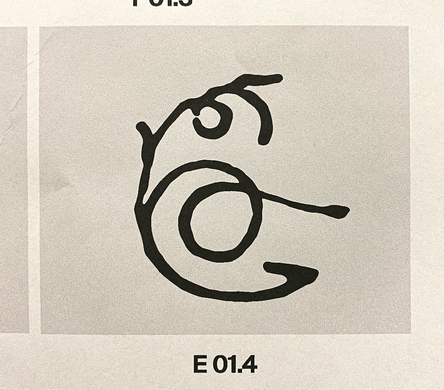
What do all the letters look like?
The letters are definitely decorative and a little experimental, not the most legible or practical, a type purist would certainly have a heart attack. But it’s a variable type that plays on that legibility. The structure of the letterform takes on the expanding decorative elements that surround them, growing outward like the flora they mimic. So you can choose something still decorative but more legible or something that almost stops becoming type, the skeleton of its form hidden and intertwined.

Where can people follow you?https://www.instagram.com/amayacrichton.png
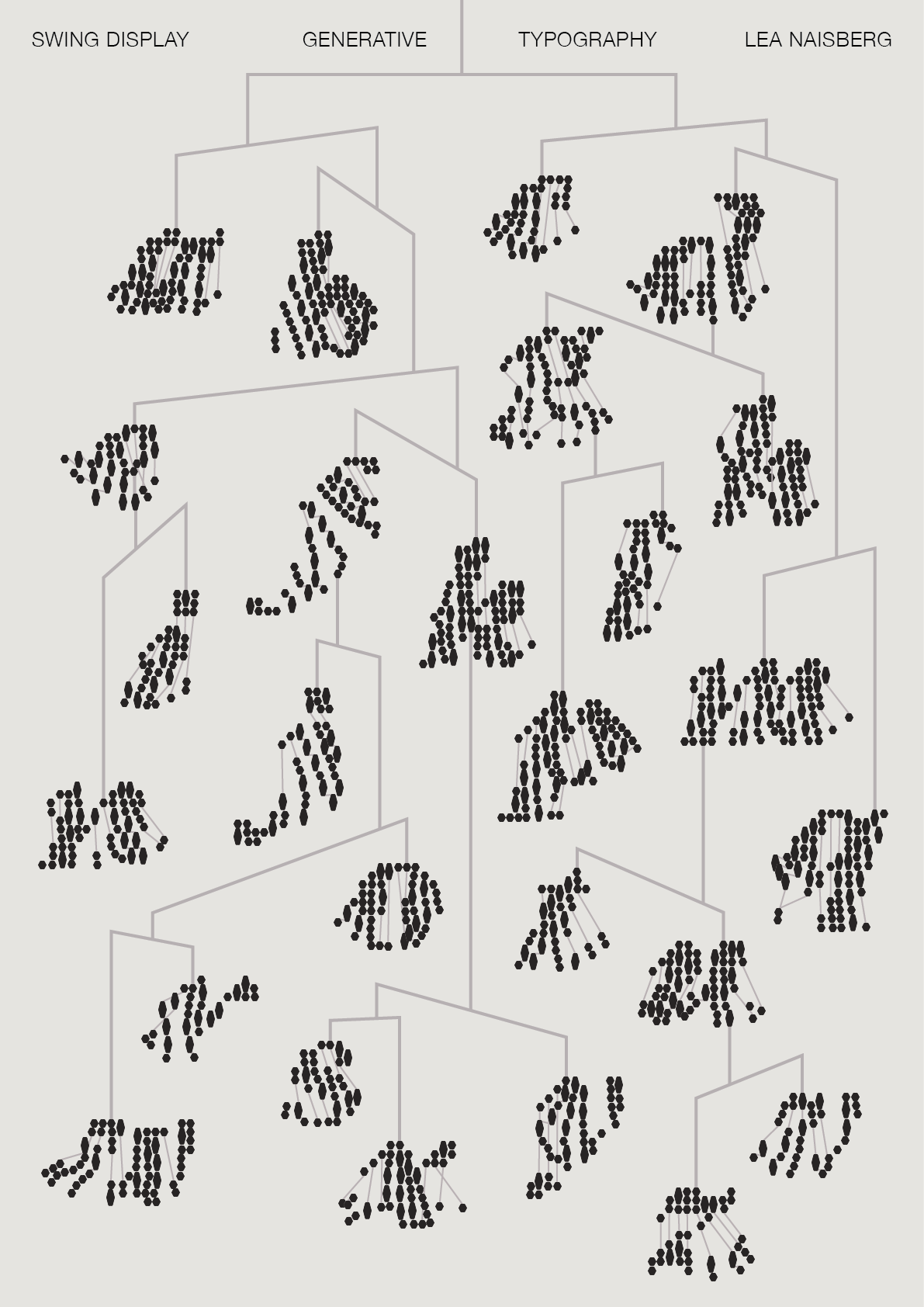
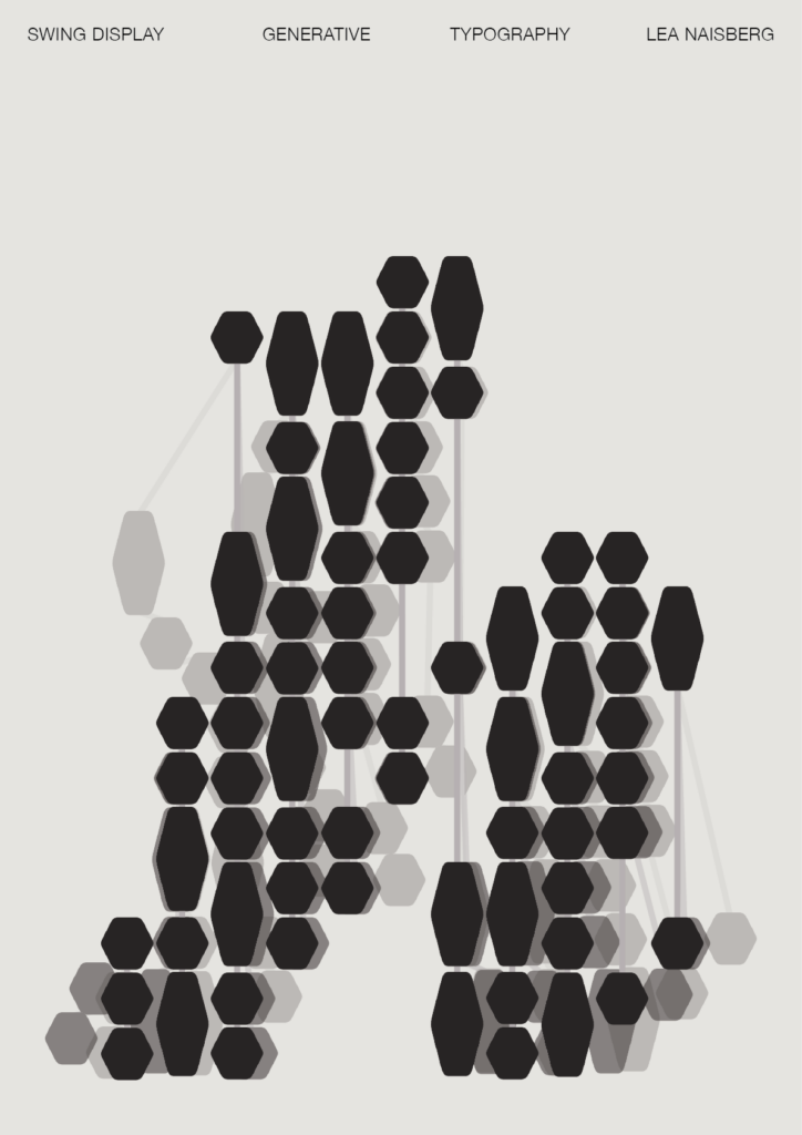
Lea Naisberg

Tell me a bit about yourself: What is your name? Where are you from? How much previous knowledge about type design did you have before participating in my workshop?
Hey, I’m Lea! I’m from both Buenos Aires and New York. In the past years, I’ve become very interested in type design. I started going to talks and meetups on the topic. I’ve also dabbled in creating (generative) letterforms, but I hadn’t formally studied type design.
Which part of the workshop did you enjoy most?
I really enjoyed walking around the neighborhood looking for inspiration and possible systems and grids for our typeface. It was interesting to walk past places that I had never looked at from that point of view and realized there are so many places (or things in general) that we can revisit with a new perspective to find inspiration. I also loved seeing everyone’s work on the last day and understanding how they connected the dots between the inspiration and final typeface.
Where did the inspiration for your font come from?
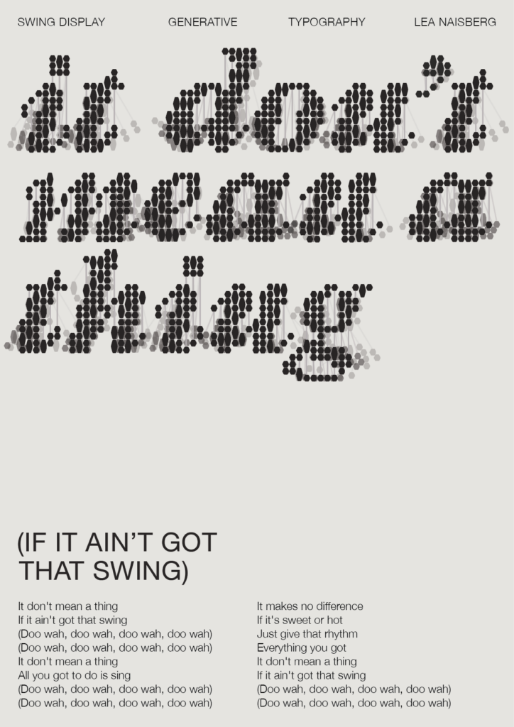
I was inspired by some chandeliers I saw while walking past what I believe is an antique shop. I saw the glass beads and jewels hanging from them and that brought me to the idea of a swinging/swaying movement, which became the main idea for my typeface.


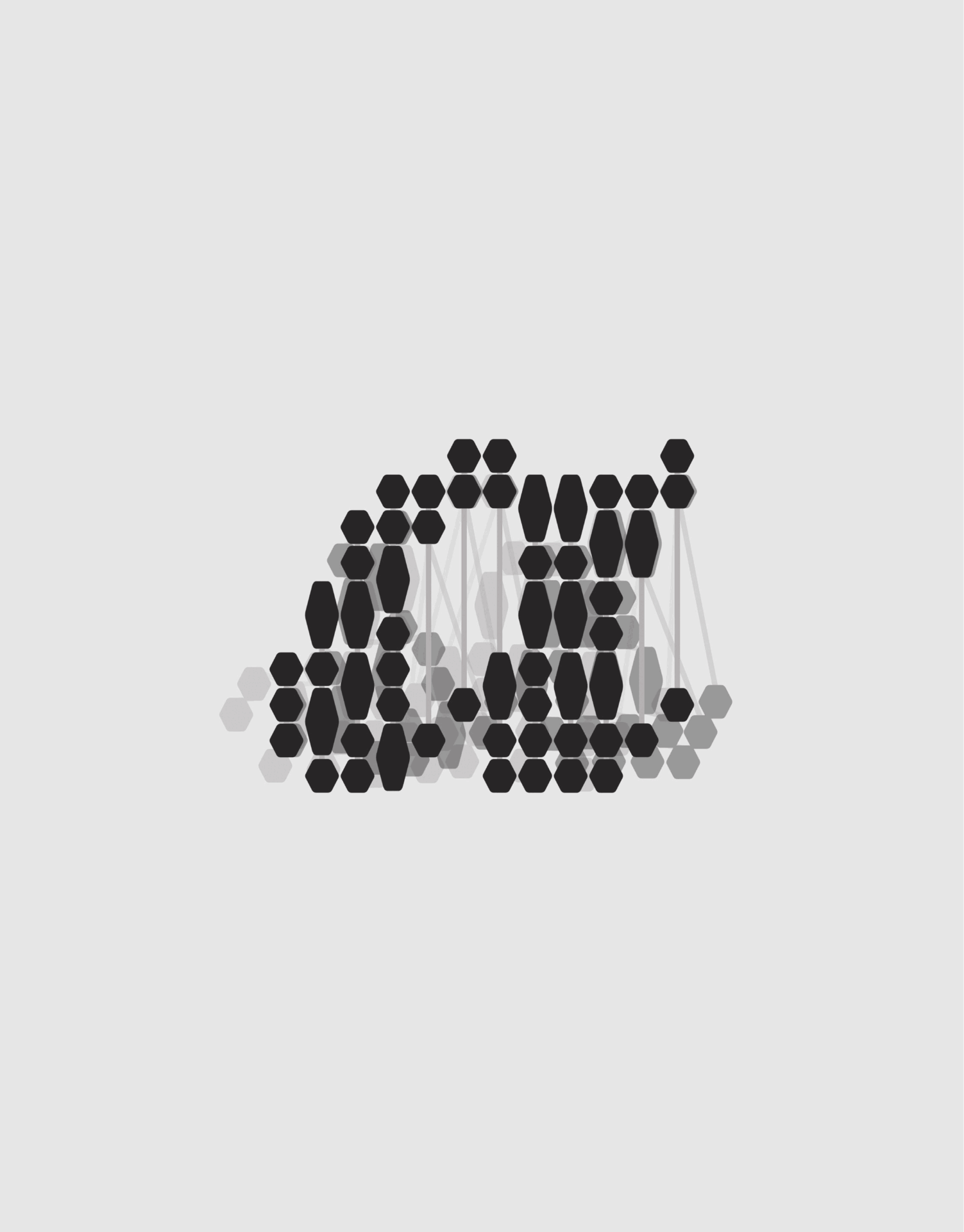
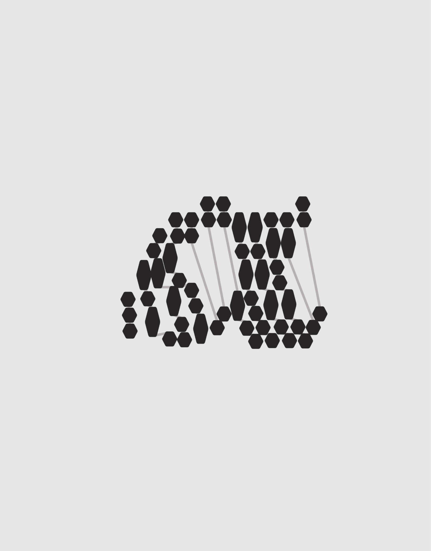
What do the modules and the grid look like?
I decided I wanted to create a generative and interactive typeface that would behave the same way a chandelier would. Each letter is made up of the jewels that hang from the chandelier and they can be distorted by swinging them around with the cursor.
The grid itself is made up of a jewel (a hexagon) and a stretched jewel that takes up two vertical spaces. The distribution of the jewels is actually randomized which means that each time a letter is generated it’s completely different.
Which struggles did you have to overcome?
My main challenge was translating the concept of a typeface that was based on motion and interaction into a static typeface for printed posters. I ended up taking screenshots while manipulating the letters through my program.
What do all the letters look like?
I decided to make three variations for each letter, playing around with the level of distortion and legibility. This actually led to an unplanned fourth variation in which all three layers are stacked.


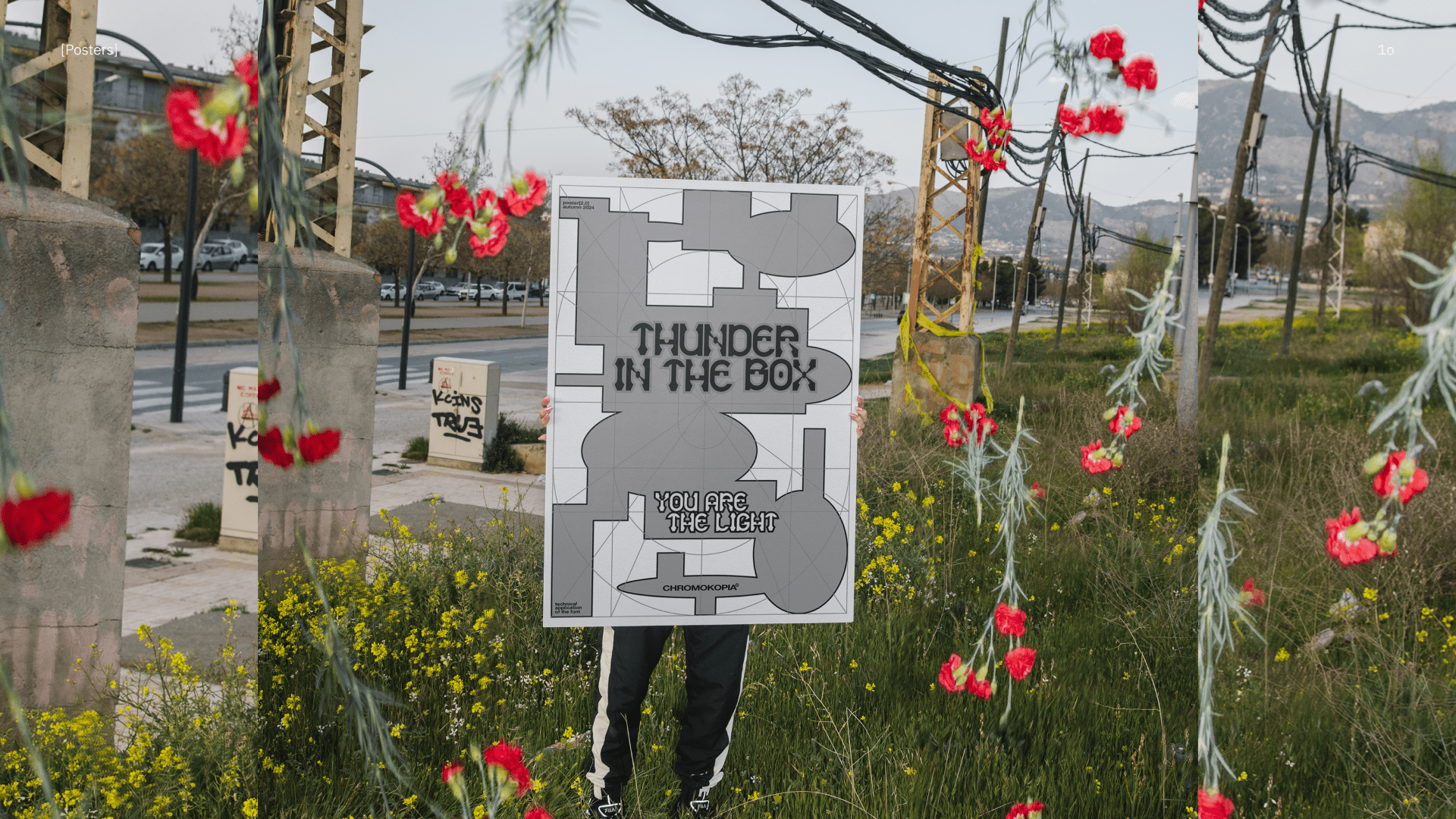
Show me the posters you designed with your font!
Where can people follow you?
https://www.instagram.com/leaniceberg/
Sofia Tuisheva
Tell me a bit about yourself: What is your name? Where are you from? How much previous knowledge about type design did you have before participating in my workshop?
Hey! I’m Sofi — a graphic and 3D designer. I’m originally from Russia, but I now live, study, and work in Barcelona. My background is in graphic design and media, and I have approached typography mostly from a classical, editorial perspective. However, I had never created a full font by myself, especially in just three days. So, for me, this workshop has been a fresh and enriching experience. Now, I feel more confident working with fonts and exploring this area further.
Which part of the workshop did you enjoy most?
I really enjoyed the pace of the workshop and the whole idea of creating something from scratch in just five days. I love the feeling of being in a rush and fully immersed in persistent work. It allowed me to dive deep into the process. The experience was very inspiring, and the results from all the students were amazing. We also learned a lot from each other, which was incredibly valuable!
Where did the inspiration for your font come from?
I found a lot of appealing patterns while walking through the El Gothic area. On the first day, I explored different ideas using multiple photos I had taken. When working with systems, I tried to find logic and coherence within the grids I discovered so that I could develop all the letters. That’s the point where decision-making comes into play, which is a great challenge. I believe this process is a core part of our work as designers — finding solutions within a vast diversity of possibilities.
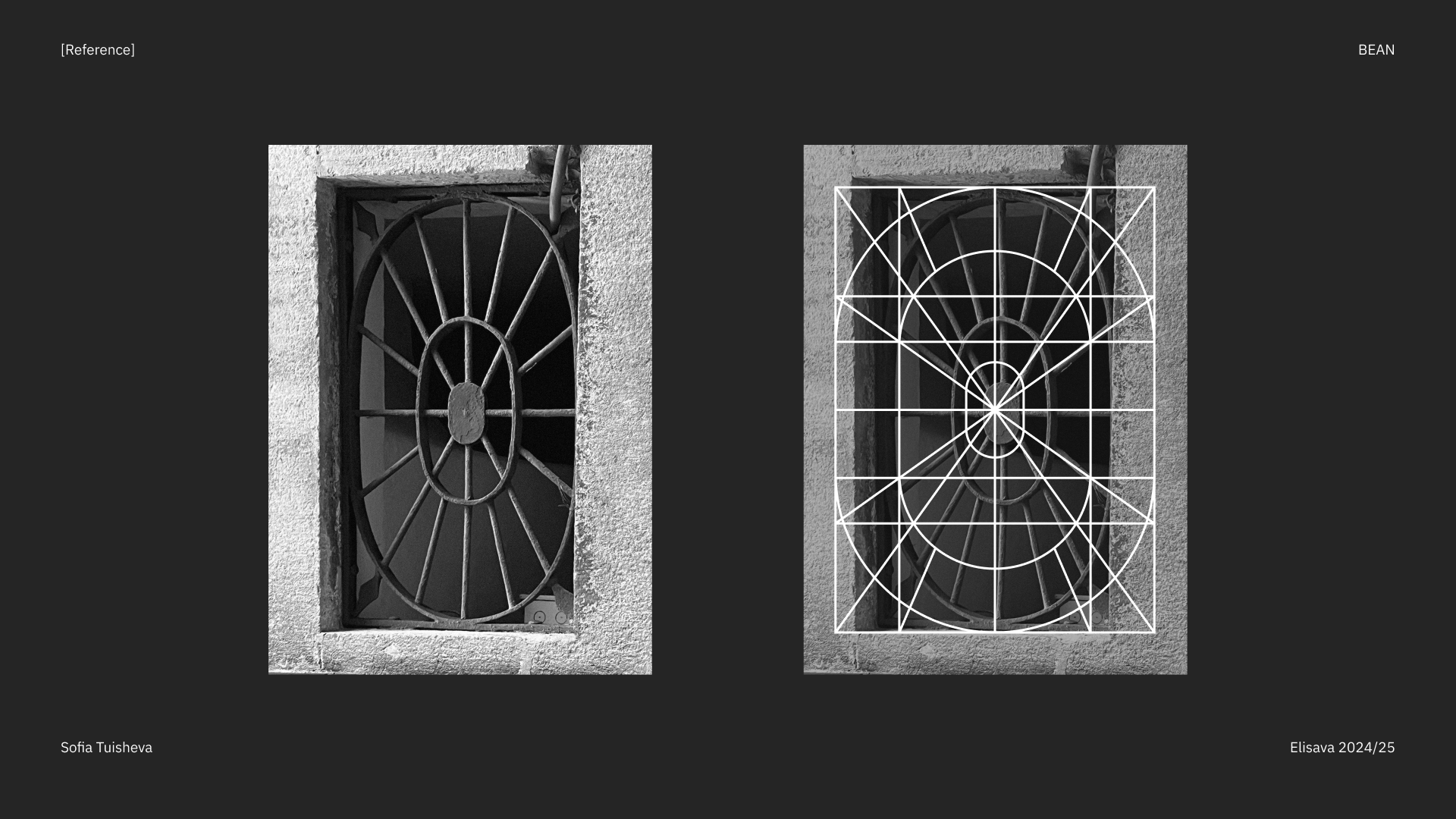
What do the modules and the grid look like?
At first glance, the grid seems pretty simple, but even though it was used by other students in the group, the results were incredibly diverse. This shows that a grid doesn’t confine a designer to strict limitations; instead, it serves as a space to create and explore. I started by refining my system references and adding small details that allowed me to design all the letters. Later, I decided to keep the grid as an integral part of my font’s design.
Which struggles did you have to overcome?
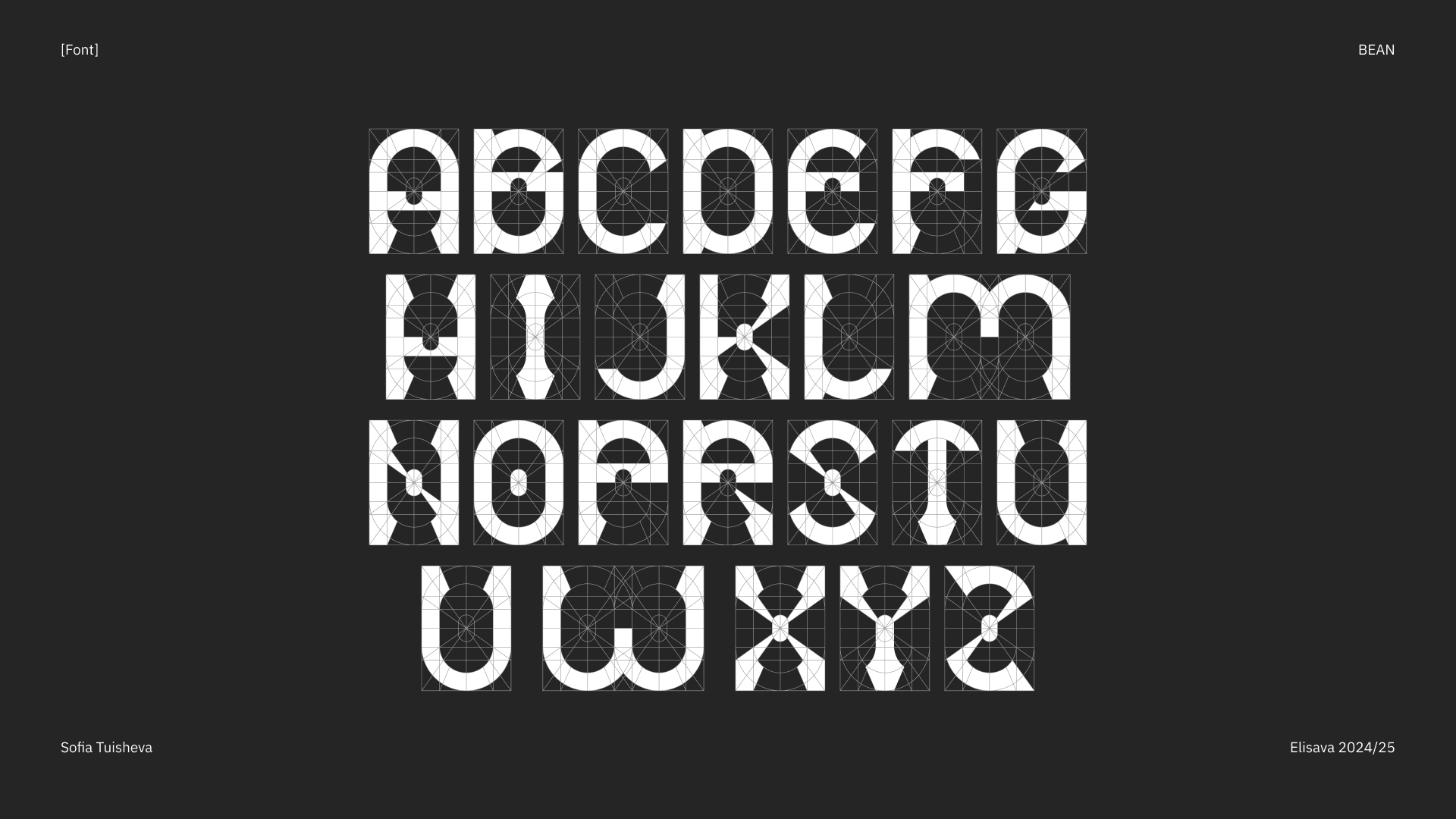
I think the most challenging part was working with wide letters like “M” and “W.” These letters tend to stand out from the rest, so it’s necessary to find a way to harmonize them with the rest of the alphabet. Overall, maintaining coherence across the font is a general challenge, but it’s also one of the most rewarding aspects of type design.
What do all the letters look like?
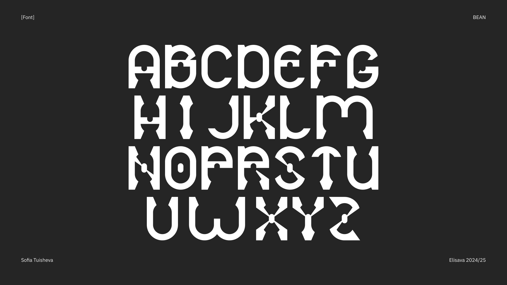
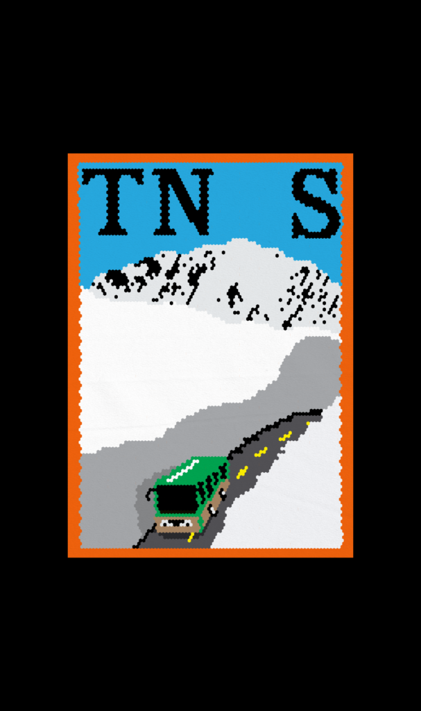
As a result of the workshop, I developed a geometric font called ‘Bean.’ It features a modular design that can be used both with and without the grid, depending on the desired visual outcome. The font is particularly suited for large sizes, where its details and structure can truly shine. Its clean geometry and distinctive shapes make it versatile for branding, posters, and experimental typography projects.
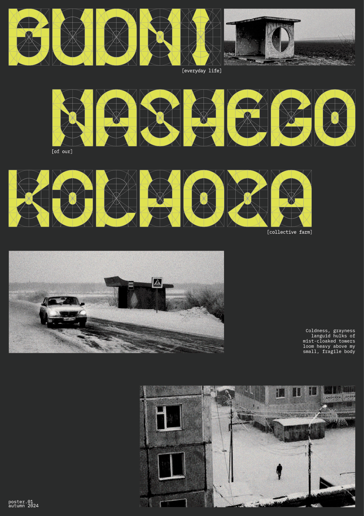
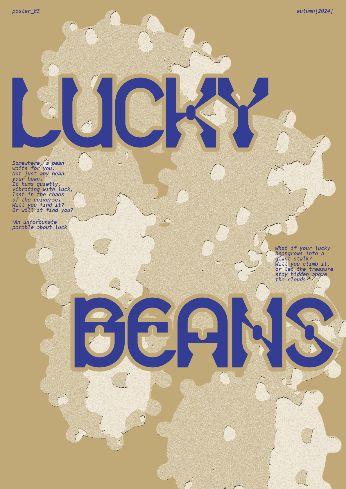
Show me the posters you designed with your font!

Where can people follow you?
https://www.instagram.com/d_e_l_iri_u_m_/
https://www.instagram.com/sonyx_art.3d/
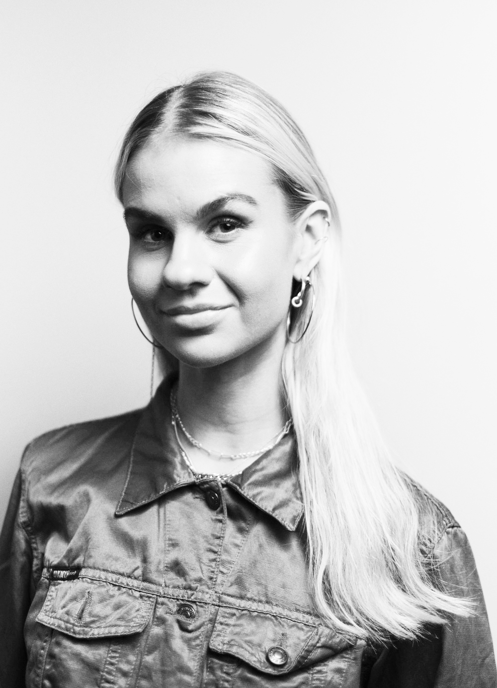
Ragnhildur Stella
Tell me a bit about yourself: What is your name? Where are you from? How much previous knowledge about type design did you have before participating in my workshop?
Hi, I’m Ragnhildur Stella, a 24-year-old graphic designer from Iceland with a bachelor’s degree in graphic design. I’ve previously taken an experimental typeface course, which gave me a glimpse into the creative side of type design. However, in the world of type, my knowledge is limited to the essentials.
Which part of the workshop did you enjoy most?
I really enjoyed this workshop as a whole. I’ve always been intrigued by type but often felt intimidated by it. This workshop and working with the grid were a brilliant reminder that it can also be fun and playful.
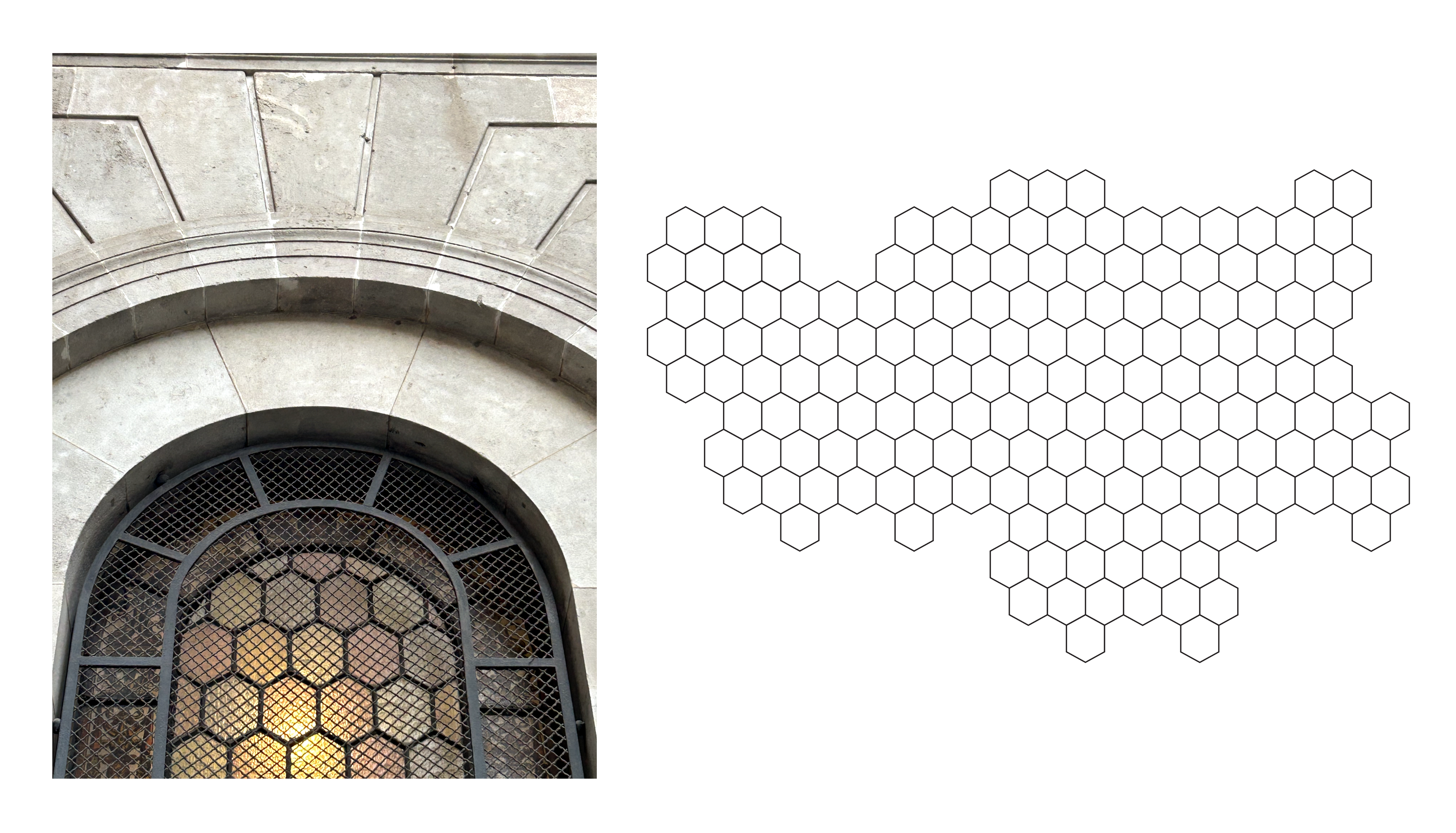
Where did the inspiration for your font come from?
This beautiful window on the side of the Ajuntament de Barcelona inspired the hexagonal grid. The grid does not have a clear beginning or end, which made it natural to approach the whole poster as a piece of mosaic art. From there, everything developed holistically, the naming progress inspired the whole concept and not the other way around.
Which struggles did you have to overcome?
Time was my biggest challenge. The workshop was short and sweet, which meant making quick decisions and trusting the progress. Additionally, mosaic art is not known for its speed.
What do all the letters look like?
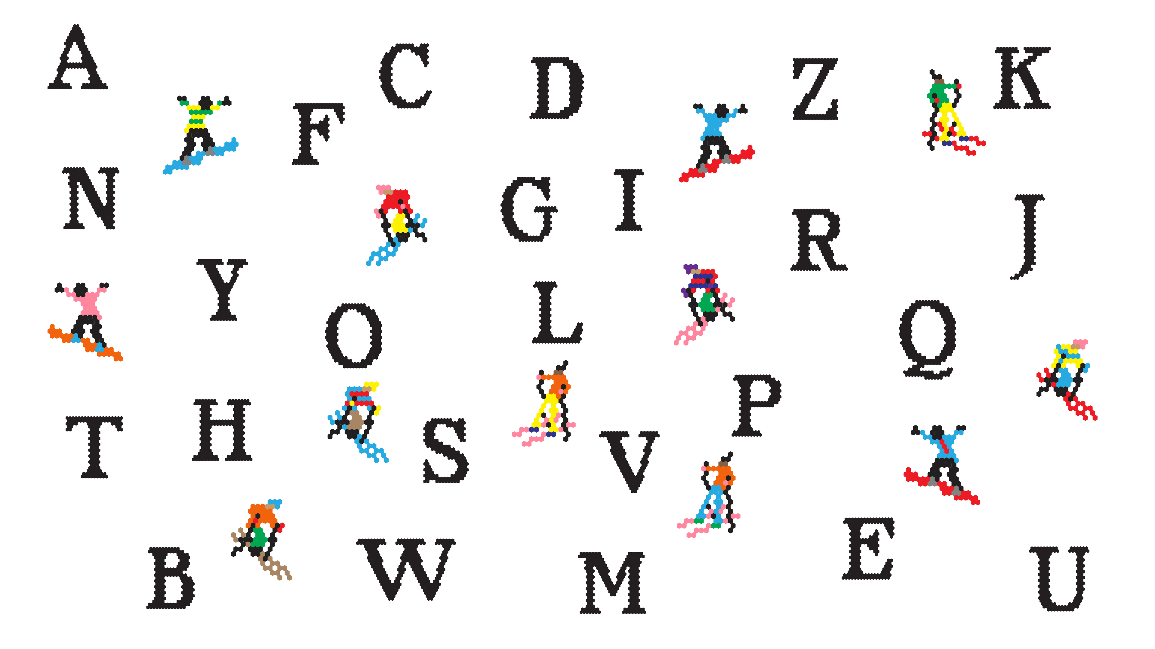
Show me the posters you designed with your font!


Where can people follow you?
https://www.instagram.com/ragnhiildur/