INTERVIEWS
with the Students of Elisava’s
Master of Visual Design

Since 2006 I have taught at the prestigious Barcelona design school ELISAVA, and even co-directed a Postgraduate Degree. At the Master of Visual Design, led by Marc Panero, I have taught since 2020 a fun workshop on Systemic Type Design. Although we just have 5 days, the results are always beyond everyone’s expectations.
Alessandra Carta

Tell me a bit about yourself: What is your name? Where are you from? How much previous knowledge about type design did you have before participating in my workshop?
I’m Alessandra, an Italian graphic designer from a small village in Sardinia. During my university years, I had the unique opportunity to delve deep into the world of typography. My fervent passion for it had always burned brightly, but I never tried making a whole alphabet from scratch before.
Which part of the workshop did you enjoy most?
Undoubtedly, the most enjoyable part was when I completed the grid where the entire alphabet would develop. As I meticulously examined and studied it, I gradually managed to create each letter of the alphabet. It felt like playing a game of filling in the missing pieces to reveal a picture. Every time I created a letter, it was like discovering something new.

Where did the inspiration for your font come from?
I called my typeface “Panot ” because it’s inspired by the iconic “Panot de flor“, one of the most representative symbols of Barcelona. The typography’s essence finds its roots in the Gothic architecture of Barcelona’s historic city center.
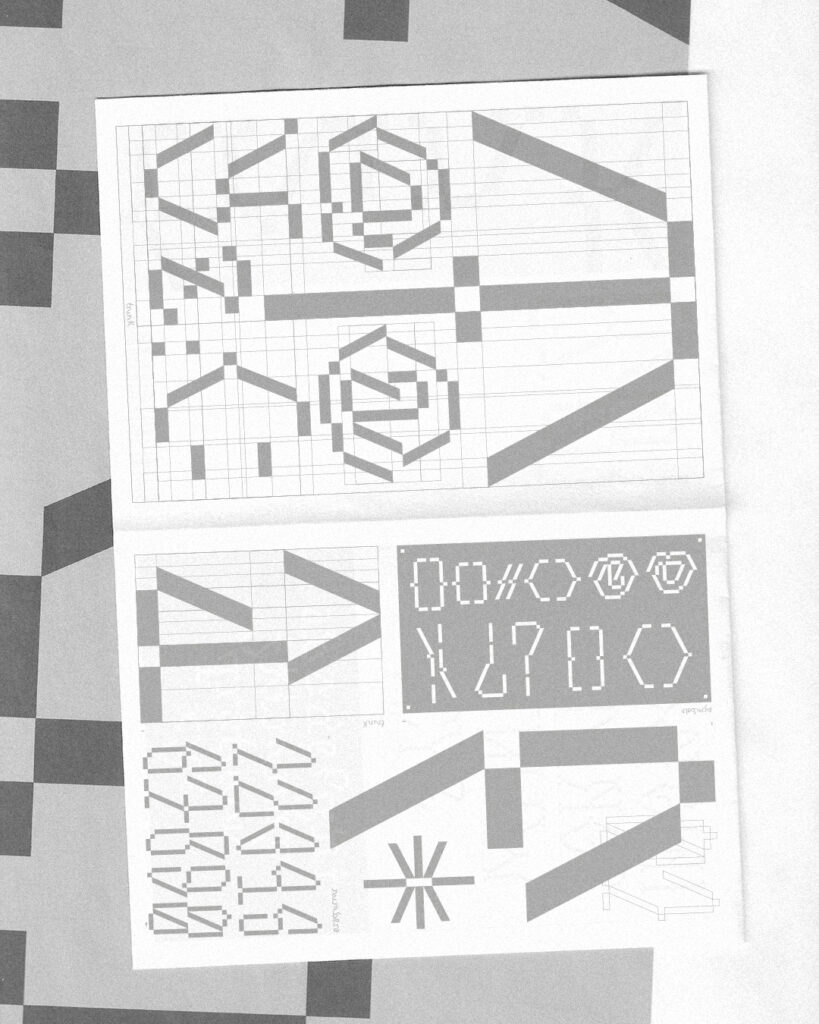
What do the modules and the grid look like?
The Panot typeface is constructed using a modular grid that incorporates the same five circles that form the “Panot de flor“, with vertical and horizontal lines passing through these circles.
Which struggles did you have to overcome?
I had a hard time with some letters, especially X and Z. At first, I thought they couldn’t be designed using this grid. However, upon further study, I managed to create them. These letters were the trickiest because they’re made of diagonal lines.

What do all the letters look like?
Panot embodies a lowercase Gothic typeface, drawing its aesthetic from the architectural style of Barcelona’s Gothic Quarter. It’s elegant and refined while maintaining a contemporary touch.


Reinaldo Camejo

Tell me a bit about yourself: What is your name? Where are you from? How much previous knowledge about type design did you have before participating in my workshop?
I am Reinaldo Camejo (REY), I come from Havana, Cuba. Since I was an undergraduate student I remember that typography caught my attention and I began to do some experimental work on my own using letters as the main resource to communicate visual messages. I had never had the opportunity to create an alphabet and this workshop opened a door in me to a field in which I have been entering more and more.
Which part of the workshop you like most?
My favorite part of the workshop was creating the whole alphabet, I loved testing and adjusting each letter to achieve a harmonic relationship between the whole alphabet. I don’t deny that the experience was challenging, especially having only 5 days to complete the project, but I enjoyed the process so much that in less time than I expected, I had already built the typography.
Where did the inspiration for your font come from?
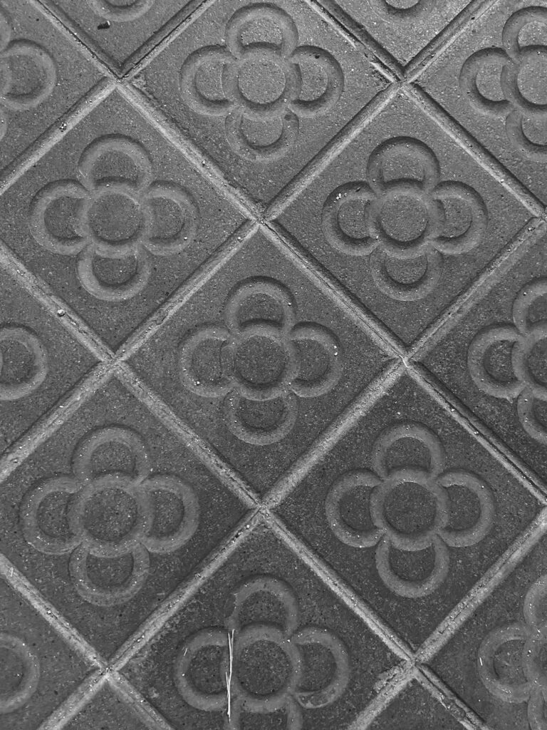
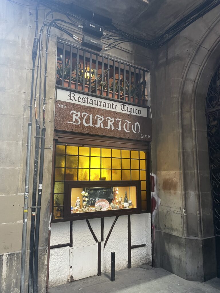
The source of inspiration to create this typeface was the geometric motifs present in several buildings in the Born neighborhood. It is curious how these geometric and striking patterns are found on the floor of balconies in old buildings. The concept of the typography is about the modern, dynamic, and funny face of the Born neighborhood.

What do the modules and the grid look like?
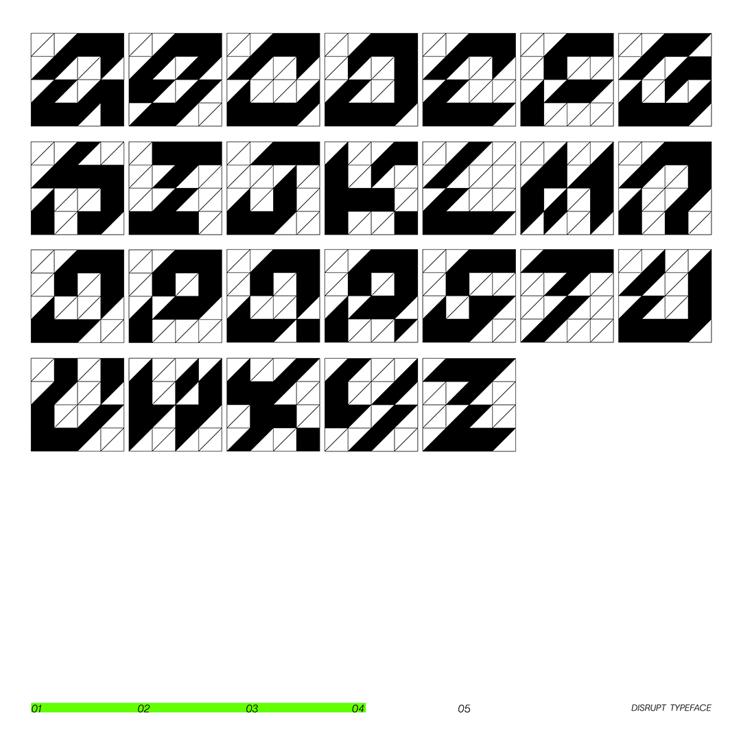
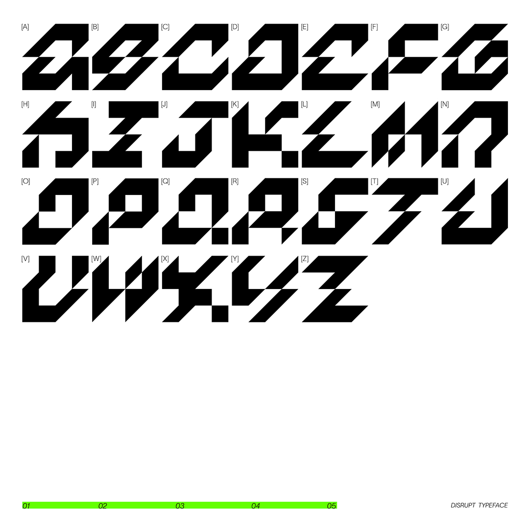
As a base structure to build this modular system, a grid is created inside a square, using lines that cross the diagonal from end to end. This is a grid that is quite faithful to the design of the balcony floor.


Which struggles did you have to overcome?
The main challenges came from letters with diagonal strokes with a slant to the right, because my grid only allowed slanting to the left. It was also challenging to build the typeface with a grid of few subdivisions, as the options were reduced.
What do all the letters look like?
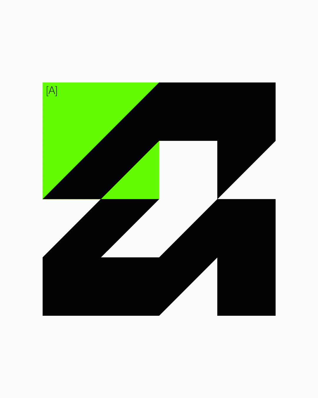
Disrupt Typeface is a display typography that seeks to convey the dynamism and modernity present in such a traditional neighborhood of Barcelona as El Born.


Where can people follow you?
https://www.instagram.com/rey.graphic/
https://www.linkedin.com/in/reinaldo-camejo-197587151/
https://reygraphic.com/
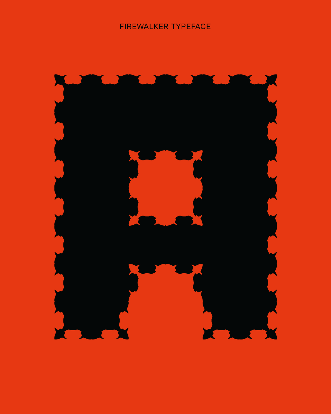
Lúa Climent
Tell me a bit about yourself: What is your name? Where are you from? How much previous knowledge about type design did you have before participating in my workshop?
I am Lúa Climent, a Spanish graphic designer based in Barcelona. Before participating in the workshop, I had zero knowledge about type design, so it was definitely a challenge!
Which part of the workshop you like most?
The best part was definitely looking for inspiration outside of the computer, going outdoors and just being present and carefully observing my surroundings.
Where did the inspiration for your font come from?
Barcelona is a truly inspiring city. Whilst walking around the Born neighborhood, I started carefully looking everywhere. I was receiving various inputs from the urban setting: shapes, colors, and textures were everywhere. In the end, a really strange tile I found on the floor of a bar caught my attention, I knew I had to do something with it.
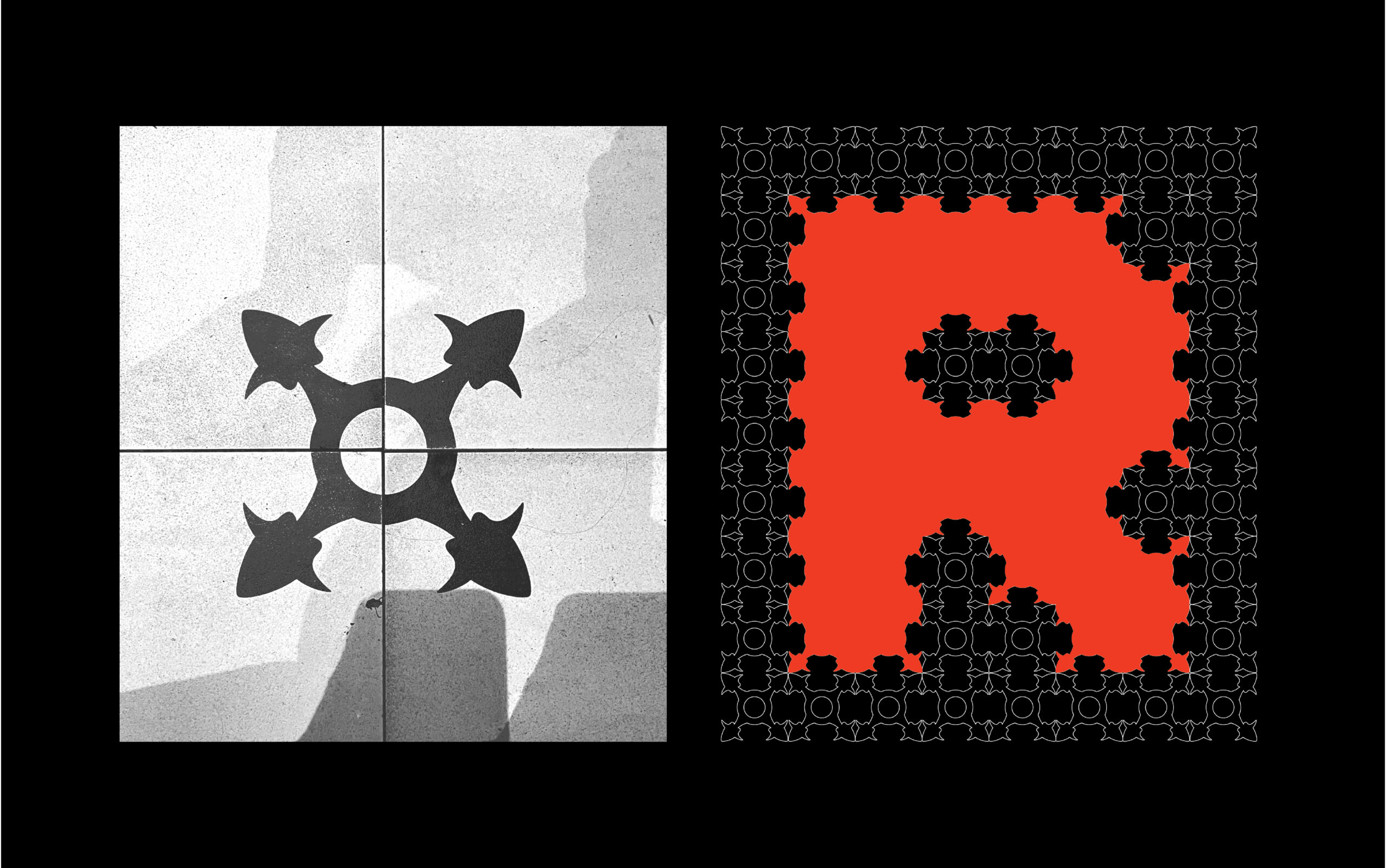
What do the modules and the grid look like?
The modules imitate the peculiar shape I found: being a circular shape, with 4 different branches. Once placed one next to each other, the grid started to show weird shapes that kind of resemble small horns. Initially, I thought the grid would look more harmonious and aesthetic, however, it ended up looking funny and odd. Precisely, that’s what I most love about it! So I decided to embrace its ugliness and weirdness.

Which struggles did you have to overcome?
I got too caught up in the initial steps of finding inspiration, I couldn’t decide which element from the city i would chose to develop my typeface. For this reason, I spent too many days testing out shapes that were not working, or that did not fully satisfy me. Once I chose my desired grid, I had a couple days to develop the whole alphabet, which was incredibly challenging. In the end, seeing the typeface fully developed resulted incredible.

What do all the letters look like?
The letters look like a tatami puzzle mat, similar to the ones used by children, due to its square shape. Funny, isn’t it?
Where can people follow you?
www.luacliment.com
https://www.linkedin.com/in/luacliment/
https://www.instagram.com/luacliment/
https://www.behance.net/luacliment
Marc Galan
Which part of the workshop you like most?
The search for inspiration in the street and apply the modules to the grid.
Where did the inspiration for your font come from?
From a decoration in the outside of a bar.
What do the modules and the grid look like?
Looks like a digital tree.

Which struggles did you have to overcome?
Adapting the modules of the type to be consistent.

Show me the posters you designed with your font!
I did an specimen that are two posters (back and front).

Where can people follow you?
Instagram: @marc_galan
Thank you, Alessandra, Rey, and Marc! There are many more brilliant works I would have loved to show, but the article is getting a bit long.
Make sure you visit: