MODULAR TYPE DESIGN WORKSHOP
with the Students of Elisava’s
Master of Visual Design 2023/24

One of my favorite weeks of the year is the week I am spending with the wonderful students of the ELISAVA Master of Visual Design, directed by Marc Panero. I have taught this fun workshop on Systemic Type Design since 2020 and with every year it is becoming more fun. Although we just have 5 days, the results are always beyond everyone’s expectations. Get to know a couple of students.
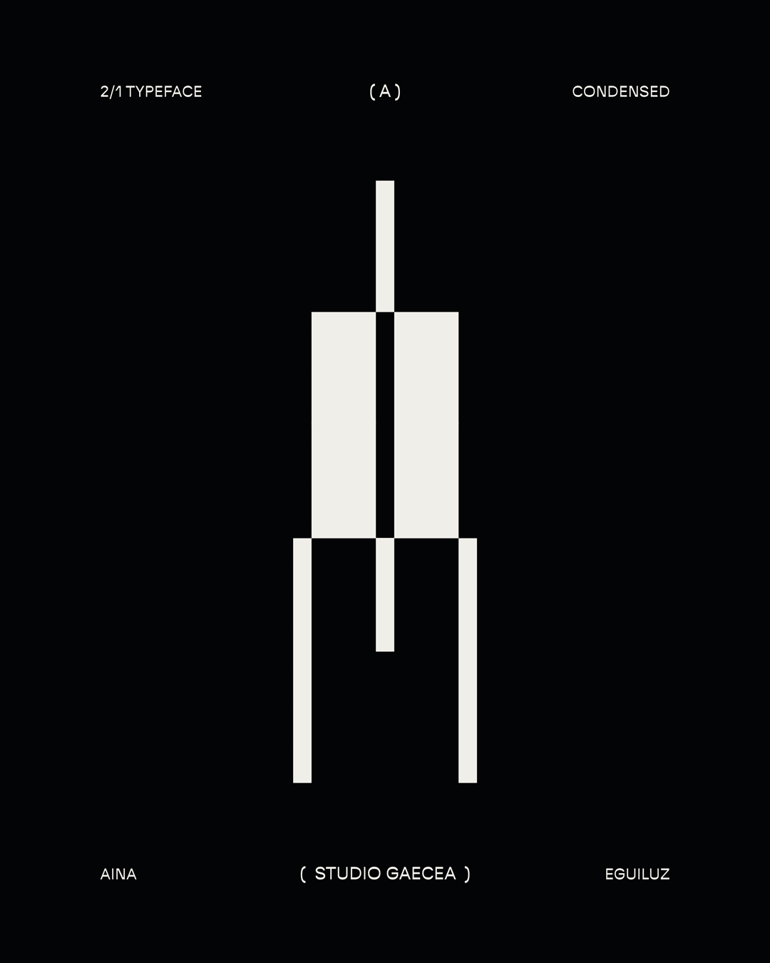
Aina Eguiluz Serra
Tell me a bit about yourself: What is your name? Where are you from? How much previous knowledge about type design did you have before participating in my workshop?
I’m Aina Eguiluz Serra, a Catalan graphic designer based in Girona, Spain. Throughout my studies and my work as a freelancer, I have always been in contact with typography. I am enthusiastic about exploring the typefaces that have been designed to date and finding ways to use them in my compositions, usually putting them in the foreground. However I had never dared to design one myself, so this workshop was definitely a challenge for me.
Which part of the workshop did you enjoy most?
The part I enjoyed the most, aside from the design process and the use of generated typography, was looking for and finding the grid in the streets of Barcelona. I love taking walks with an attentive look at our surroundings to finding patterns, typefaces, or simply ideas on the street to work with.

Where did the inspiration for your font come from?
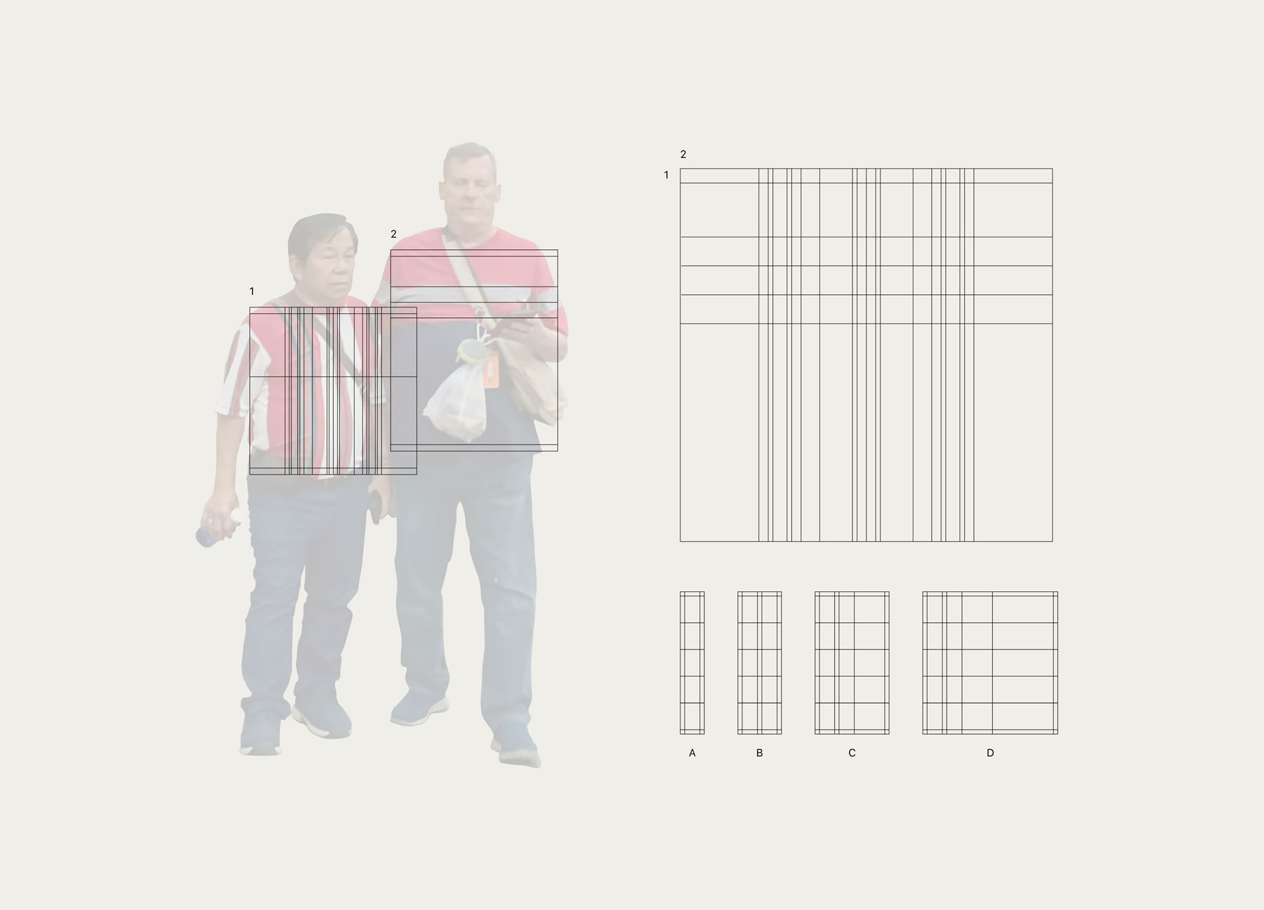
My reference for the project appeared right at the end of the observation process. It was so spontaneous and fun that I couldn’t help but take a photograph. Right in the Plaça Sant Jaume I found my grid: two men touring Barcelona, dressed in the same sneakers, the same pants, and both with striped T-shirts in the same colors. The only difference was that one of them was wearing horizontal stripes and the other vertical stripes, as if they had agreed on which pattern each would wear. When producing the posters, I returned to the initial image of these two men, having fun while I incorporated some of these elements, such as the sneaker, the color palette of the T-shirts, and even a small photograph of the two tourists hidden among the typography.
What do the modules and the grid look like?
The grid was developed by overlapping the patterns of the T-shirts, using the thickness of each stripe and its arrangement in the horizontal and vertical axis as a reference. After some tests, I filled the grid as if it were the cells of an Excel table and, playing with the thicknesses of the different cells and the contrasts they generated, I managed to develop the typography.


Which struggles did you have to overcome?
One of the main problems was using the reference of the T-shirts too literally. Because of this, I encountered some stiffness problems when designing the system by which to generate the typography. It was then that I decided to bring the grid into my territory and make it more flexible, adapting it to the needs of each letter without affecting the overall appearance.
What do all the letters look like?
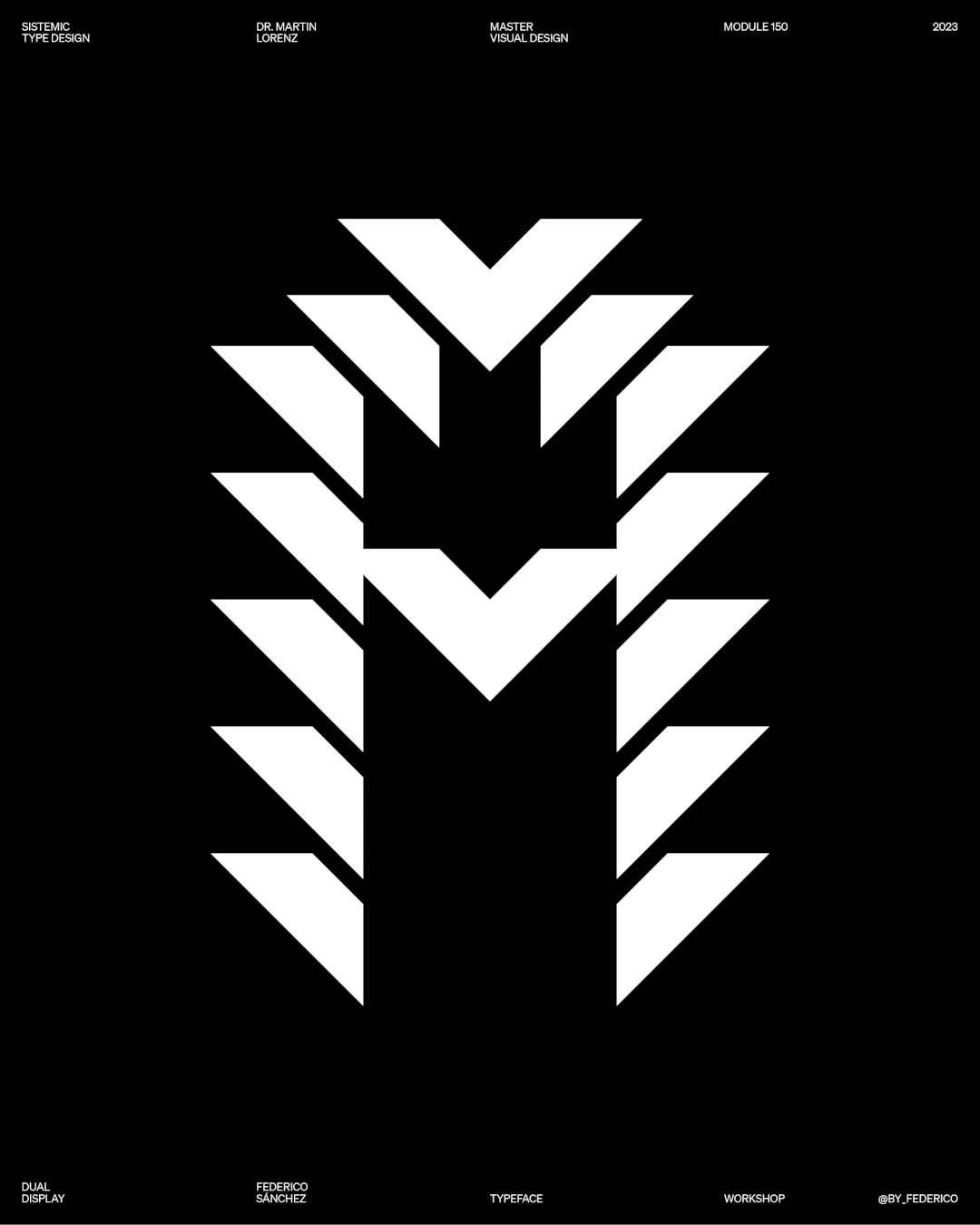
21 Display (21 as 2 Men and 1 Destiny – Dos hombres y un destino) is a variable display typography with a pixel and glitch aesthetic, in condensed, regular, and extended versions. It is a typeface with which you can find interesting contrasts and bring dynamism to your compositions. I hope whoever uses it has as much fun as I did while designing it 🙂
Find me at www.gaecea.xyz
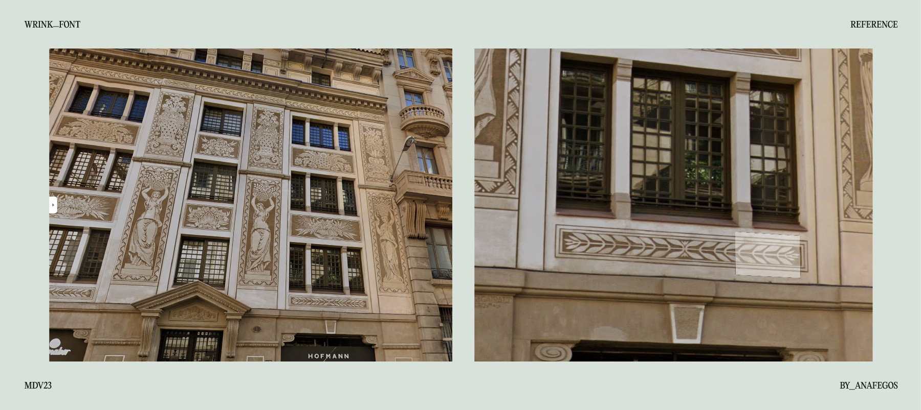
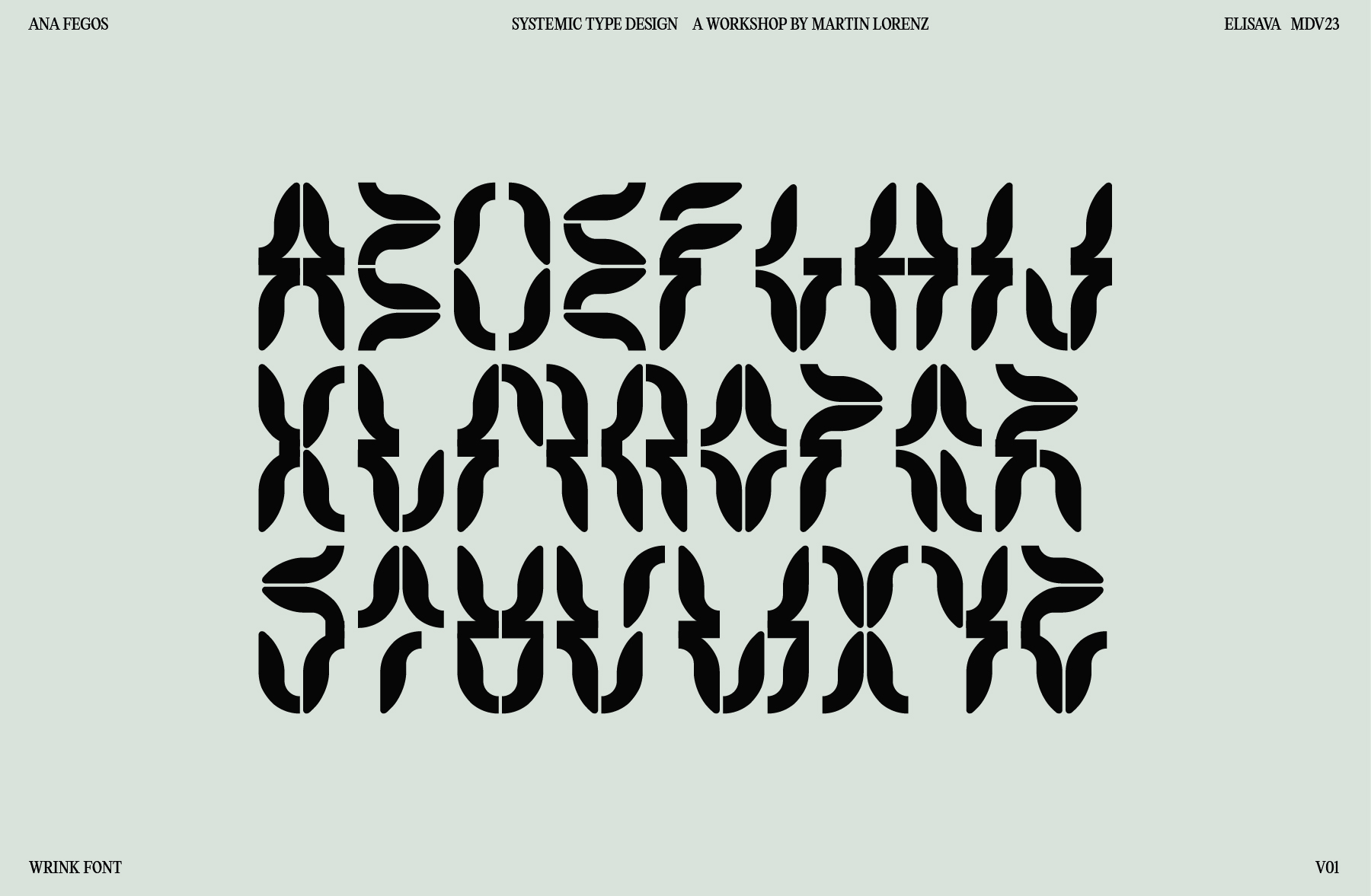
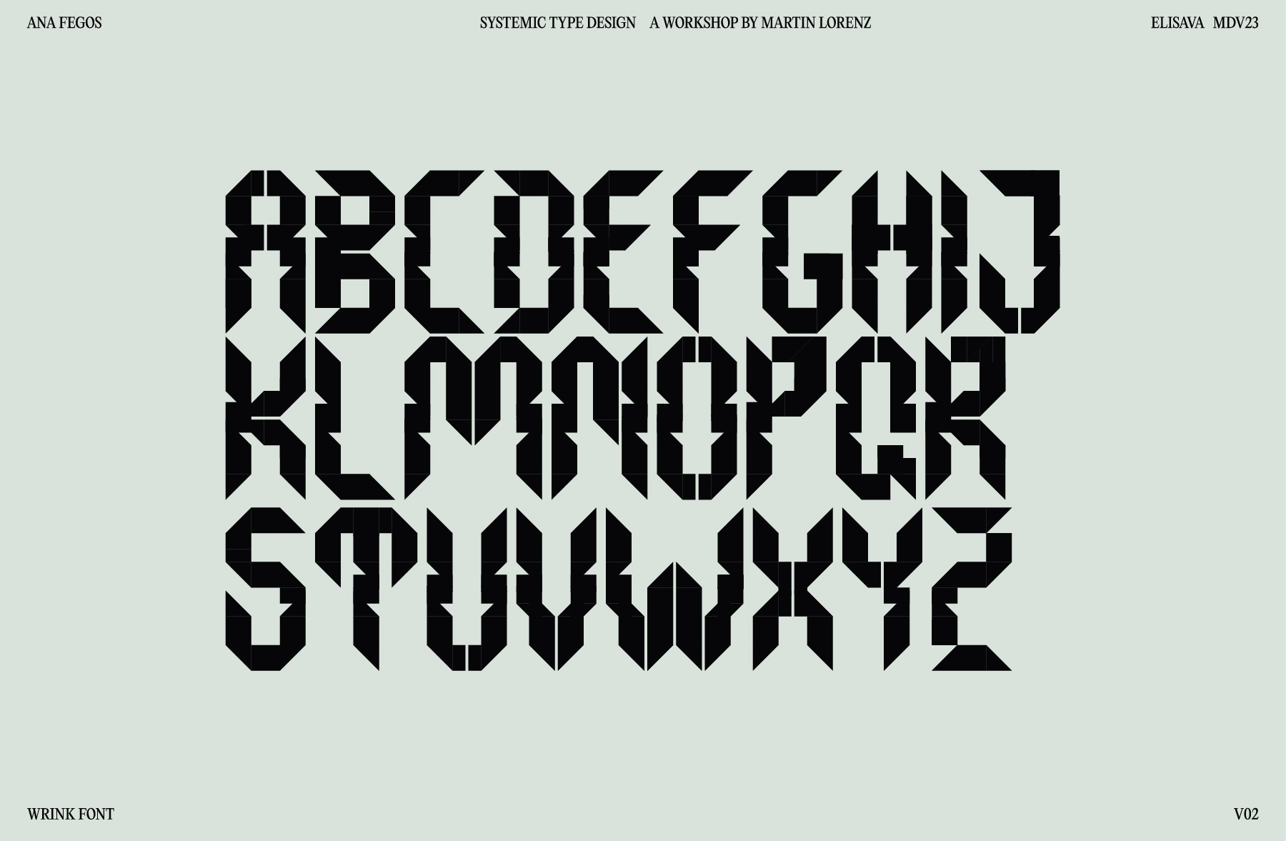
Ana Fegos

Tell me a bit about yourself: What is your name? Where are you from? How much previous knowledge about type design did you have before participating in my workshop?
I’m Ana, a graphic designer from Madrid. As an undergrad, I was introduced to the vast world of typography, where the utmost attention to detail in every aspect of their construction really struck me. Since then, I’ve always looked at type design as something very difficult and even a bit scary, but deep down probably so fun. I’m glad that Martin helped me realize how amazing it is to have type design as an asset of communication and how it can enrich any project in my practice.
Which part of the workshop did you enjoy most?
As someone who spends probably way too much time behind a computer screen, I loved being able to walk the streets of Barcelona to find unexpected inspiration, having a short amount of time to prevent overthinking, and then reflecting on what I found to make an interesting project. The constraint of working with what I had retrieved and making the most out of it really pushed my creativity.
Where did the inspiration for your font come from?
Almost at the end of the walk, I encountered the “Casa Felip Colldefors”, where a frieze of leaf-like components at the bottom of its façade really caught my eye.
What do the modules and the grid look like?
The modules created for my font are very unique in shape since they come from something as organic as the profile of a leaf. In the first version of the “Wrink Font”, the modules try to stay as true as possible to the original shape of the frieze, resulting in a construction dictated by the rotation, mirroring, and combination of these modules.

In the second version, I tried to actually construct a grid by simplifying the module to basic shapes, in a way that it could allow me to have more control and overall consistency.

Which struggles did you have to overcome?
By working with such an unusual module, I had to do an intensive exercise of constraining the amount of possibilities in order to keep all letters coherent and readable once the system was understood. Also, in the second version I had to make sure that my simplification of shapes wouldn’t create a very different typeface, but rather represent the original concept in a different “weight”, maintaining correlation and working together visually.
What do all the letters look like?
Wrink Font is a systemic display font that generates a wrinkling movement in the verticals of the letters. It comes in two variations, where one stays true to the leaf-like component of the original inspiration, while the other stylizes it in a more brutalist approach. Because of the singularity of the component, Wrink achieves unique and unexpected letterforms.
Show me the posters you designed with your font!
The idea behind the series of posters was to use key components of Wrink to evoke a sci-fi scenario from a movie set in the 60s but designed in an apocalyptic future.

Where can people follow you?
https://www.instagram.com/anafegos/
https://www.behance.net/anafegos
Camilla Vittozzi

Tell me a bit about yourself: What is your name? Where are you from? How much previous knowledge about type design did you have before participating in my workshop?
Hi, I’m Camilla Vittozzi, I’m from Rome, Italy. Even if typography has always been very interesting for me, I had never done a workshop like this before and I had never created an alphabet starting from scratch, so I’m very happy to have had this opportunity.
Which part of the workshop did you enjoy most?
One of the most exciting aspects of this workshop was to find inspiration directly from the streets. It was inspiring that everyone was attracted by different details/patterns… Someone even worked on the same grid but created two completely different typefaces.
Where did the inspiration for your font come from?
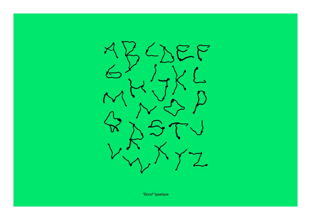
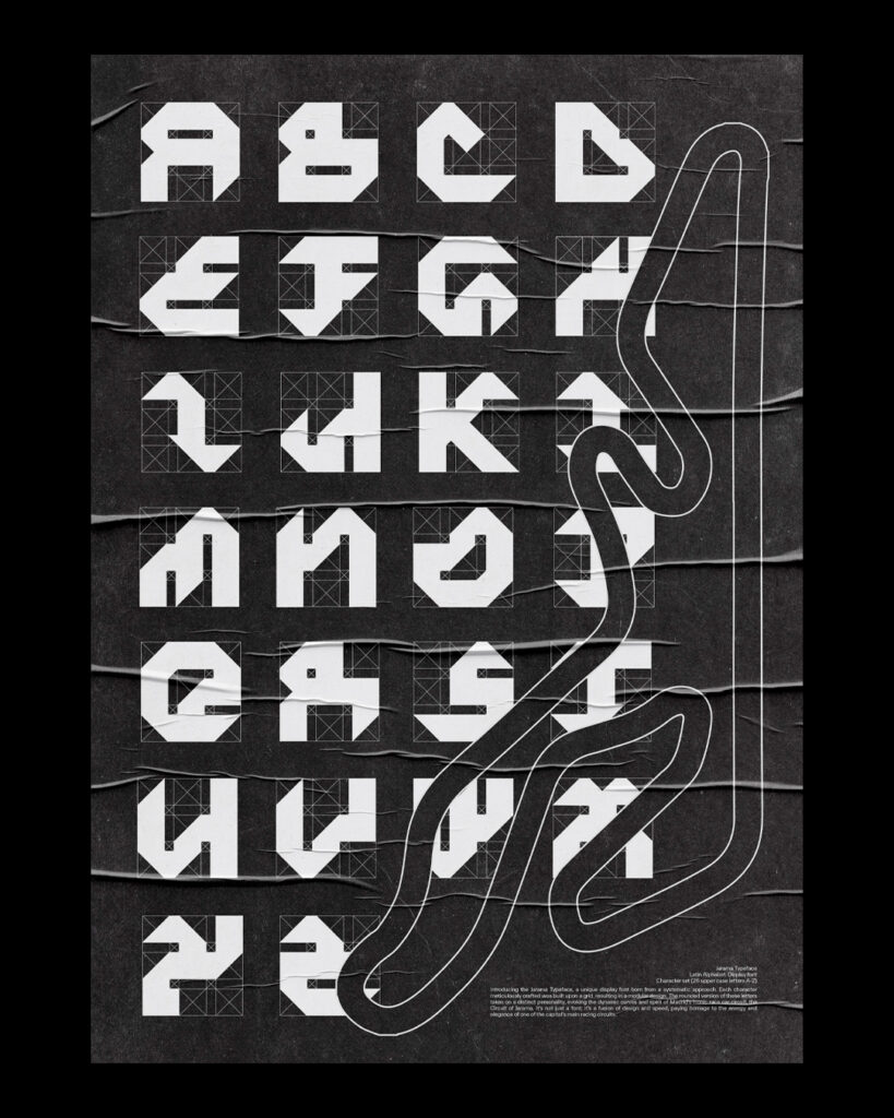
“Bond” typeface is a typographic character inspired by “Monument als Castellers” in Plaça Sant Miquel in Barcelona, which homages one of the most spectacular Catalan traditions. A “bond” is “a relationship between people or groups based on shared feelings, interests, or experiences”. I started creating letters using the monument as a grid. All of them can be connected, like a real bond.

Which struggles did you have to overcome?
Having a dynamic grid was funny in the process but it was also a challenge for me. I started creating multiple versions for each letter and at the end, I had to choose the ones that worked better together.
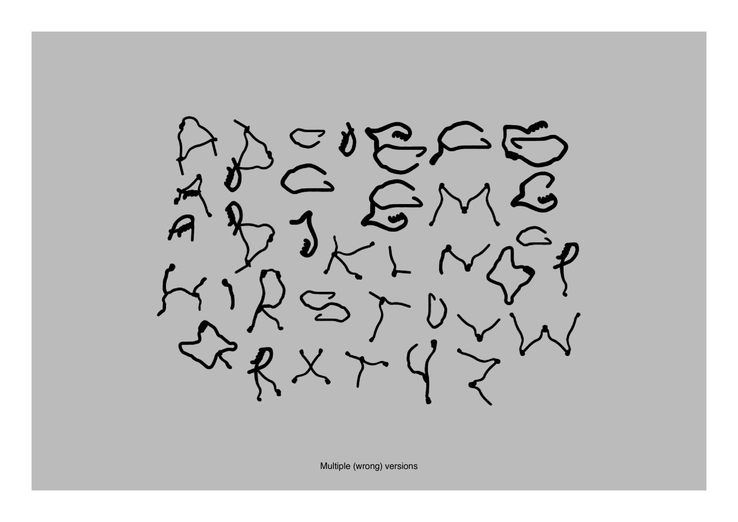
What do all the letters look like?
Every letter has multiple versions because the grid I used was very dynamic. They appear organic because of their shapes and they work very well with ligatures.

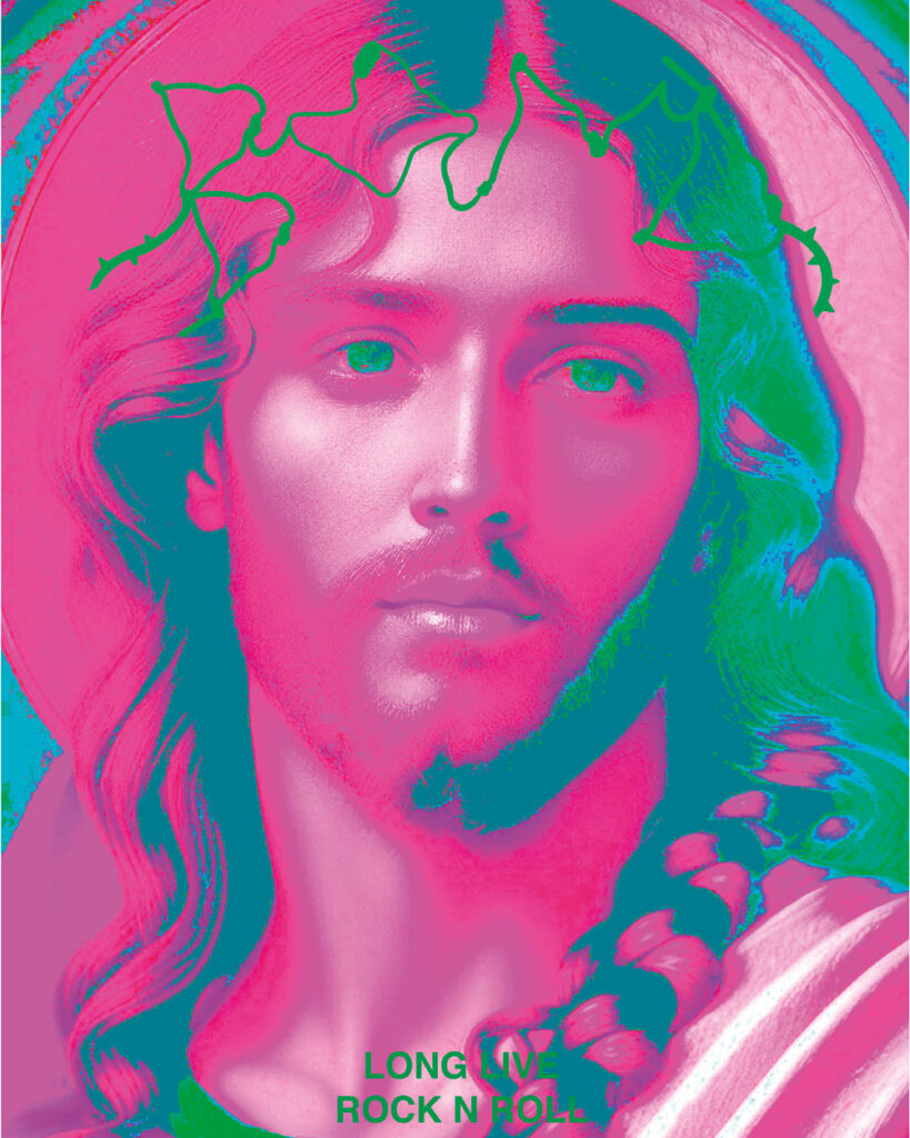
Show me the posters you designed with your font!


Where can people follow you?
https://www.instagram.com/ccam.ind/
Gonçalo Salgado
Tell me a bit about yourself: What is your name? Where are you from? How much previous knowledge about type design did you have before participating in my workshop?
Hey, I’m Gonçalo from Leiria, Portugal. As a self-taught graphic designer, my journey into the world of typography has been mostly guided by typography books and finding amazing foundries online. Apart from that, I don’t have any experience per se.
Which part of the workshop did you enjoy most?
Walking around El Gotic was really liberating in the sense that we looked for inspiration for our project outside of the digital world. The last day was also really fun getting to see everyone’s results and their own take on this intense but rewarding workshop.
Where did the inspiration for your font come from?
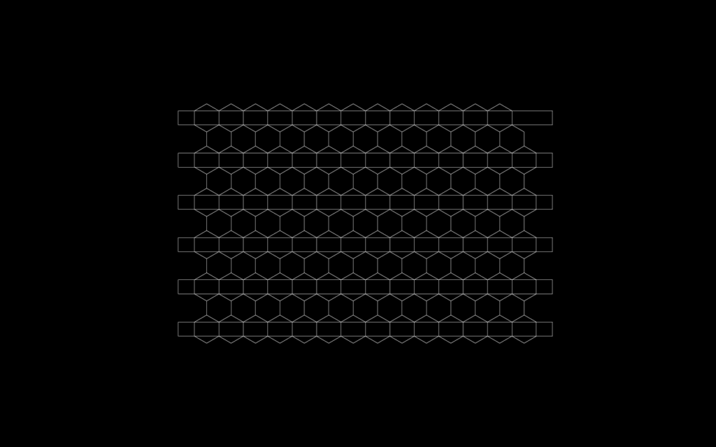
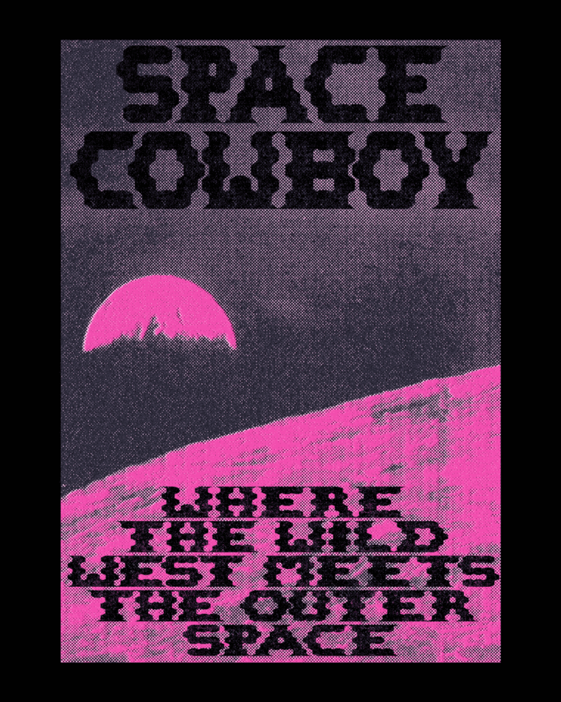
I was quite struck by the ways these blinds of a shop were shaped. Not only was the grid composed of hexagons but also the horizontal axis that crossed them. Surely after noticing these, I’ve seen a lot more of them around town.

Which struggles did you have to overcome?
Some letters worked better than others and there wasn’t a lot of room for customization. Another aspect was that some letters were lighter which makes this font not suitable for running text but in display, it works a little better.

What do all the letters look like?
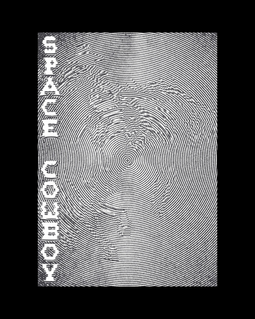
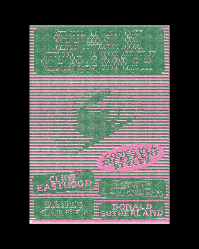
The result is a futuristic slab serif perfect for display and unapologetic big use. I called it Space Cowboy (based on the 2000’s movie). Recently I found that it is a bar in El Born. I am planning on gifting them the posters and the font but haven’t gotten round to it yet.

Show me the posters you designed with your font!

Where can people follow you?
https://www.instagram.com/olasn0g/
https://www.goncalosalgado.com/
Lakis Sobyra

Tell me a bit about yourself: What is your name? Where are you from? How much previous knowledge about type design did you have before participating in my workshop?
My name is Lakis Sobyra, I come from Poland although half through my life I moved to the Canary Islands. My previous experience with type design limits itself to a class project tutored by Javier Cabrera and one online workshop with you, Martin during the pandemic. Although I am very interested in the topic, I never had the chance to deepen my knowledge too much as it seemed intimidating and even sort of mystical to me.
Which part of the workshop did you enjoy most?
The part that I enjoyed the most was the conceptualization of the typeface. I look for inspiration while traversing the streets in my daily life but never in a type design way. This method of perceiving the world quite enlightened me, and since then I have tried to look also for shapes or concepts that could inspire me to create a typeface.
Where did the inspiration for your font come from?
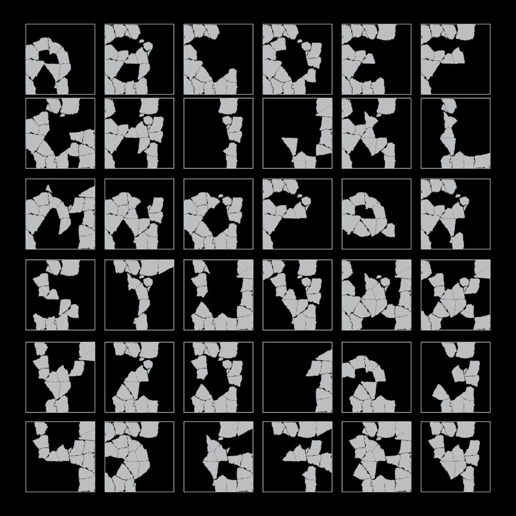
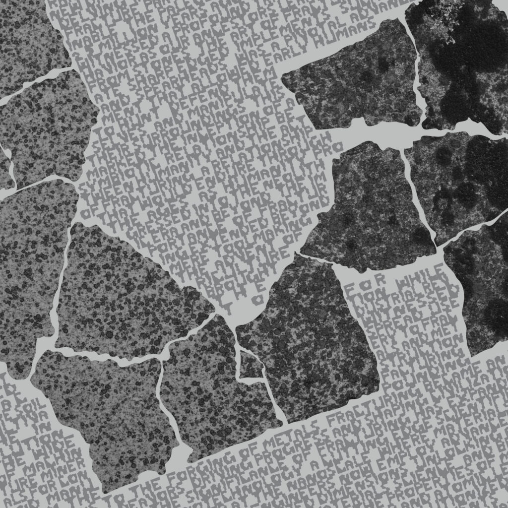
My inspiration came from a cracked tile I found at Plaça de Sant Jaume. I saw that I photographed similar objects as the rest of the group, that’s why I focused on shapes that were less attractive at first, and maybe less modular. That’s where I stumbled upon this interesting-looking tile in which I already saw a few letters from the start.

What do the modules and the grid look like?
In this case, the modules are not as important as the grid in itself, because the exercise I took upon myself is to draw letters in an existing ecosystem rather than creating one from chosen modules. The grid is literally formed by the broken pieces of the tile.

Which struggles did you have to overcome?
The biggest struggle was drawing letters from this grid. It seemed easy at the beginning but later became difficult, because some came to me instantly, some were more difficult and the rest of the letters were at first easily confused with others. Again, translating this into a typable font was a difficult task because at first almost all of the letters had more than 10.000 anchor points.

What do all the letters look like?
Show me the posters you designed with your font!

Where can people follow you?
https://www.instagram.com/lakis_sobyra
https://lakis.es
More Works:

Camilla Vitozzi

Camille Lévy
Denica Zdravkvoska

Emma Maalouf
Gonçalo Salgado
Inés Acero

Julia Gontier

Lakis Jan Sobyra

Carey de Victoria-Michel

Lola Mallue
Aviy Alkabets

Marta Celso