MODULAR TYPE DESIGN WORKSHOP
with the Students of Elisava’s
Master of Visual Design 2024/25
Part II
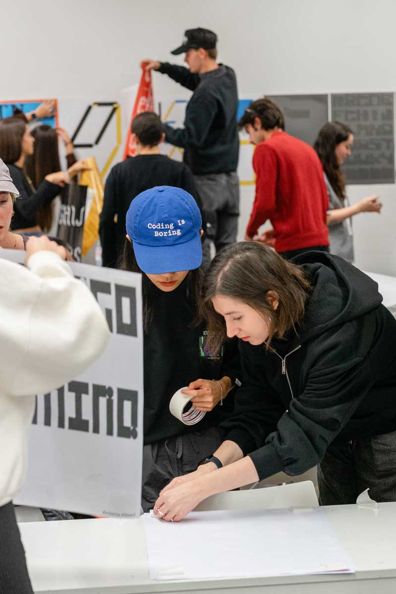
One of my favorite weeks of the year is the week I am spending with the wonderful students of the ELISAVA Master of Visual Design, directed by Marc Panero. I have taught this fun workshop on Systemic Type Design since 2020 and with every year it is becoming more fun. Although we just have 5 days, the results are always beyond everyone’s expectations. Get to know a couple of students.
Lucrecia Strano

Tell me a bit about yourself: What is your name? Where are you from? How much previous knowledge about type design did you have before participating in my workshop?
Hi there! I’m Lucrecia Strano, originally from Argentina and based in Barcelona for the past seven years. Academically, I am a textile designer, and professionally, I work as a product designer. I’m also a biomaterial researcher, deeply fascinated by the intersection of biology and design. I consider myself a multidisciplinary designer, full of curiosity. My knowledge of typography was not very deep—mostly self-taught and without much structure. So, I can consider this workshop my first formal experience exploring the world of type.
Which part of the workshop did you enjoy most?
What I enjoyed most this week were two things:
First, seeing a neighborhood so familiar to me through fresh eyes. Walking through it with an observational perspective was a wonderful experience, I personally think that, as designers, it is crucial to open our eyes to observation, staying receptive and connected to everything happening around us.
Second, letting go of expectations and embracing the week with a playful attitude. I focused on enjoying the process without being attached to achieving great results. This is the lesson I wanna keep with me: Do not forget to integrate into the creative process the sensitivity to enjoy the journey.
These two things were exactly what I aimed to reflect in my posters.
Where did the inspiration for your font come from?
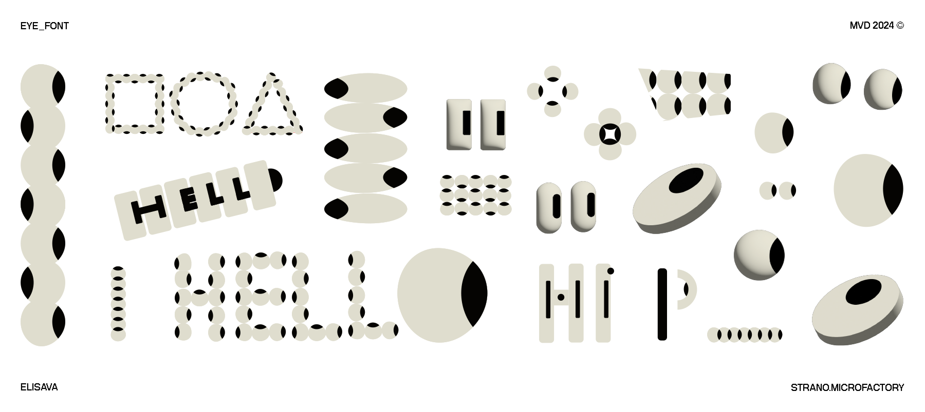
I like the concept of thinking that every answer is already there, it doesn’t come from anywhere else. In this case, the eyes appeared looking at a balcony railing and then reaffirmed with a grafity.
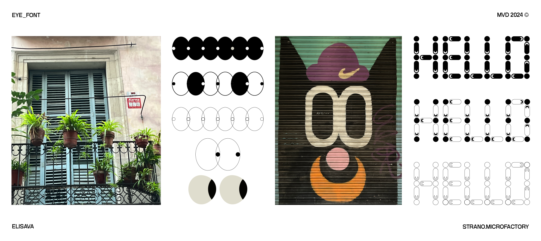
What do the modules and the grid look like?
The module ended up being the eye itself, and regarding the grid, I played with a triangle, a circle, and a square, from which all the letters emerged.
Which struggles did you have to overcome?
I think the main challenge was to achieve harmonious proportions in each letter.
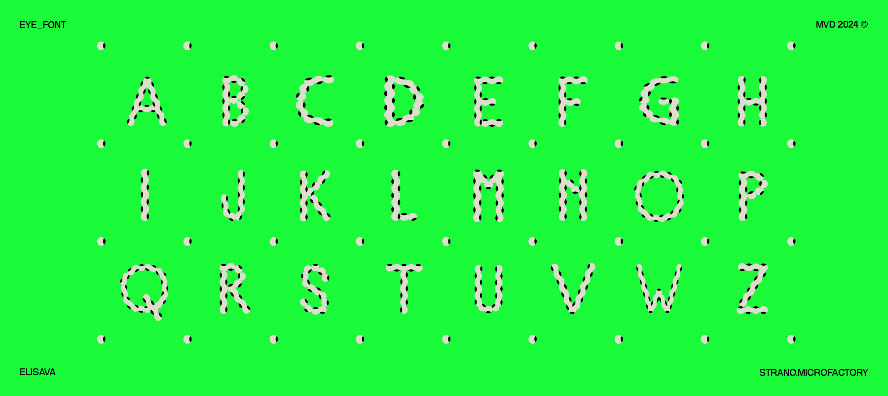
What do all the letters look like?
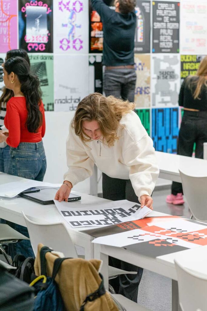
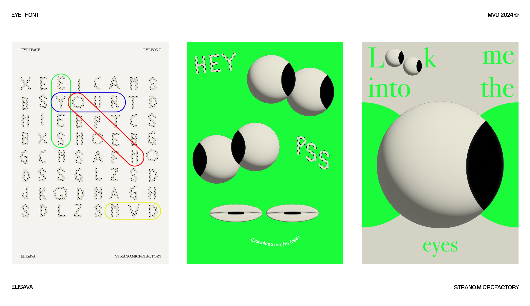
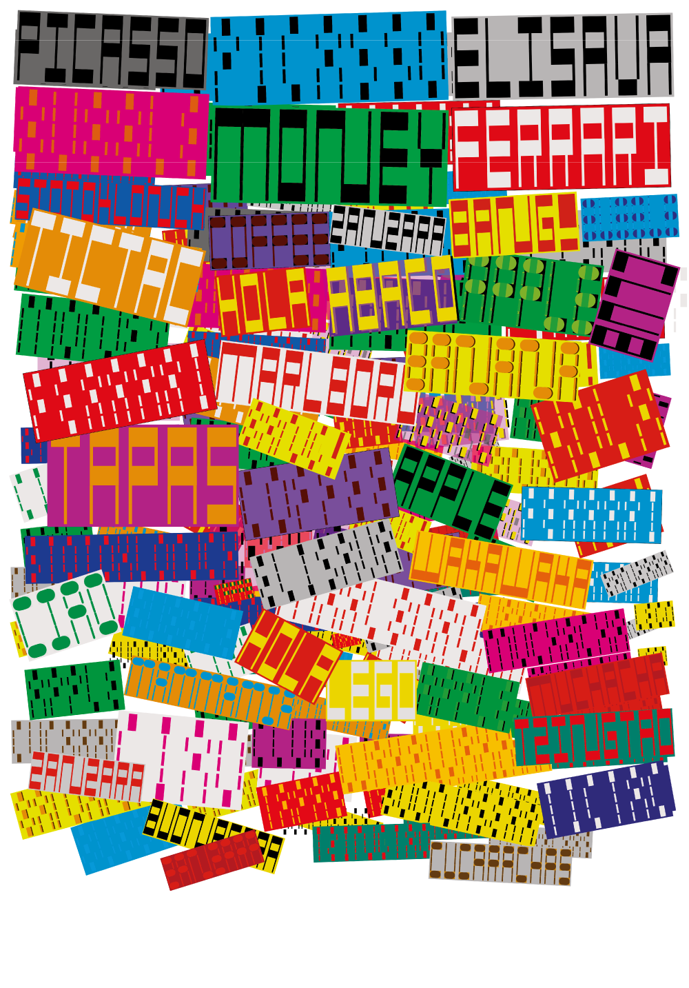
Show me the posters you designed with your font!
Where can people follow you?
https://www.instagram.com/strano.microfactory/
Varali Nagpal
Tell me a bit about yourself: What is your name? Where are you from? How much previous knowledge about type design did you have before participating in my workshop?
I’m Varali Nagpal, a graphic designer based in Barcelona, Spain. With a bachelor’s in image design, I’ve always been passionate about typography, exploring fonts and typefaces. However, I had never created a custom typeface—until Martin’s workshop.
This experience was transformative. It not only introduced me to lettering as a design system but also unlocked new creative possibilities. What started as a challenge became an exciting journey, deepening my understanding of type as a form of visual expression.
Which part of the workshop did you enjoy most?
What I enjoyed most during the workshop was discovering the countless ways to expand my type once I had established a basic structure and system. Exploring how each variation could evolve while maintaining cohesion was both exciting and creatively rewarding.
Where did the inspiration for your font come from?
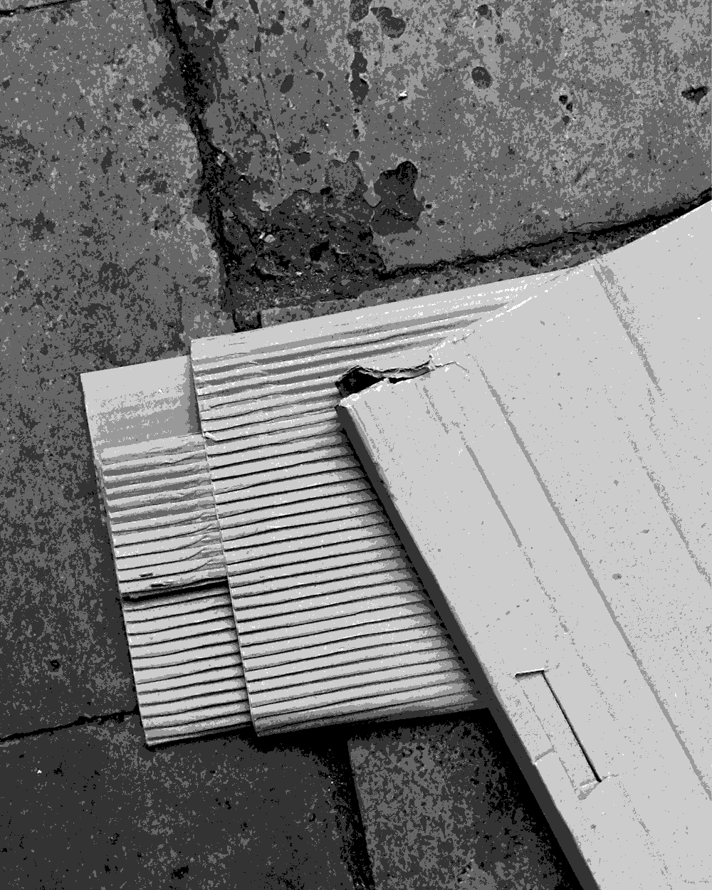
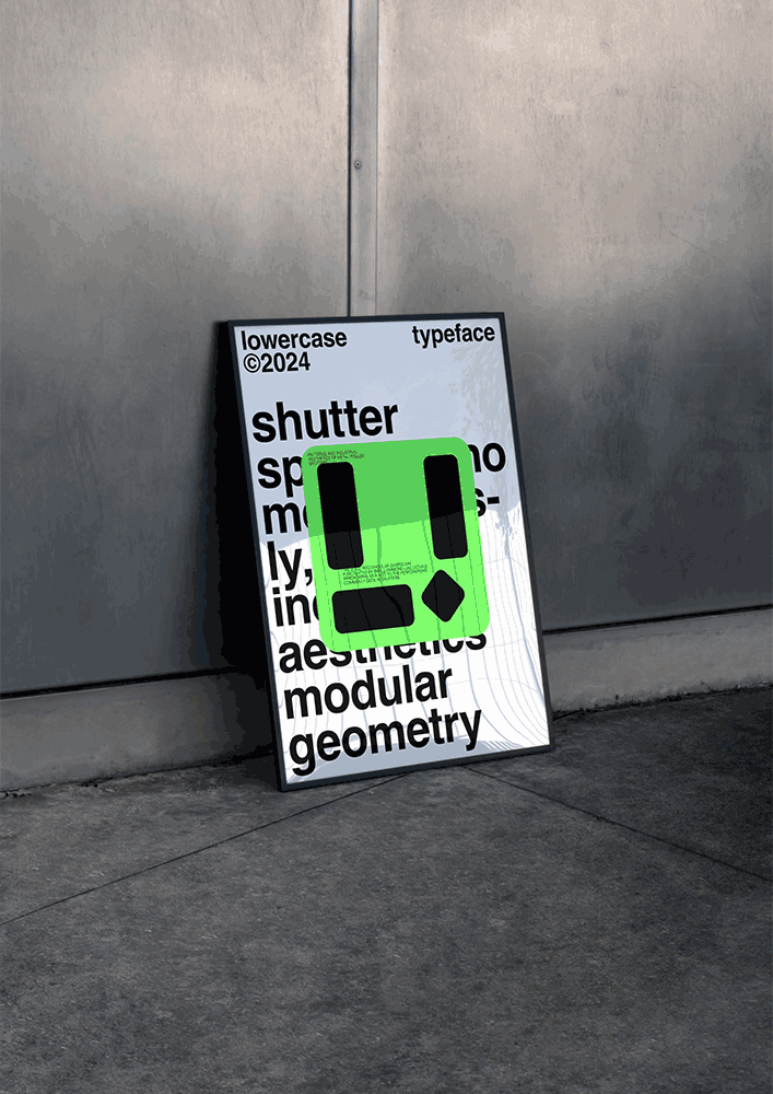
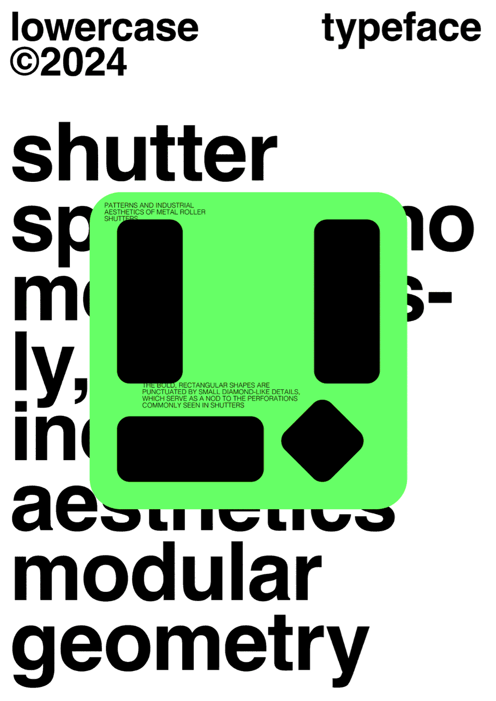
The inspiration for my font came from the shuttered shop fronts commonly seen in the Gothic Quarter. As I wandered the streets, I was drawn to barred windows, galleries, and anything with a quadrilateral shape or pattern. However, it was an image of a shutter that stood out to me the most. Its structure reminded me of the alphabet, making it the perfect starting point for my type design.
What do all the letters look like?
ShutterSpace Mono is a geometric, modular font inspired by metal roller shutters, featuring bold shapes and rhythmic negative spaces. Its industrial aesthetic bridges utility and creativity, ideal for modern, urban, and experimental design projects. The name reflects the font’s inspiration from the structured patterns of metal roller shutters (Shutter) and the balance of solid and void (Space). The “Mono” signifies its monospaced design, emphasizing precision and uniformity.

Where can people follow you?
https://www.instagram.com/vairali/
Tobia Morara

What is your name? Where are you from? How much previous knowledge about type design did you have before participating in my workshop?
Hi! I’m Tobia Morara, from Bologna, Italy. I got my bachelor’s degree in Communication Design this July at Politecnico di Milano. During these three years, I didn’t really have the chance to learn much about type design or try it out. The freedom to explore without worrying about strict rules made me enjoy and appreciate every step of this workshop, thanks to Martin.
Which part of the workshop did you enjoy most?
I had fun figuring out how to make my font changeable, working to add movement and different features to the font using just one shape.
Where did the inspiration for your font come from?
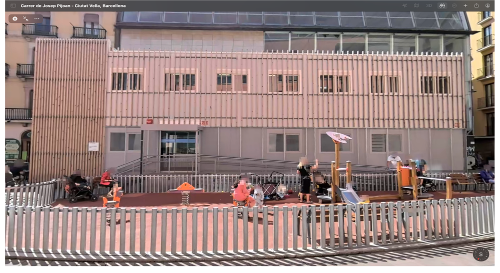
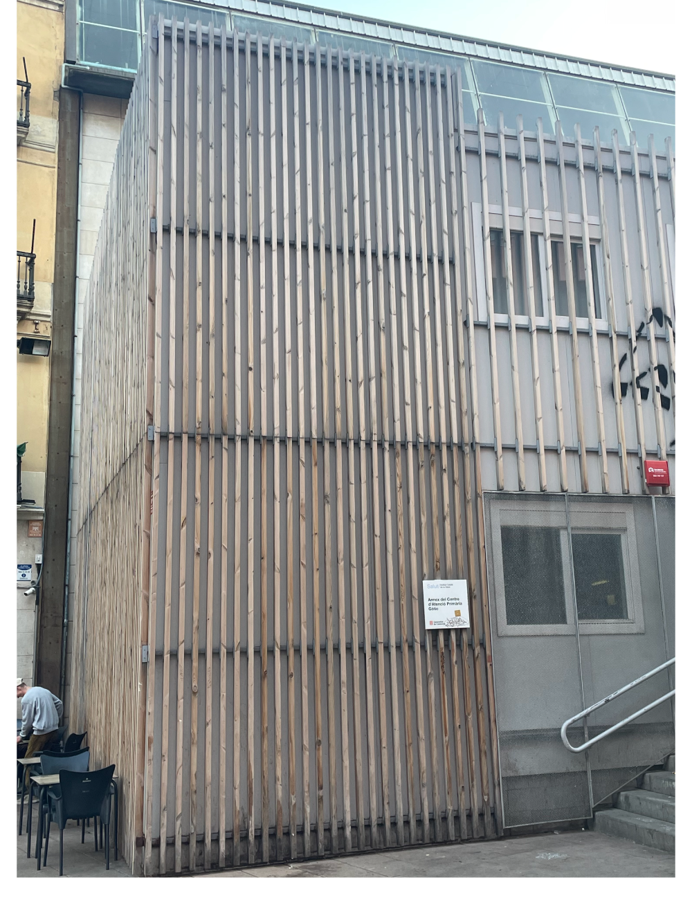
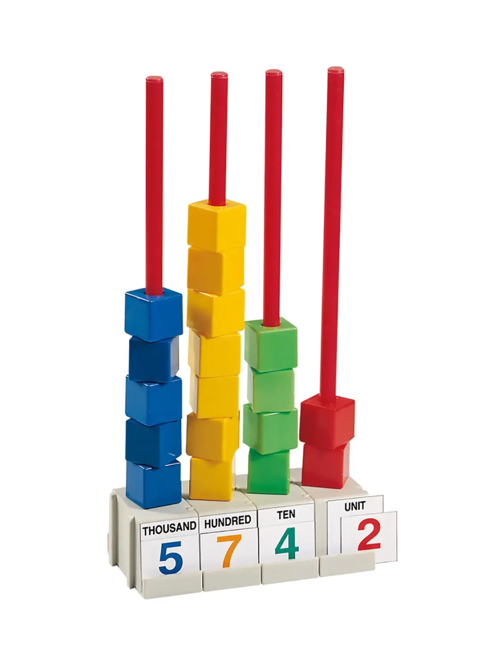
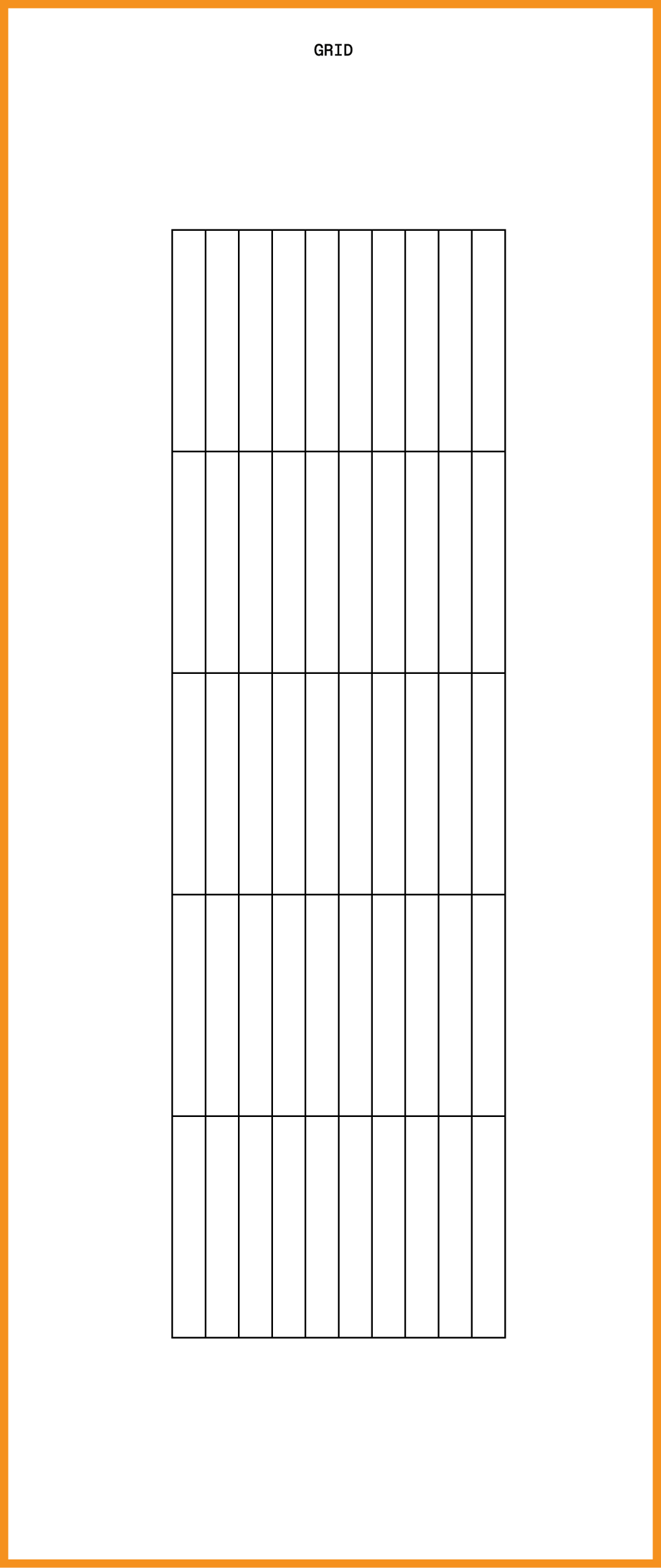
When you leave Elisava, one of the first things you see behind you is the “Annex del Centre d’Atenció Primària Gòtic” building. The building is covered with lots of thin wooden blocks placed upright. I was struck by this simple pattern, especially on the left side of the building’s front: inside a rectangle, 27 wooden blocks are placed upright, divided by 4 horizontal lines that create 4 equal sections. This setup reminded me of a tool I used in my early school years for simple math: the abacus—a way to show numbers with pieces you can move. I later found out that the oldest abacus known has the same grid structure as the one I used.
What do the modules and the grid look like?
I looked for a simple system made of a few basic shapes to create an easy grid for a basic font. The system I saw was already a grid, with the rectangle—used in two sizes—as the only shape. To make it work for me, I added a fifth level for character heights and reduced the number of upright rectangles for the vertical parts to nine.

Which struggles did you have to overcome?
Trying to create a font using just one shape in two sizes was tricky because some letters aren’t very clear at first or can look like others. For example, the “Z” might be mistaken for a “2,” and the “S” for a “5.”
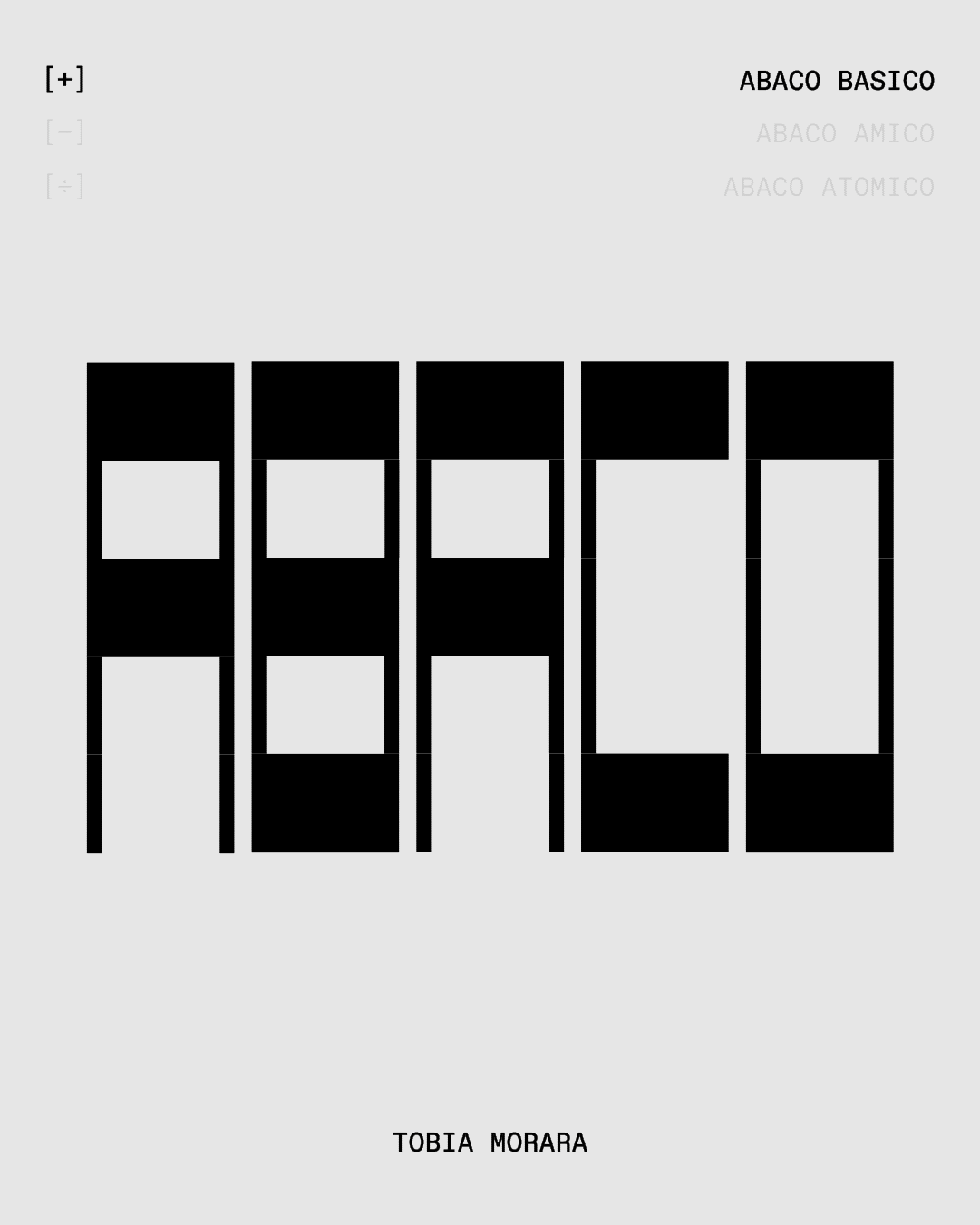
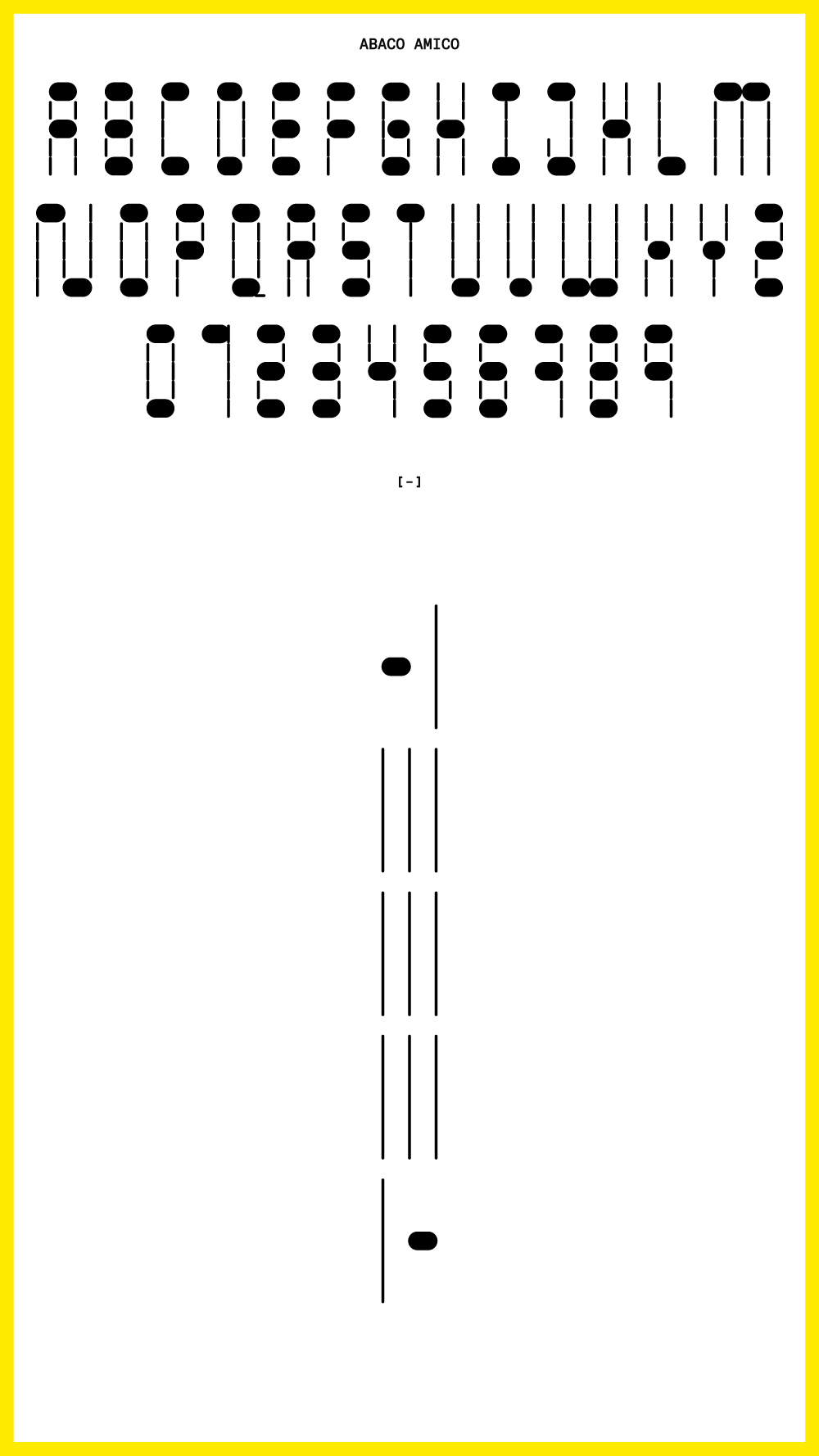
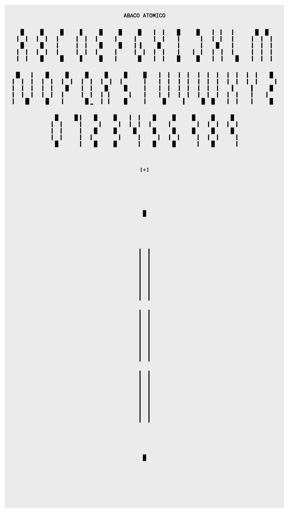
What do all the letters look like?
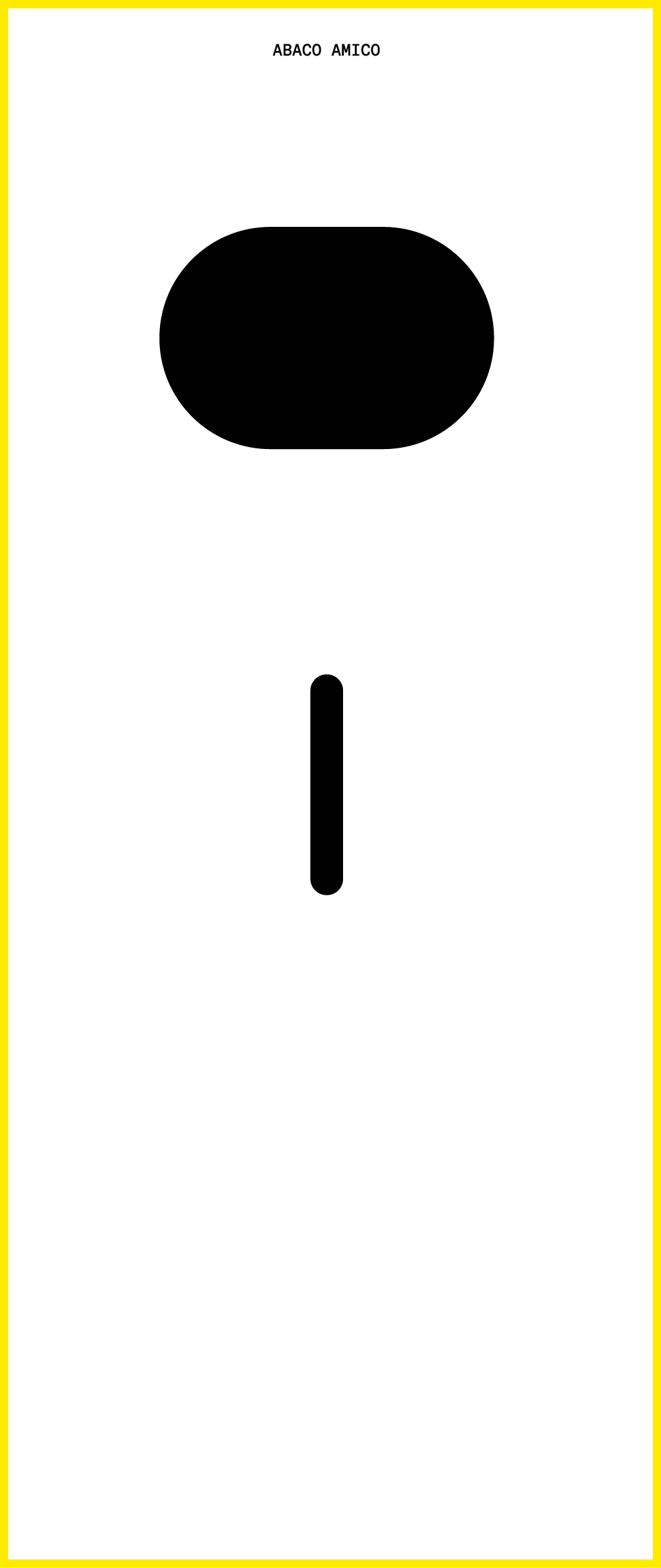
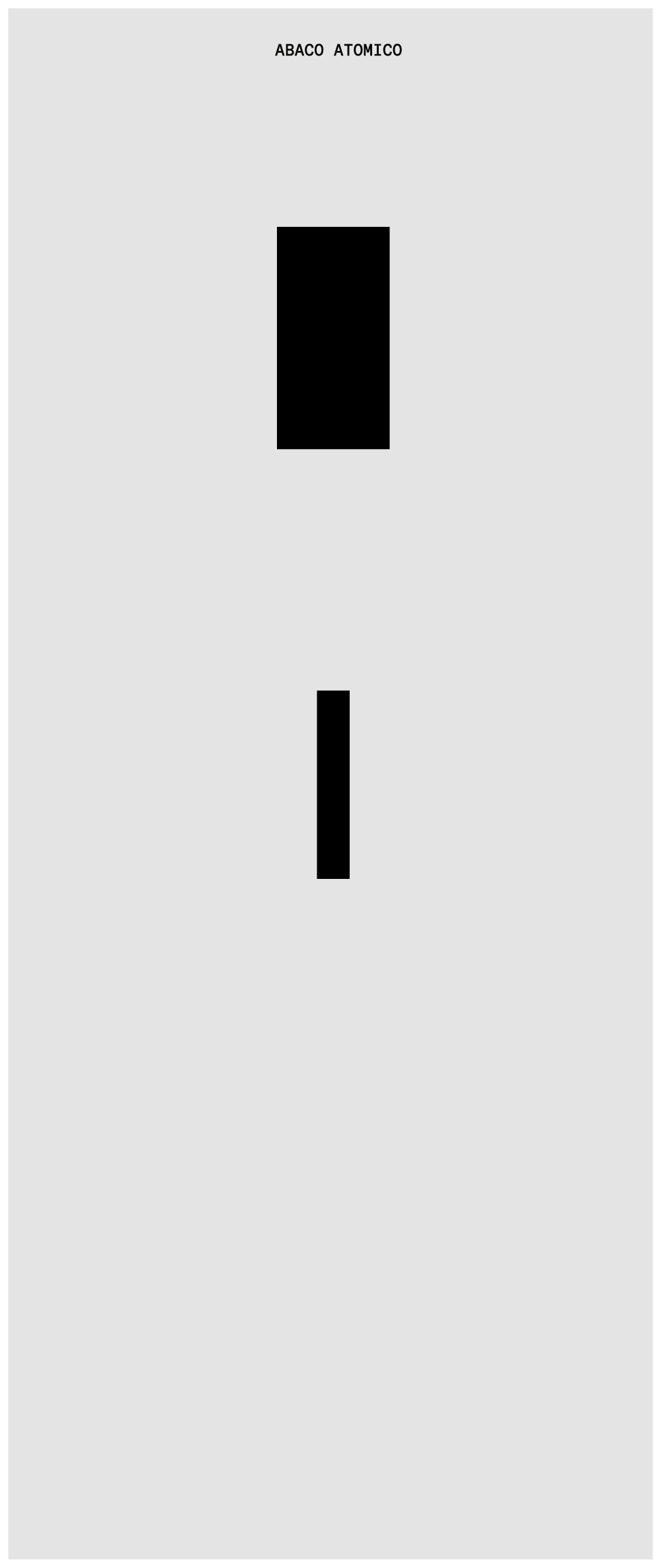
ABACO has three versions. I changed the rectangle shape by adjusting its line thickness, creating three different fonts:
ABACO BASICO, with regular lines that make it the easiest to read because of its strong contrast.
ABACO AMICO, with rounded lines to give it a softer and more playful look.
ABACO ATOMICO, which is more like a pattern maker than a font. Just like with an abacus, where you could move the pieces around to make patterns,
ABACO in all its versions allows you to create fun and colorful designs.

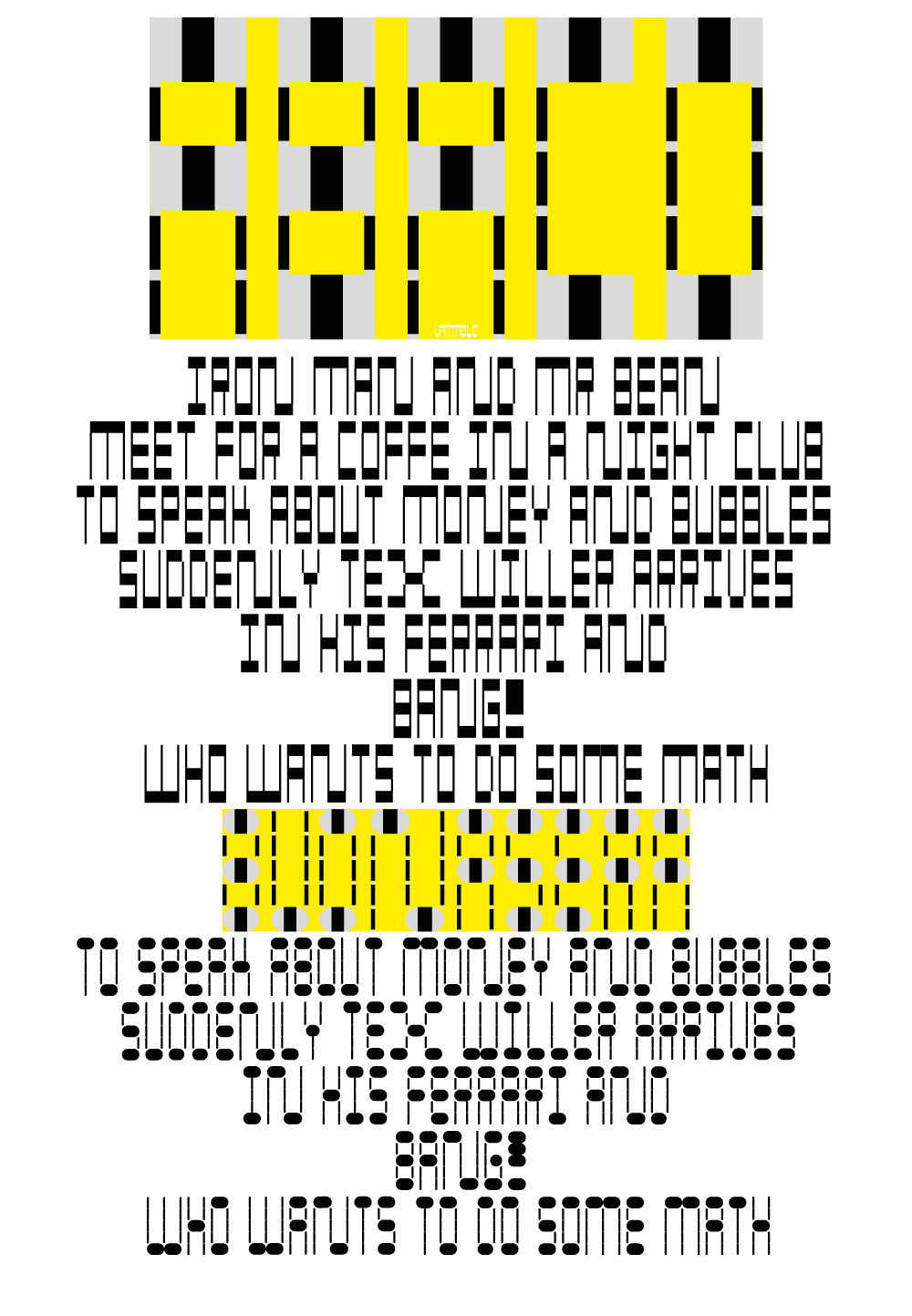
Show me the posters you designed with your font!

Where can people follow you?
https://www.instagram.com/tobiamorara/