MODULAR TYPE DESIGN
WORKSHOP
with the Students of Elisava’s
Master of Visual Design 2025/26
Part II
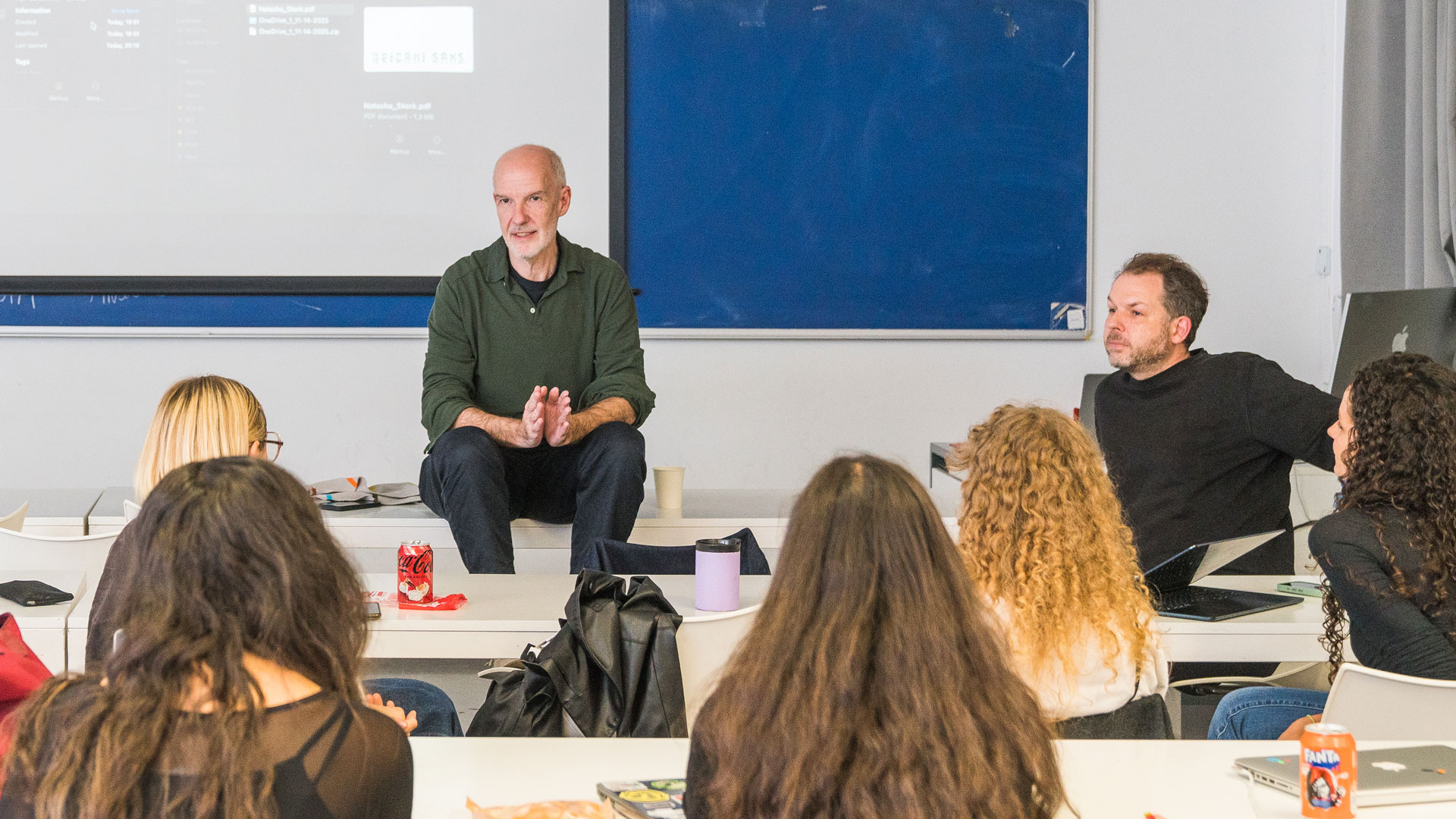
This is the second part of the interviews with the class of MVD 2025/26.
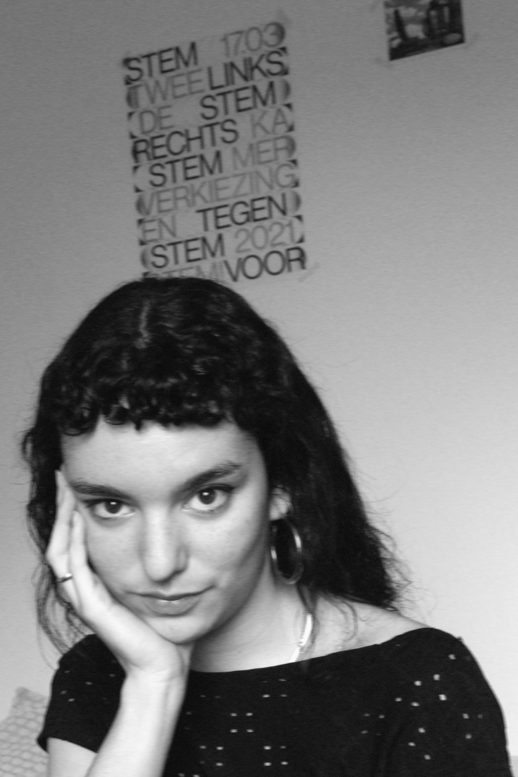
Paula A. Roca
Tell me a bit about yourself: What is your name? Where are you from? How much previous knowledge about type design did you have before participating in my workshop?
Hi! I’m Paula and I’m from Barcelona, Catalonia. I would say I’ve always loved type even when I didn’t know what it was, and it’s one of the main reasons I studied graphic design. That’s how my approach to type design has been mostly academic and I had never worked with it in such a playful way, which was a lot of fun!
Which part of the workshop did you enjoy most?
Being specific, I really liked it when I already had some of the basic letters designed, and I had to search in them for the solution about how the others should be. Understanding the alphabet as a modular system was so reassuring; I like to think that the answer is already there.
I also appreciated having the privilege to stop for a week and dedicate 100% on an experimental project like this, which lets you dive so deep into the process.
Where did the inspiration for your font come from?
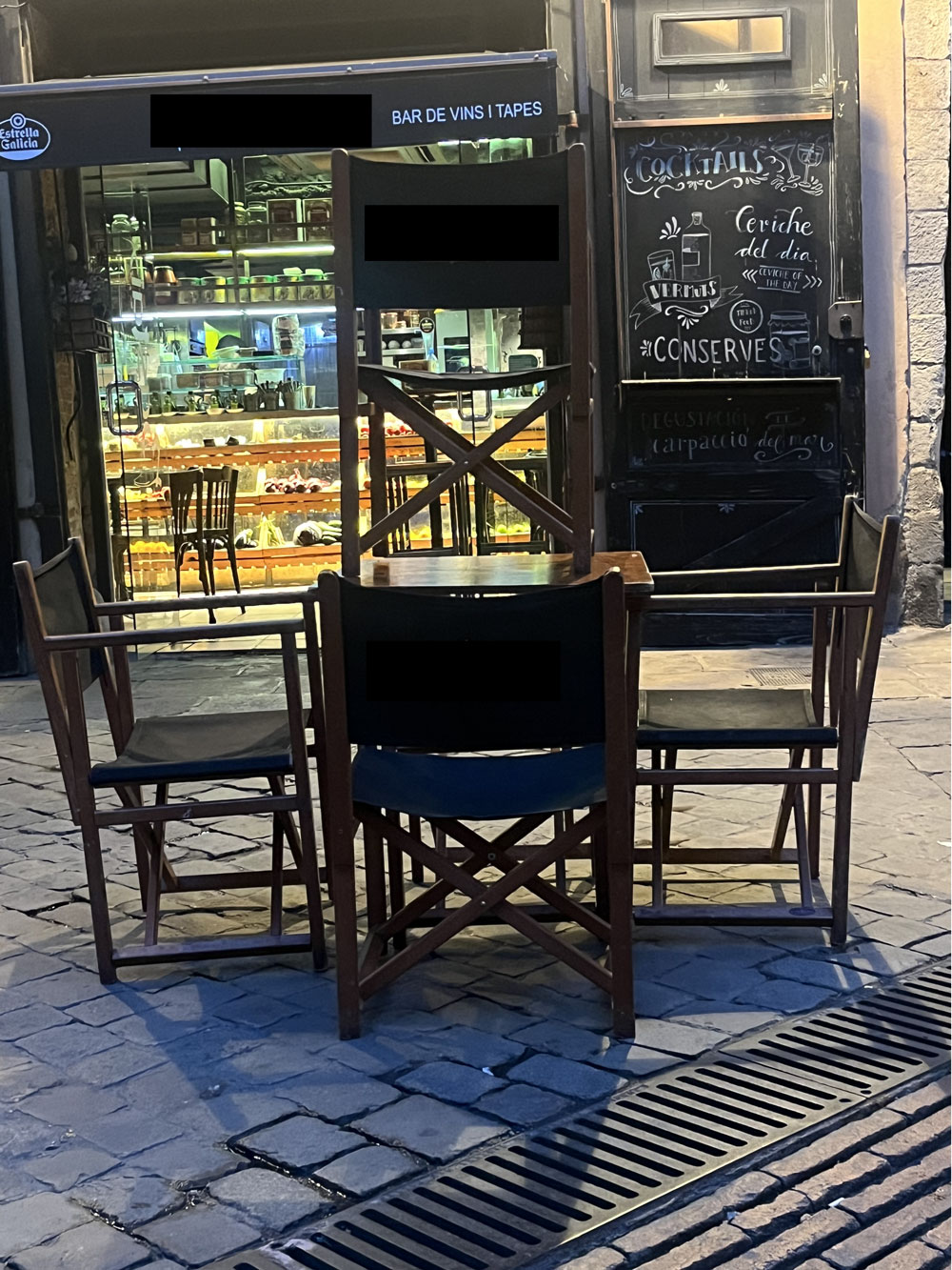
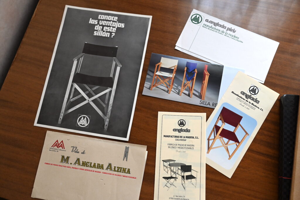
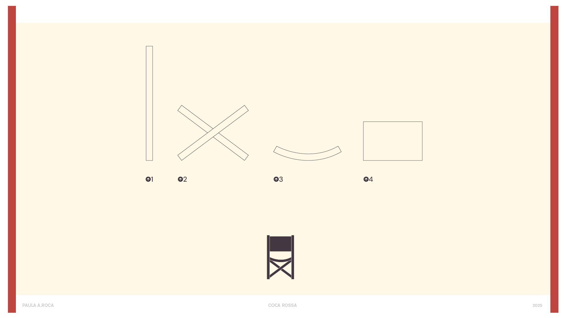
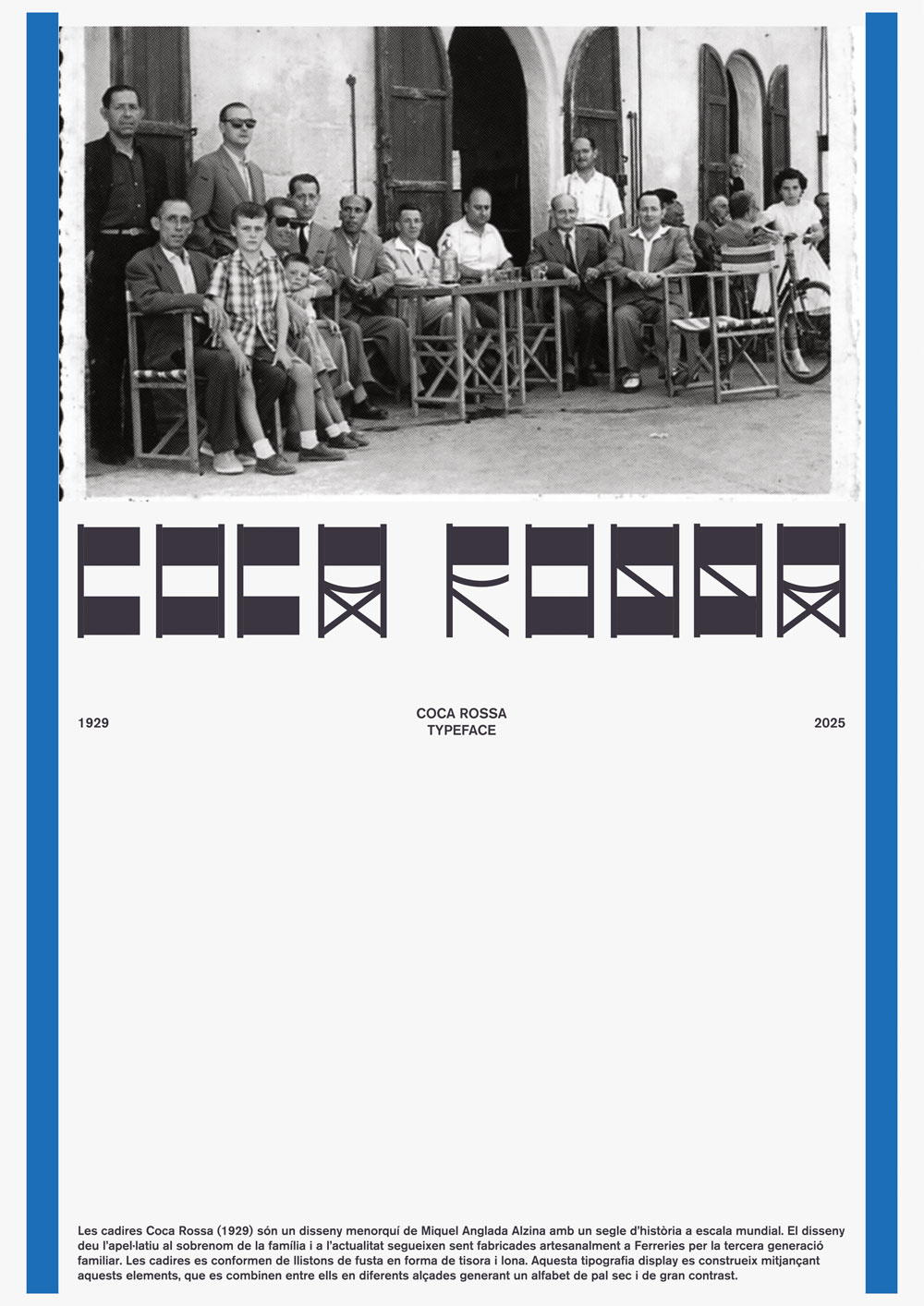
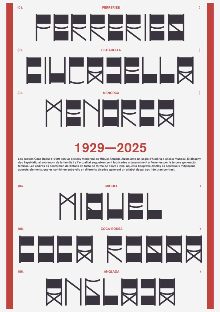
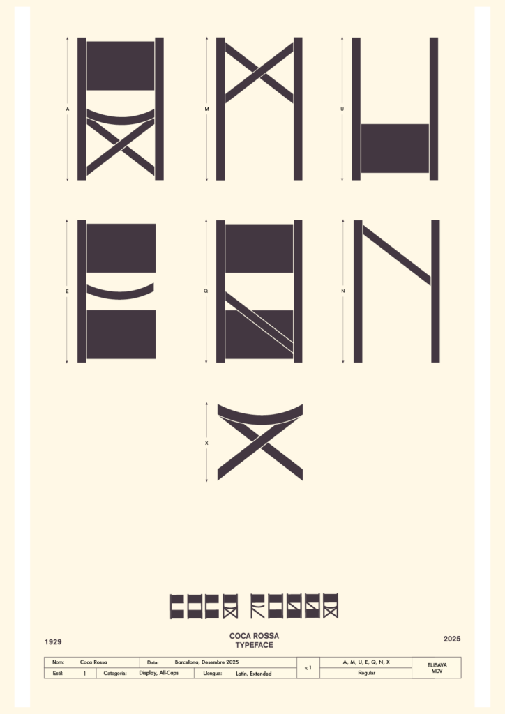
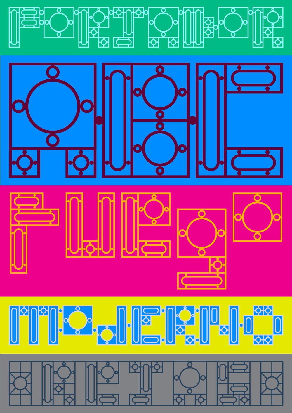
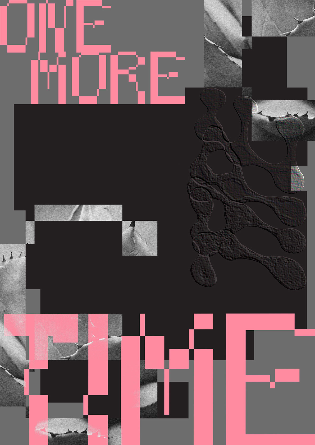
I saw these chairs in a bar we walked through, which is the classical menorquina chair –from Menorca–, called Coca Rossa and designed by Miquel Anglada in 1920. I really felt like designing a chair’s type but didn’t really know where to start from. Later on, looking at the image I took, I would see the A from the chair in a frontal perspective. From there, I started to build the rest of the letters by combining four modules.
What do all the letters look like?
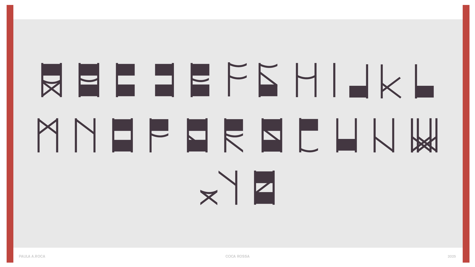
Coca Rossa is a contemporary typographic interpretation of Miquel Anglada’s chair, translating its artisanal and Mediterranean essence into a geometric but warm language.
Each glyph is built from a clear constructive logic: straight lines, defined angles, and restrained curves that evoke the modules in which it is built: wooden strips and canvas. All caps and lowercase are mixed in the alphabet, so you can see the chair from different points of view and also other types of seats from the designer, such as the X–.

Show me the posters you designed with your font!
Where can people follow you?
https://www.instagram.com/paula.a.roca/
Sofia Merino
Tell me a bit about yourself: What is your name? Where are you from? How much previous knowledge about type design did you have before participating in my workshop?
Hello! I’m Sofia, from Mexico. I’ve done a mix of visual communication and fine arts studies, in Mexico City and Chicago. I’ve always enjoyed type design and had gotten an introduction to its history and technical aspects on glyphs, but I had never approached it in such an experimental way. It was very exciting to make up the rules as we went along.
Which part of the workshop did you enjoy most?
I love getting inspiration from everyday objects that we actually interact with, and may not seem like they would translate immediately to our field of work. Additionally, having one week meant there was not much time to overthink, you just have to go with your gut and do all the “what ifs” possible. Trying to find the best solutions in a short amount of time and making the unexpected was very fun.
Where did the inspiration for your font come from?
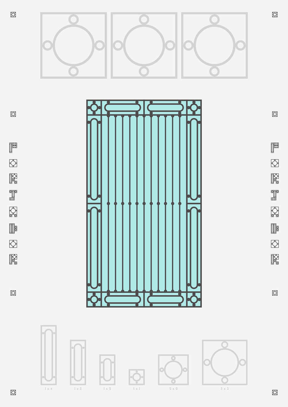
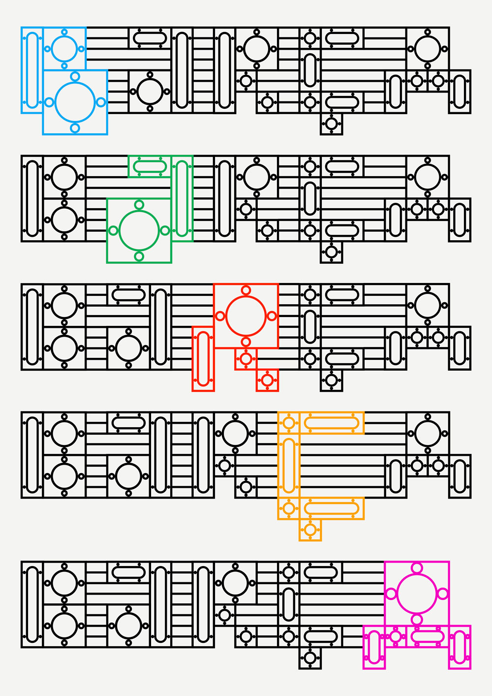
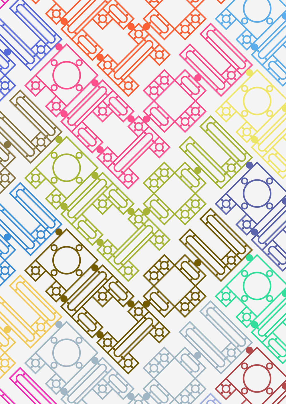
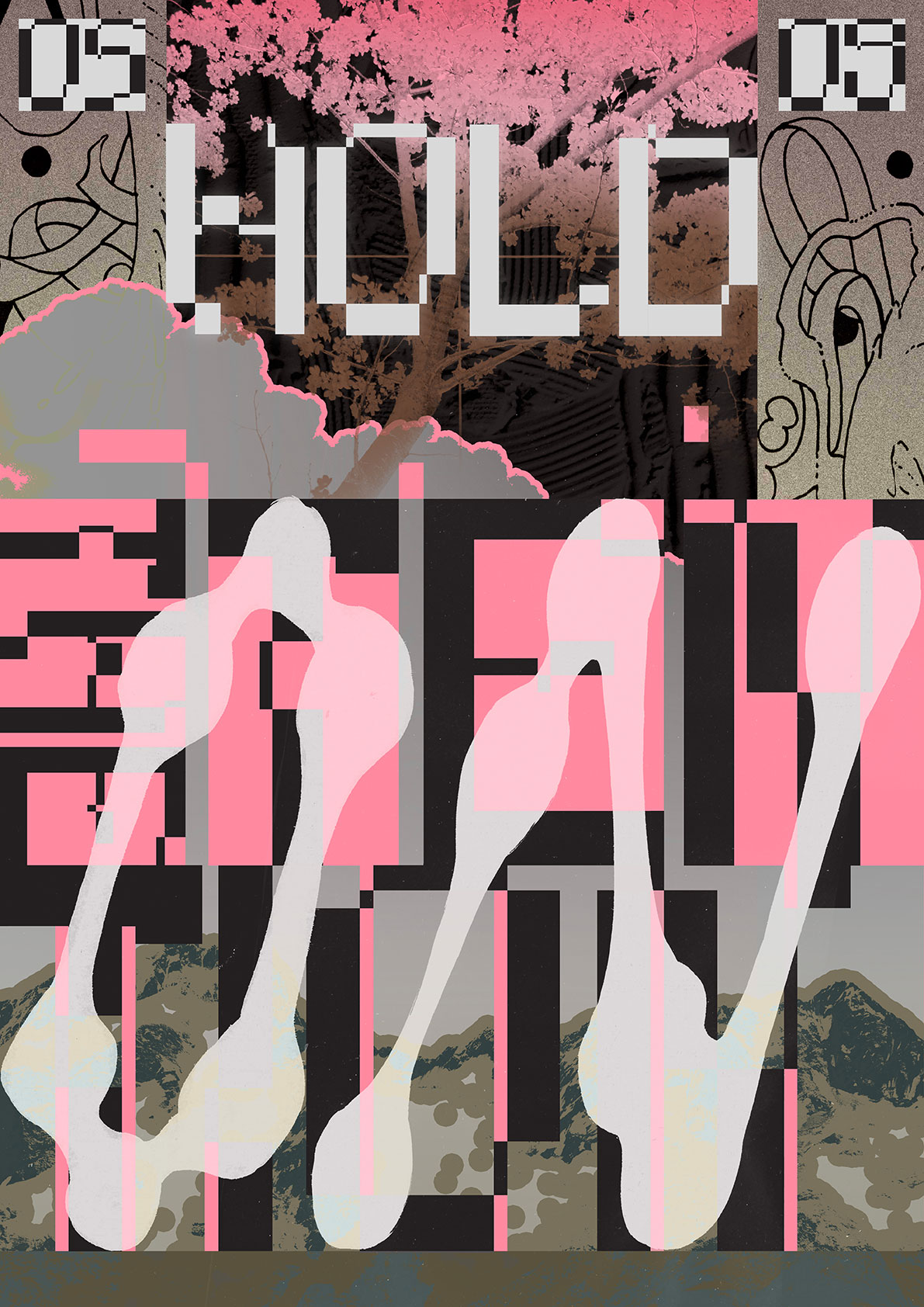
I’ve always been an admirer of the artistry that goes into fences, therefore, the source of inspiration was pretty evident. I was initially looking at more “inspired” or ornamental ones, but I ended up opting for a relatively simple window fence that we passed by, because I thought its straight lines and curved insides could make for an interesting modular system.

What do all the letters look like?
Forjador is based on the idea of forging iron, in this case, “forging” modules digitally in order to create recognizable, funky display letters. All letters work within a grid, using a variation of 6 modules with either a rectangular or square perimeter and a circular inside, based on the fence that I saw. The module sizes are 1 x 1, 1 x 2, 1 x 3, 1 x 4 , 2 x 2 and 3 x 3. The classic set are in all-caps and have an x-height of 4, but each letter has multiple variations that may go above or below it, as well as small cap representations. Then there is the issue of the way the letters are joined together; they can be on their own, joined by circles, or held together by vertical lines, to become part of the writing in a fence. So many possibilities!
Where can people follow you?
https://www.instagram.com/ssofiamerinohace
(@ssofiamerino)
Zosia Zarska
Tell me a bit about yourself: What is your name? Where are you from? How much previous knowledge about type design did you have before participating in my workshop?
Hi! I’m Zosia, originally from Poland. Before coming to Elisava, I studied in Milan, where I did my Bachelor’s in Graphic Design with a focus on visual arts and illustration. Over time, I became more and more interested in typography. I started learning it through rules: what works, what doesn’t, and mostly what you’re NOT supposed to do. And I really respect that foundation, but I’m also very curious about the little mistakes, gaps, and unexpected moments where typography becomes more expressive. That balance between structure and experimentation is what excites me most.
Which part of the workshop did you enjoy most?
Definitely the non-linear process. I found it really exciting not knowing exactly where the design would end up. It taught me to give up a bit of control and trust experimentation, which often leads to the most interesting results. Also, going outside to search for inspiration was amazing. It makes you realize that systems and type ideas are literally everywhere, you just need the right perspective to see them.
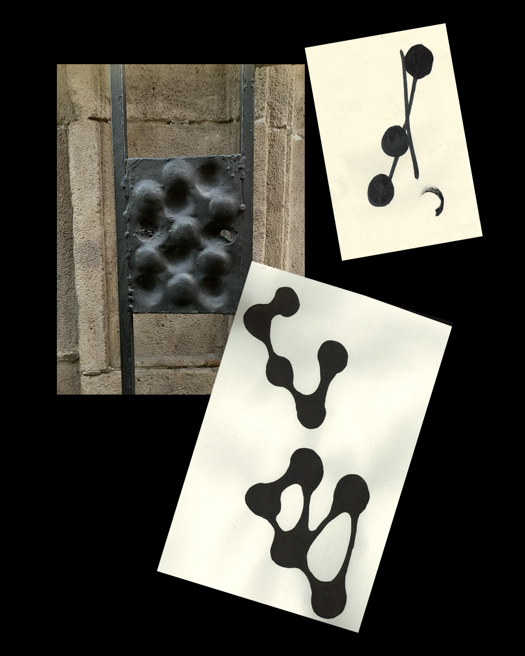
Where did the inspiration for your font come from?
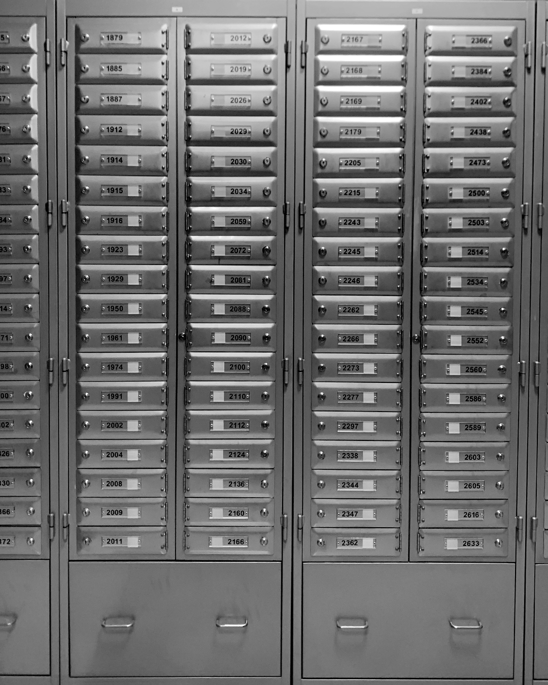
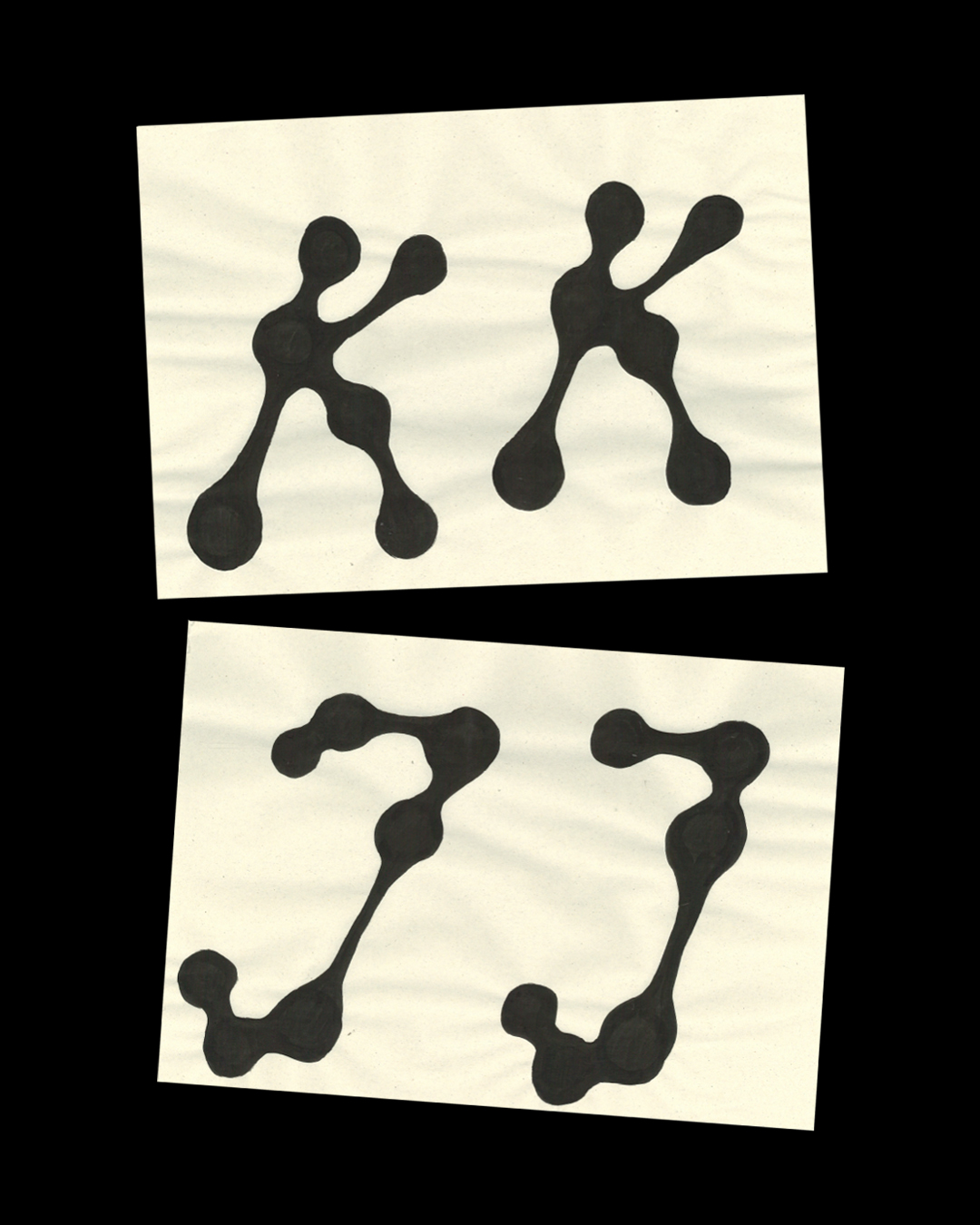
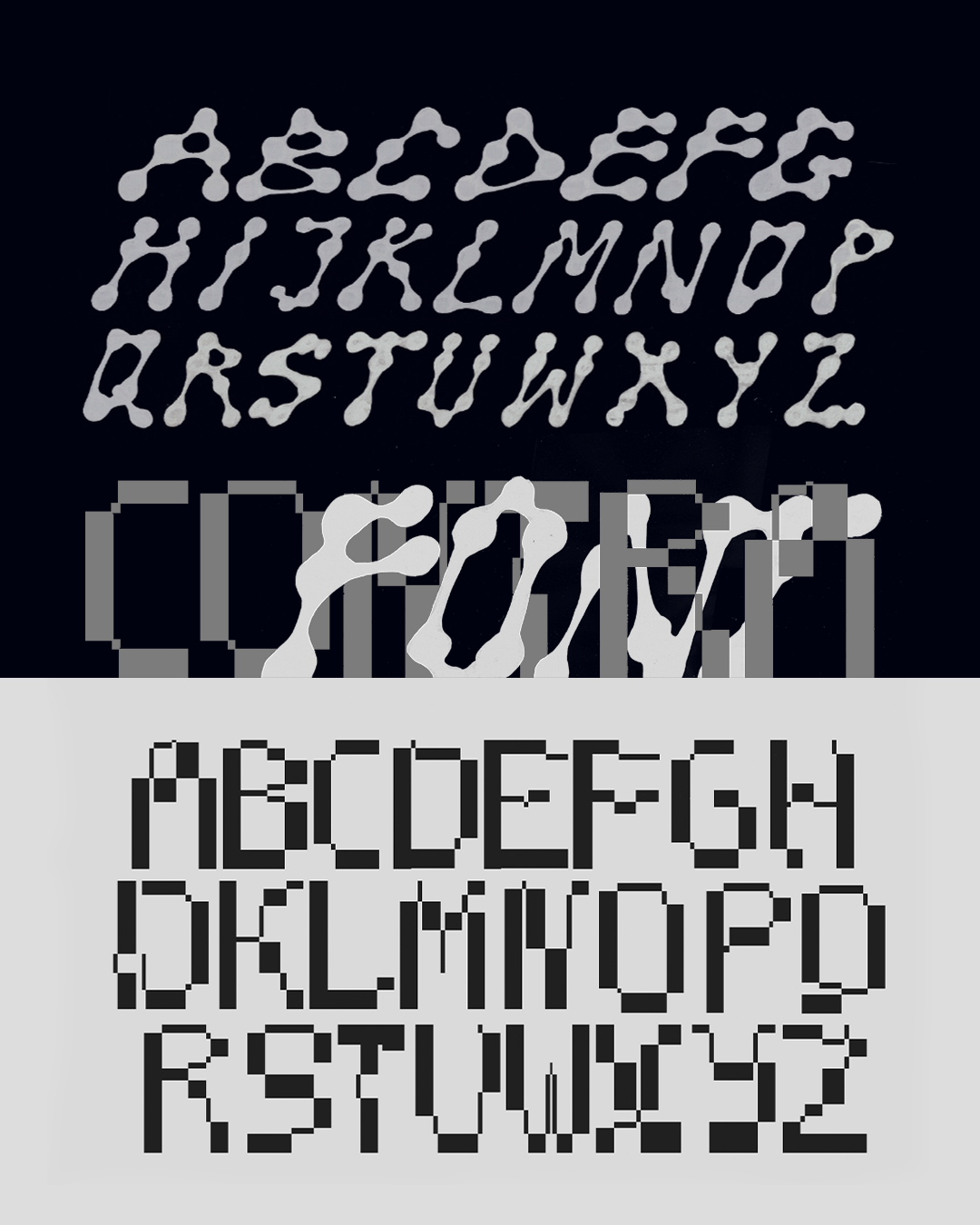
The inspiration came from two completely different places. The first was a handmade iron gate with a very irregular, shaky grid built from circular elements. I was drawn to its fragile rhythm. But I needed contrast. Later, I found a very precise letter locker in a post office building. Its perfectly structured grid allowed me to build a second visual language. This led me to create two typefaces: one handmade, rounded, and imperfect, and the other precise and grid

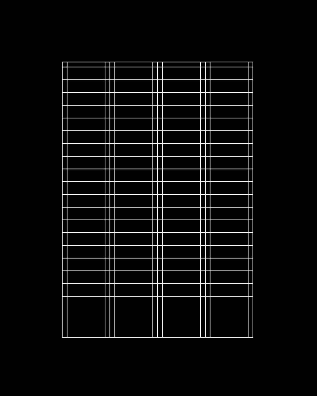
What do all the letters look like?
Contra is a modular type family built on the contrast between different visual behaviours. It reflects the duality of forms around us, allowing the letters to interact, overlap, and shift balance between structure and freedom. It becomes a language where elements can merge, interfere, and negotiate space with each other.
Show me the posters you designed with your font!

Where can people follow you?
https://www.instagram.com/zone_a3/