MODULAR TYPE DESIGN
WORKSHOP
with the Students of Elisava’s
Master of Visual Design 2025/26
Part I

One of my favorite weeks of the year is the week I am spending with the wonderful students of the ELISAVA Master of Visual Design, directed by Marc Panero. I have taught this fun workshop on Systemic Type Design since 2020 and with every year it is becoming more fun. Although we just have 5 days, the results are always beyond everyone’s expectations. Get to know a couple of students.
Javier Montañez Arnau
Tell me a bit about yourself: What is your name? Where are you from? How much previous knowledge about type design did you have before participating in my workshop?
I was born in Valencia but i’m living in Barcelona right now. I knew the basics, but the workshop helped me dive deeper into several aspects of typography that I wasn’t aware of.
Which part of the workshop did you enjoy most?
I really enjoyed looking for inspo around El Born, cause i think inspo can come in any shape or form.
Where did the inspiration for your font come from?
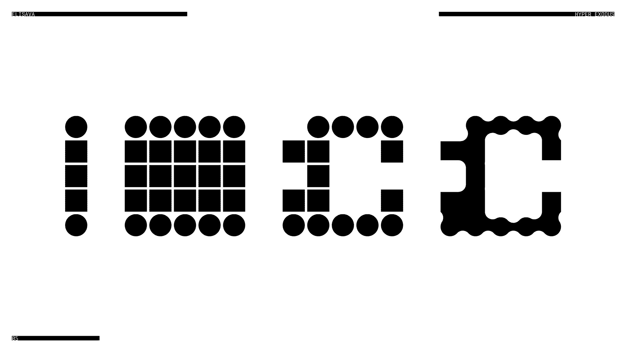
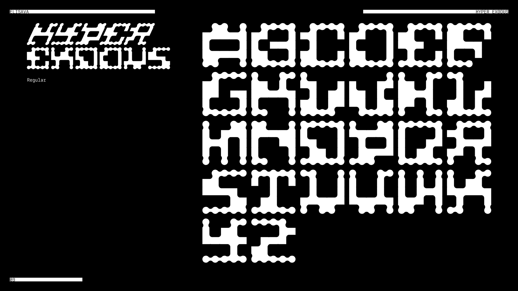
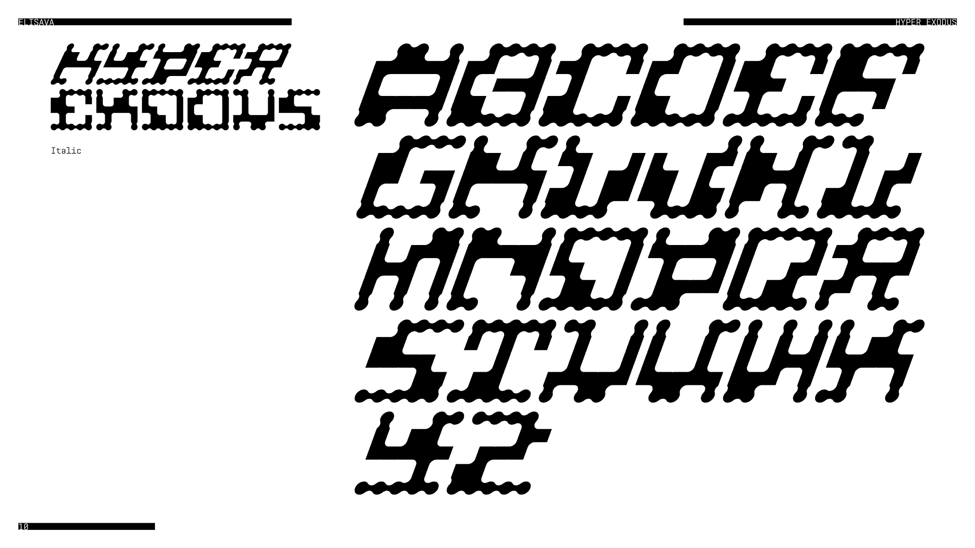
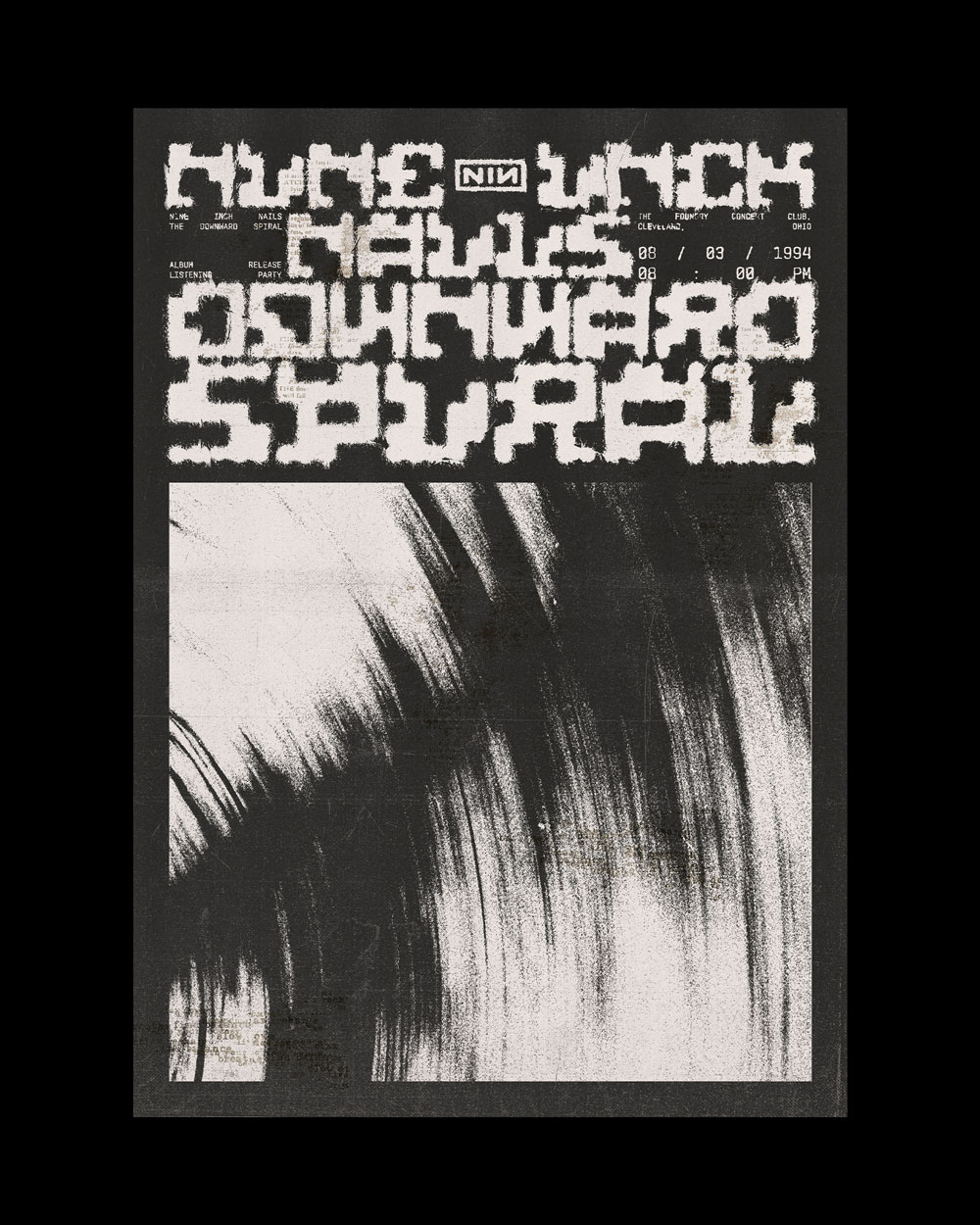
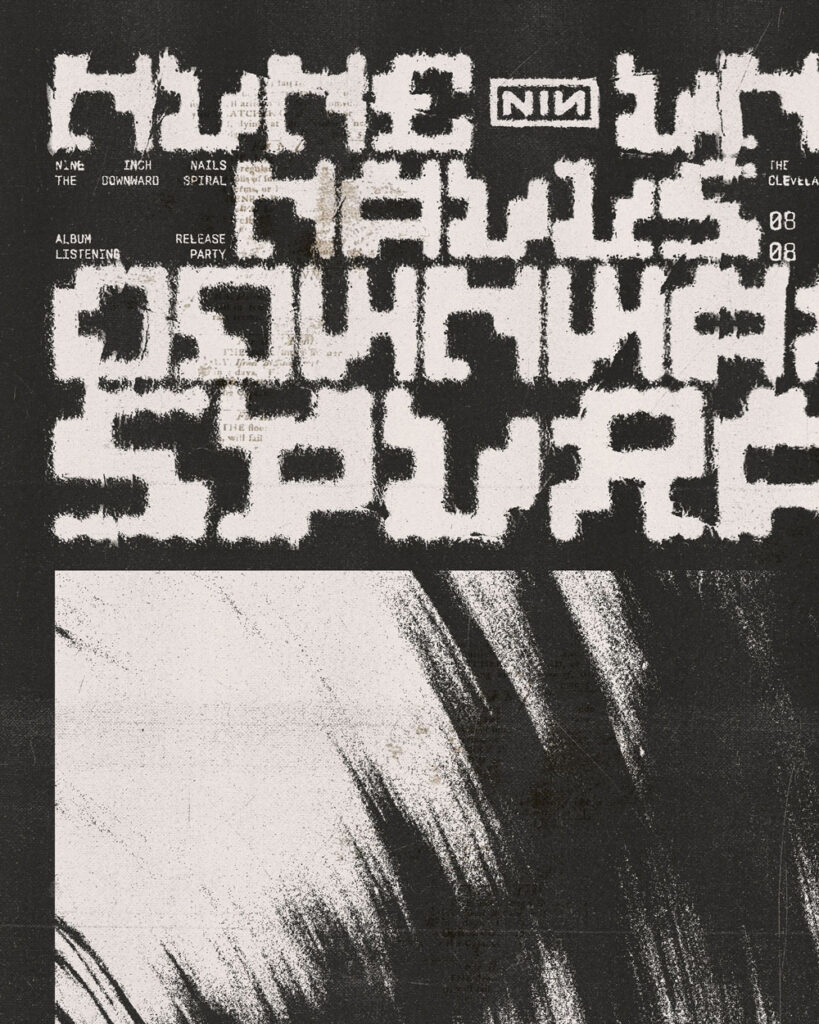
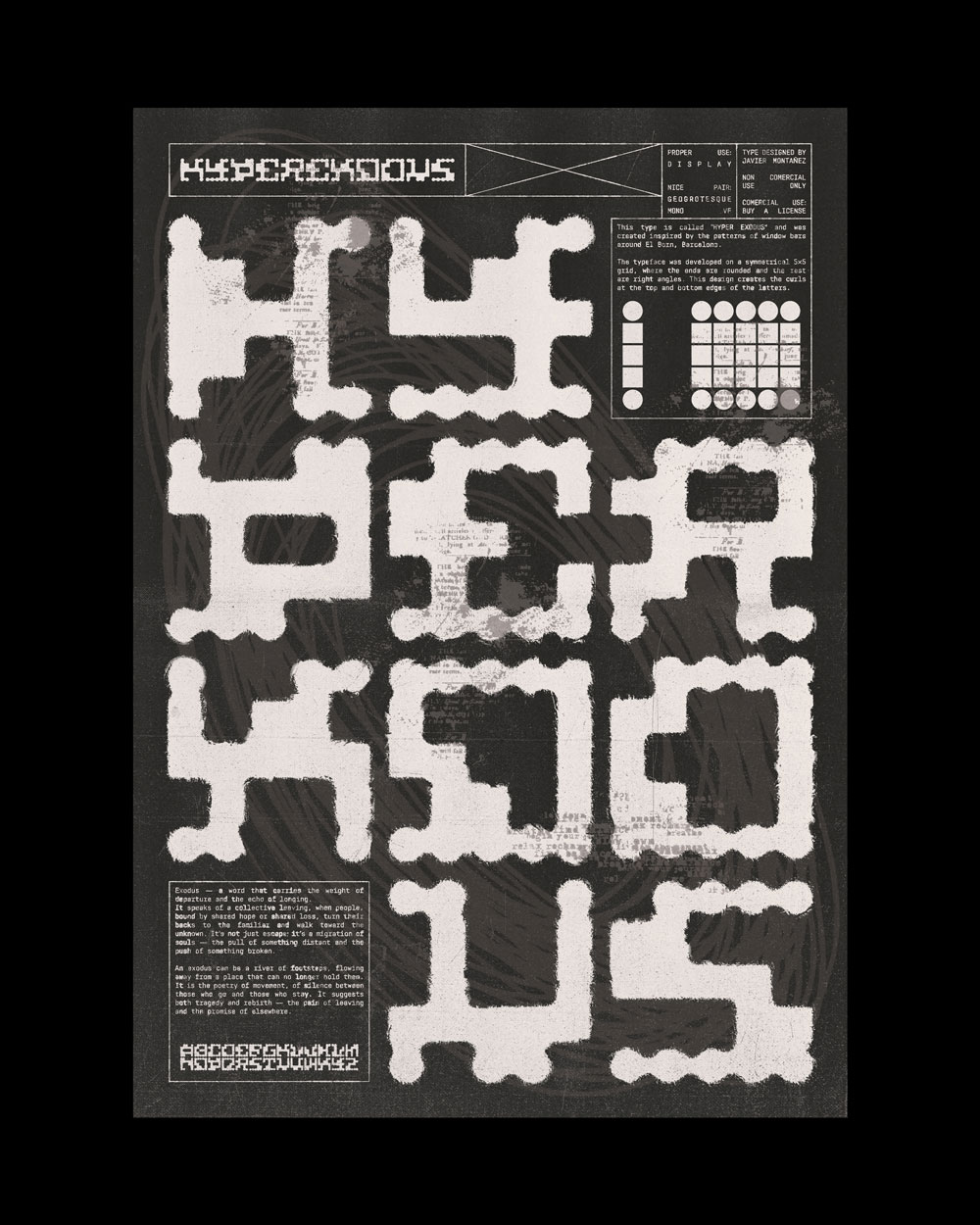
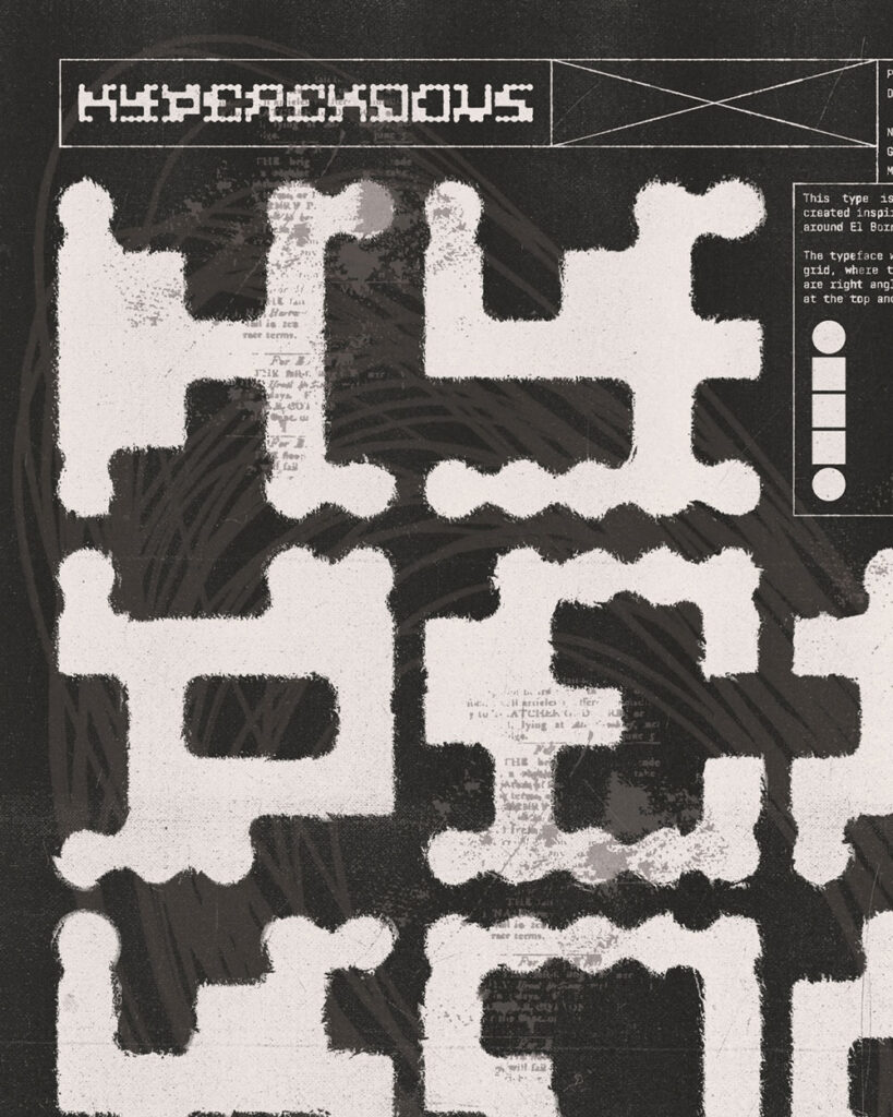
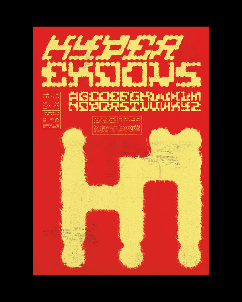
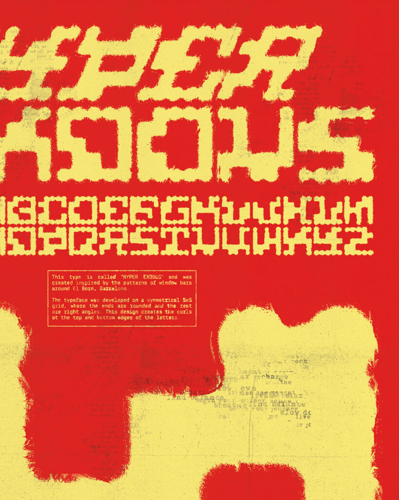
The inspiration for my typeface Exodus came from the ornamental ironwork on various windows and doors, where the patterns are linear with rounded terminals.
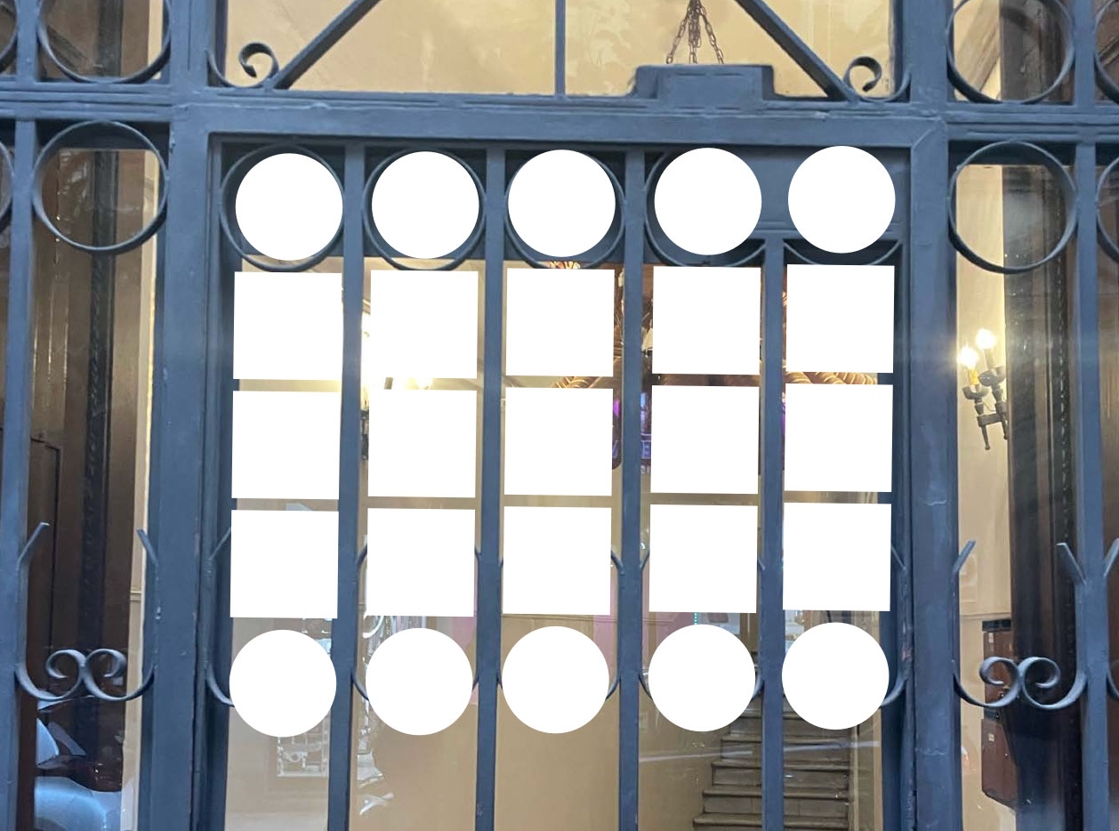
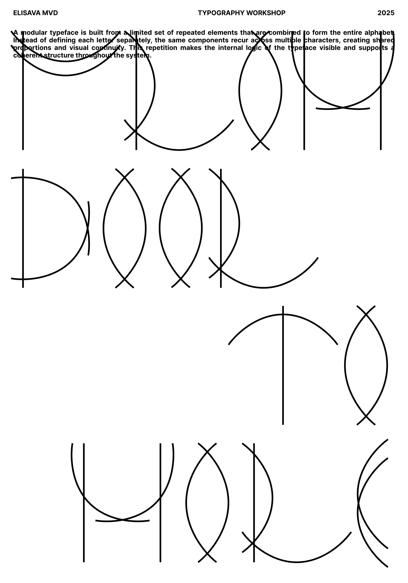
What do the modules and the grid look like?
The letterforms were constructed within the grid system of the window grilles themselves. Later, the rounded and straight shapes were morphed to create a seamless flow, resulting in a curled or flourished effect at the top and bottom of the characters.
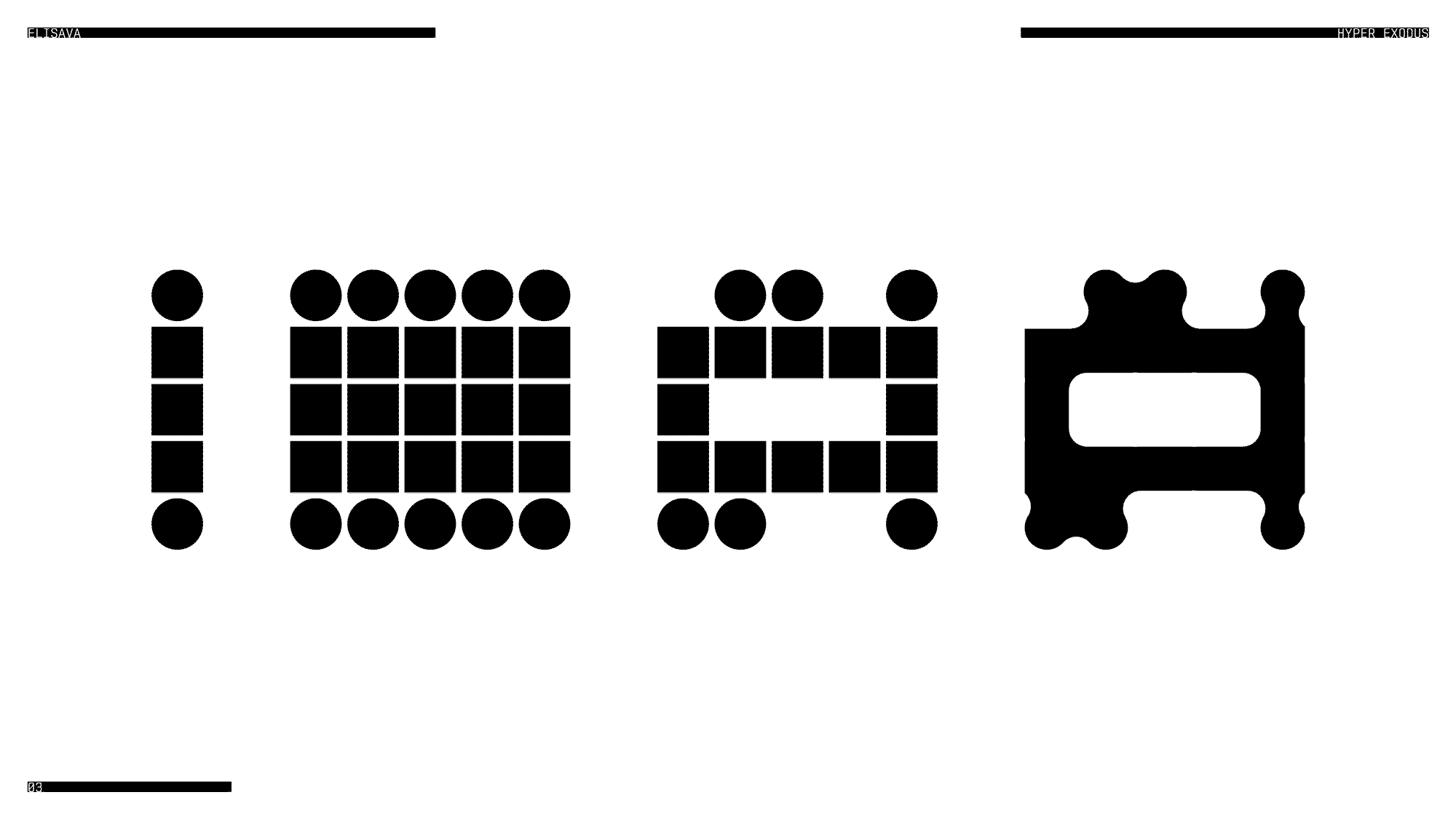
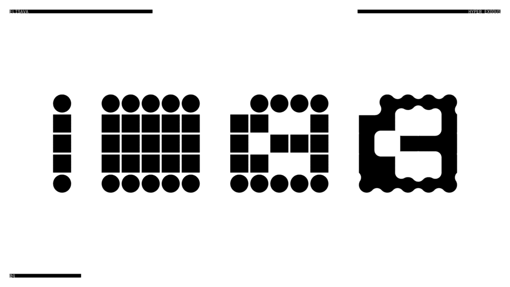
What do all the letters look like?
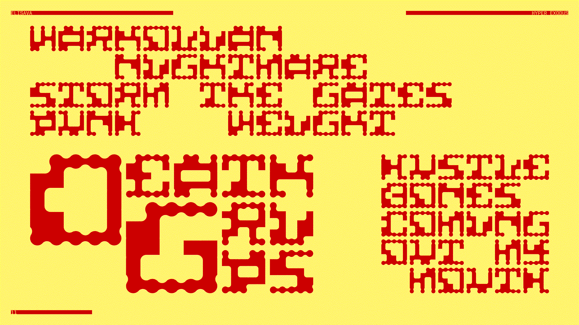
Show me the posters you designed with your font!
Where can people follow you?
https://www.instagram.com/montad3sign
Oksana Antipova
Tell me a bit about yourself: What is your name? Where are you from? How much previous knowledge about type design did you have before participating in my workshop?
Hey! I am Oksana. I’m from Moscow, but I live in Barcelona now. I’ve always loved typography because I enjoy working with certain limits. When you give yourself a structure, it actually pushes you to be more creative. I like that balance between control and experimentation.
Which part of the workshop did you enjoy most?
I really enjoyed searching for unusual solutions for certain letters. Some characters were easy to build from the elements, but others were harder to adapt to the system. Figuring out how to solve those tricky letters was the most exciting part for me. I love that moment when you suddenly find a solution that feels unexpected but still logical.
Where did the inspiration for your font come from?
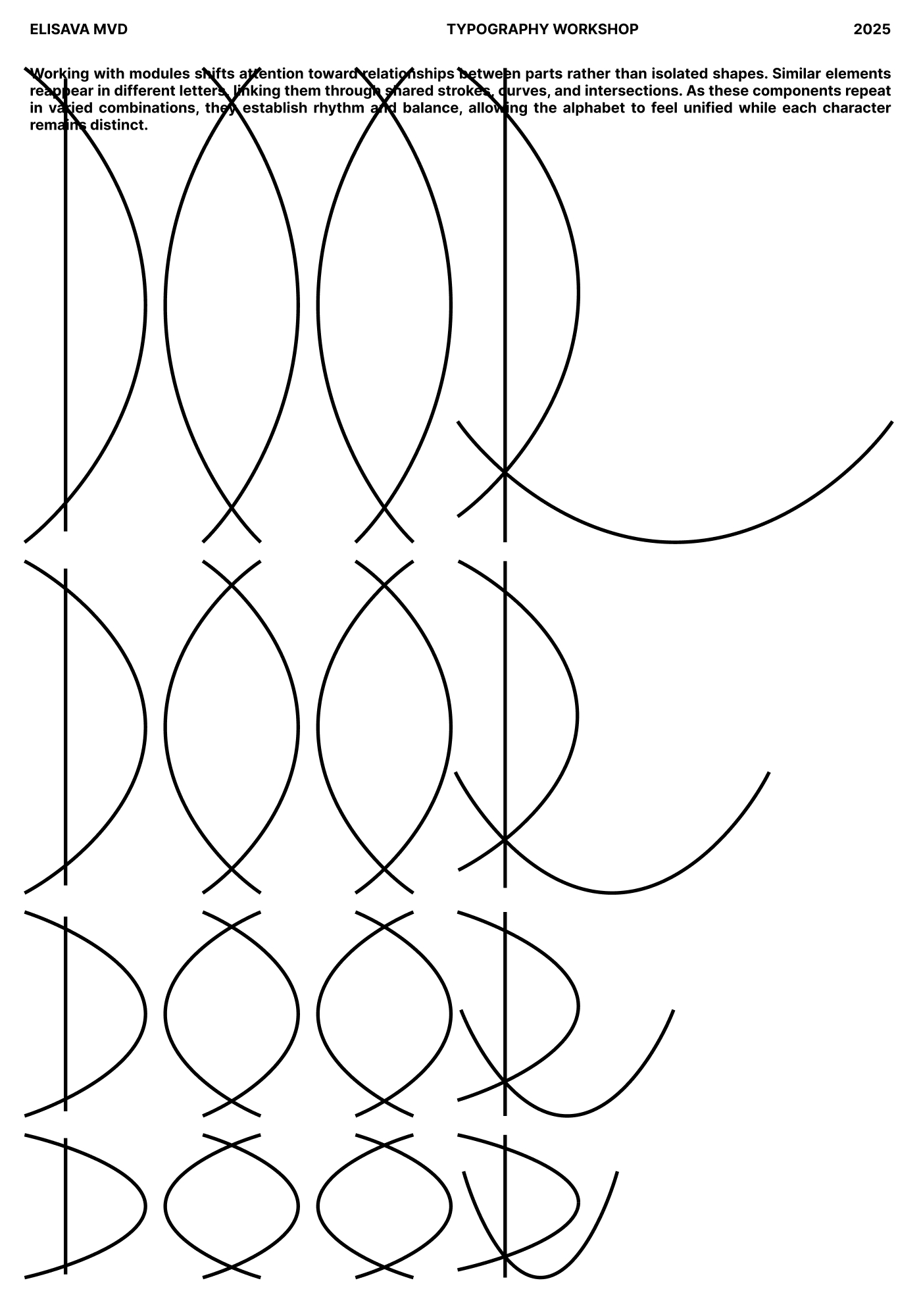
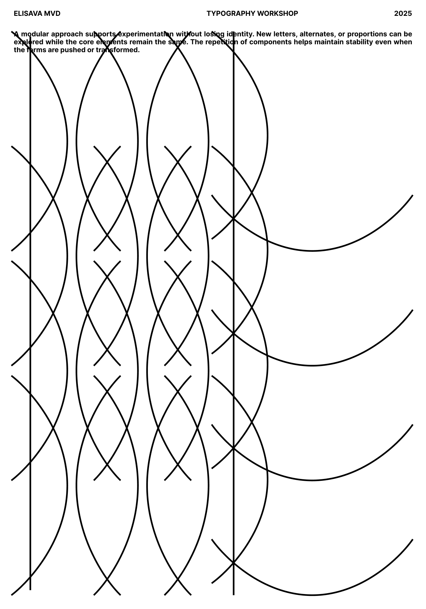
This typeface is inspired by an iron gate in the Gothic Quarter of Barcelona. I liked the contrast between the curves and the strict vertical bars, so I decided to build the whole type system from that idea.

What do all the letters look like?
Where can people follow you?
https://www.instagram.com/oksthanks
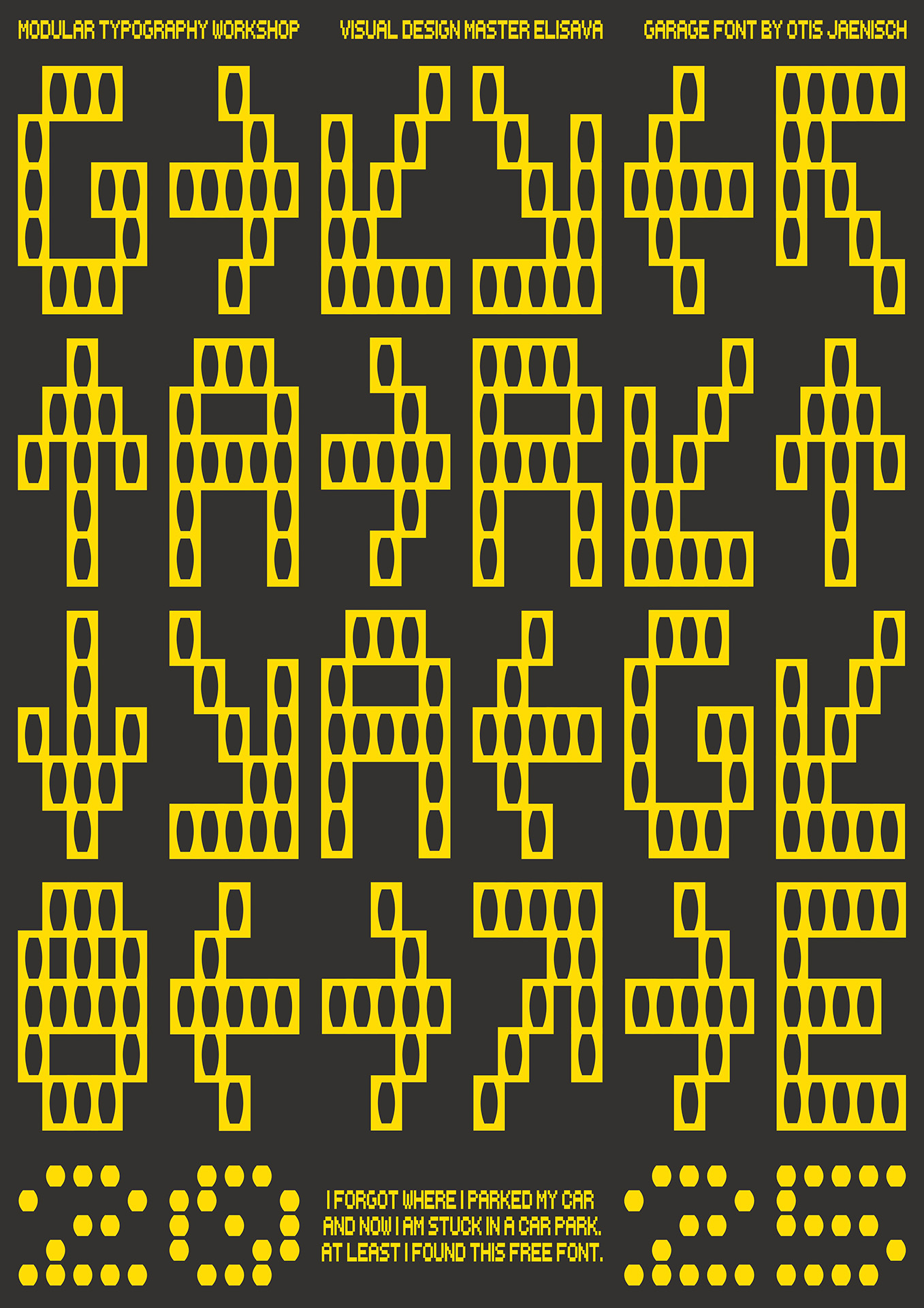
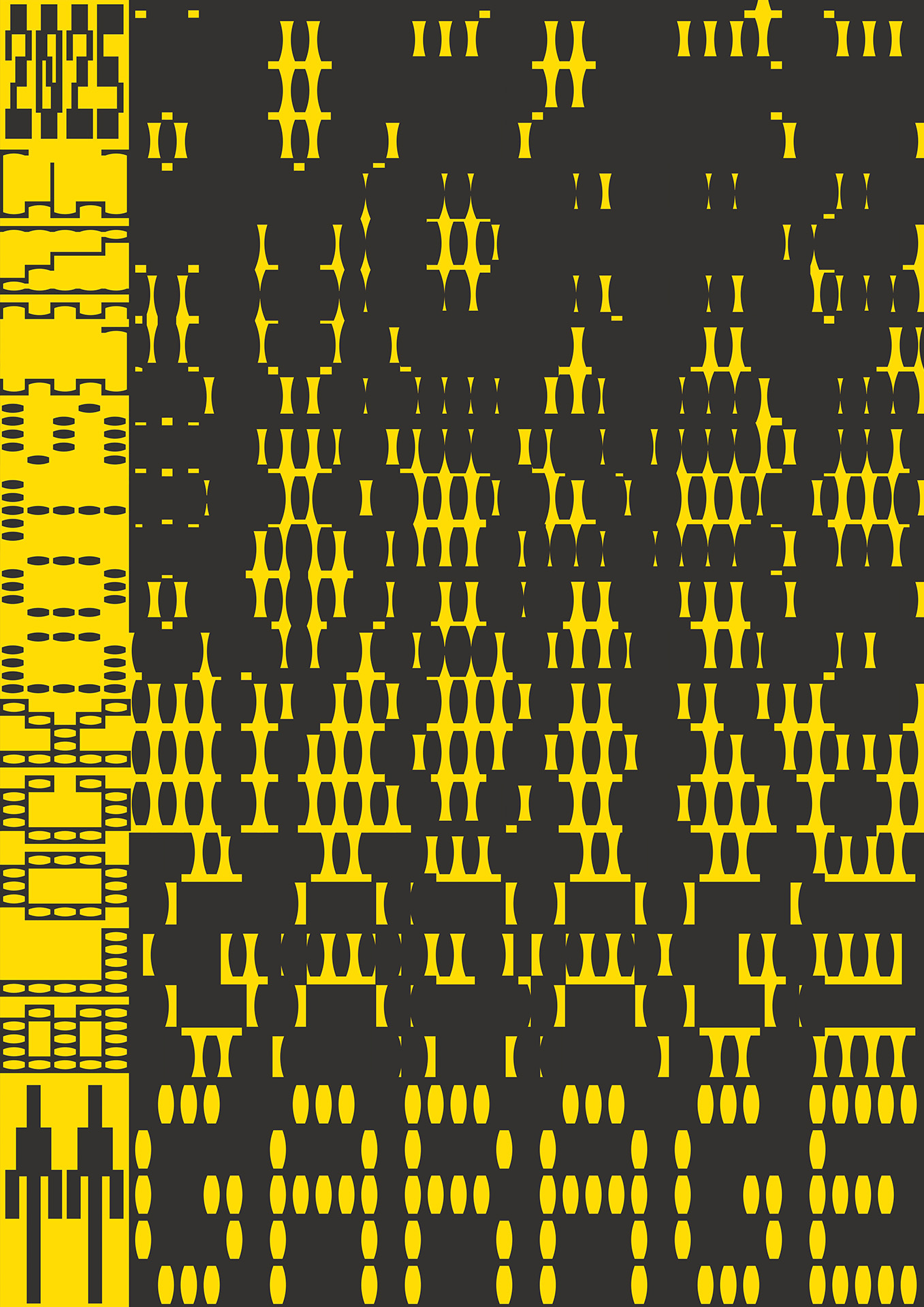
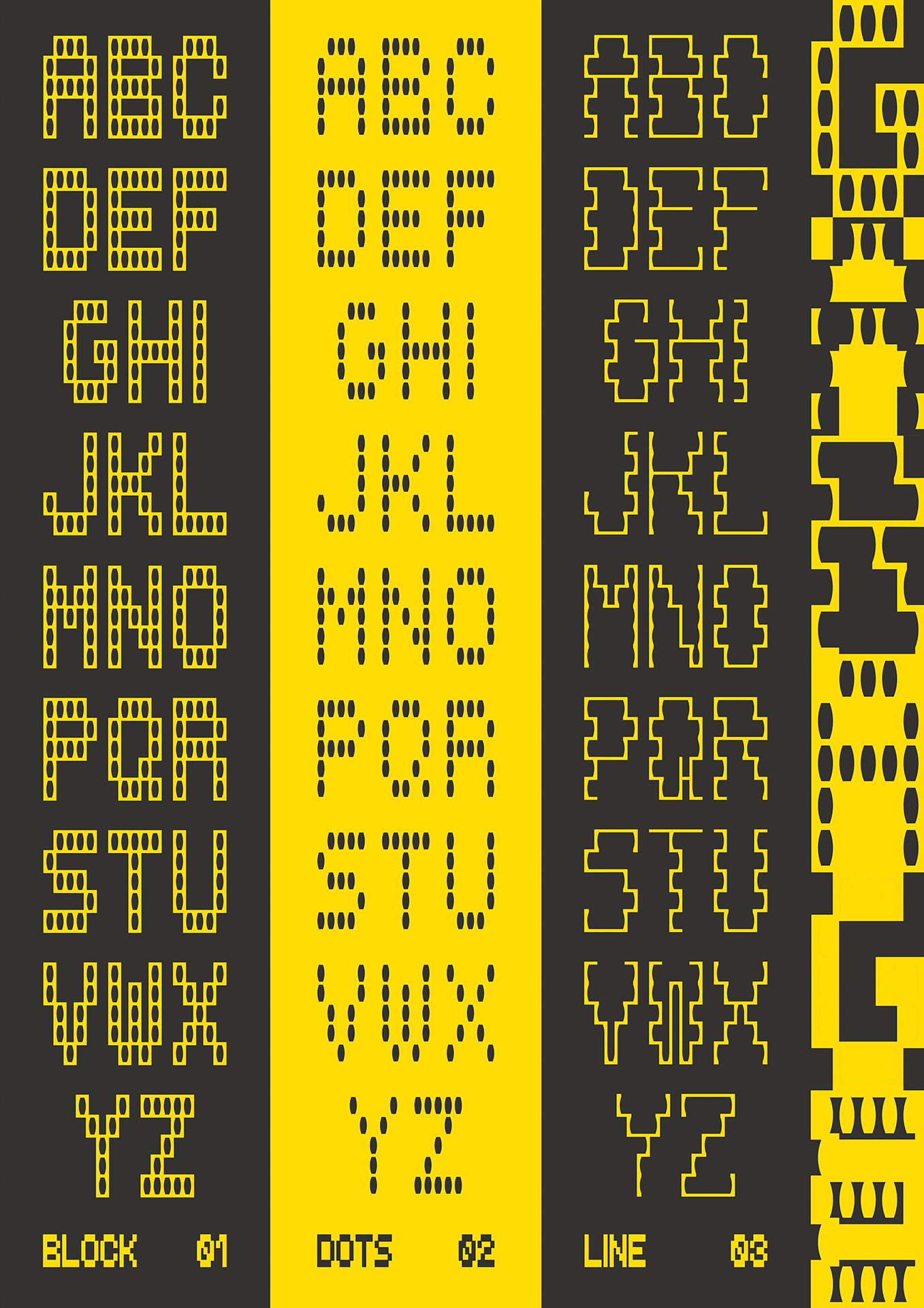
Otis Jänisch
Tell me a bit about yourself: What is your name? Where are you from? How much previous knowledge about type design did you have before participating in my workshop?
Heyo, my name’s Otis. I’m from Germany and studied communication design in Hamburg. My focus was on illustration and graphic design, and I had a typography class as part of my curriculum. I’ve always appreciated good type design, but it was one of the areas where I never really felt confident myself. So it was actually one of my goals to get a deeper understanding of it in the master’s program at Elisava and this workshop was a great opportunity to do so.
Which part of the workshop did you enjoy most?
Definitely the freedom to explore and try out new things. And I think the time constraint helped a lot with that actually. Given that we had to design a typeface and posters in just a week, you really didn’t have time to overthink every decision. I think in regular typography classes you have to be pretty meticulous on how you approach the design and use of a typeface, so it was refreshing to have to rely more on your intuition due to the workshop format.
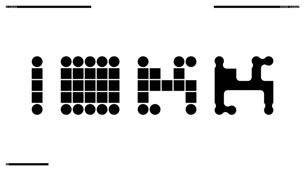
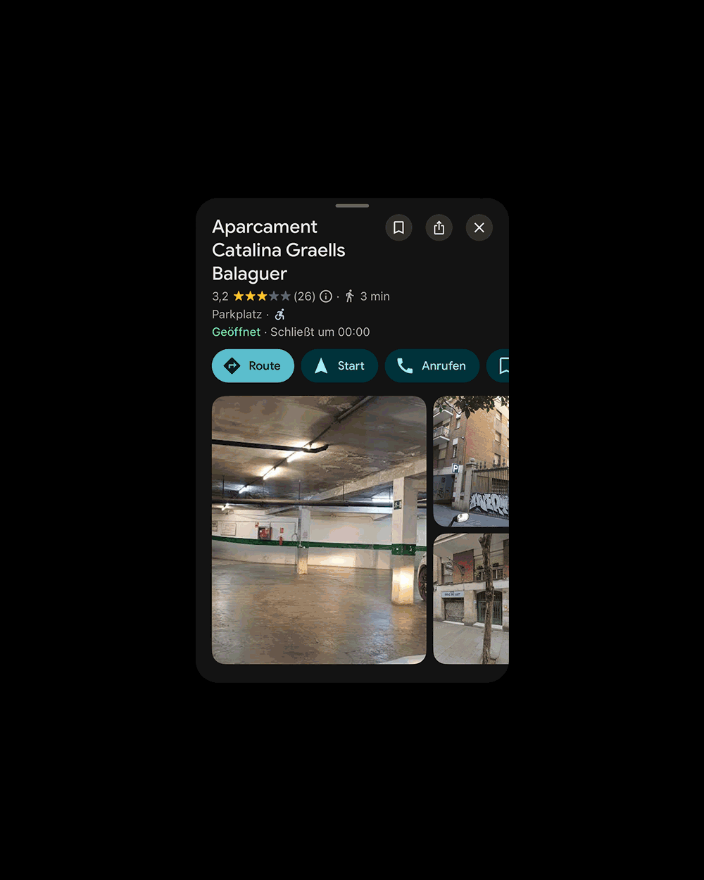
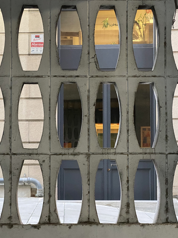
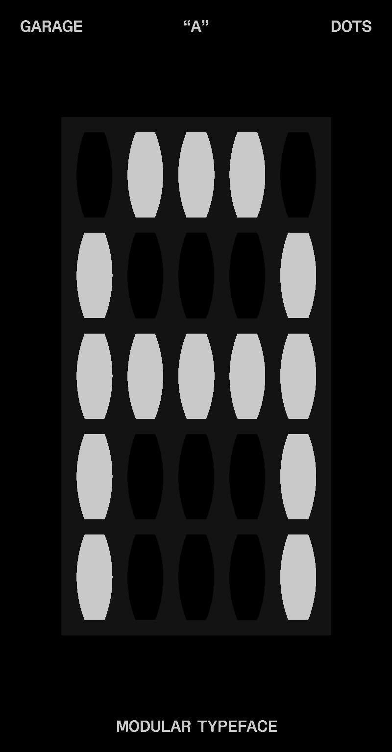
Where did the inspiration for your font come from?
My grid is based on these concrete blocks that I spotted in front of a parking garage. I really enjoyed how simple and geometric the bricks looked, and thought they would be a great basis for creating a typeface with multiple versions.
What do all the letters look like?


Show me the posters you designed with your font!
Where can people follow you?
https://www.instagram.com/ojae_n/