System Design Workshop at the HGB Leipzig
Interview with Nina Louiza
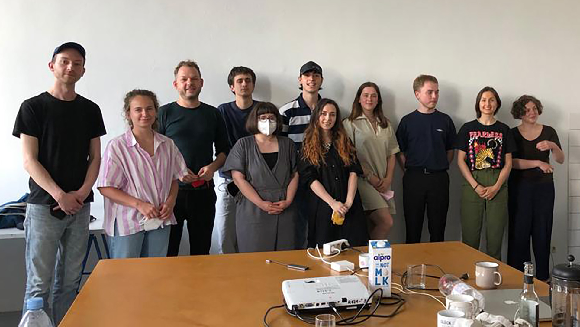
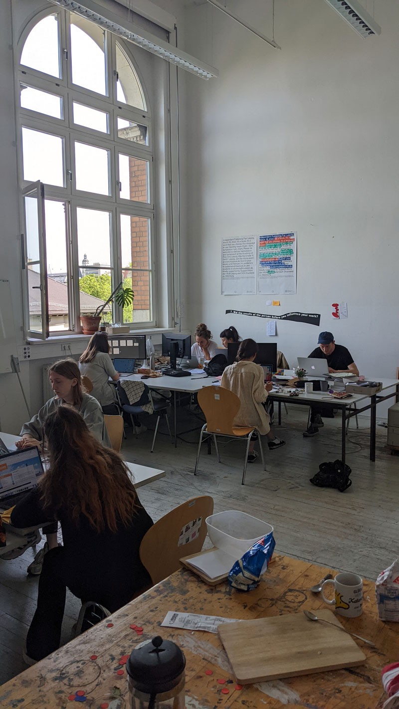
In May 2022 I was invited by Maureen Mooren,* Professor at the Academy of Visual Arts Leipzig, to teach a workshop about System Design to her class which bears the same name. The System Design class is a Leipzig Academy for Graphics and Book Art (HGB) specialist class. Conceptual graphic design is the starting point for developing projects in different media, forms of work, and formats. The class understands design as a critical, research-oriented, holistically understood tool for “publishing ideas”. In their understanding of design, in addition to influences from other fields and sciences, working methods from the field of art also play a role in the testing and development of new and experimental forms of design practice and discourse. The classes’ projects range from books, publication series, and other prints to corporate identity, exhibition design, film, installations, and architectural situations.

Archive Project 1—Storage
Sohyeon Lee

Emil Feinweber
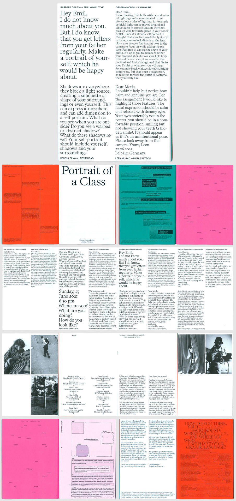
Conversation pieces from System design class students about self-marketing, cultural responsibilities, and design education form a portrait of the class. A4 on Clairfontaine Color Trophée 120g/qm. Supervised by Claudia Doms.
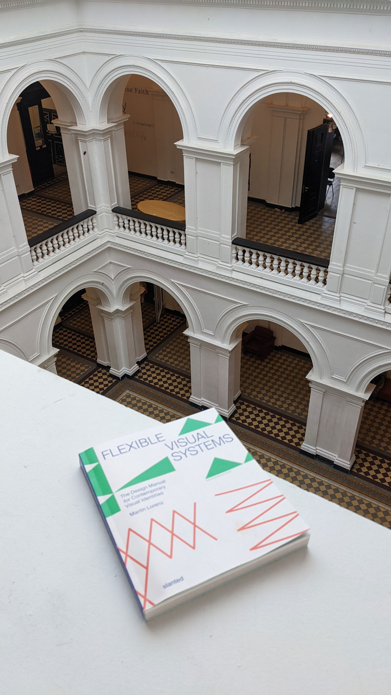
As in my workshop for UMPRUM, The Academy of Arts, Architecture, and Design in Prague, I based the workshop on pages 72–75 of the book Flexible Visual Systems. The workshop aims to break preconceptions about what a grid is and how it is designed. Instead of dominating the experiments with a grid, the grid emerges from the experiments. To give you an idea, I asked Nina Louiza, one of the participants, to share some of her work with us.
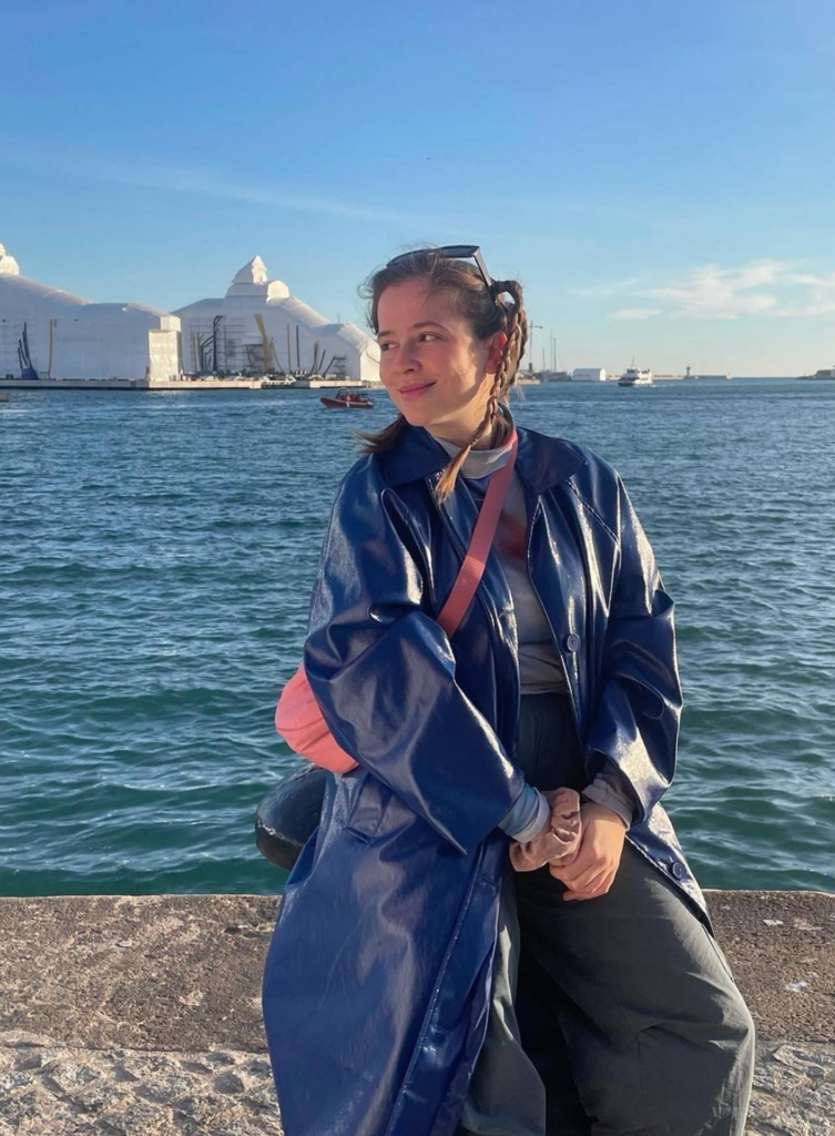
Hi Nina, I am really glad we are going to have this conversation about the workshop. A teacher explaining the workshop he or she gave is always an incomplete picture. Especially when the program leaves a lot of space for free exploration. I am sure our readers will appreciate reading about your experience. Before we go through different phases of the workshop, please introduce yourself. Who is Nina? Why did she study design? What are the works you are most proud of and why?
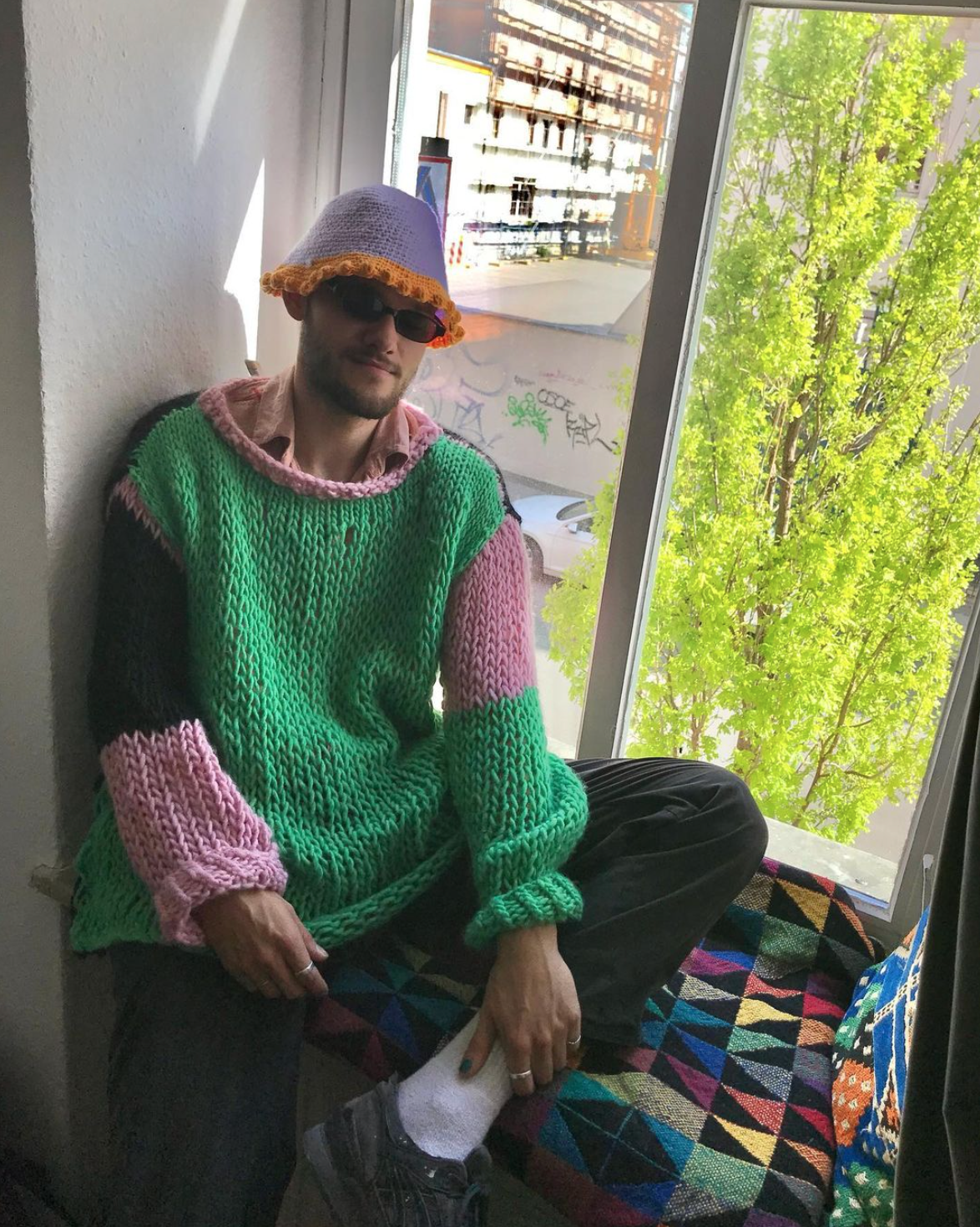
My name is Nina Louiza, and I am currently 29 years old. I am studying system design at the Academy of Fine Arts in Leipzig, and I am in my 10th semester. It took me some time to figure out what I truly wanted to pursue in life, and I eventually realized that I wanted to be creative. While living in Amsterdam for two years and working at the cultural institution De School, I was surrounded by many creatives, and this experience made me appreciate the value of art exhibitions, concerts, and other creative pursuits.
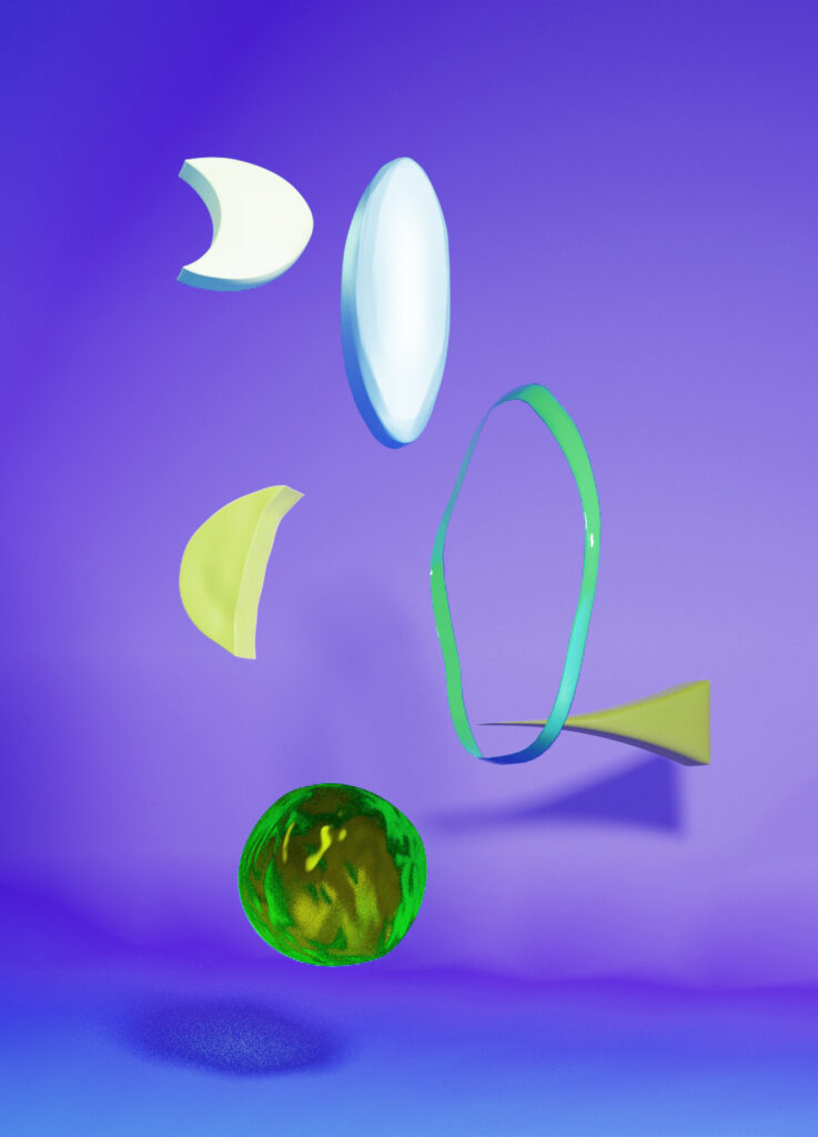
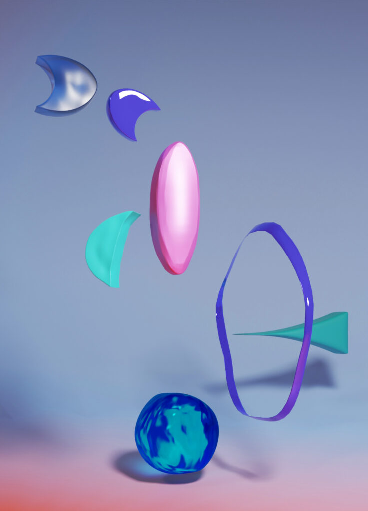
In general, I would not describe myself as a graphic designer, but more as a multidisciplinary designer. As I continued my studies, I discovered that I was particularly drawn to graphic design that offers other dimensions than print, such as 3D, video, and VR. I find these mediums to be particularly interesting and enjoy exploring how they can be used to convey ideas and messages in new and innovative ways. I am also interested in the use of AI, such as touch designer, and have a passion for textiles and music production as well. Currently, I am exploring how I can combine these topics and discover where they will take me in my career.
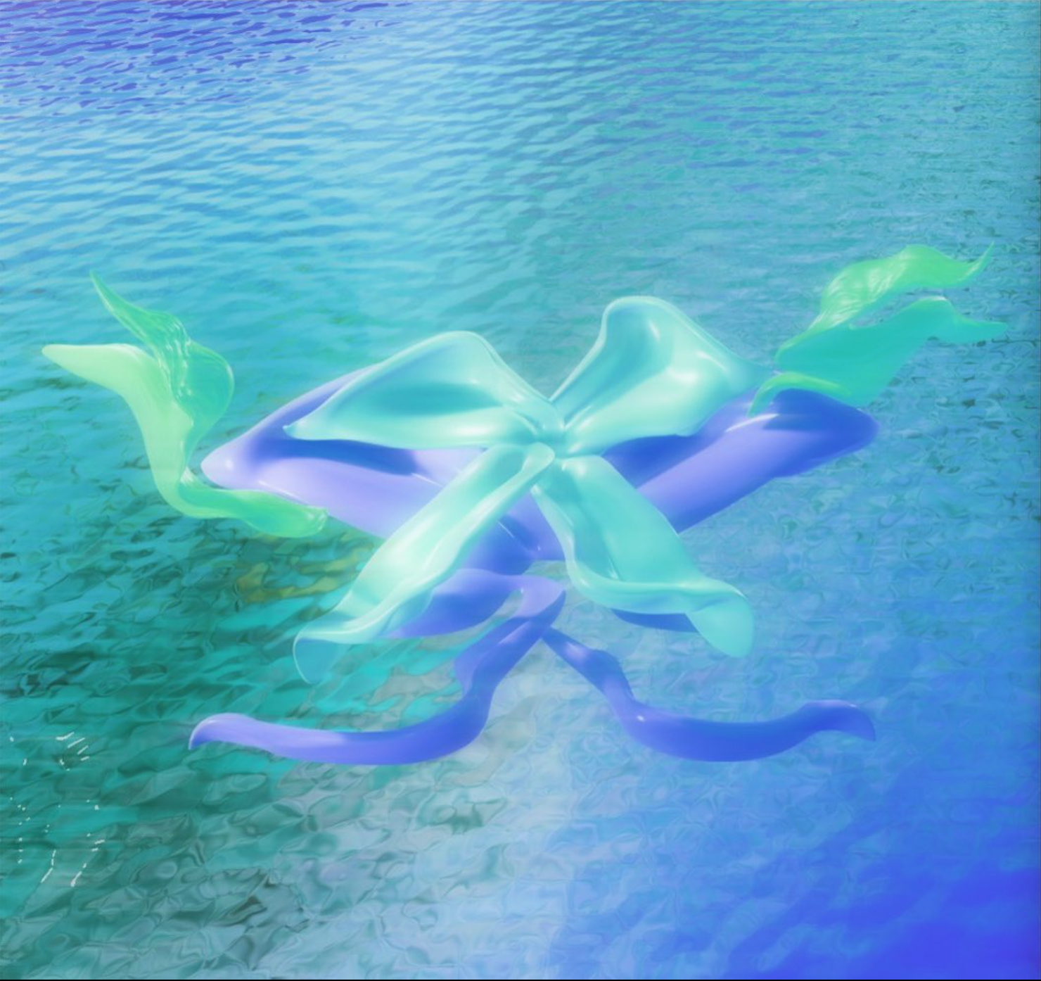
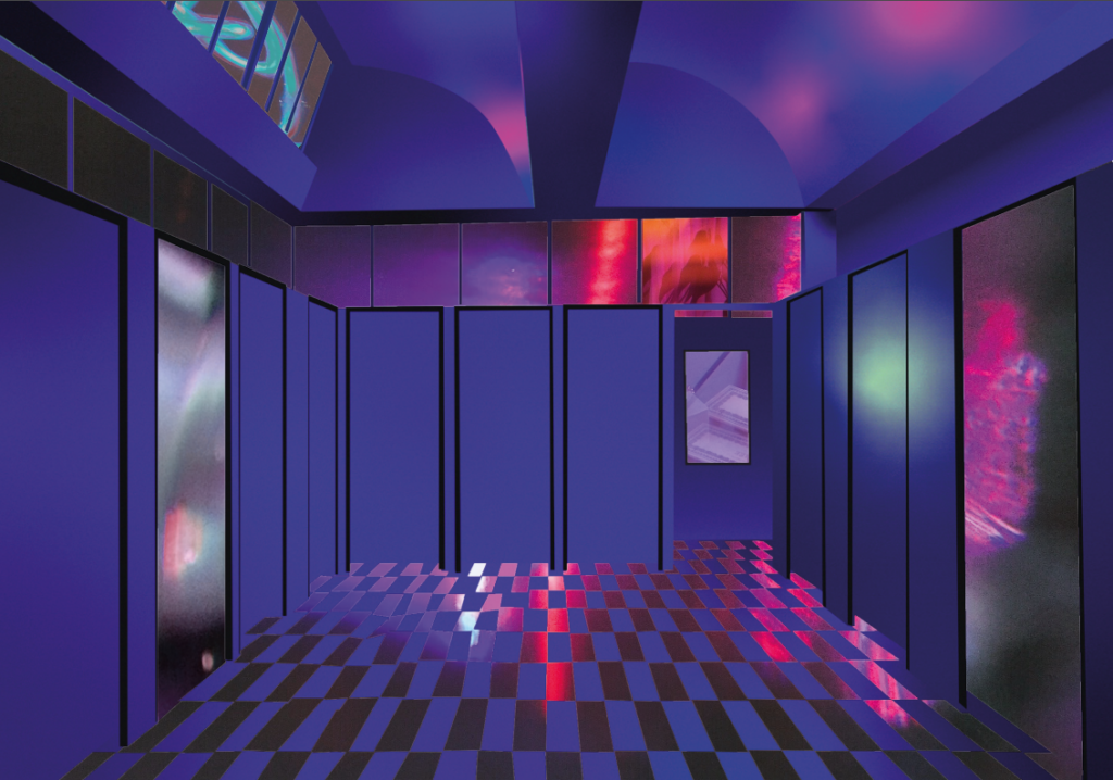
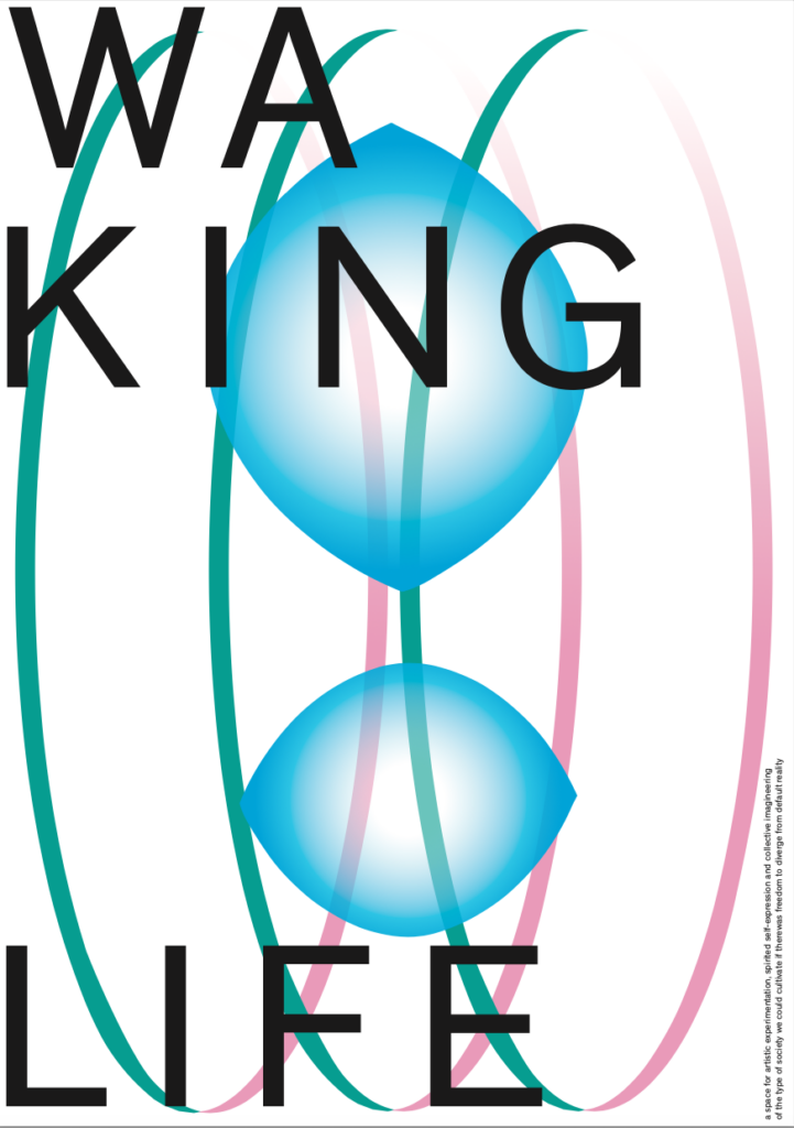
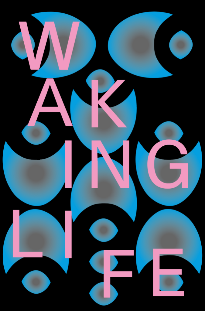
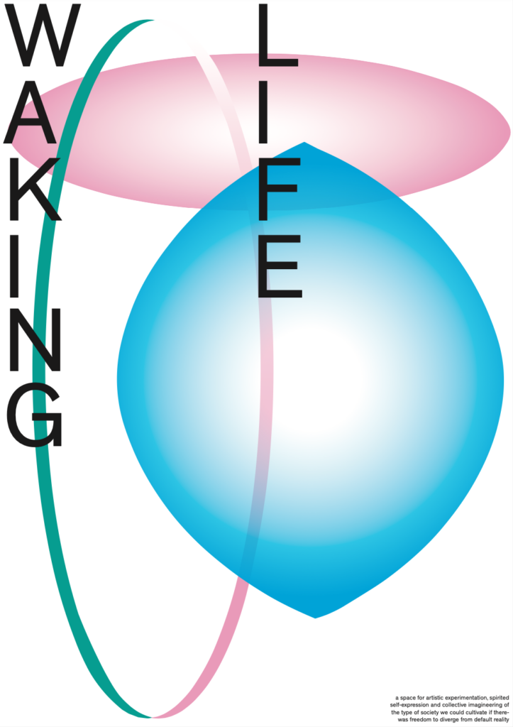
There are a few works that I am particularly proud of, including a fictitious travel guide that I created in 2020. For this project, I imagined a second reality or society that could be accessed through VR glasses. Although I didn’t have the skills to create a 3D representation at the time, I used the gradient tool in Illustrator to create a mockup of the 3D aesthetics. While it is not a true 3D representation, I believe that the results turned out to be quite special and unique.
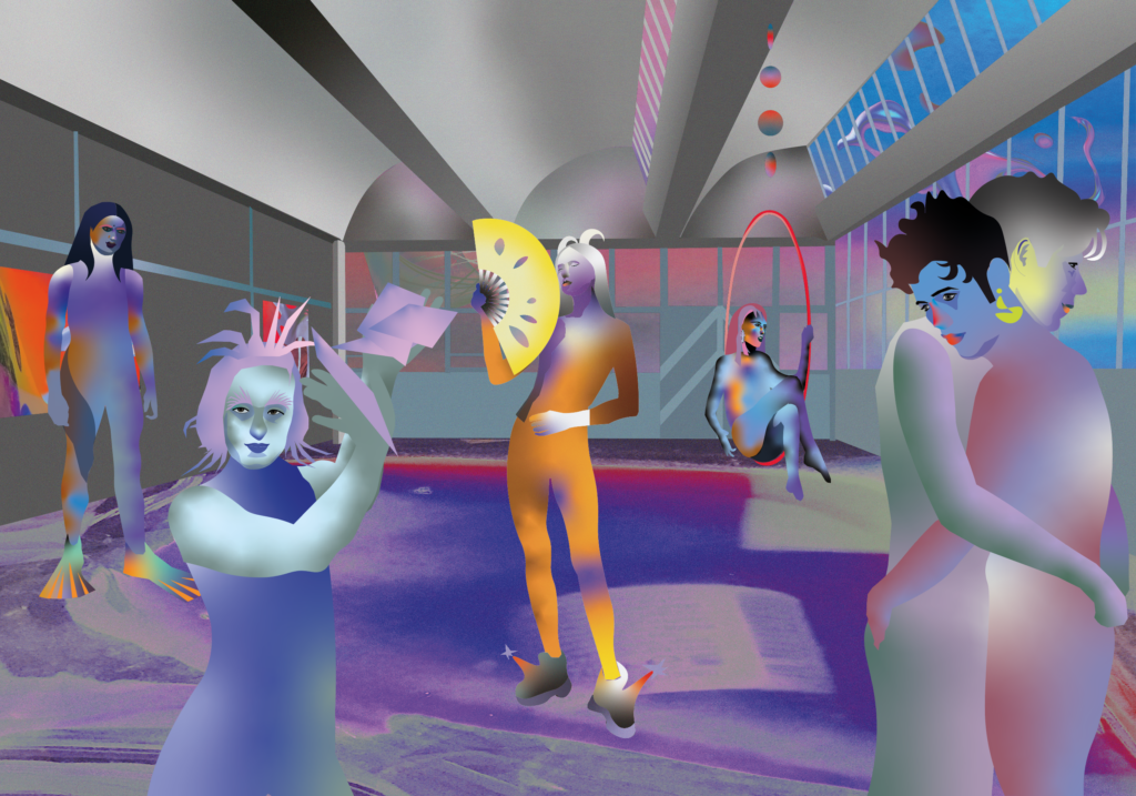
Furthermore, I am proud of my experimental photography, in which I try to distort reality by using random analog objects as filters. By incorporating these unconventional elements into my photography, I am able to create images that are truly unique and push the boundaries of traditional photography. I find this approach to be both challenging and rewarding, and I am excited to continue exploring this style of photography in my future work.
On the first day, I let you design three different grids. One with a circle, one with a triangle, and one with a square. I did this to question the preconception that grids always need to be built with rectangles. Also, starting formal explorations without any previously defined goal of what these forms need to communicate can lead us to surprising results. For some, it is very difficult to experiment freely and therefore also very difficult to come to surprising results. They need a goal. They need to know what their task is to know what their design has to look like. I totally get that, but sometimes this also leads to predictable solutions. A design, developed in a phase of free experimentation, applied to communication design projects, can become very surprising because they become functional in its new context. Can you show a couple of your grids and say a few words about your experience making them?
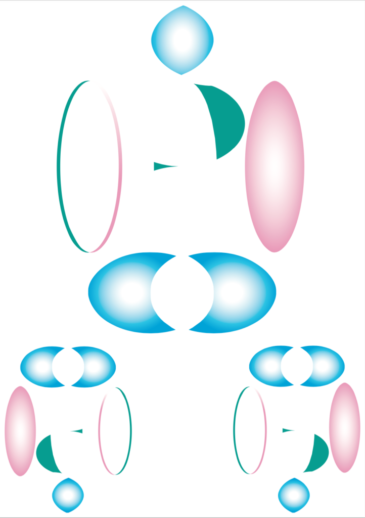
I really liked the idea of starting an identity by playing around with grids and fully immersing myself in the process of experimentation, without having a clear idea of what the end result would look like. What I discovered early on was that I was drawn to grids made with circles, probably because I love the look of organic, fluid, and rounded shapes. At first, I wasn’t sure what to expect, but as I continued to experiment, I found myself becoming more and more interested in the results. And when I stepped out of my comfort zone (which, in this case, was the circle), I discovered some really fascinating possibilities.
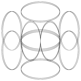
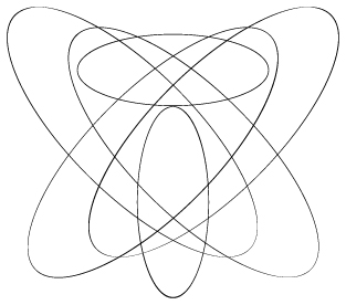
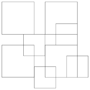
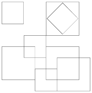
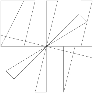
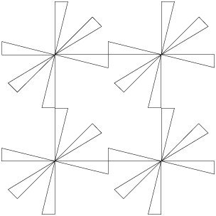
Then I asked you to create forms that derive from the grid.
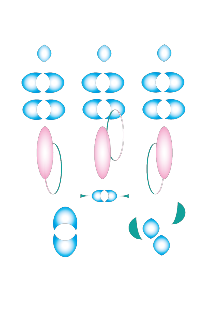

Then I asked you to combine typography and form.
Thank you so much for doing this Nina. Two last questions: What are your next steps? Where can we follow your work?
For now, I will finish my study in Leipzig and figure out ways how to combine my interests in 3D, and textiles soon and afterward probably move to Berlin or Amsterdam. I aim to work somewhere in between identity design, 3D, and textiles. Let’s see where life takes me! You can follow my work on @ninalouiza
Footnote*
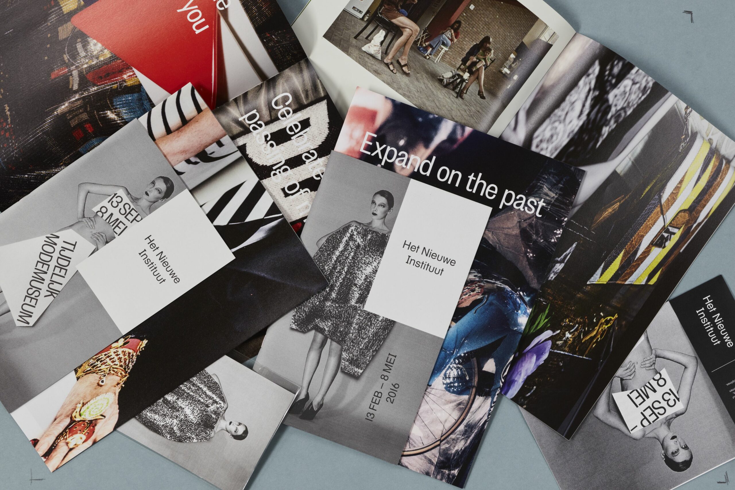
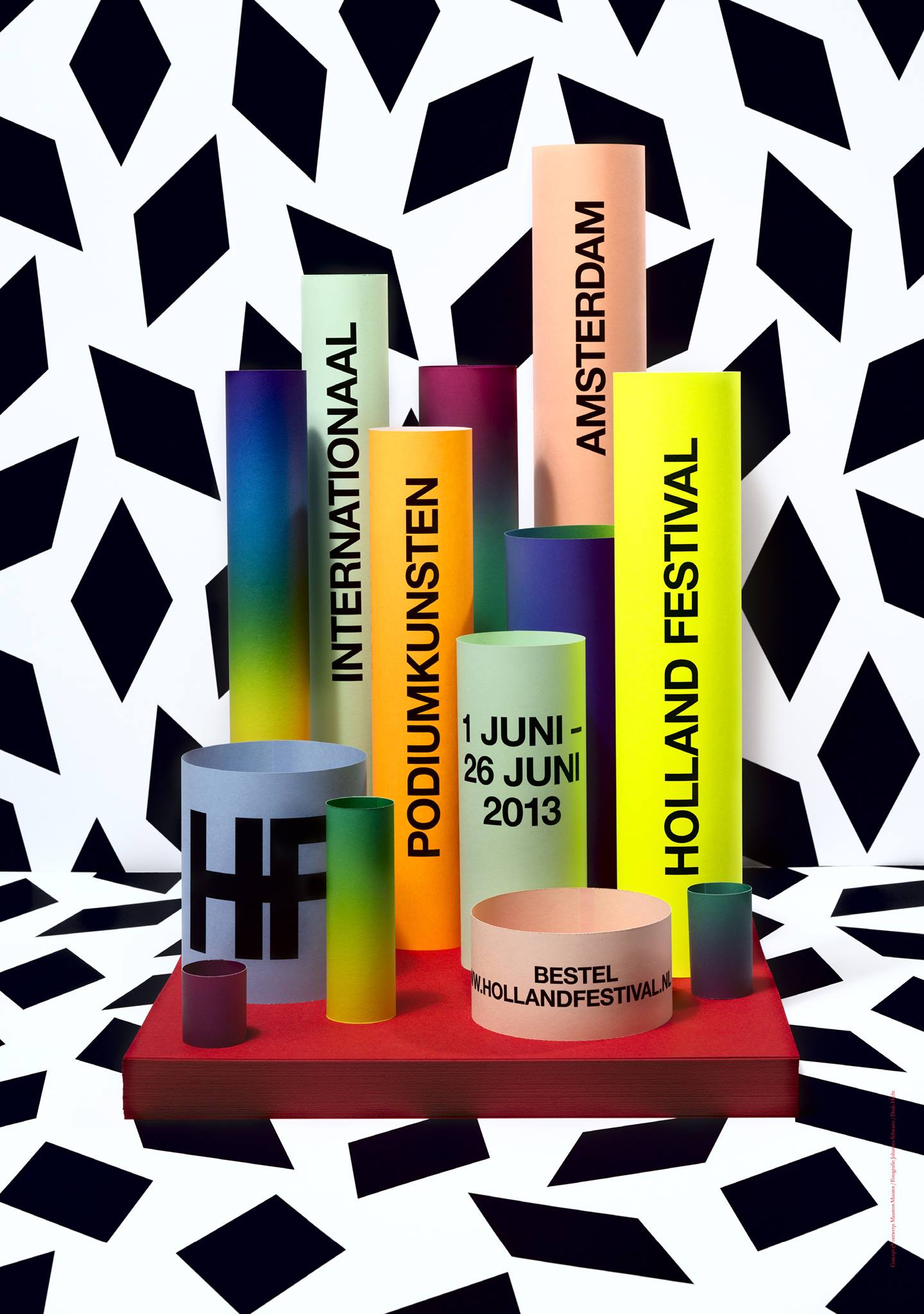
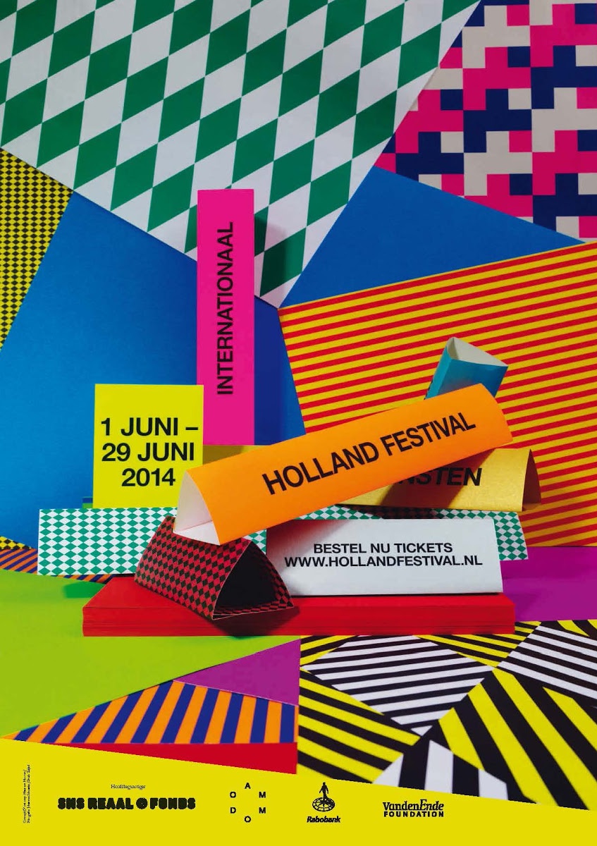
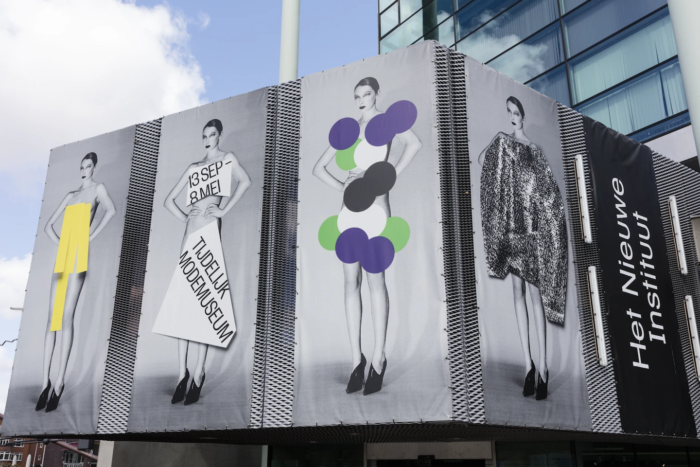
I could not have ended this article without showing some of the work of Maureen and admitting that I am a huge fan for over 20 years.
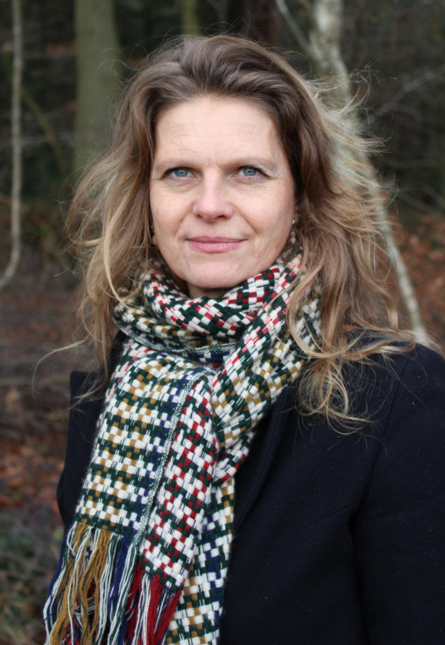
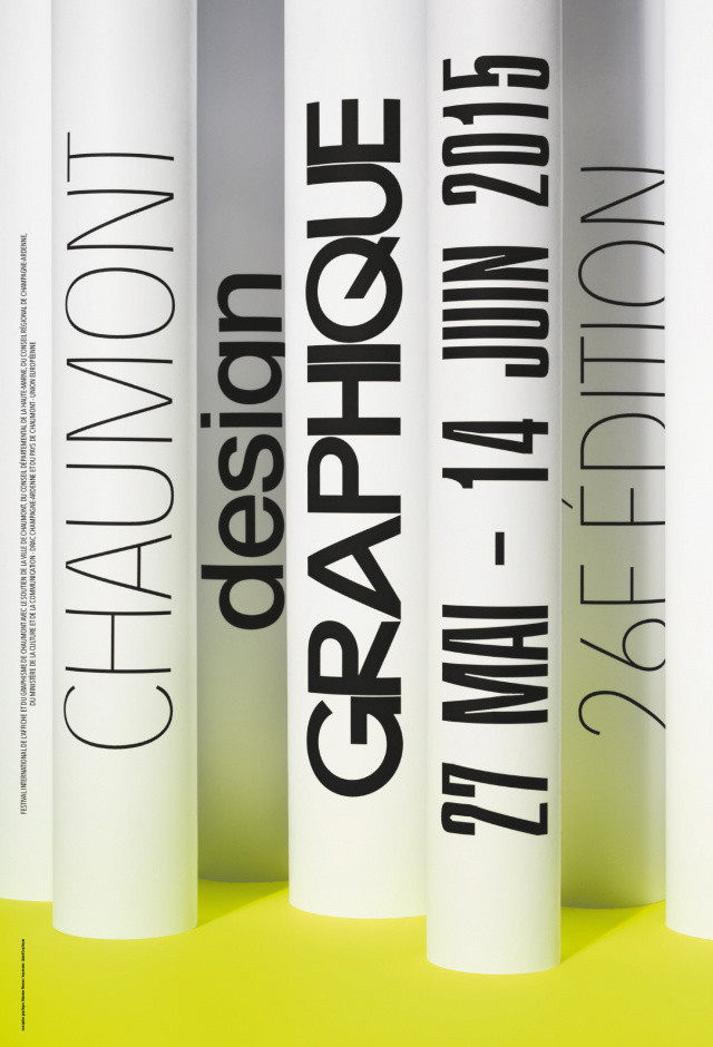
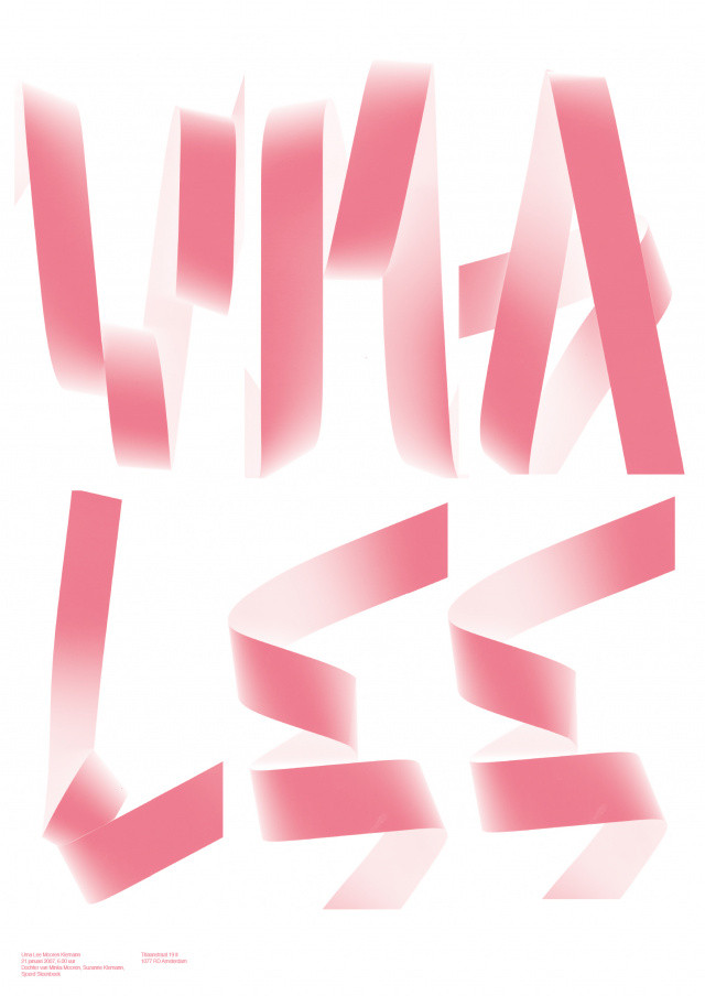
Maureen Mooren (* 1969, Netherlands) studied graphic design at the Willem de Kooning Academy Rotterdam. Together with the designer and writer Daniel van der Velden she worked from 1997 till 2006 for various cultural projects and institutions such as the Archis magazine, now known as Volume, the visual identity of the Holland Festival and a variety of art catalogues. Maureen Mooren has been independently developing corporate designs, books and print material since 2007, primarily for cultural institutions such as the Holland Festival, Marres Center for Contemporary Culture Maastricht and the initiative If I Can’t Dance, I Don’t Want To Be Part Of Your Revolution. She also designs artist books. In 2011 she was one of the exhibiting artists of Opera Aperta/Loose Work in the Dutch Pavilion at the 54th Venice Biennale. Since October 2013, Mooren has been responsible for the visual appearance of Nieuwe Instituut Rotterdam. From 2001 to 2004 Mooren taught at the ArtEZ Institute of the Arts Arnhem in the Department of Graphic Design. She also taught at the Werkplaats Arnhem from 2011 to 2014. Since 2015 she is a professor at the Academy of Visual Arts in Leipzig for the System Design class in Leipzig. Maureen Mooren lives and works in Leipzig and Amsterdam.
