Thought & Found

Amery Oke-Johnston is the Creative Director of Thought & Found, a multi-disciplined design practice based in Melbourne/Naarm, Australia. Their methodology is built on the unexpected, the importance of meaningful, intelligent outcomes and the occasional happy accident. Through challenging typical conventions of branding, Amery seeks to generate unique and engaging outcomes for each and every project. The foundation of their approach is derived from the concept that design should not only engage the mind, but also touch the heart.
Thought & Found is one of the 46 studios from 23 countries showcased in the book FVS Atlas, published by Viction:ary and authored and designed by TwoPoints.Net. The book serves as evidence of a shift in how designers worldwide approach brand identity design. While in the last century, the identity design revolved around logos, representing a message, this century is about systems functioning as flexible visual languages. In this series of interviews, the trailblazing designers give insight into their systemic approaches.
Focusing on Flexible Identity Systems as a global phenomenon, I would like to know which places influenced your understanding of systems.
I’ve always been interested in systems—I think they play an important role in cultivating and bolstering a brand’s overall narrative. For me, flexible identities are not just a design approach but an acknowledgement of multiplicity; brands, like people, are rarely one-dimensional.
It’s difficult to pinpoint those exact key influences—but I began my career in a branding studio that worked across print, packaging and web—so from very early on in my creative practice, it was integral that identities needed to translate across a variety of formats. I was exposed to a non-static way of thinking—observing how frameworks could flex and adapt between different contexts without losing their integrity.
Which of the Identity Systems you designed is your favorite and why?
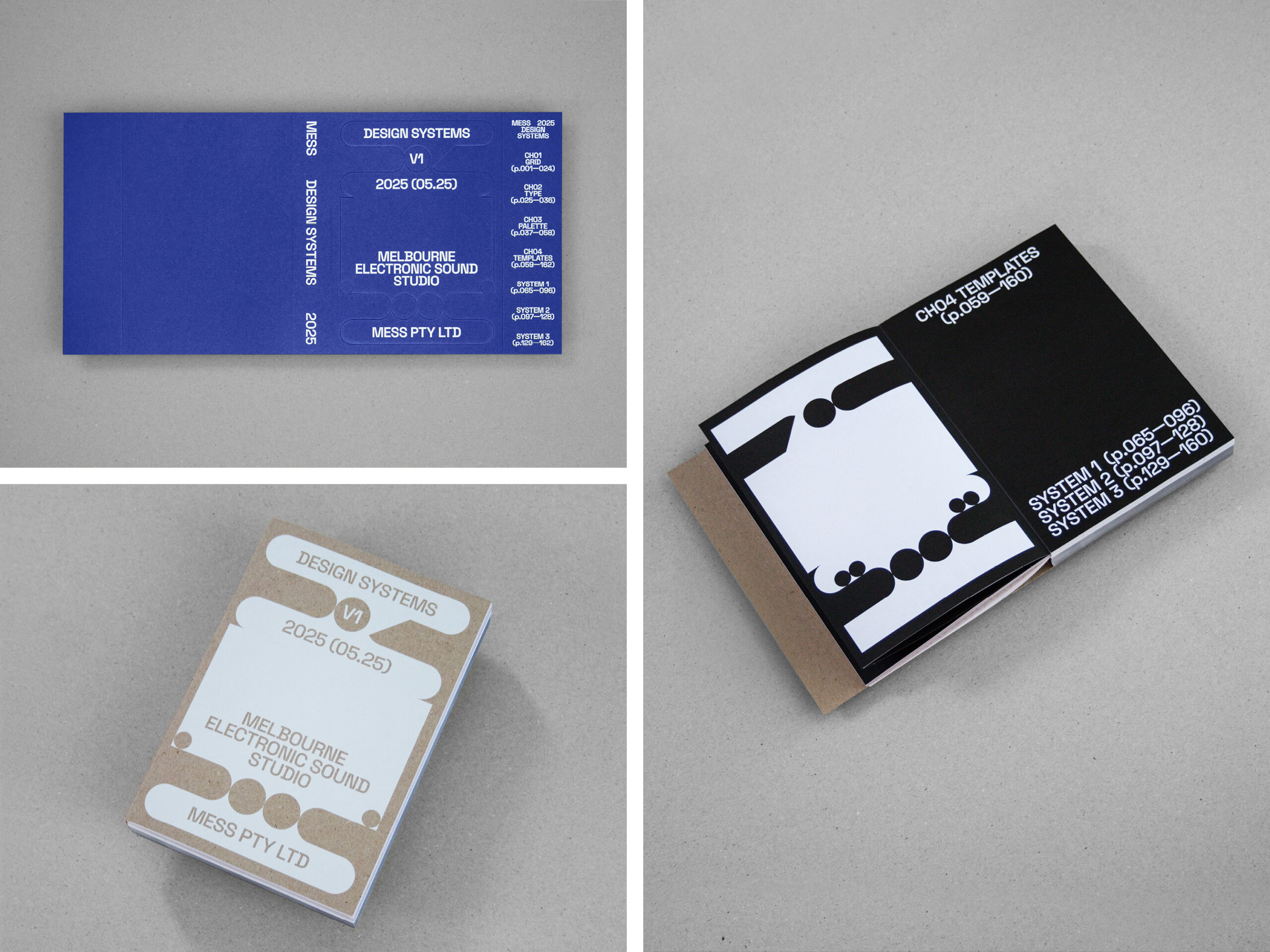
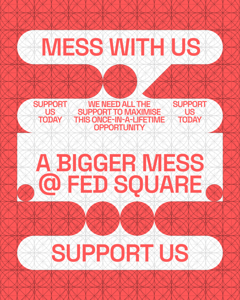
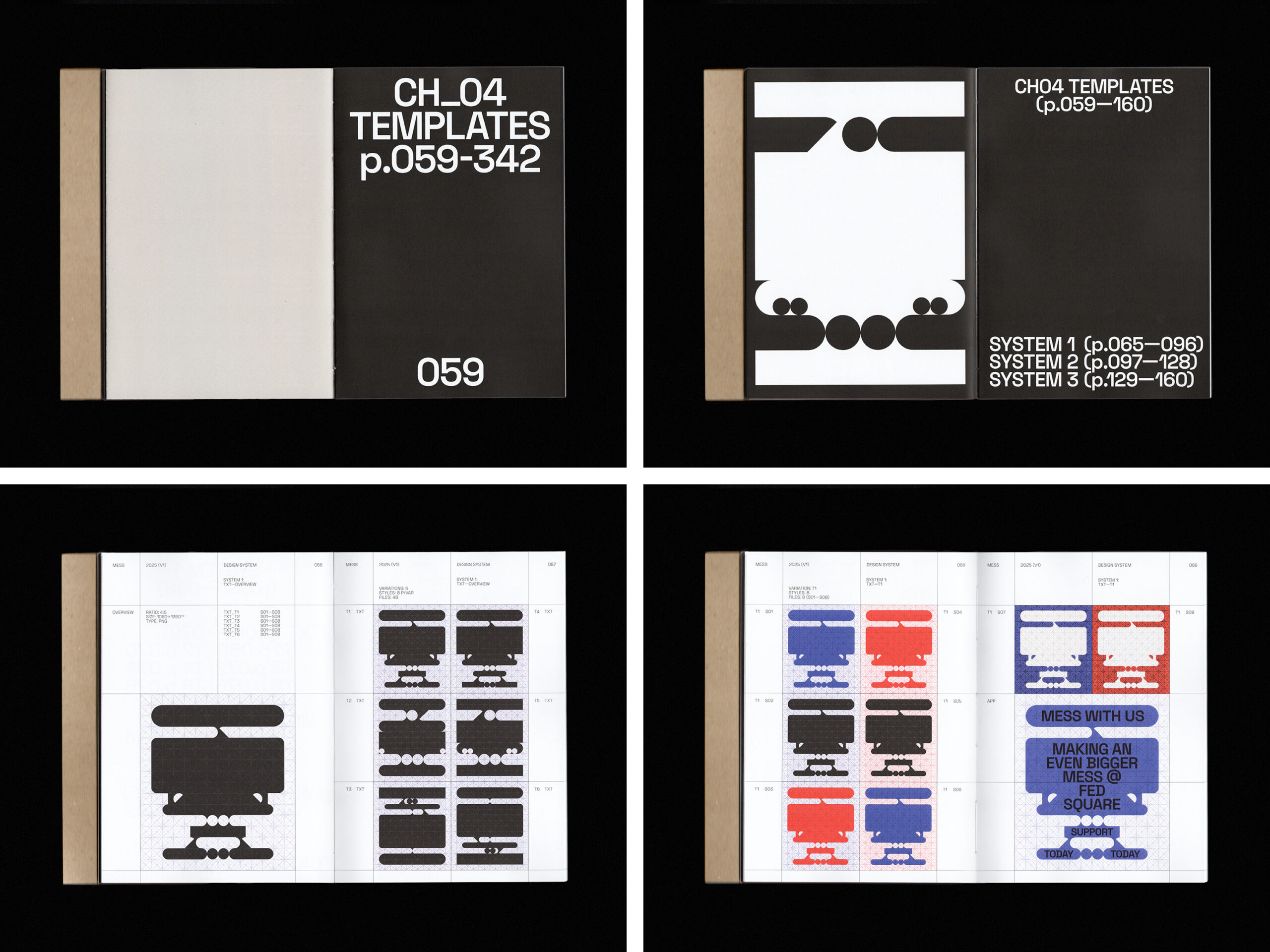
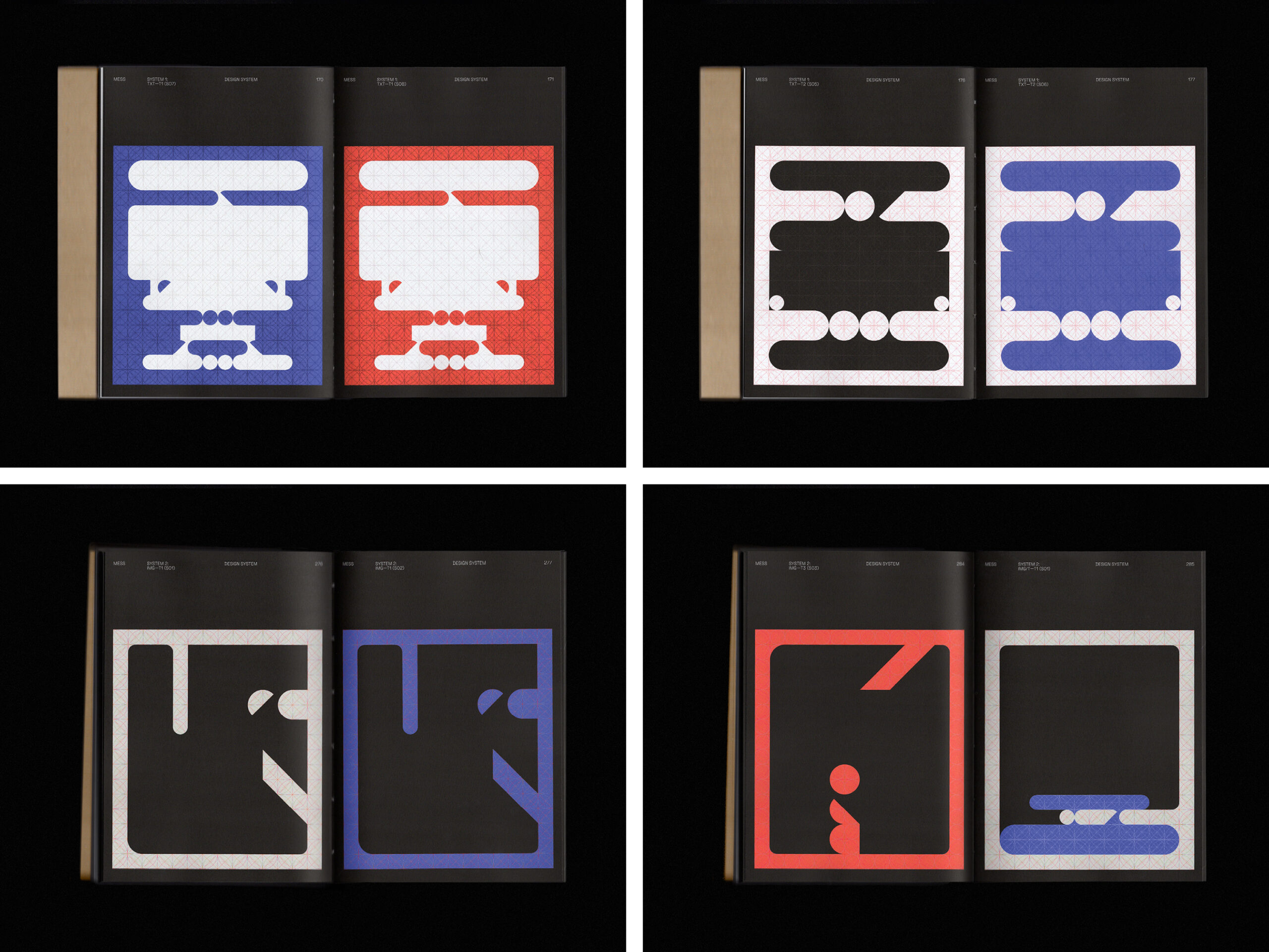
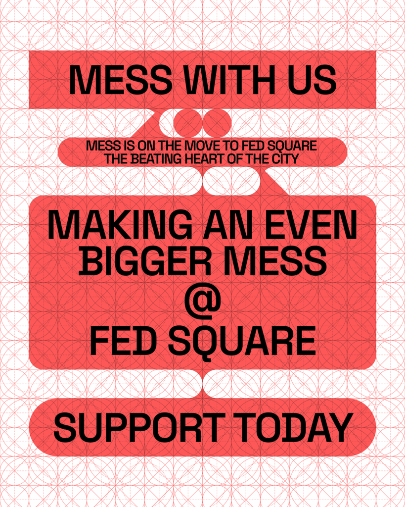
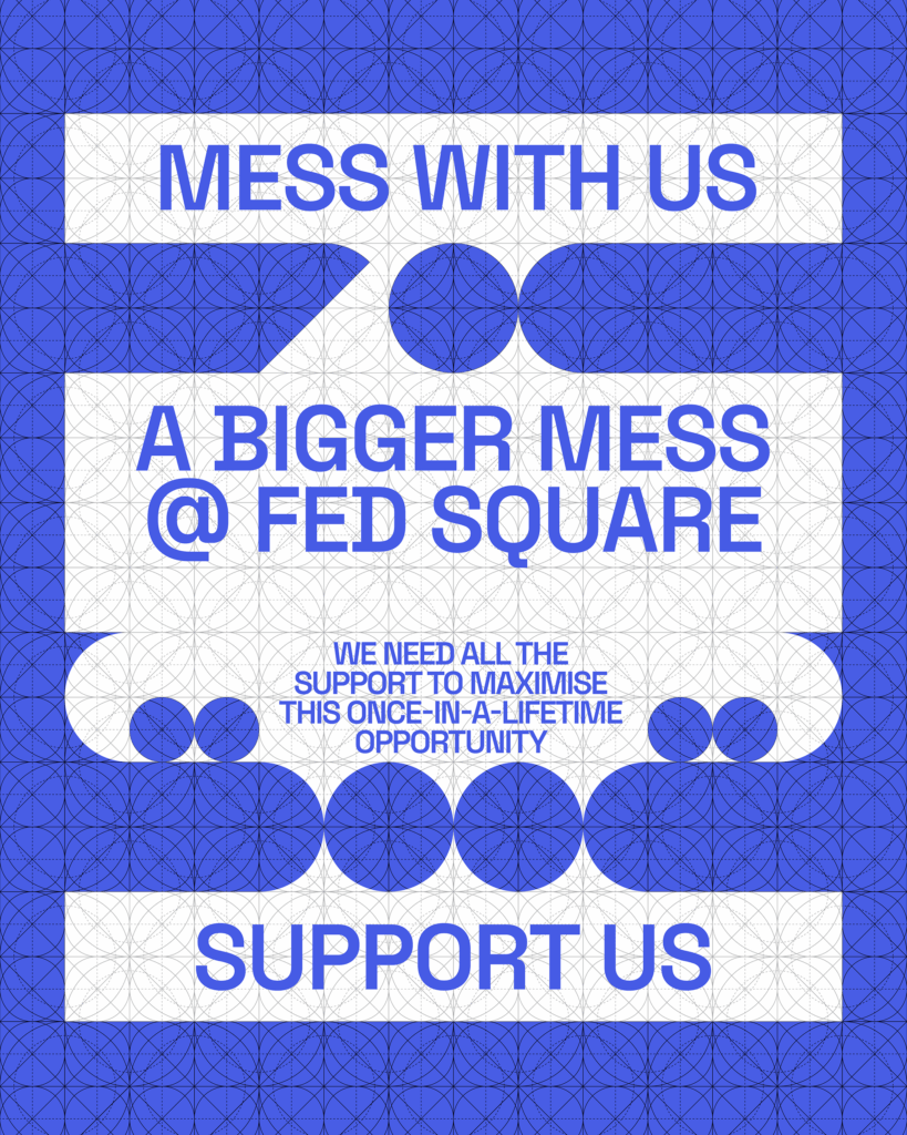
MESS (Melbourne Electronic Sound Studio)—Visual System
Oh, there’s a few in the archive that stand out but the most recent visual system for MESS was an interesting outcome.
MESS is an organisation dedicated to electronic sound, providing access to one of the world’s most significant collections of synthesisers. The intent was to develop a dynamic digital framework enabling MESS to communicate with clarity and consistency, speaking in a way that was both experimental and professional—all the while avoiding expected clichés of electronic music.
By integrating the principle of electronic music into its structure, the visual system takes shape as a modular, grid-driven system inspired by the interfaces and improvisational nature of synthesisers. Much like synths are reconfigured to produce new sonic textures, the framework allows for variation and responsiveness while ensuring coherence and recognisability. The system itself behaves as an instrument—encouraging experimentation, adaptability and play.
It’s quite the joy to play with!

Can you describe your system with less than ten rules, like if it were a cooking recipe?
Well, I do love cooking!
1. Open up the grid system.
2. Choose your palette system (a simple 1–2 colour combination).
3. Draw in your shapes to create a new modular form.
4. If a message-focused expression:
a) Set the key messaging in the brand’s primary typeface (use consistently across all typographic levels).
b) Center typography within the form—and don’t forget to play with the positioning of the elements.
5. If an image-focused expression:
a) Mask the image into the new modular form.
6. Then export!