The Woork

Founded in Madrid in 2014 by Debbie and David, The Woork is a boutique branding studio that combines strategy and creativity with a strong focus on brand activation. Both partners came from the world of marketing and art direction in large multinational agencies, where they worked on award-winning international campaigns. That experience allowed them to identify a common issue: many brands tried to solve strategic problems with spectacular campaigns, but without a solid foundation to give them coherence and longevity. With that motivation, The Woork was born, with the conviction that a well-built brand should have the power to grow, adapt, and remain relevant over time. More than ten years have passed since then. They have worked with a wide range of companies—tech firms, architecture studios, food brands, and cultural projects—and each one has been a world of its own. What makes The Woork different is that they don’t hand over a brand manual and disappear. They stay, guide, adjust. Over time, they have developed their own approach to working: workshops where ideas flow and ongoing support that ensures everything works in real-life applications. Since then, the studio has worked with companies of all sizes, from start-ups to multinationals, both in Spain and abroad. Their approach is close and practical, to ensure that brands are not only launched with strength but also maintain coherence in their day-to-day reality.
The Woork is one of the 46 design studios from 23 countries showcased in the book FVS Atlas, published by Viction:ary and authored and designed by TwoPoints.Net. The book serves as evidence of a shift in how designers worldwide approach brand identity design. While in the last century, the identity design revolved around logos, representing a message, this century is about systems functioning as flexible visual languages. In this series of interviews, the trailblazing designers give insight into their systemic approaches.
Focusing on Flexible Identity Systems as a global phenomenon, I would like to know which places influenced your understanding of systems.
Our understanding of flexible identity systems comes mainly from practice and also from our beginnings in marketing. Very early on, we realized that creating an identity was only the starting point, and that the real challenge—and also the most interesting part—began when that identity had to be put into play in everyday life.
That’s when it became clear to us that a brand faces countless situations: media, channels, formats… from the purely graphic to the specific needs of a communications team or a sales department. That experience taught us that a brand is not just a logo or a closed manual, but a toolbox. And while we love conceptualizing and designing strategy, what sets us apart is that we don’t stop at the creation phase. What really makes the difference is how everything comes to life afterward. Coherence doesn’t come from repeating the same thing everywhere, but from knowing how to use those tools to build different pieces that still speak the same language.
In the end, what’s most interesting is that the needs of communications and sales are not the same, but both must draw from the same brand essence. Being the same brand doesn’t mean showing up identically in every context—it means having the flexibility to adapt without losing identity. For us, that’s where the true value of a system lies.
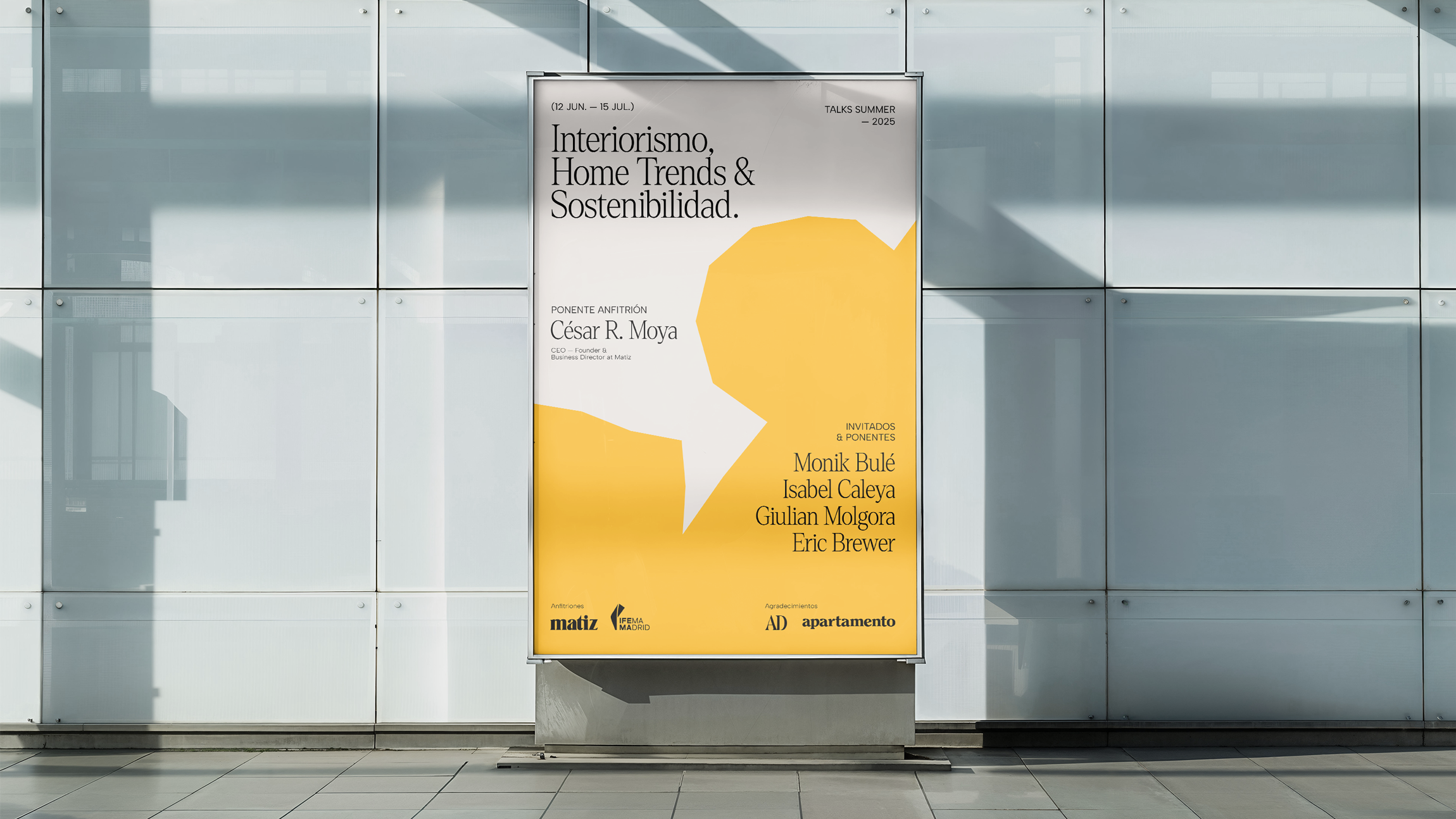
Which of the Identity Systems you designed is your favorite and why?
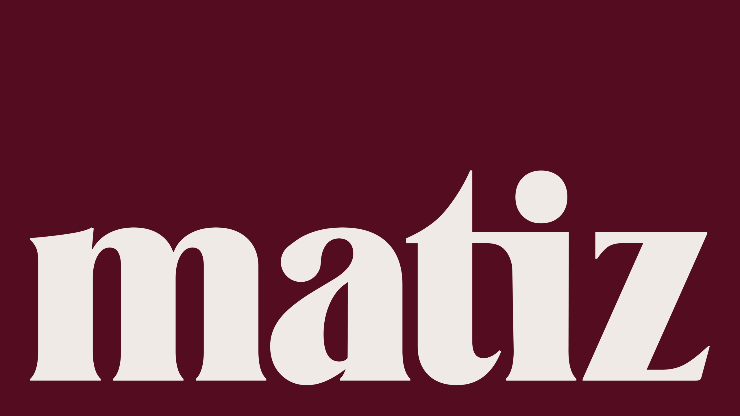
If we had to choose a favorite identity system, we’d say that Matiz represents very well the way we understand brands. As we’ve already mentioned, for us, an identity must always be flexible: rigidity eventually breaks, and a brand needs to adapt and evolve to stay alive.
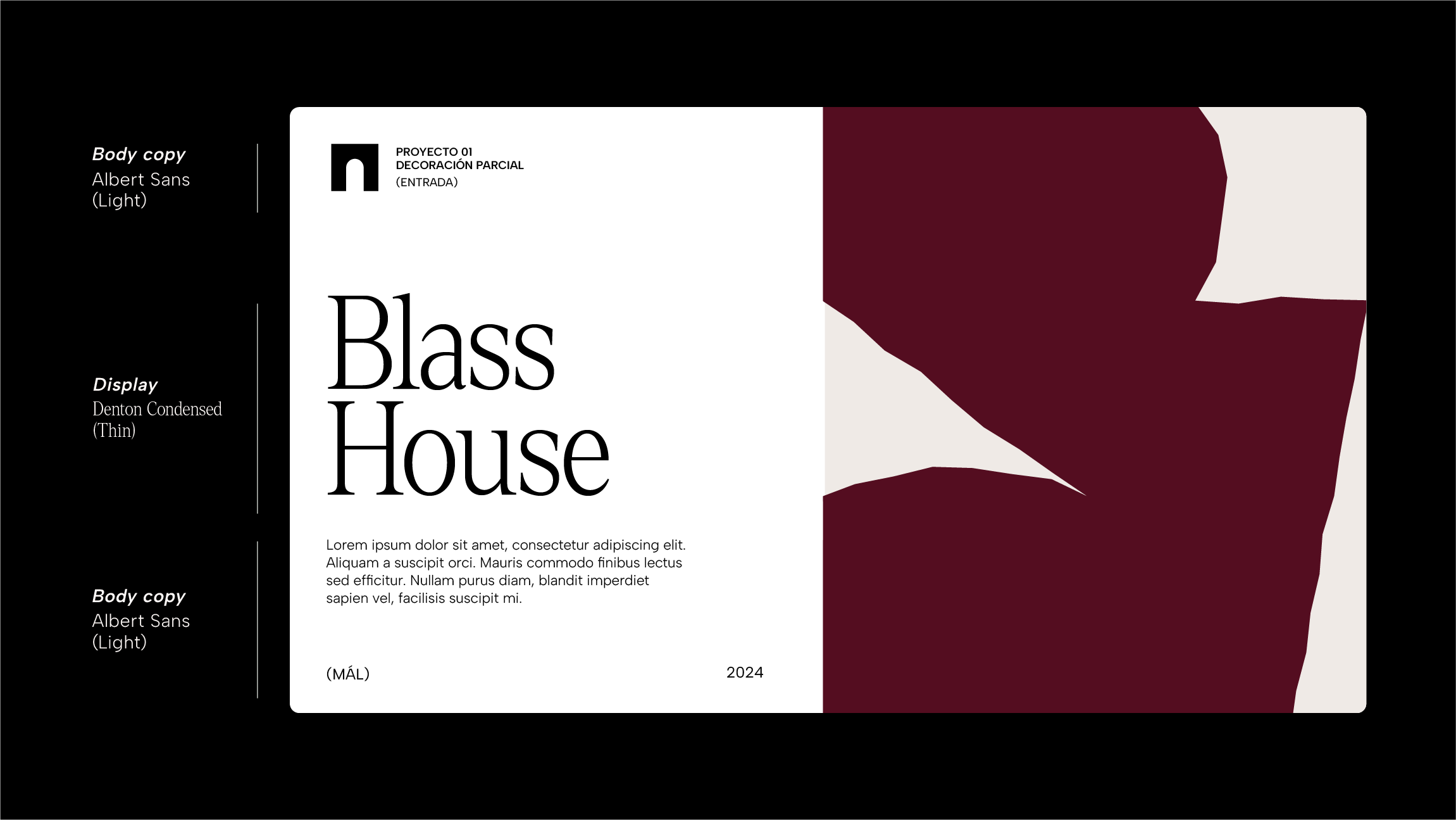
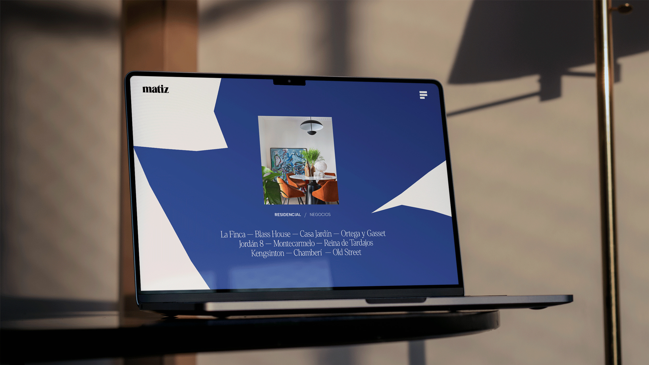
In Matiz, the heart of the visual system is a set of abstract shapes that transform and adapt to each space or format, reflecting the way the interior design studio shapes every project. From this core also comes a distinctive illustrative style, which integrates naturally into the identity. Alongside this, the system is completed with more stable and structured elements, such as the color palette and the set of pictograms, which provide solidity and recognition.
We like to think of a visual identity as a piece of music: for it to sound like something specific, you have to carefully modulate the volume of each channel. Each element of the identity contributes something—reinforcing or complementing certain attributes—to create a unique language. And, like in music, there are moments when some elements resonate more strongly than others. In the same way, depending on the medium, the format, or the purpose of each piece, the tools of the identity rearrange themselves to always project a brand that is defined and coherent.


Can you describe your system with less than ten rules, like if it were a cooking recipe?
Of course, we’d describe it like this:
1. Always start with a neutral background. Soft Ivory is usually our canvas, bringing light and warmth without being a cold white.
2. Add character with Dark Merlot or Indigo Night. If you want a burst of energy, a touch of Honey Gold does the trick.
3. Introduce the abstract shapes: they are the heart of the system and adapt to each space, fitting into the format as if tailor-made.
4. Let those shapes breathe and evolve into a simple illustrative style—slightly imperfect, textured, full of personality.
5. Balance it with the pictograms and the logo: they are the most solid elements of the system, the ones that bring structure and ensure recognition.
6. For typography, use Denton Condensed for headlines and combine it with a geometric sans for body text. This mix provides sophistication and clarity.
7. Add photography that highlights architectural strength, but also moments that feel more human to convey warmth and closeness.
8. Modulate each piece as if it were music: sometimes color plays louder, sometimes shapes, sometimes typography.
9. Step back and check: does the piece taste like Matiz? Is it recognizable even if it doesn’t repeat the same formula?
10. And that’s it: an identity that doesn’t stay rigid but adapts, finding its own form in every context.