León Romero
Established in 2019, LEÓN ROMERO is a Barcelona-based visual communication studio founded by Jorge León and Mikel Romero. The studio approaches projects through creative direction and visual design, delivering bold and functional solutions in both cultural and commercial fields, while seamlessly merging the physical and digital worlds in a cohesive manner. Driven by typographic design, LEÓN ROMERO offers a wide array of services, including visual identity, graphic campaigns, editorial and web design, packaging, and art direction. Maintaining strong relationships with a vibrant network of photographers, illustrators, editors, and copywriters, the studio delivers projects of all sizes. In addition to client work, LEÓN ROMERO conducts personalised workshops at institutions, universities, and festivals, including ELISAVA and IDEP, among others.
LEÓN ROMERO is one of the 46 design studios from 23 countries showcased in the book FVS Atlas, published by Viction:ary and authored and designed by TwoPoints.Net. The book serves as evidence of a shift in how designers worldwide approach brand identity design. While in the last century, the identity design revolved around logos, representing a message, this century is about systems functioning as flexible visual languages. In this series of interviews, the trailblazing designers give insight into their systemic approaches.
Focusing on Flexible Identity Systems as a global phenomenon, I would like to know which places influenced your understanding of systems.
We believe it is our design practice that has given us the most control over flexible identity systems. But it is through observing what surrounds us that we have expanded our understanding—we have realised it goes much further. We can find systems that shape identity behind every object, film, website, building, or book… everywhere there are relationships, rules, decisions. We can see systems everywhere; nothing is conceived in isolation from something else.
Taking into account the increasingly diverse communication needs of projects, we have managed to generate systems quite naturally. We do not set strict frameworks—we simply do it, it is intrinsic.
Which of the Identity Systems you designed is your favorite and why?
We usually say that the project we are working on at the moment is the one we feel most connected to, but we both have a special attachment to the identity we created for Barcelona Design Week 2023. The approach, and the way the identity was alive and constantly changing, made it a project full of nuances, consistent and visually powerful.
The idea came from the number 18 (the edition number and the new Sustainable Development Goal proposed for the SDGs). From there we developed an iconic, dynamic and transgressive image to achieve a more organic and humanist approach through technology. We reached the solution with different treatments and processes using generative language tools (not AI). The result was endless possibilities that kept the identity open.

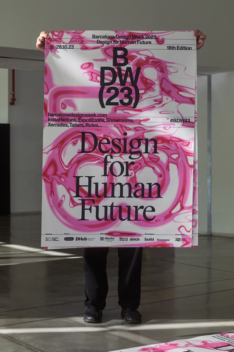

Can you describe your system with less than ten rules, like if it were a cooking recipe?
- Choose the format of the piece according to the communication needs.
- Place the number 18 on the artboard using the campaign’s sans serif typeface.
- Apply the edition’s magenta colour, corresponding to the campaign identity.
- Explore different possibilities in After Effects: add superimposed layers of other videos with natural and organic textures (selected from the pre-curated footage), experiment with finishes, and adjust the parameters of the pre-defined filters to achieve the outcome that best fits the creative direction. Produce several video pieces featuring the 18 in motion together with the interacting textures.
- For the print version, export a range of high-quality stills from the videos.
- Arrange and frame the images within the chosen format. Position the number 18 centrally, at a large scale so that it occupies almost the entire space. Carry out several tests and select the most suitable option from the generated stills.
- Finally, add the typographic layer with its text hierarchies and supporting lines to structure the secondary information. Ensure that all text remains legible and is not compromised by the background textures.