Eager Zhang

Eager Zhang (she/they) is a visual artist and graphic designer. Being brought up as multi-lingual and trained with coding tools in college, she explores the territory of reading behavior, language issues, and poetry writing, and expands her practice into printmaking, editorial design, and web architecture. In 2021, she started OmensOmens Lab, a studio + agency that provides integrated design solutions for client-based projects.
IdN Magazine featured Zhang’s recent works, It’s Nice That, Communication Arts, Creative Review, Tokyo TDC, etc; She recently hosted talks and workshops at AICAD Symposium, Inscript Festival, Roski School of Art and Design at University of Southern California, etc; She has been commissioned with design projects by AIGA, GQ Japan, Crack Magazine and Kaya Press, or grant / exhibition based projects with Rhizome and Kansas City Artists Coalition. Zhang received the New Artist Award by PRINT Magazine in 2024, and now serves on the board of the Society of Typographic Arts (STA). As a design educator, Zhang now serves as Assistant Professor at Otis College of Art and Design, as well as Director of the Graphic Design MFA Program.
Eager Zhang is one of the 46 designers from 23 countries showcased in the book FVS Atlas, published by Viction:ary and authored and designed by TwoPoints.Net. The book serves as evidence of a shift in how designers worldwide approach brand identity design. While in the last century, the identity design revolved around logos, representing a message, this century is about systems functioning as flexible visual languages. In this series of interviews, the trailblazing designers give insight into their systemic approaches.
Focusing on Flexible Identity Systems as a global phenomenon, I would like to know which places influenced your understanding of systems.
A graphic designer is the planner of forms, and forms in flexible identity systems nowadays take their shape through emerging technologies. In my practice today, creating a new flexible identity system isn’t just about inventing another set of visual forms; it is about inventing a new workflow, or new tools, every single time, from creating a series of outcomes to designing a “machine” that can consistently produce new visual assets, from designer to programmer. I work with creative coding a lot. The generative nature of coding really empowered my ideation towards client projects. To explain how a non-static, dynamic identity system generated by coding tools isn’t always easy, but I do feel that many clients are more and more into this type of practice (and aesthetics, that’s also ok), and they are willing to trust your judgement at the beginning stage.
Another change in my practice is that I tried less and less thinking directly from the typographic grid system, and instead, I started to adapt more organic shapes and invent new rules that don’t rely solely on mathematical lines and numbers of picas. I do think designers need to be well-trained with the grid system, but, at a certain point of life-long creative practice, you have to notice the limitation (Euro-centric, dominating, sometimes makes people lazy) of the grid system, and try to break from inside.
Which of the Identity Systems you designed is your favorite and why?
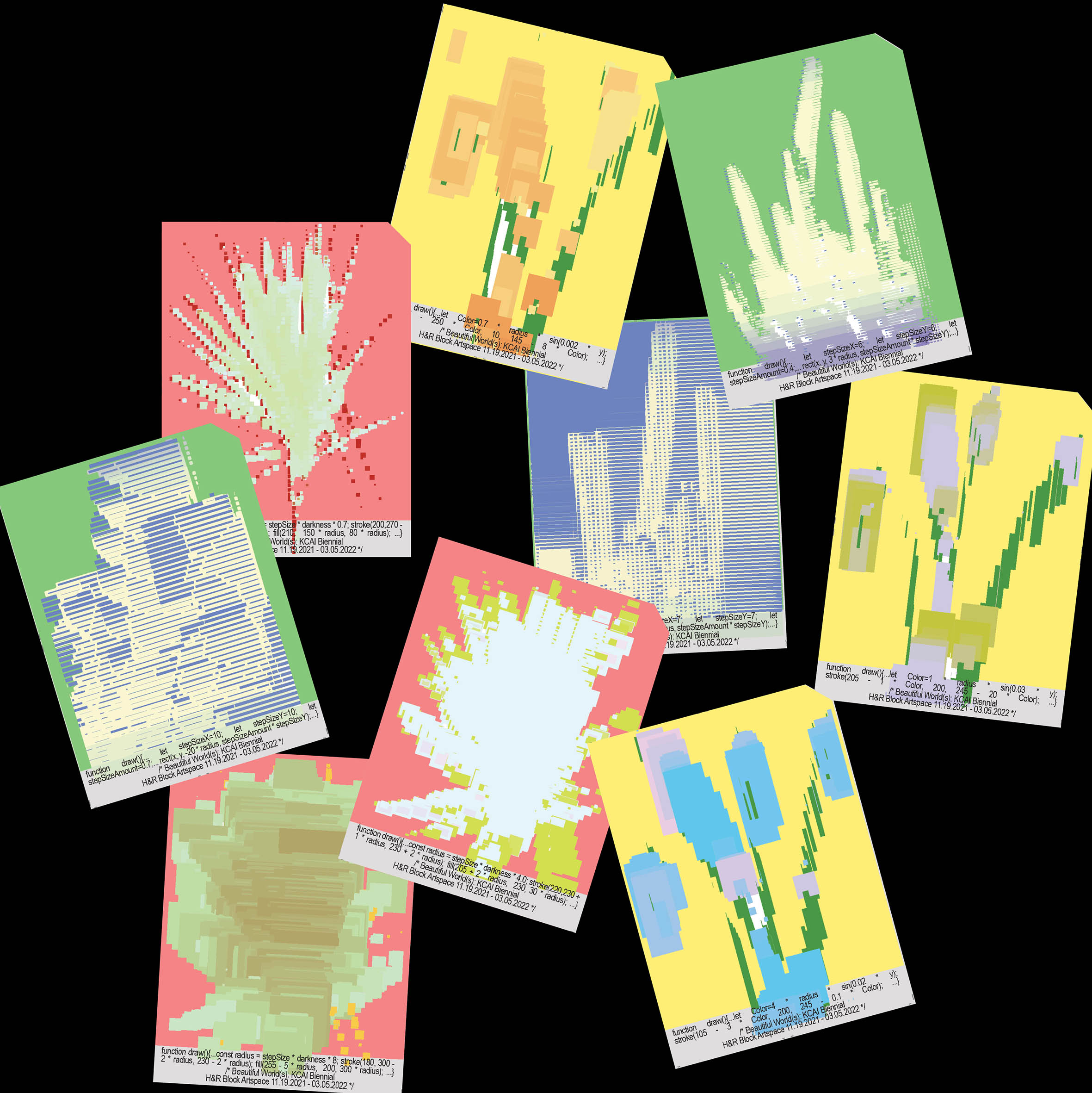
My favourite identity system project was the exhibition identity I created for Kansas City Art Institute (KCAI) ‘s Biennial Show in 2021. Previously, I created assets for a system simply through Adobe Suites, but when I first got this commission from KCAI, I wanted to try something different. As the exhibition theme “Beautiful World(s)” indicates, we are looking at the landscape around us, but in a special moment when the pandemic was still there, we were still under the great quarantine and isolated from nature. The altered aesthetics of “nature” gave me the courage to use code to re-display the plant imagery.
The true fun part happened when I completed the “pixel filter” program and started tweaking around the parameters in the code, and suddenly, the moving image of plants started to change color and appearance; it almost felt like a seasonal change. All the slices of code rendering variations become the assets of the system, and of course, I can make an infinite number of them. We start to print these coded patterns onto small posters inside the big poster, held together by perforated paper. It became so popular among students that after 3 days of launching, all the small posters were gone, and they ran around different locations to collect them. Whoo!


Can you describe your system with less than ten rules, like if it were a cooking recipe?
1. Create a “camera filter” through p5.js. The filter should have parameters such as re-coloring options for the target video.
2. Found three plants in pots and took a video of them moving or rotating, in front of a white wall.
3. Import the video into the filter program. Some testing of the size… It worked!
4. Start to tweak with as many parameters as you can, from the code. Every time I did something and it looked cool, I exported a version.
5. Now I have a stack of assets. Then, it’s a rather simple workflow to create printed components. I used Arial Narrow to display the information in a neutral manner. I think it won’t distract the viewer from the graphics too much.
6. Create different components based on the size I’ll need; pulling assets from the library I just built; generate more if needed!
THANK YOU!!!
Learning resources about p5.js:
The Coding Train:
https://thecodingtrain.com
OpenProcessing:
https://openprocessing.org
Tim Rodenbröker Creative Coding:
https://timrodenbroeker.de/category/tutorial/