Appelle moi Papa
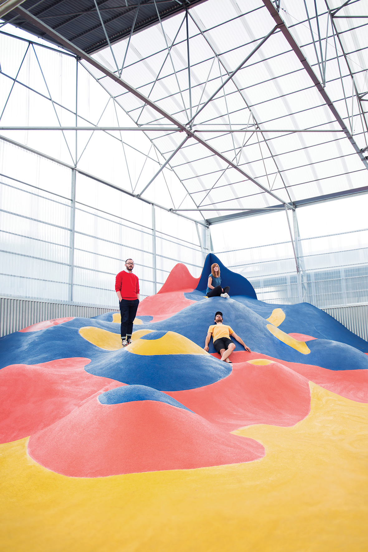
Appelle moi Papa is a graphic design studio based in Nantes, France. They have been operating since 2010 and currently consist of three graphic designers: Lucie, Jonathan, and Tom. They create graphic objects in various forms, such as visual identities, communication materials, publications, and signage. From the outset, they adopted a collaborative approach, integrating applied arts with artistic research. That’s why, alongside commissioned work, the trio also organizes exhibitions that allow them to question their practice and explore different media such as screen printing, glassblowing, or woodworking. Aesthetically, they enjoy challenging graphic codes and tools—color, typography, imagery, and composition—to find solutions that are both minimal and impactful. Since 2013, their offices have been located at La Bonneterie, a co-working space they created, which now hosts other creative and entrepreneurial talents.
Appelle moi Papa is one of the 46 studios from 23 countries showcased in the book FVS Atlas, published by Viction:ary and authored and designed by TwoPoints.Net. The book serves as evidence of a shift in how designers worldwide approach brand identity design. While in the last century, the identity design revolved around logos, representing a message, this century is about systems functioning as flexible visual languages. In this series of interviews, the trailblazing designers give insight into their systemic approaches.
Focusing on Flexible Identity Systems as a global phenomenon, I would like to know which places influenced your understanding of systems.
I’m not sure that, by the end of our studies, we had truly grasped the idea of an identity system. We created our studio very shortly after that time. We were innocent but ambitious, driven mainly by a strong desire to produce images.
It was ultimately through experimenting and responding to communication challenges that this notion naturally became part of our practice. Now, of course, it seems perfectly logical: every project is built on specific, identity-driven graphic codes that we can play with. That, for us, is really the heart of the profession—playing with imagery, typography, colors, composition… and constantly questioning these meaningful tools, choosing them, confronting them. An exercise that may appear simple but actually demands extensive research.
Every graphic project is therefore a system in itself, but depending on its scale, it necessarily unfolds differently. When all you need is a logo and a business card, the playing field is smaller. When you have to develop a project that spans from a logo to Instagram posts, including a series of posters, signage, and more, you need to establish a framework that is both solid and coherent, yet flexible enough to allow diversity. It’s a subtle and fascinating balance to strike—one that enables the expression of what a brand, a cultural event, or a company truly is.
Which of the Identity Systems you designed is your favorite and why?
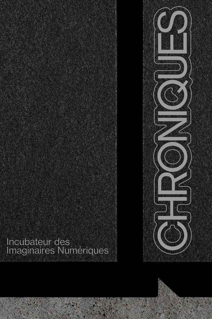
Chroniques
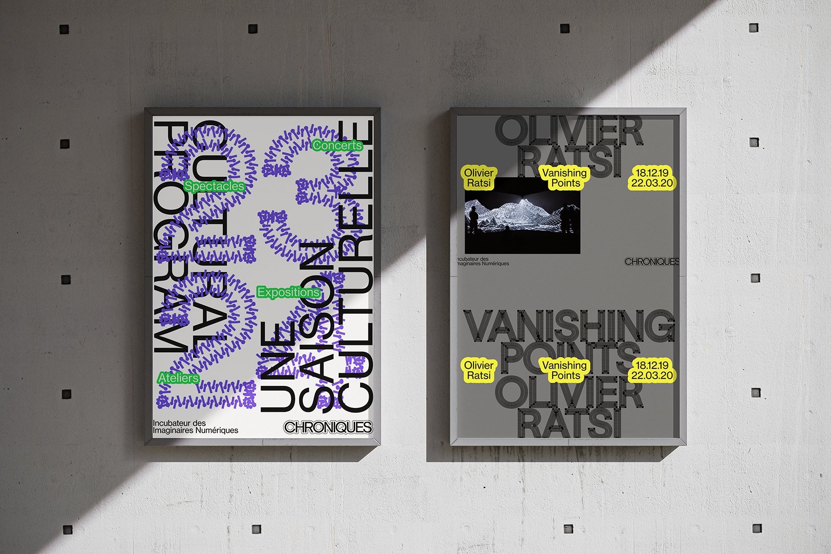
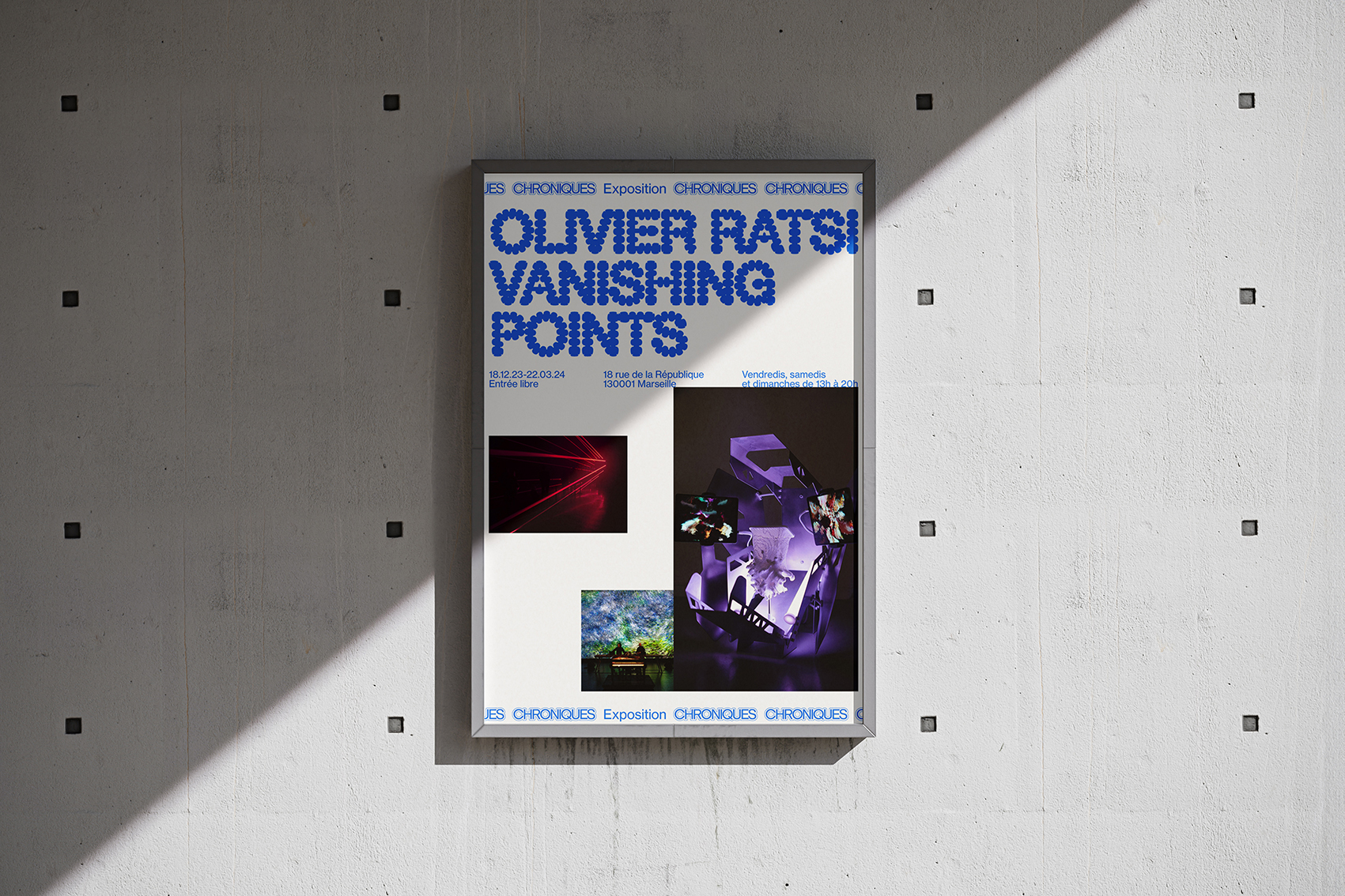
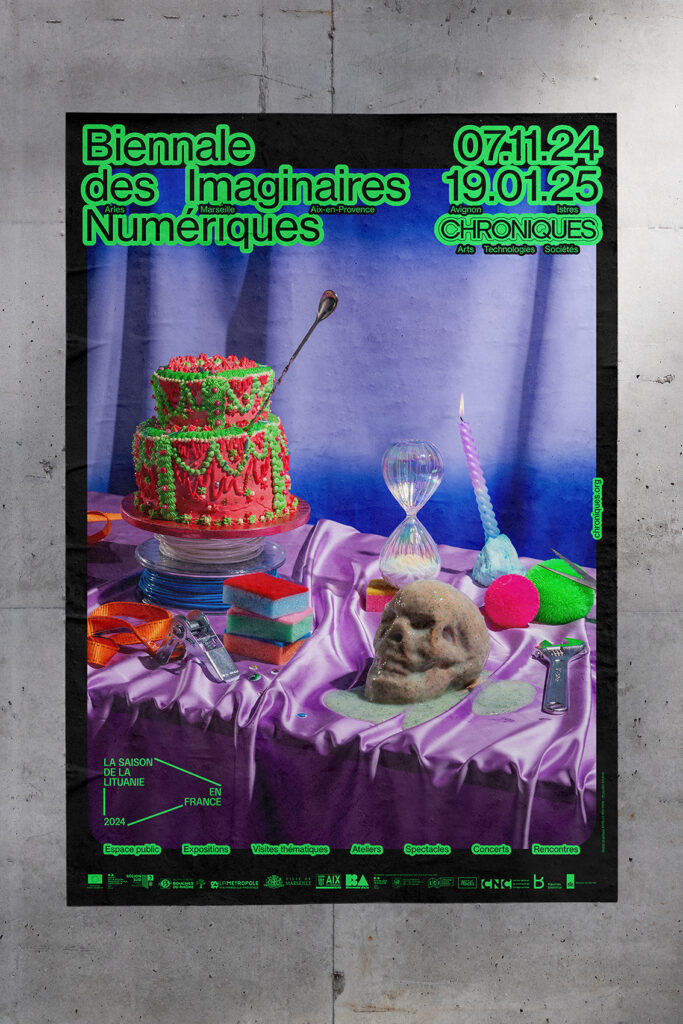
Based in Marseille and Aix-en-Provence, Chronques is a platform dedicated to the production and presentation of digital arts. Founded in 1998, it now hosts exhibitions, talks, performances, concerts, and workshops, and every two years organizes the Biennale des Imaginaires Numériques. This wealth of activity was the starting point for their new visual identity. Their existing tools felt outdated and disconnected from the contemporary nature of their work—so the redesign was essentially a fresh start.
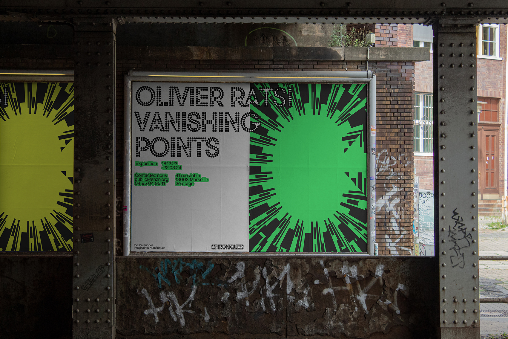
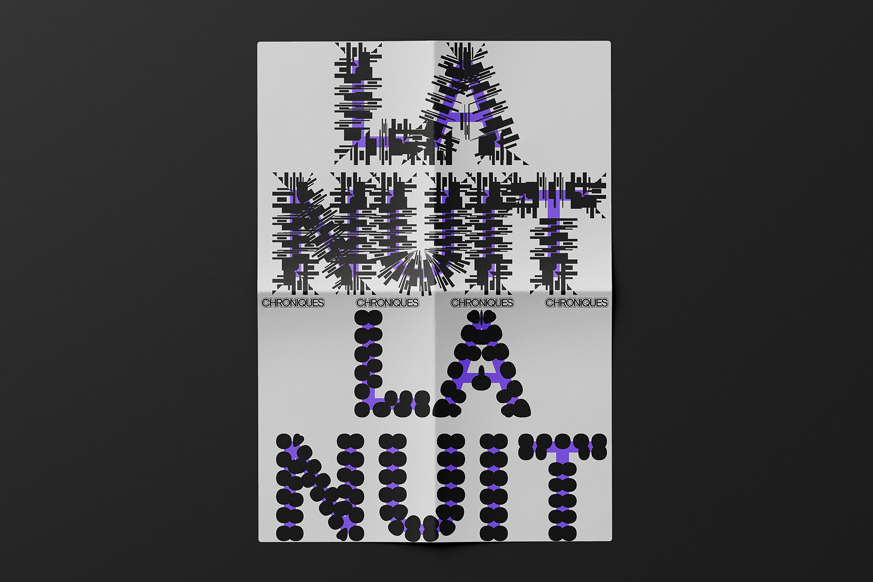
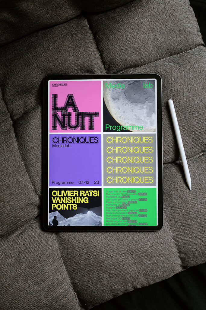
Our goal was to visually capture the aesthetics of digital culture: software interfaces, glitches, pop-ups, website buttons, screen colors, layers of information… but reinterpreted through our lens as graphic designers with a strong attachment to print.
The challenge was to build a robust visual system that could adapt across many formats. The solution is a modular identity: simple in its core structure and typographic choices, yet flexible enough to generate variety. Within this recognizable framework, freedom comes through in fluid, ever-changing typographic outlines that give the project its distinctive voice, paired with a vivid, acidic color palette that brings energy and


Can you describe your system with less than ten rules, like if it were a cooking recipe?
1. For the background color, choose from the five core brand colors, or any shade between pure white and solid black.
2. It’s not the most exciting part, but start by placing the fixed elements: the Chroniques logo, the subcategory, the partner logos line… Don’t worry, templates are provided to make alignment easy.
3. Now for the fun part: the title. Create a unique, illustrative outline starting from Neue Haas Grotesk. Does the project suggest something geometric? Organic? Hand-drawn? Think carefully about the form—it will be the key visual hook of the design.
4. Including photography isn’t required, but it’s an option. Is there a single image? Several? How should they be arranged within the grid? Do we keep them in full color or convert them to monochrome? Being a designer means making choices!
5. Secondary information will inevitably need to be laid out. Place it cleanly to structure the design, following the column grid. Should it stay as is, or be highlighted with an outline to give it more weight?
6. Let’s take a step back. Is the result impactful enough? Balanced? Does the information hierarchy make sense? Maybe there are too many colors—favor a duo (a bright color + black, gray, or white).
7. And there we go—time to feel good about the work accomplished 🙂