40 Mustaqel
40 MUSTAQEL is an independent design studio based in Cairo, Egypt, founded by Nada Hesham, who also leads as Chief Creative Officer, alongside Mina Maurice, Creative Director at the studio. The studio is driven by a purpose to contribute to the ongoing conversations around graphic design in the SWANA region. It is committed to exploring themes of culture and identity, with a focus on dissecting the complexity of diverse Arab visual languages. Through its design practice and its independent publishing endeavour, ISDAR Mustaqel, it seeks to contribute to the development of a design discourse that engages dialogue among communities on the margins of Western-centric design practices.
40 MUSTAQEL is one of the 46 design studios from 23 countries showcased in the book FVS Atlas, published by Viction:ary and authored and designed by TwoPoints.Net. The book serves as evidence of a shift in how designers worldwide approach brand identity design. While in the last century, the identity design revolved around logos, representing a message, this century is about systems functioning as flexible visual languages. In this series of interviews, the trailblazing designers give insight into their systemic approaches.
Focusing on Flexible Identity Systems as a global phenomenon, I would like to know which places influenced your understanding of systems.
We think there’s been a real shift away from centering logos or marks as the main or only marker of an entity, whether that’s a brand, a person, or even a movement. This shift allowed for a more fluid and versatile approach towards what we like to call “visual expressions”. Flexible systems sit right at the heart of that because they are built on versatile elements such as color schemes, typography, art direction, and graphical motifs but extends further to language and sound among various possibilities that can help define and weave a cohesive and identifiable brand experience without being overly restrictive.
Flexible systems feel like a natural response to the number of surfaces a brand has to exist on now. A magazine isn’t just a printed object anymore; it has to be a website, a reel, a holding screen, maybe even merchandise. A lifestyle brand has to live digitally and physically, and it has to understand its own personality beyond one single graphic element and live within new platforms, trends, and audience expectations. The trick of a good flexible visual system is that it sustains a dynamic framework developed with the future unpredictability of visual environments in mind. It is exciting and terrifying at the same time to trust the process in orchestrating a system that works in the absence of the safety net of a single logo.
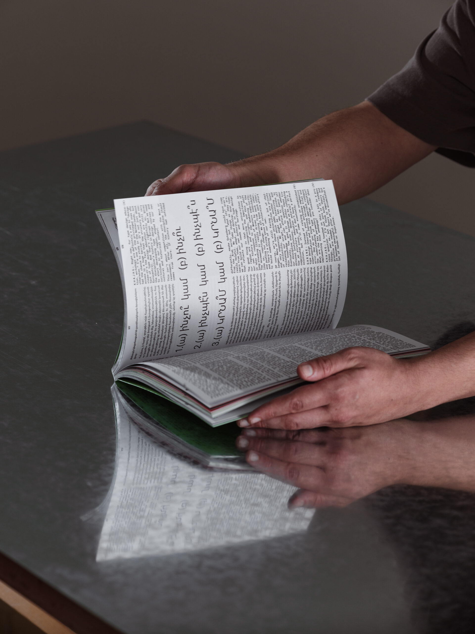
Our understanding of Flexible Systems can be heavily tied to the nature of work the studio produces. Designing for bilingual audiences has made us deeply aware of this need for flexibility. Arabic and Latin scripts each carry their own cultural weight and stylistic rules, and when you force one to mimic the other, it usually ends in awkward compromises. A strong identity system has to honor those differences while still maintaining cohesiveness so both languages and audiences can still recognize themselves in the brand. Another thing that shaped our understanding of Flexible Systems is the nature of our work in ephemera; posters for events, exhibitions, binnieals…etc. Because these identities are not necessarily meant to be “timeless”, we started questioning the hyperfixation on “timeless” brands altogether. We believe that it is a consumerist lens to deem the passage of time as a flaw. Streamlining production using one mark or logo can also be traced to the height of consumerism. Before that, large entities often operated without rigid systems. A department store’s signage might feature one lettering style, while its bags or wrapping paper displayed another, perhaps just a color or a pattern. Yet all of these pieces still belonged recognizably to the same place. Identity lived in fragments, atmospheres, and associations rather than in a monolithic framework which is how we work with Flexible Systems.
Which of the Identity Systems you designed is your favorite and why?
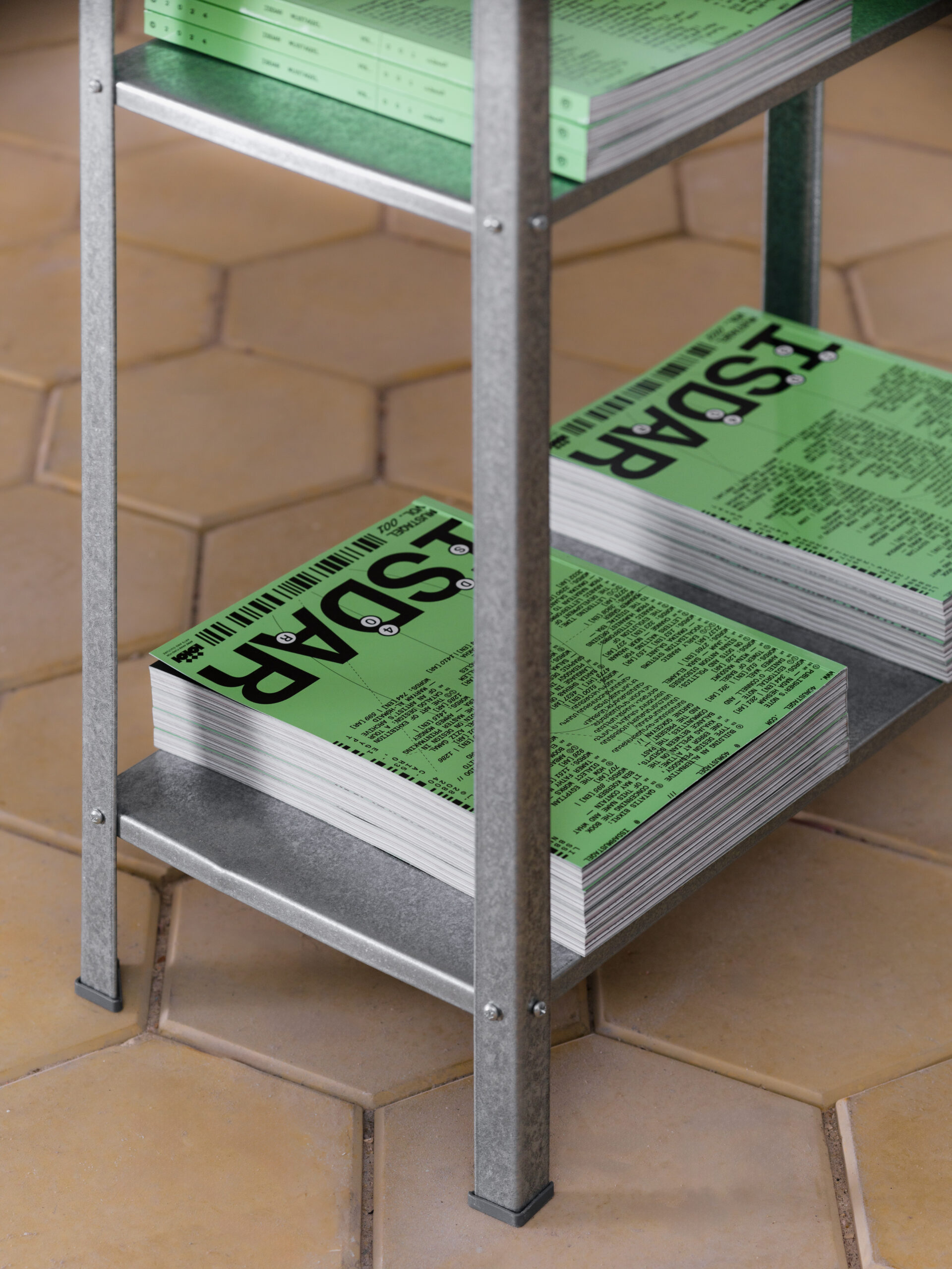
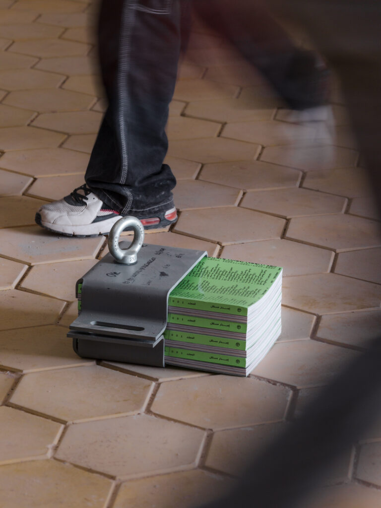
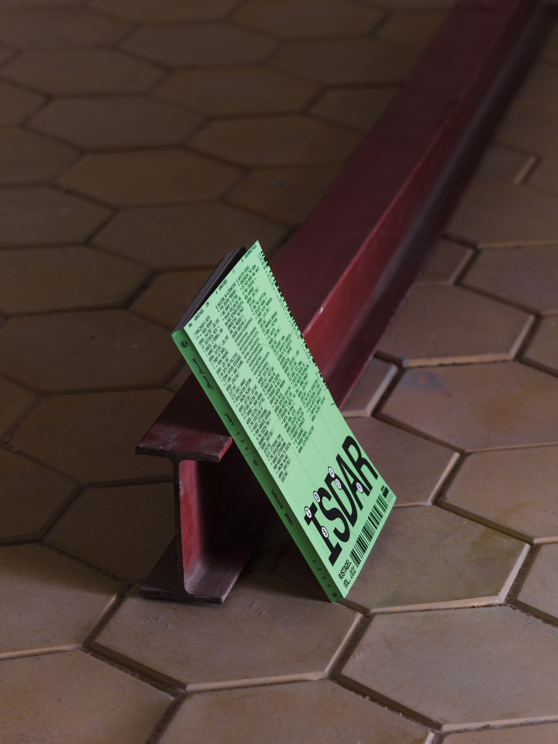
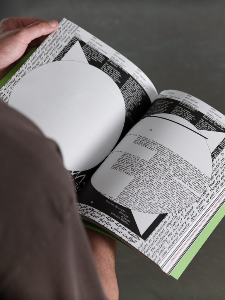
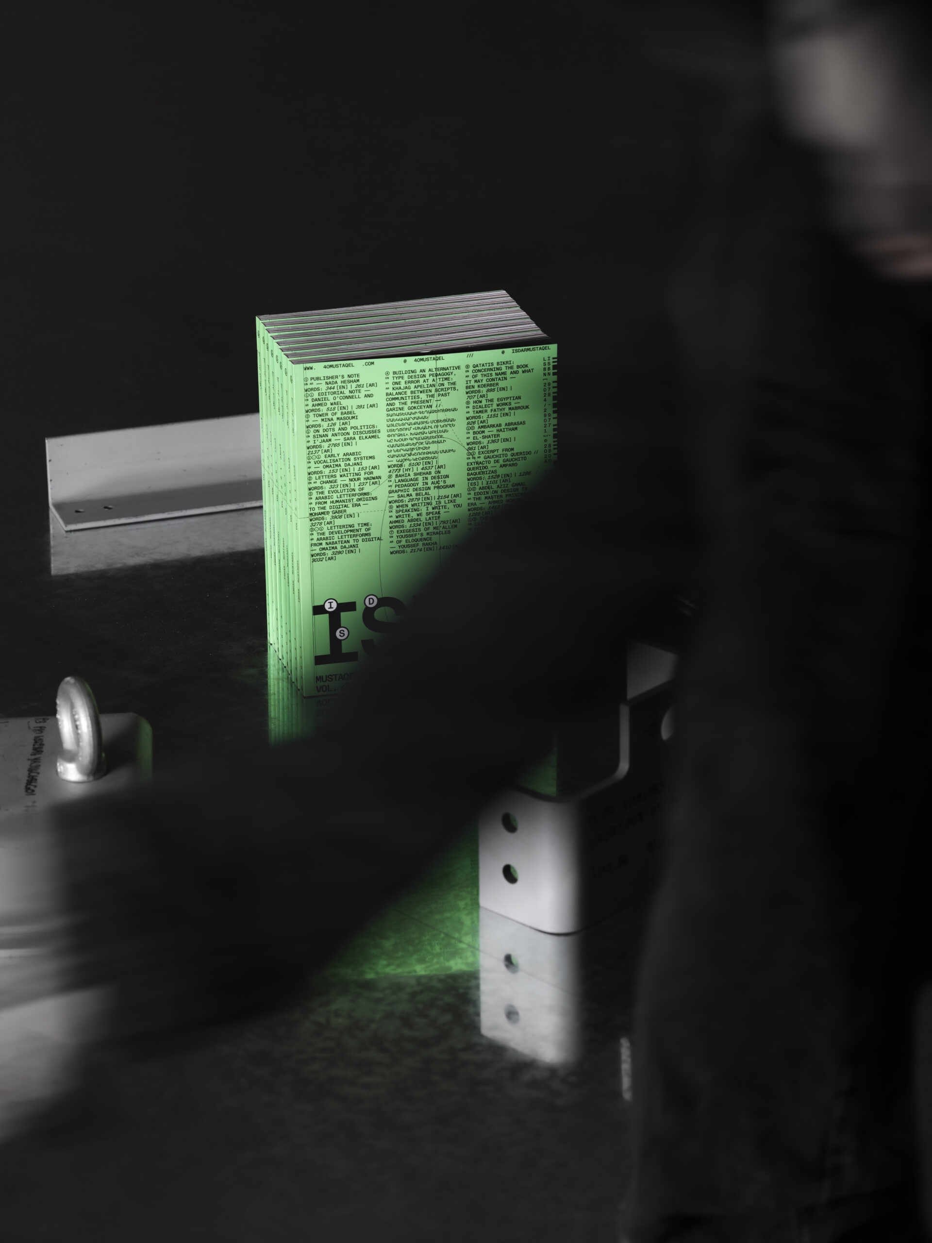
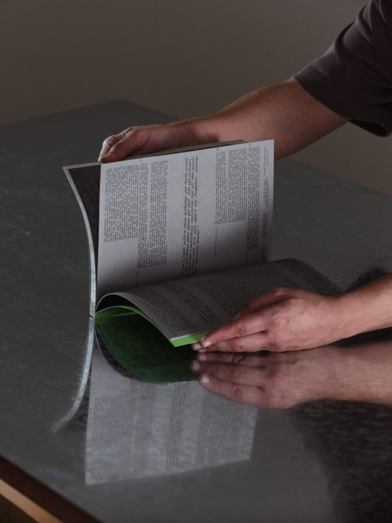
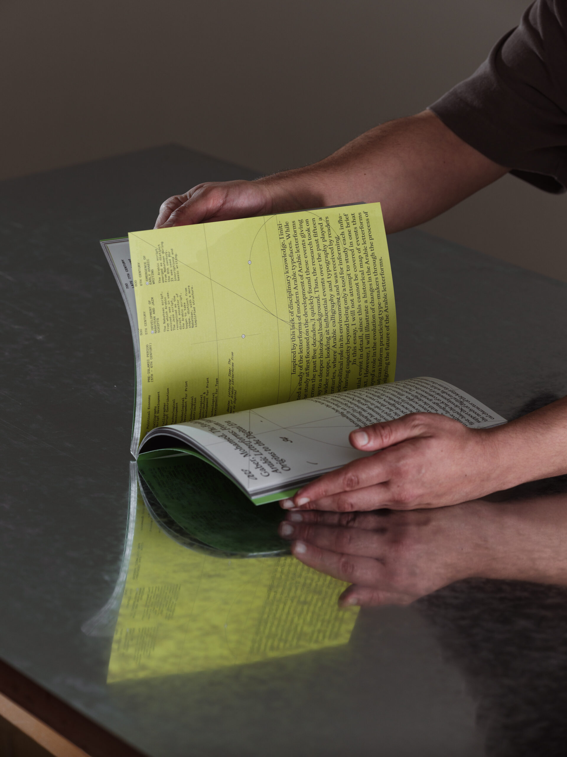
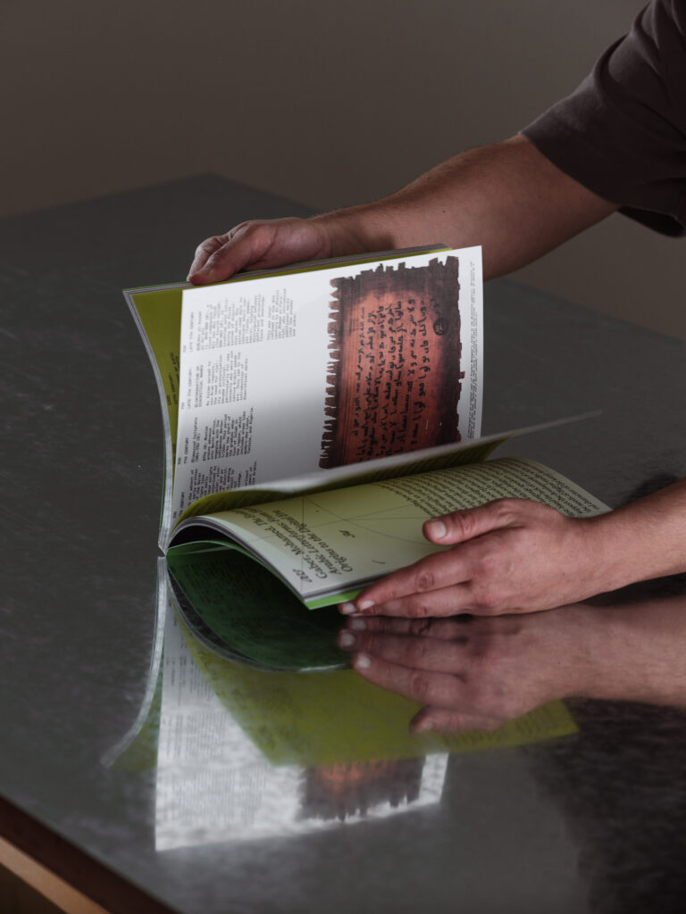
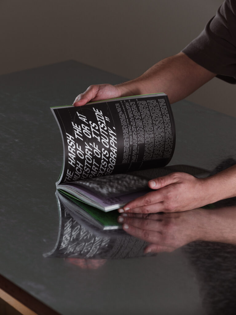
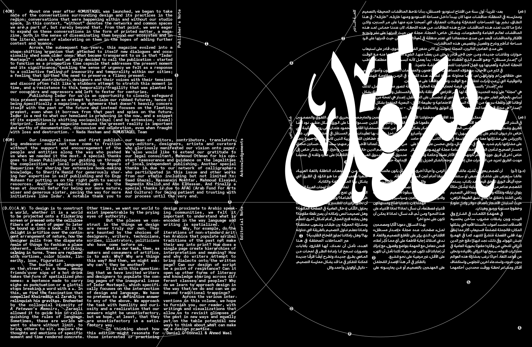
Our favourite identity system has to be the one designed for the inaugural issue of ISDAR MUSTAQEL, an Arabic–English publication exploring the relationship between design and language. A unique challenge to self-publish a magazine as an extension of the studio’s visual system. This challenge raised a lot of questions about our own visual expression within the studio and the ways it can carry through to the magazine. Early on, we made the realization that what holds everything together is not a single fixed mark, but rather a cohesive approach to typography and layout and a consistent sensibility. This gives us a recognizable voice without relying too much on a logo or icon. That thinking culminated in the design of our publication ISDAR MUSTAQEL, which features design writing from and about the region. In it, we distilled the elements that make our brand recognizable: the interplay of long Latin text runs with calligraphic Arabic writing, the use of typographic characters within circular shapes referencing the 40 motif, geometric compositions and the contrast of scale and rhythm. We re-composed these ingredients in new ways, not even bound to the same typefaces or proportions, and yet the result still felt unmistakably ours.
The typographic palette of ISDAR is one of its main heroes. From the get go we knew we wanted a very comprehensive palette to work with as an arsenal of sorts that we can depend on to create an expressive and very strong visual impression. Part of the thought process was also to cater to the diversity and the unexpectancy in the visuals we received from different contributors and writers, our typographic palette worked as a base and a ground that can hold some stability whether we are supplemented with very strong visuals to pair with articles or in some cases none at all. The generosity of typeface choices was also a response to the diverse formats of the contributions which needed to be highlighted somehow, the magazine has essays, timelines, interviews, commentaries..etc. and we used type as a tool to play around with each format and present it differently.
The shape system that is often spotted throughout the magazine is a nod to our own branding at 40MUSTAQEL that features these shapes heavily in our posters, website, etc. The rationale behind these, when working on our studio branding back in 2020, was inspired by the mizan of the Arabic script, which directly translates to the “scale” that Arabic calligraphy is often built on, a process that is often hidden and erased once a calligraphy piece is done, like a wireframe that is no longer needed. However, there was something that spoke to us as we put a lot of emphasis on our process and the journey before the end product so we decided to feature these wireframes and we wanted to bring some of 40MUSTAQEL’s essence along the way with us to ISDAR as its first publishing endeavor.

Can you describe your system with less than ten rules, like if it were a cooking recipe?
- Build your blocks with long text runs.
- Weave in hyper stylized Arabic calligraphic pieces.
- Prepare a large arsenal of typefaces, you’ll need it.
- Tie everything together with an ongoing graphical motif.
- Don’t be afraid of interacting with marginalia served as commentary, annotations, and alternative readings.
- Layering, layering and more layering. Multi-author compositions are key.
- Don’t try to match scripts, each script has its system. Wear a different hat when dealing with each.
- It is okay if the reader takes some time on each page, words are not only tools for reading, they are often elements of expression.