SMLXL
Based between New York and Barcelona, SMLXL is a full-service design studio whose work spans scales, disciplines, and audiences. From crafting large-scale visual identity systems for international sports events to shaping the intimate atmosphere of a small independent bookstore, their projects consistently push the boundaries of contemporary visual culture. Their portfolio ranges from designing covers for The New York Times Magazine to developing Seth Rogen’s Houseplant home goods packaging line—each project reflecting a balance of strategic thinking and creative intuition. At the core of SMLXL’s process lies a deep commitment to research and context. Yet, beyond logic and strategy, the studio embraces the power of play, instinct, and wonder—qualities that give their work its distinctive emotional resonance. In this interview, we explore how SMLXL navigates between reason and intuition to create design that is both meaningful and memorable.
SMLXL is one of the 46 design studios from 23 countries showcased in the book FVS Atlas, published by Viction:ary and authored and designed by TwoPoints.Net. The book serves as evidence of a shift in how designers worldwide approach brand identity design. While in the last century, the identity design revolved around logos, representing a message, this century is about systems functioning as flexible visual languages. In this series of interviews, the trailblazing designers give insight into their systemic approaches.
Focusing on Flexible Identity Systems as a global phenomenon, I would like to know which places influenced your understanding of systems.
For me, and perhaps many in our generation, there’s no understanding of identity as just a logotype repeated over and over. Growing up exposed to multiple formats, we saw early on not just the need but the opportunity to explore how a brand could express itself in different ways, instead of being confined to a single form of adaptation.
As media and tools have multiplied, so have the demands placed on brands. This is where flexible systems become essential. The most successful brands, in our view, are the ones that have achieved so in ways that feel unique to the medium, rather than just a byproduct of it.
Which of the Identity Systems you designed is your favorite and why?
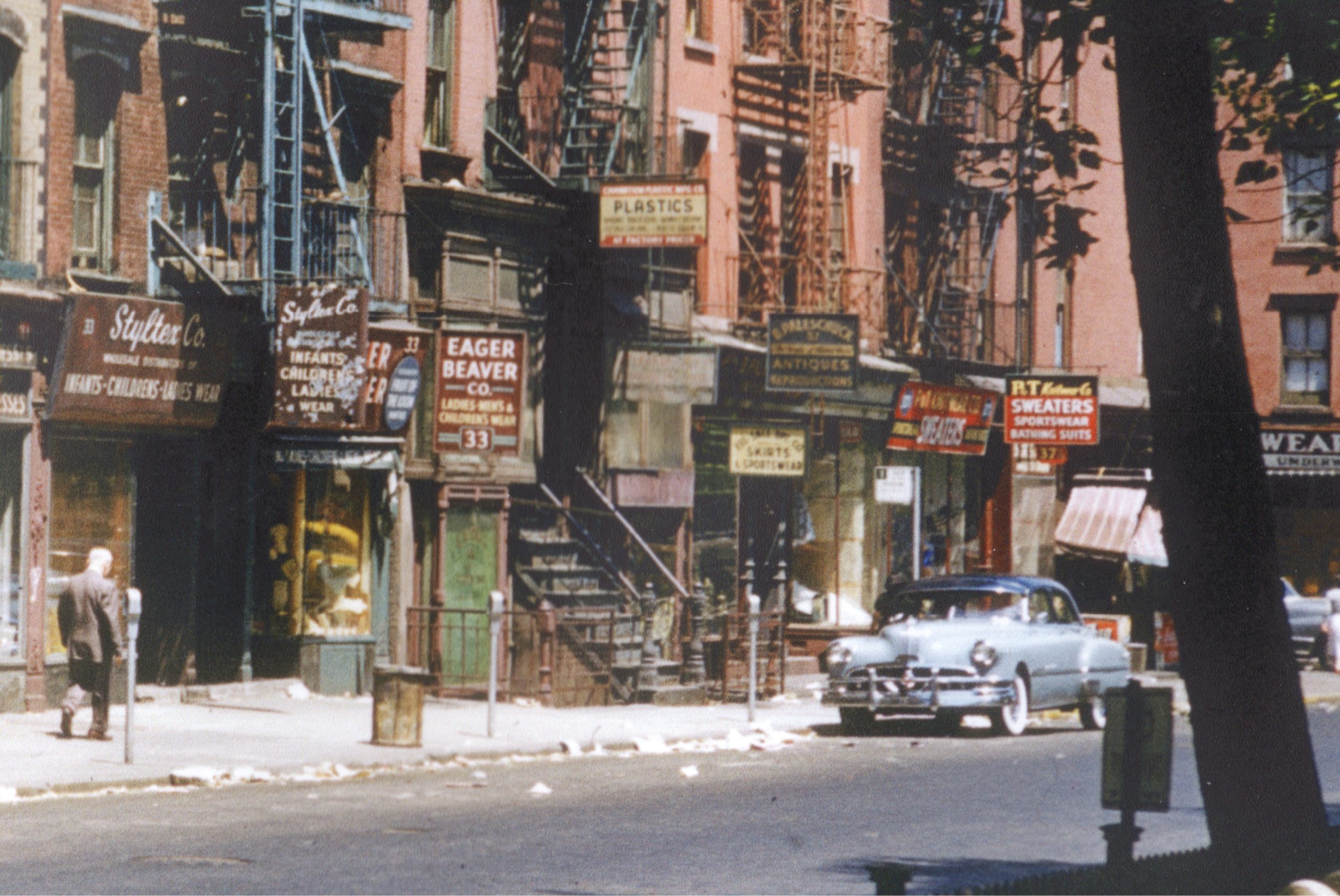
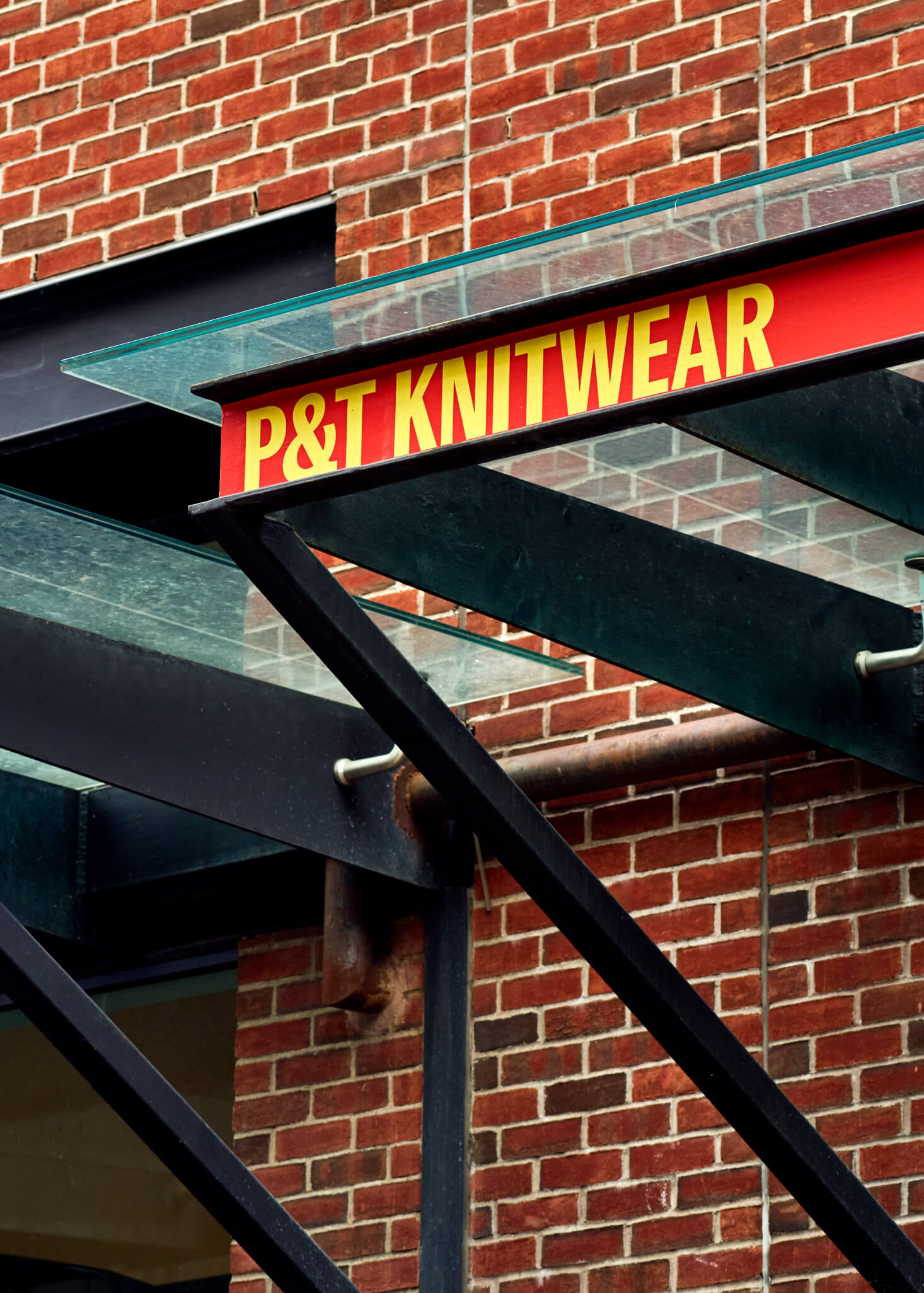
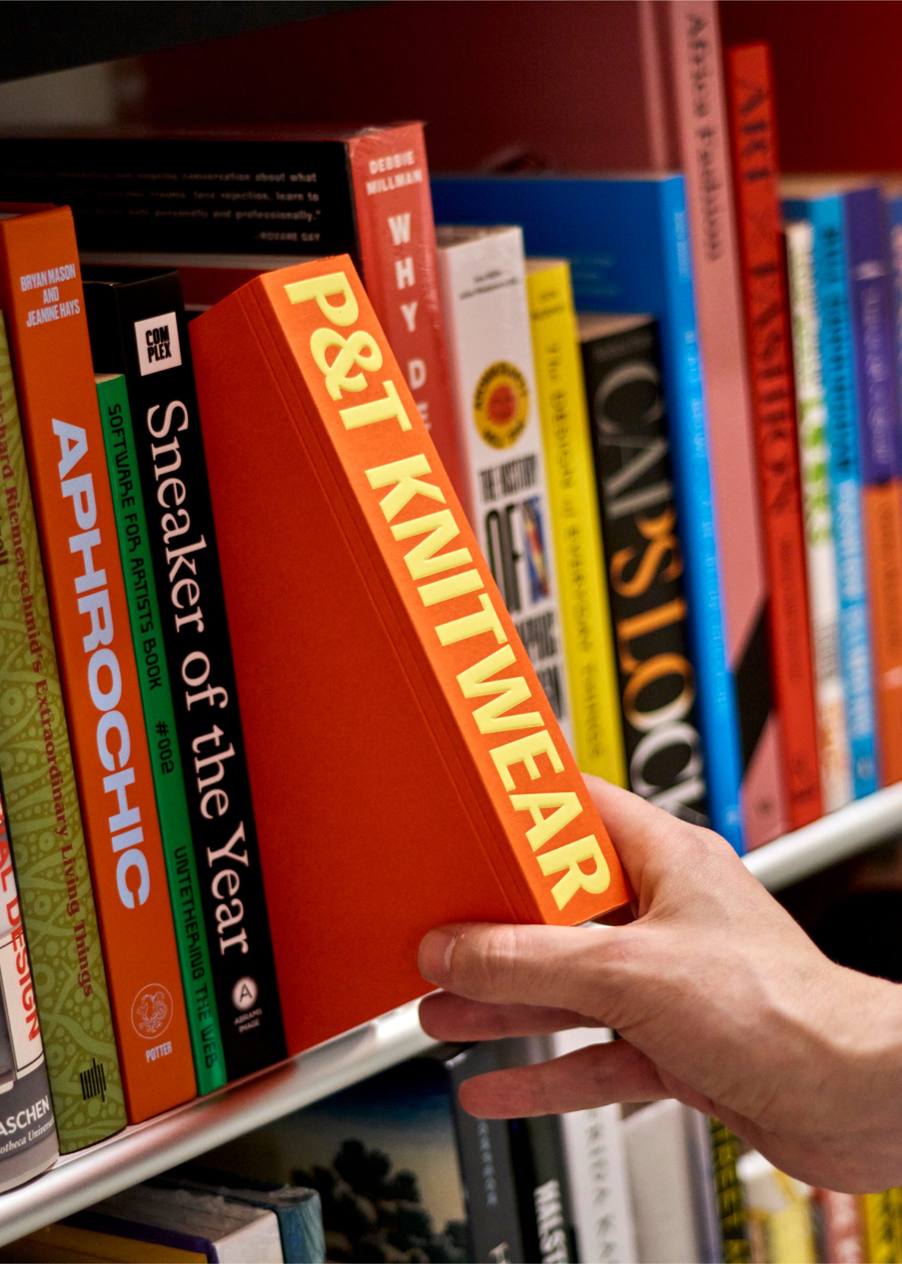
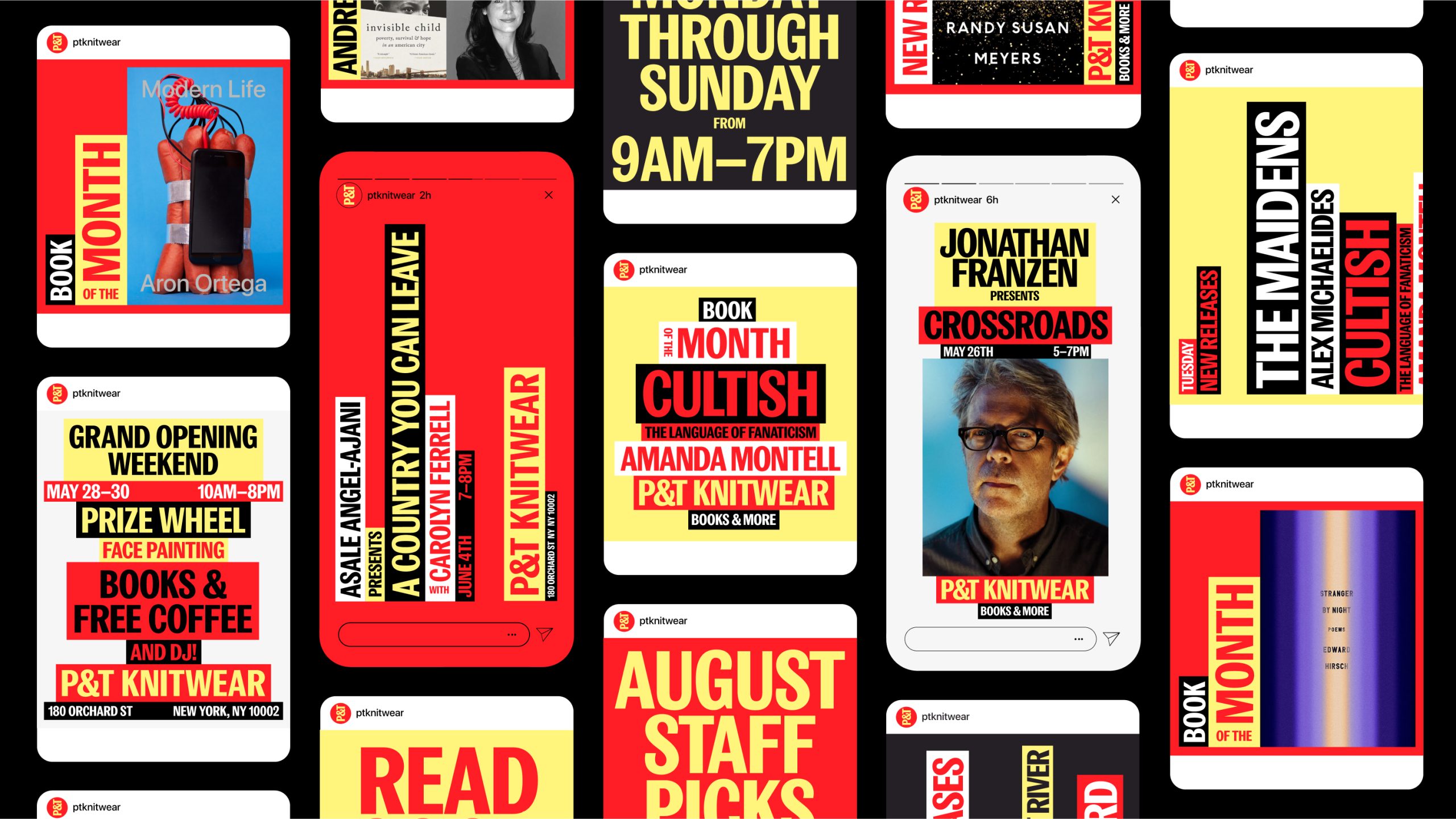
I think a good project that exemplifies this flexibility and need to adapt to new mediums is the identity we did for P&T Knitwear, a family-owned independent bookstore, podcast studio, event space, and cafe on Manhattan’s Lower East Side. Named after the family business established in the same neighborhood 70 years ago, the commission required taking its old sign as a starting point.
I think this example is a strong case that shows how context has shifted the needs of brands, and how, what in the past was just a “hey here goes a sign that says I sell sweaters, sportswear and bathing suits”, now requires more than just a sign (or a logo). This I think should be taken lightly, since I think there’s a lot of value too in just having a sign for your business. At the end it all comes down to what the communicative needs of the business are.
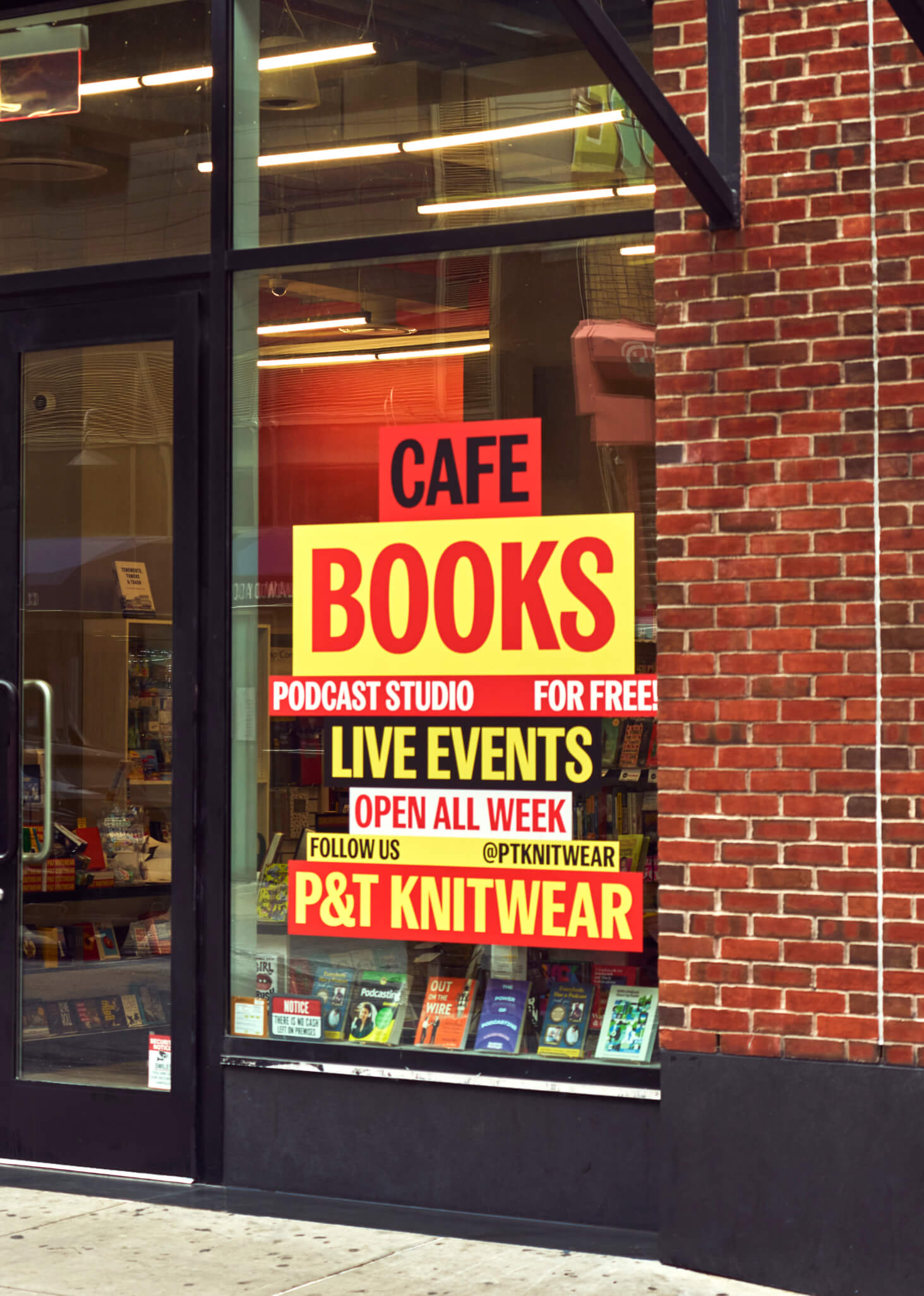
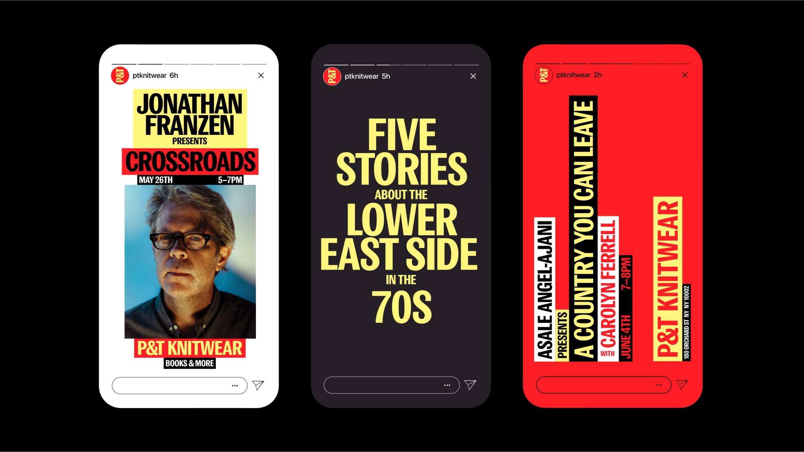
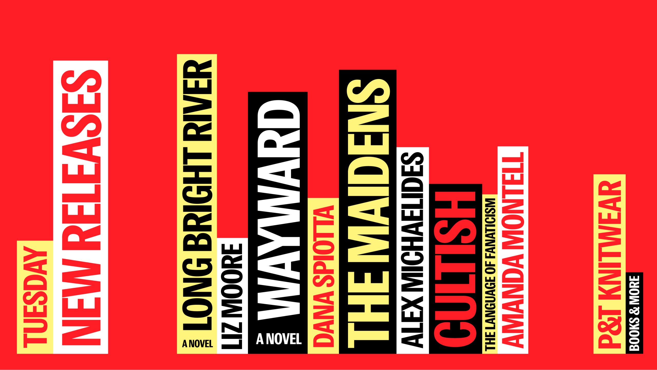
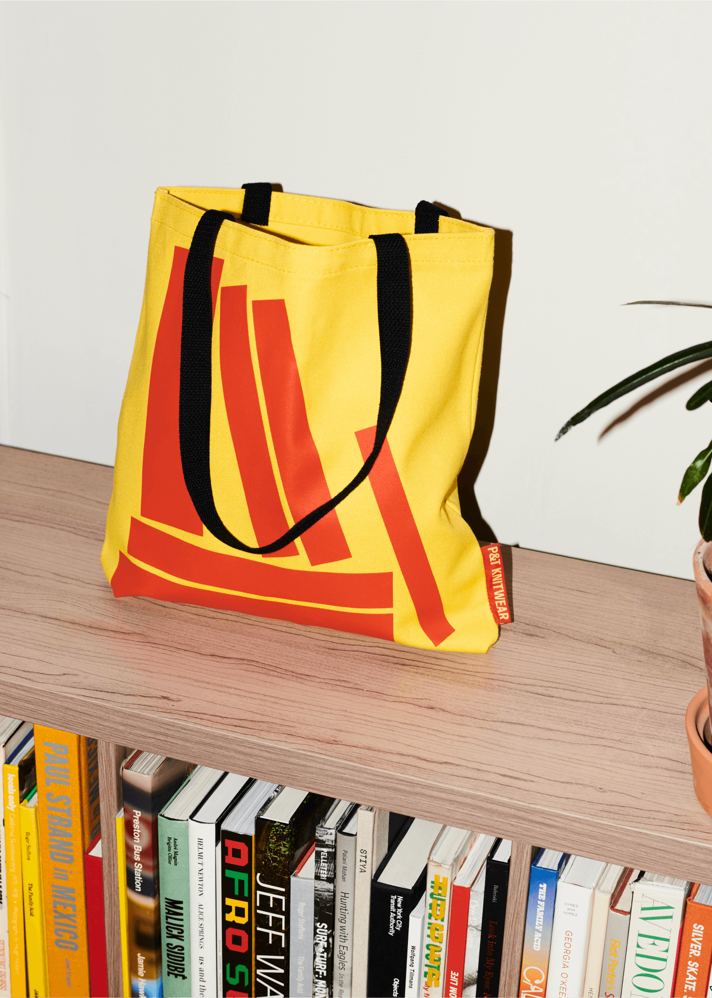
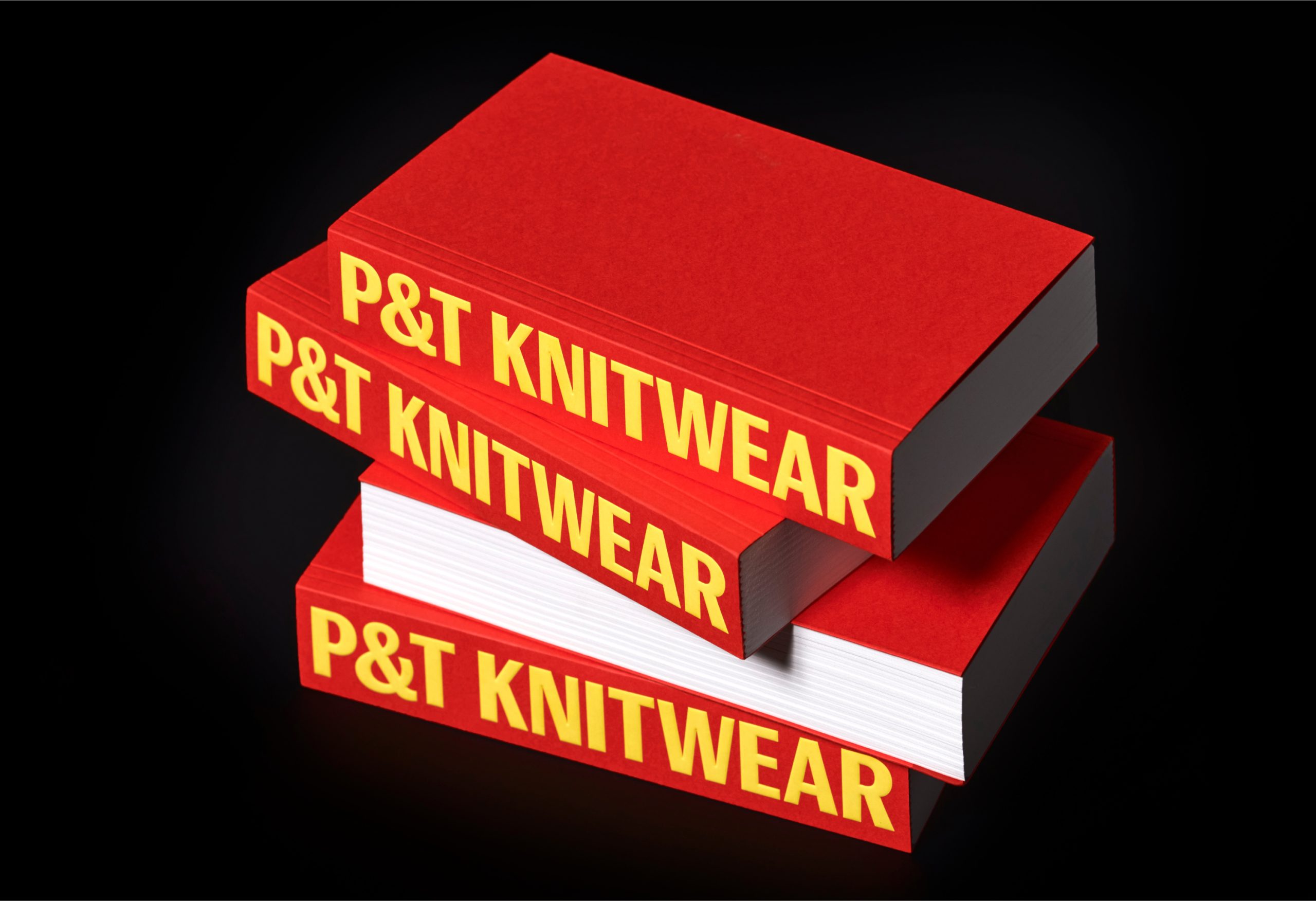
Specifically to the bookstore, they couldn’t have gone far with just a revitalized sign. They needed a flexible new system capable of solving a wide and diverse range of applications, from signage, to merch, to social media, to event communications, to even a rug for their kids section. So what did we do? Inspired by the original sign, we transferred its main visual attributes to a new system based on the structure of book spines, reinterpreting them as a communicative and signaling tool. This way, we relied on a familiar strategy to the reader (book-spine browsing), playfully associating it to an unprecedented medium.
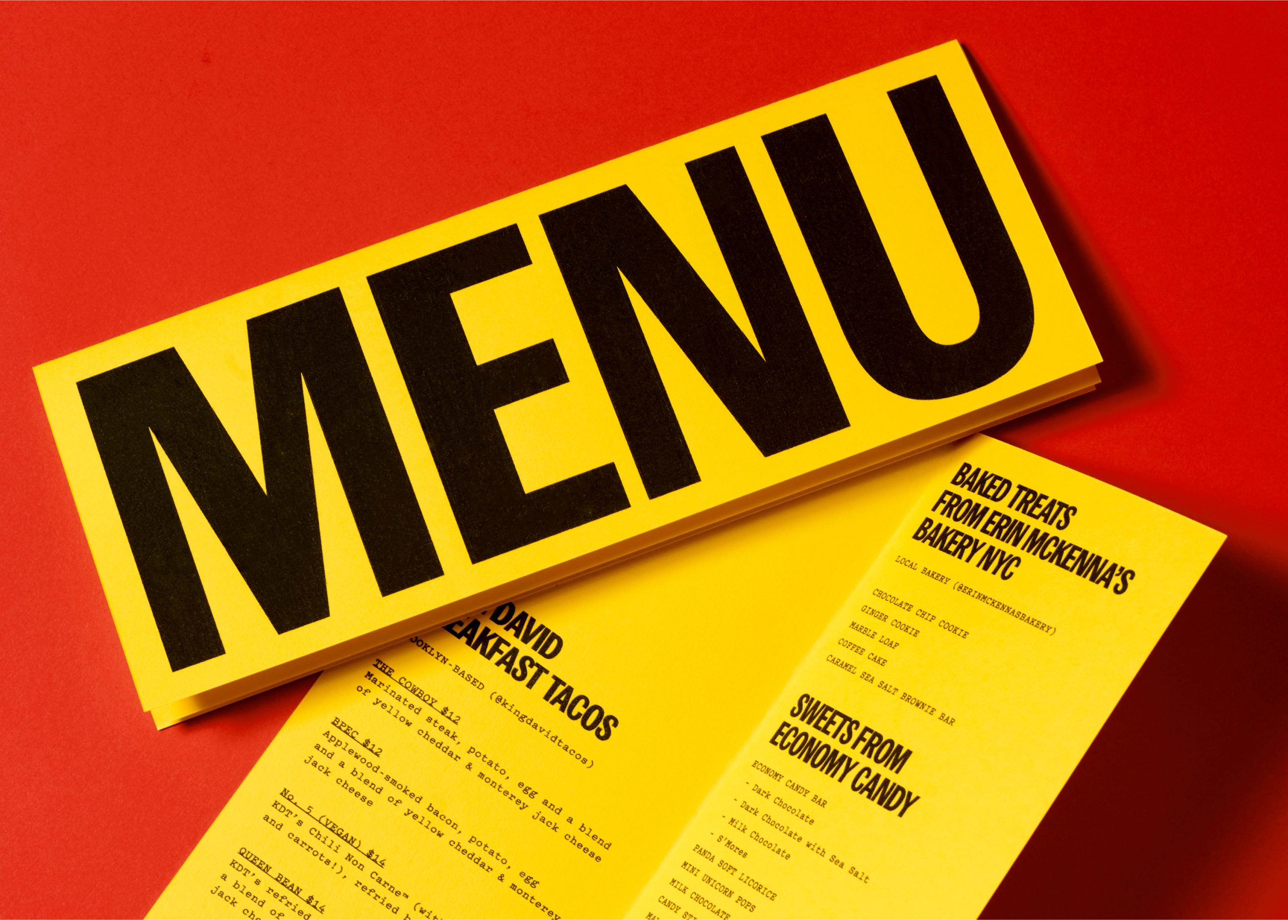
As a result, the store not only had a new sign now, but also a way of communicating. The new system had the bandwidth of communicating the bookstore without the need of having their logotype. Whether that was the cafe menu (just a yellow rectangle with bold type), to the wayfinding, to the window signage, to their events communications; each of these applications were designed with its context in mind first, finding ways to see how it should speak within that environment. Sometimes it’s easy, others more complicated, but ultimately having a system is not trifle, but rather a tool that helps the brand react in engaging ways that otherwise would become repetitive, formulaic and as a result, invisible to its audience.


Can you describe your system with less than ten rules, like if it were a cooking recipe?
1. Have red, black, yellow, and white ready.
2. Select Publish Gothic Condensed from Playtype (buy it first).
3. Draw a rectangle. Write the message in all caps. Combine colors: one for the rectangle, another one for the type.
4. Repeat the process for each word.
5. Place blocks side by side with no separation.
○ If horizontal: bottom align.
○ If vertical: center align.
6. Avoid repeating color combinations (or at least not more than every 2–3 blocks). Optional: If you want to include an image, just add it to the block composition.
7. Take all of this and now, depending on the context, find ways to impress your audience: ○ On a notebook: what if the logo becomes the spine?
○ On a menu: what if the word MENU set as a color block becomes the menu?
○ On the kids section rug: what if the blocks are all loose and colorful?