Mainstudio

Edwin van Gelder is an Amsterdam-based graphic designer and founder of Mainstudio, renowned for his systemic design approach. His work, primarily focused on editorial design for architecture, art, and fashion, seamlessly integrates content and form through meticulously crafted visual systems. Van Gelder has won the Netherlands’ Best Book Design prize multiple times, reflecting his mastery of creating dynamic yet coherent designs. His projects include collaborations with leading cultural institutions and publishers. He is also a guest lecturer at the Academy of Architecture Amsterdam, further linking his graphic work with architectural thinking.
Edwin van Gelder is one of the 46 designers from 23 countries showcased in the book FVS Atlas, published by Viction:ary and authored and designed by TwoPoints.Net. The book serves as evidence of a shift in how designers worldwide approach brand identity design. While in the last century, the identity design revolved around logos, representing a message, this century is about systems functioning as flexible visual languages. In this series of interviews, the trailblazing designers give insight into their systemic approaches.
Focusing on Flexible Identity Systems as a global phenomenon, I would like to know which places influenced your understanding of systems.
My understanding of systems has been influenced by the idea that design operates at the intersection of order and invention. I see the role of the designer not as someone who delivers fixed solutions, but as someone who creates frameworks, rules, and processes that allow for the emergence of varied, context-sensitive outcomes. In this sense, the designer sets up conditions—what might be called programmes—from which multiple appropriate solutions can be derived. This approach positions design as an evolving structure rather than a static object.
In identity design, grids play a particularly important role as both visual and conceptual tools. A grid is not just a way to regulate form; it becomes a set of parameters that expand rather than limit possibility. By defining the underlying structure—proportions, alignments, relationships among elements—you actually gain greater freedom to experiment. This paradox is central to my thinking: the more rigorously the framework is established, the more inventive and unexpected the outcomes can be.
Flexible identity systems rely on this principle of structured openness. They allow a brand or institution to adapt across multiple contexts, cultures, and media without losing coherence. For me, the grid or system behind an identity is not about enforcing uniformity, but about enabling diversity within a recognizable logic. It ensures that every iteration of the identity feels connected while also leaving space for change, play, and reinterpretation.
What has influenced me most is recognizing how these systematic approaches create dialogue between stability and fluidity. Just as in book design, where proportions, typography, formats, and imagery exist in constant relation to one another, identity systems thrive when all the elements are conceived as part of a living structure. By treating design as a system, you acknowledge that outcomes are not singular or closed, but iterative and responsive—capable of evolving alongside the contexts in which they exist.
Which of the Identity Systems you designed is your favorite and why?
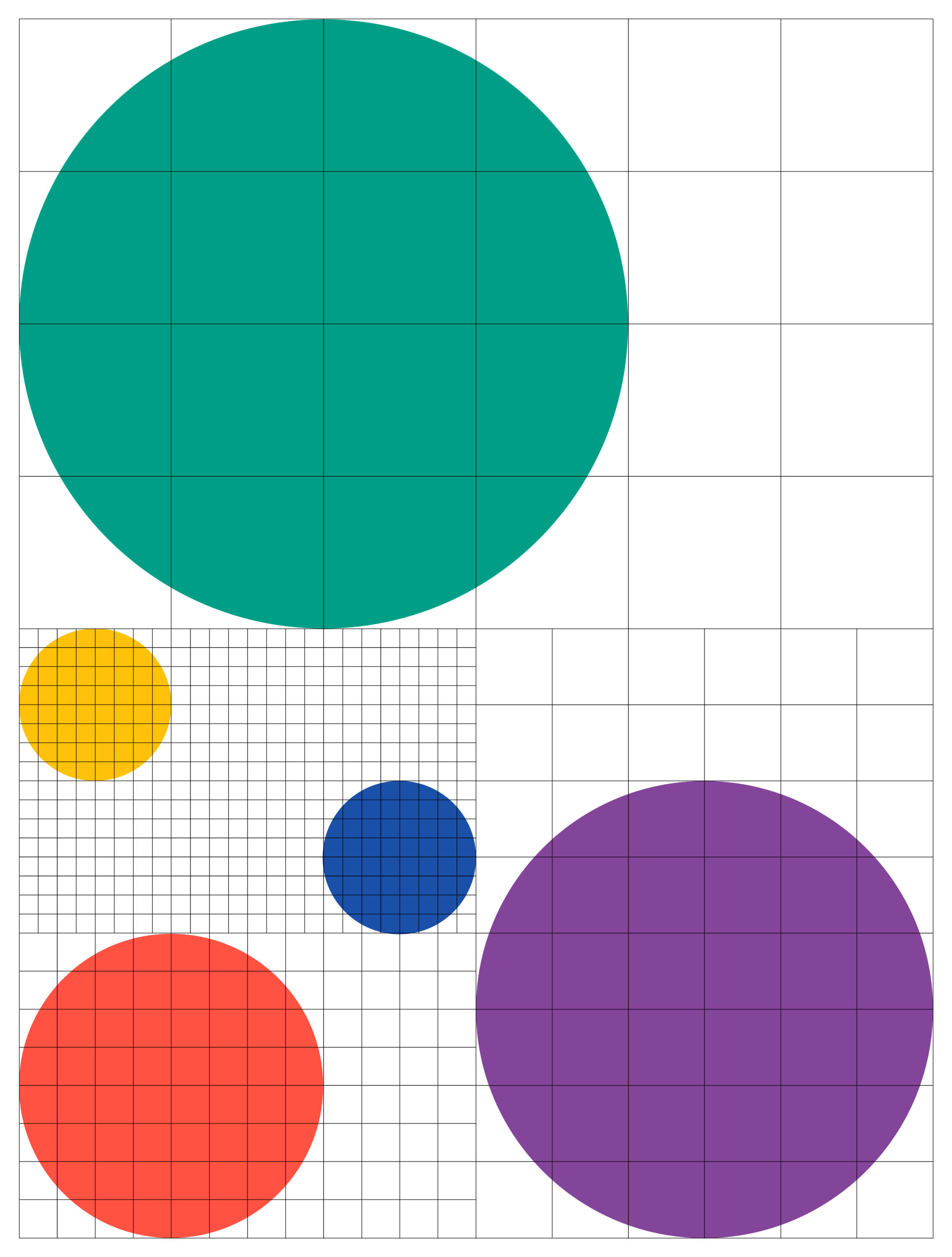
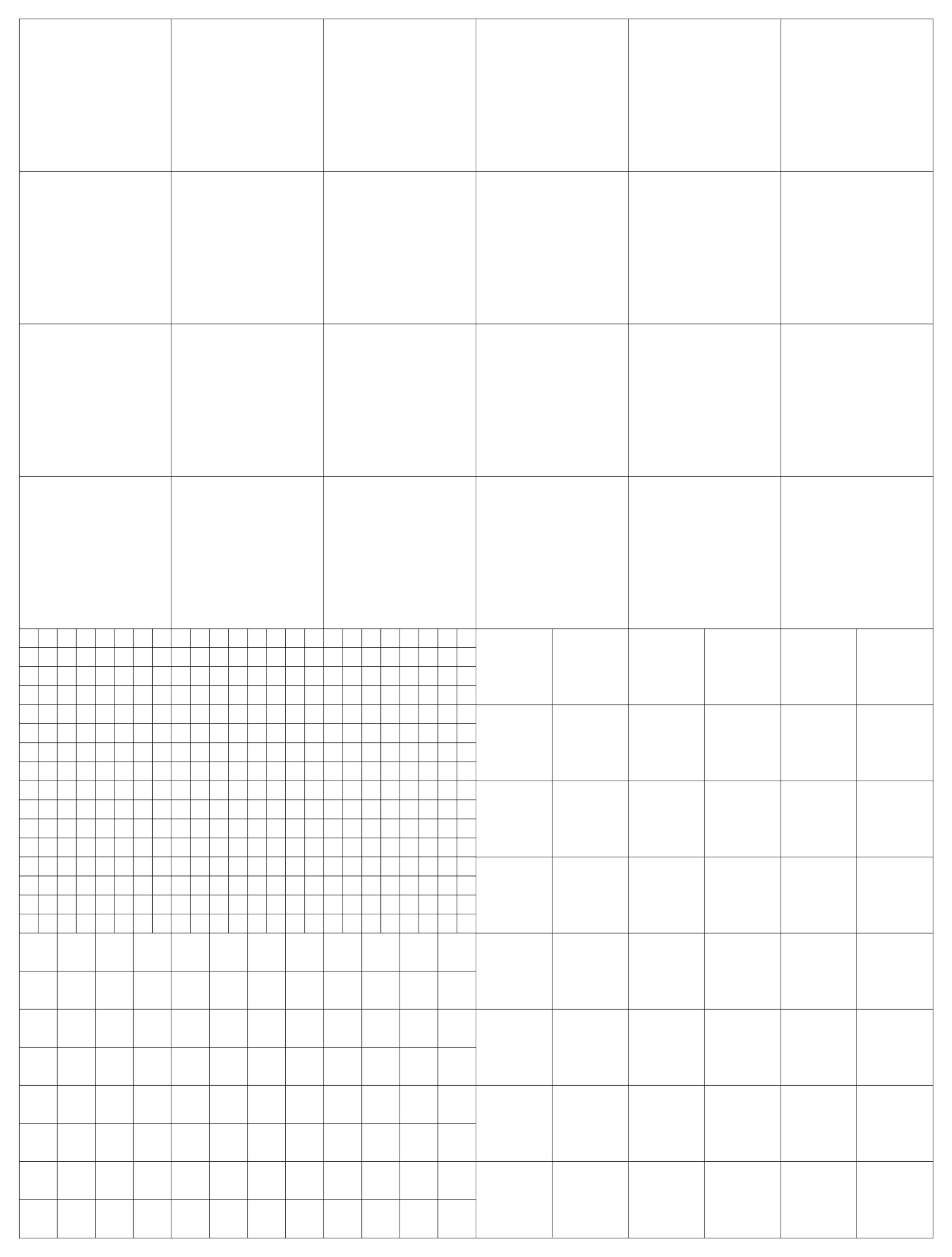
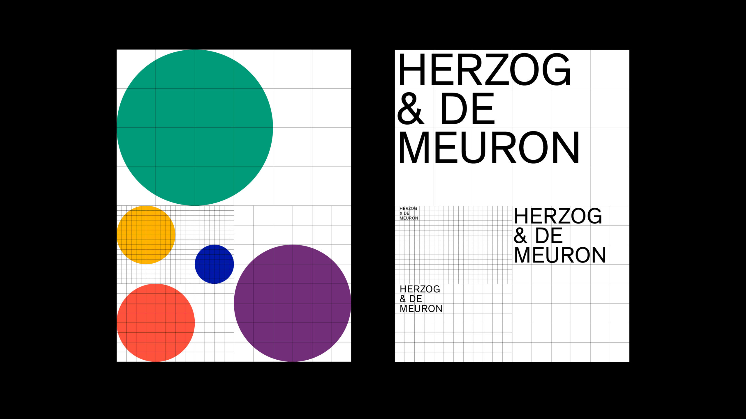
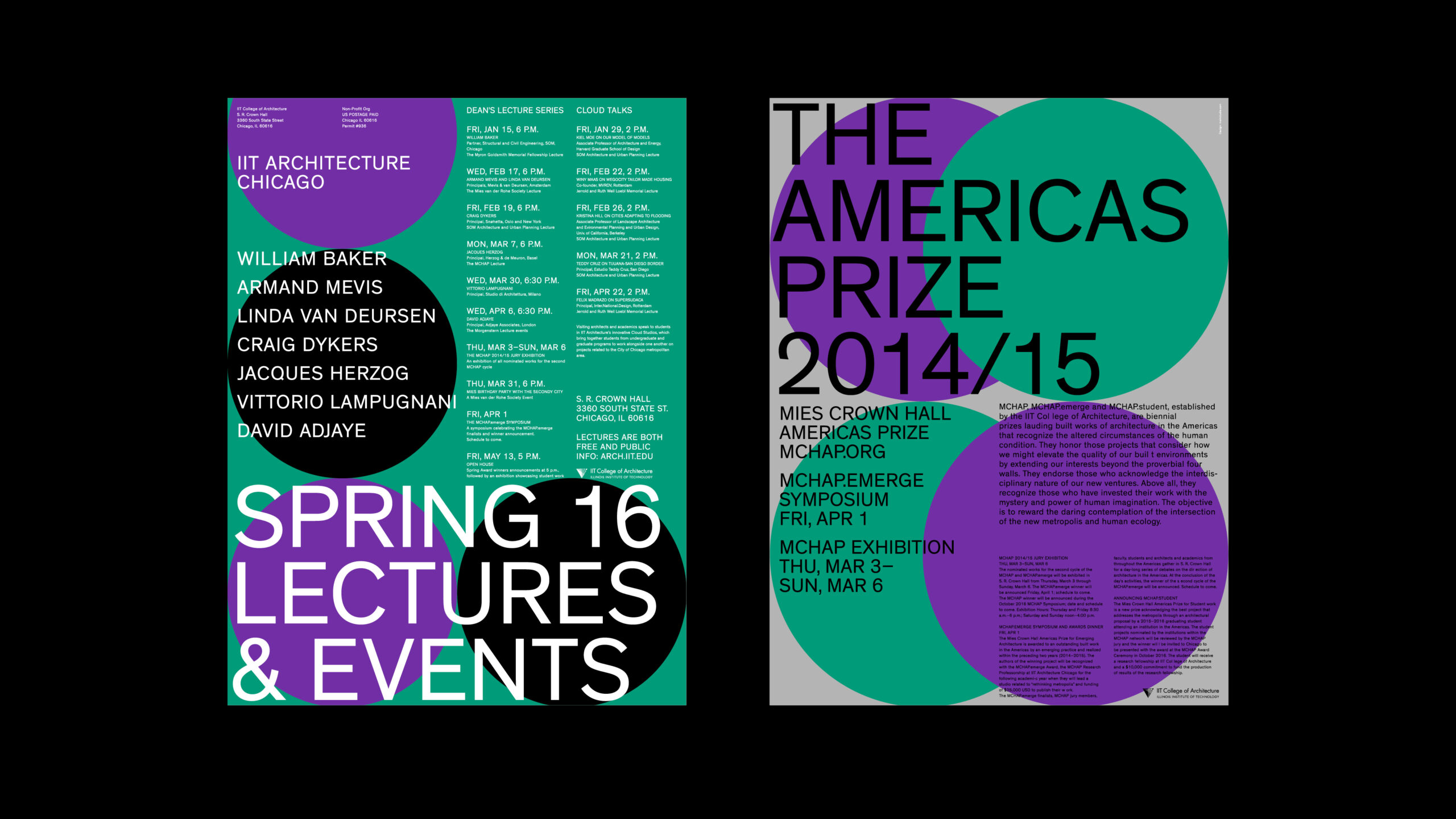
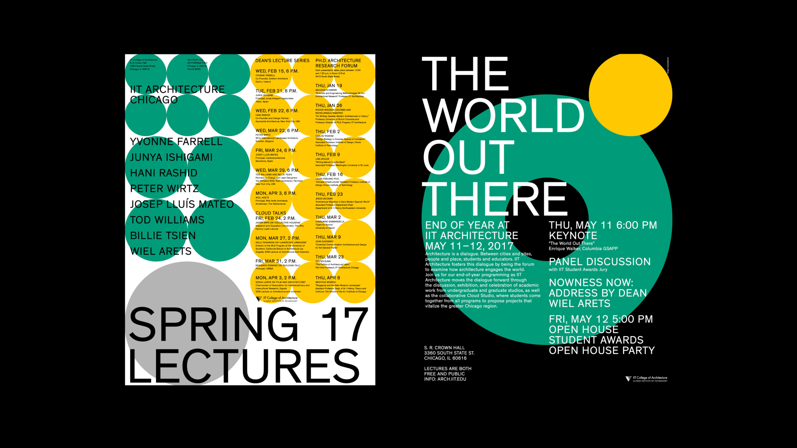
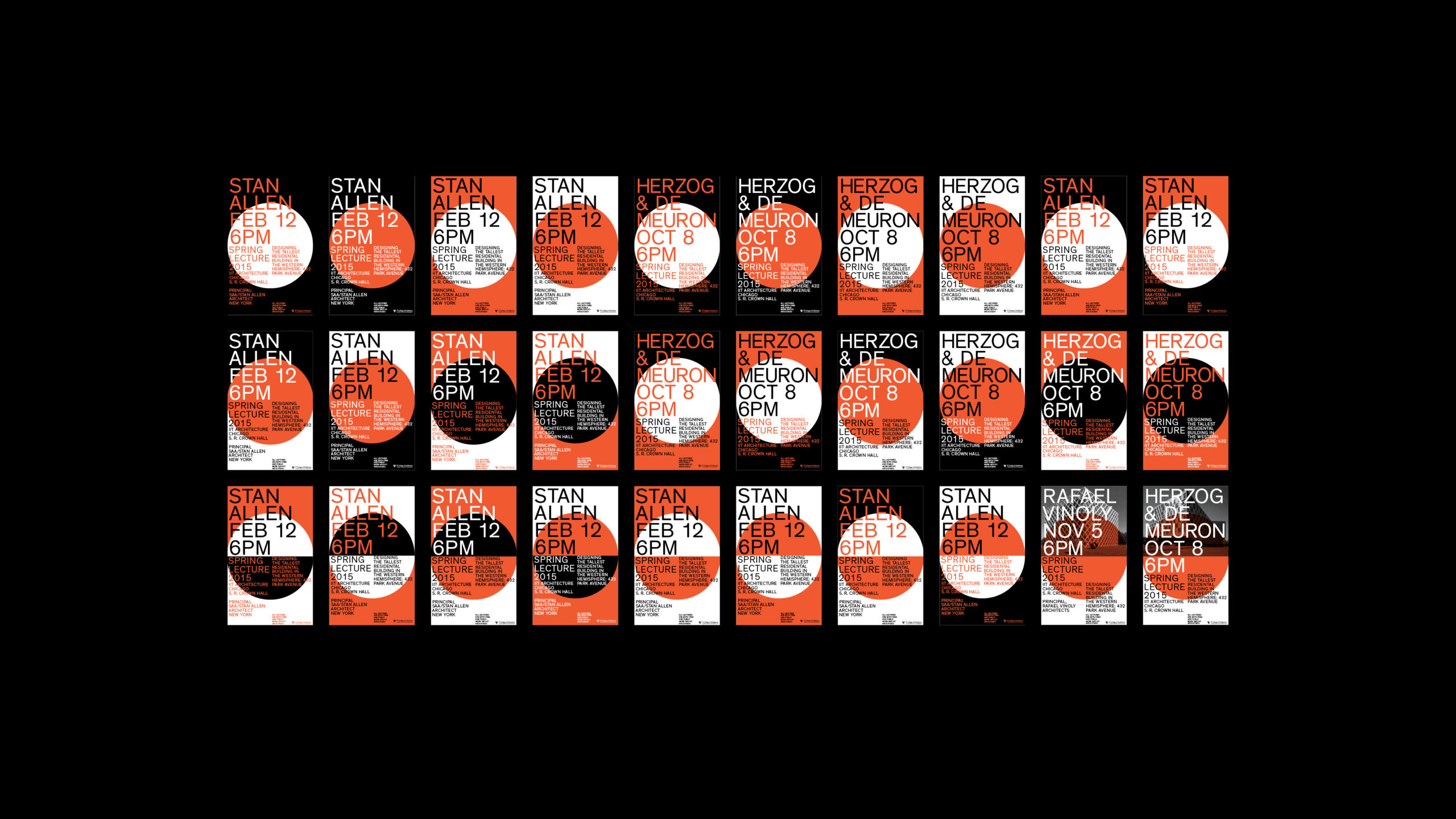
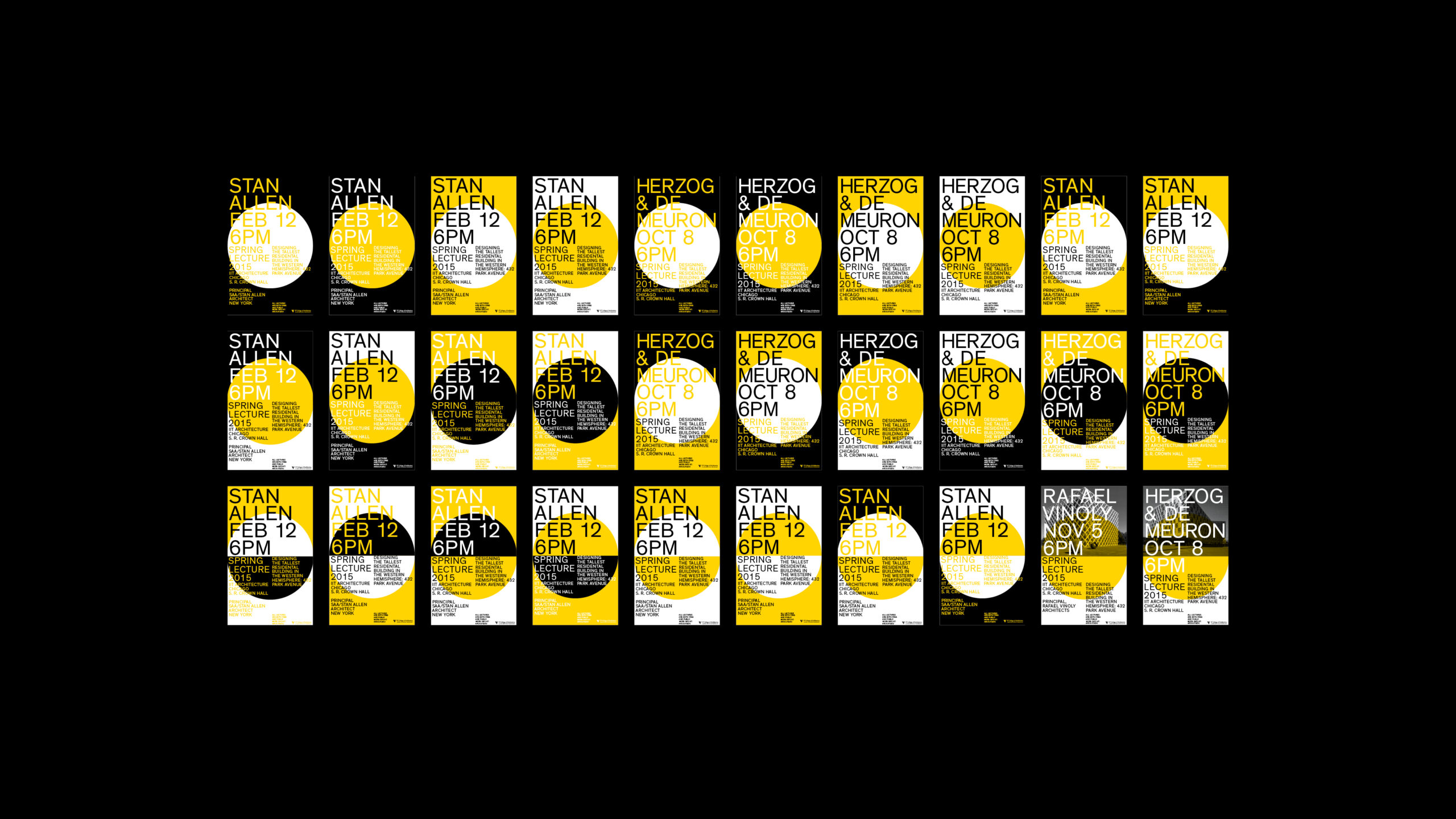
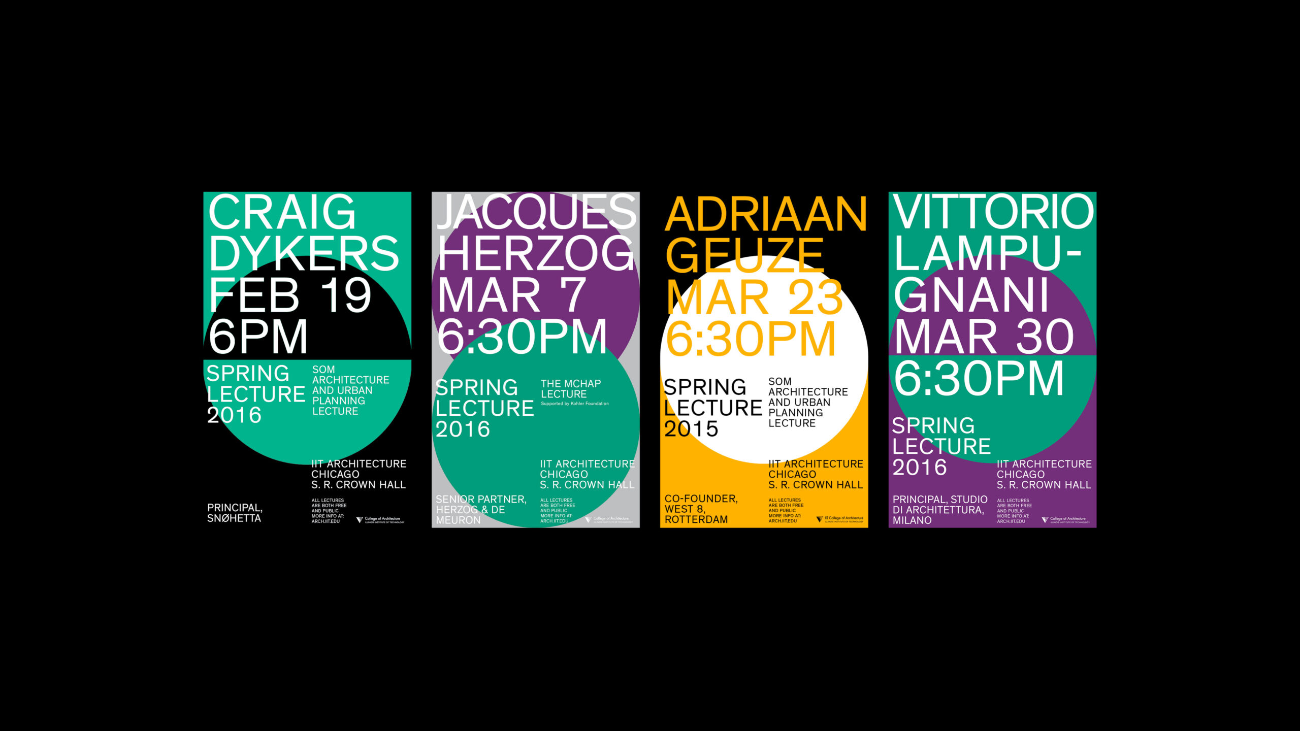
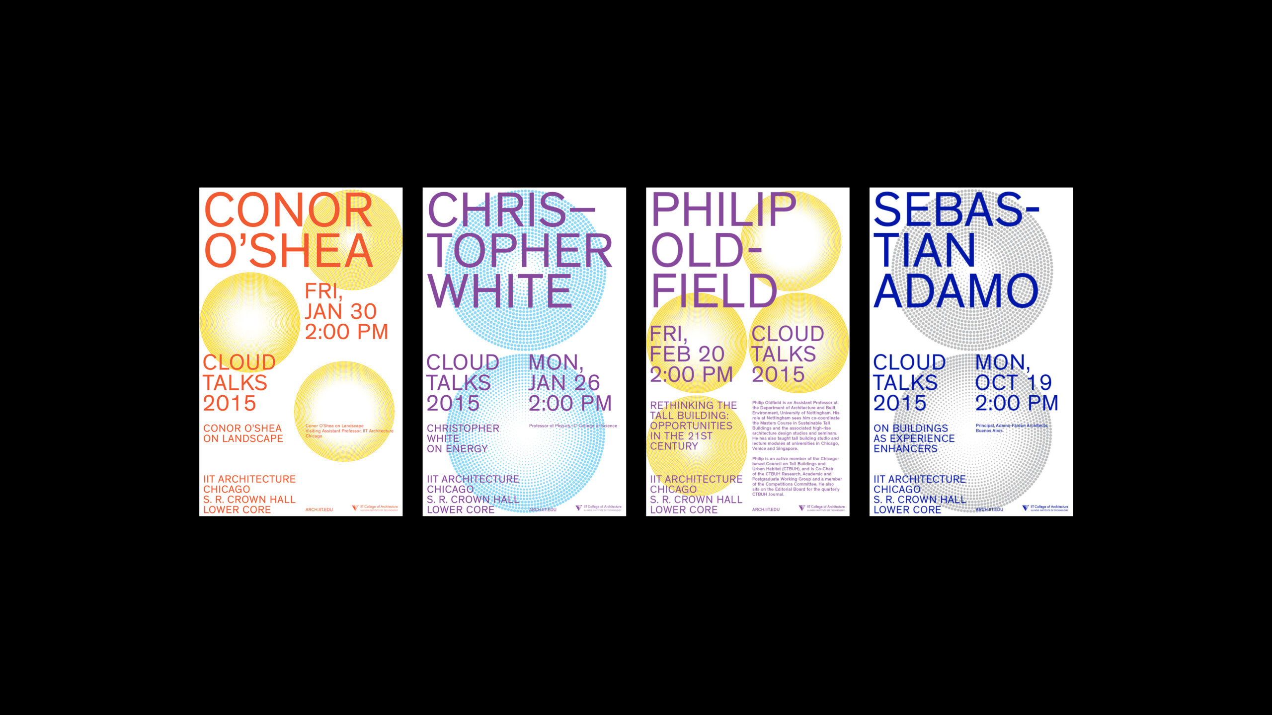
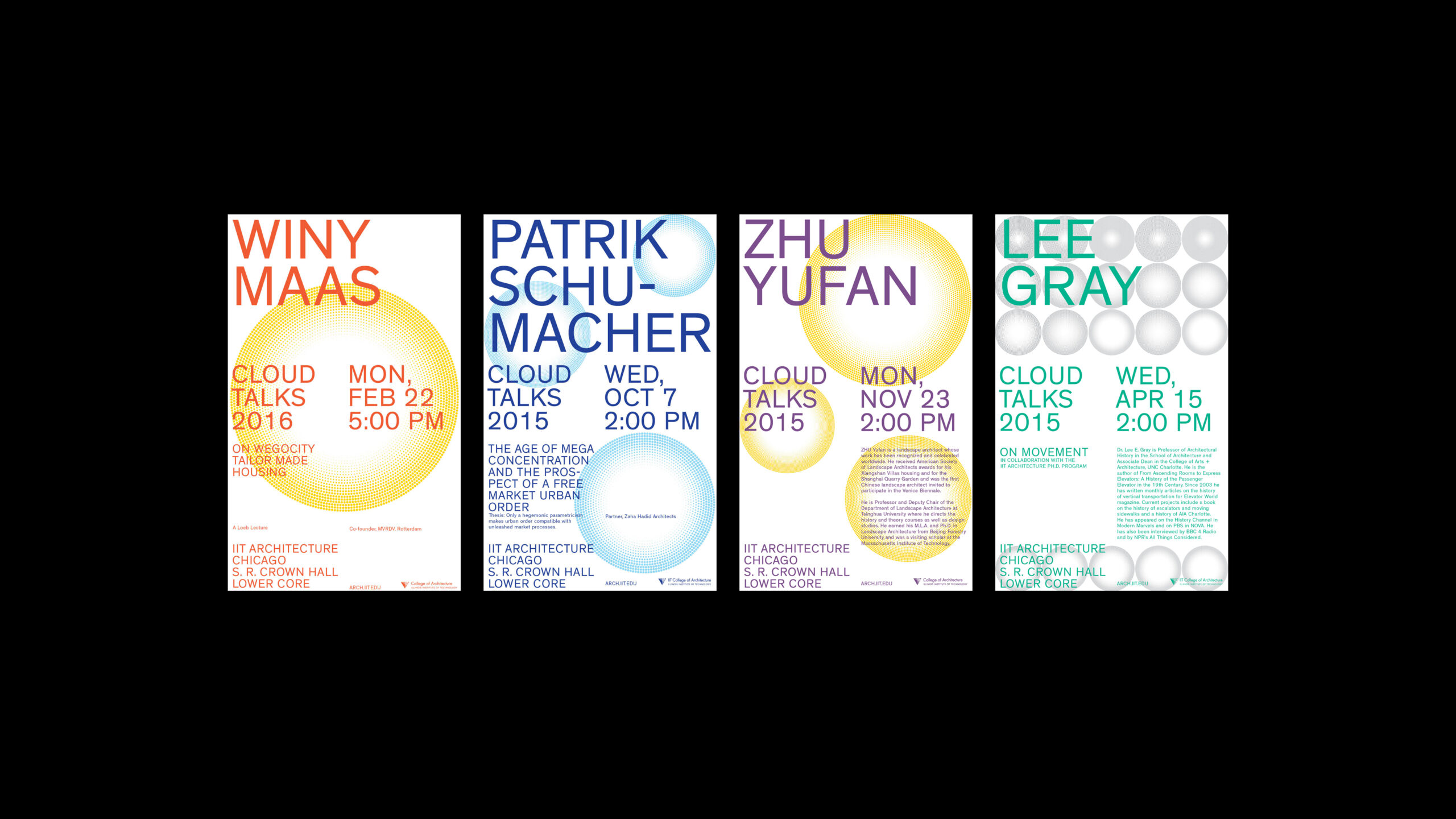
The Illinois Institute of Technology’s College of Architecture’s graphic identity that situates both the school and the city of Chicago on the map with a single dot. As the map radiates outward, the dots gradually shrink in scale, symbolizing the school’s global reach and its connections to students from Japan, South America, and Europe. The concept draws inspiration from Charles and Ray Eames’s Powers of Ten.
The system is structured around four distinct “information zones,” defined by contrasting color palettes and dots of varying sizes. These dots are often arranged in patterns that create shapes and establish hierarchy within each zone. Typography is set in Theinhardt, a Grotesque typeface by François Rappo, selected for its precise structure and its resonance with the grid-based principles of Mies van der Rohe, the school’s founder.
Applications extend across both print and digital platforms. Posters can be broken down into smaller formats, while the school’s website adopts the identity online. Event-specific posters incorporate two-color schemes, and select series employ white backgrounds for emphasis.
The identity also carries over into the MCHAP publication series.
This identity shows how large the output is when working with these very simple and clear parameters.


Can you describe your system with less than ten rules, like if it were a cooking recipe?
Ingredients
1 strong grid as the base identity
5 possible grid sizes
5 dot sizes
5 type sizes
5 colors, each paired with a matching type size
Method
- Begin with the grid as your main foundation of each designLet typography interact on top of the grid, always in dialogue with its structure.
- Select one of the five grid sizes
- Add dots in one of five sizes, for creating an “image” rhythm and texture.
- Use typography by choosing among five type sizes, for which kind of message you want to tell.
- Use five shades of color in total
- Dots can be used as highlighting information or illustrative
- Balance all ingredients so that everything is in dialogue