Rejane Dal Bello
Rejane Dal Bello, an AGI member, is an award-winning designer with a history of iconic work. She has more than 25 years of experience in graphic design and branding, including stints at renowned agencies such as Wolff Olins (UK), Studio Dumbar (NL) and COLLINS (US). She recently wrote the book ‘Citizen First, Designer Second,’ among the top 50 must-read design books of all time. As the founder of Studio Rejane Dal Bello (SRDB), based in London, she specializes in helping brands find their unique identities by creating impactful and purposeful designs. The studio boasts a clientele spanning the non-profit sector and art foundations, reflecting her commitment to impactful and purposeful design.
Apart from being one of my favourite designers, she is also one of the nicest people I know on this planet. Despite my lousy timing during the winter holidays, she kindly accepted my invitation to interview her in the context of the FVS Atlas.
Focusing on Flexible Identity Systems as a global phenomenon, I would like to know which places influenced your understanding of systems.
Design Evolves with Technology
I began my journey in a branding studio at the tail end of the 1990s, a time when we were experiencing a monumental technological shift heading into the new millennium. This shift opened up a wide array of design career opportunities: web design, CD-ROM design, motion graphics, and the exploration of emerging tools and programs. Back then, the core of “corporate identity” work primarily revolved around logo applications—letterheads and a limited range of communication materials. However, as technology advanced and new media channels emerged, the scope of branding rapidly expanded and transformed.
Adapting to these changes meant learning to work with systems—a natural progression of the profession. The terminology and methodologies we now associate with branding came later, often coined by thought leaders and authors who formalized these ideas. At the time, we didn’t have a defined framework; we simply understood that to effectively express a brand across diverse scenarios, we needed to move beyond the logo. Stronger, more versatile visual elements were essential—elements that could carry the brand’s tone and character across a variety of formats, from small-scale applications to large banners, deep reports, and everything in between.
These shifts weren’t theoretical; they were a lived experience within the studio design culture. We evolved our craft organically, responding to the needs of the moment, and in doing so, laid the groundwork for the methodologies that continue to shape design today.
Which of the Identity Systems you designed is your favorite and why?
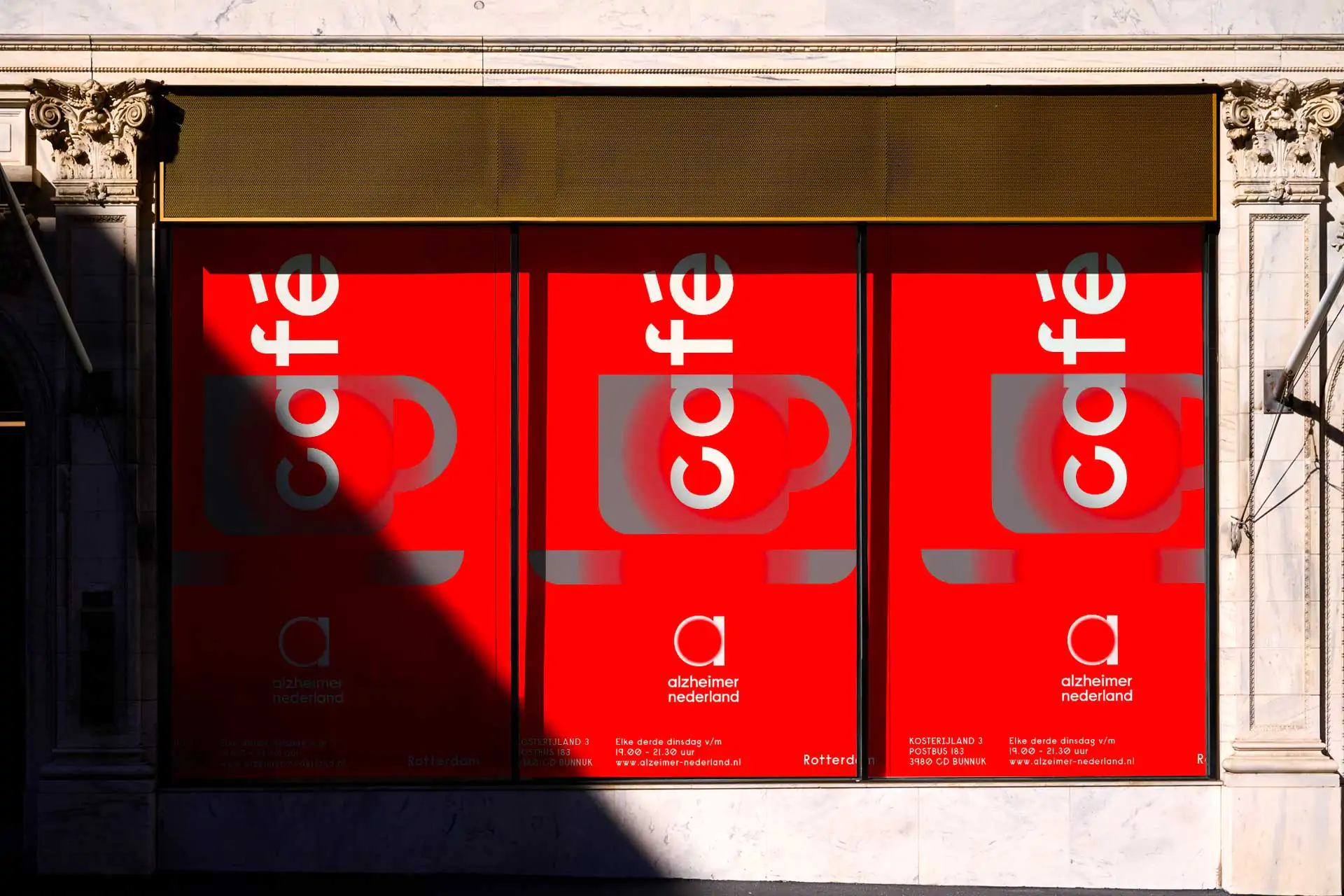
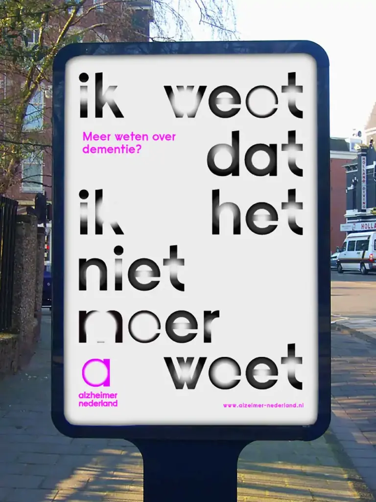
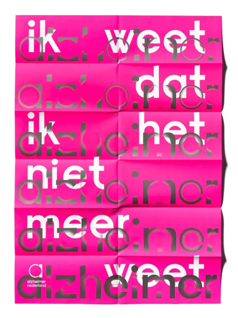
Alzheimer Nederland Visual Identity
Designing the visual identity for Alzheimer Nederland, a nonprofit organization, was an incredibly challenging yet deeply meaningful project. The goal was to create an effective and bold design system that would highlight the urgency of the cause, increase visibility, and secure vital funding. At the same time, the design needed to strike a delicate balance—standing out in a competitive landscape of charitable causes while providing support and reassurance to those affected, including their families.
One of the toughest aspects was representing the disease visually in a way that avoided clichés or insensitivity. It was essential to convey the gravity of Alzheimer’s without overwhelming or alienating the audience. The design had to be impactful yet respectful, showing enough to raise awareness but not so much as to intrude upon or burden those living with the condition.
This project remains one of the proudest achievements of my career. It required thoughtful precision to craft a system that was strong, empathetic, and effective in delivering the organization’s message to the public.


Can you describe your system with less than ten rules, like if it were a cooking recipe?
Bad news… I don’t cook… haha, but I’ll give it a shot!
- Only full-bleed background solid colors.
- Start with the primary typeface.
- Choose one of the five radial gradient styles from the package. These gradients represent the Alzheimer’s effect on memory, creating a visual link to the disease’s progression.
- The gradient within the type represents the disease’s non-linear progression, reflecting moments of lucidity and confusion. The five gradient variations symbolize these stages, culminating in the loss of word recognition and meaning, evoking the cognitive effects of Alzheimer’s.
- Apply the gradient effect to the primary type, experimenting with the words and main taglines.
- The color palette consists of black and white as base colors, plus eight secondary colors representing B2B and B2C. For cost-effectiveness, use black and only one secondary color per design.
- The overall combination of materials gives the impression of a vibrant brand while maintaining simplicity, avoiding a chaotic or carnival-like look.
- Photography is in black and white, featuring close-up shots of individuals at various stages of their Alzheimer’s journey—moments of clarity, adaptation, and rediscovery of the “new normal.”
- Secondary type is left-aligned and minimal, using the same font as the main title but without effects.
- Covers can rely on typography alone, with the gradient effect inside the type serving as the “image.”
THANK YOU!!!
Thank you!!! And my pleasure! Wishing you all the best and success with this project!! Have a wonderful new year, and I hope to see you again soon!!