MVD FOUNDRY
The Open-Source Modular Font Foundry
by the students of Elisava’s
Master of Visual Design
(Workshop based on the online course Modular Type — Learn How to Build Flexible Type Systems)

Download and use the fonts of my wonderful students of the ELISAVA Master of Visual Design, designed at our Modular Type Design Workshop, for FREE! We do not care if you use them for commissioned or self-commissioned projects, as long as you mention the type designer, tutor, and this URL!
We do not take any responsibility for any problems you might encounter using our fonts. Remember: Never look a gifted horse in the mouth!

Type Designer:
Marta Celso
Marta Celso is an Italian graphic designer blending a passion for design and art. Graduated in Design and Visual Communication in Torino, she is now working as a graphic designer. She crafts visual pieces reflecting a fusion of diverse inspirations, showcasing her eye for detail and a commitment to effective communication through design. https://www.instagram.com/celsomarta/
Name of Font:
Supermarket
The Supermarket font was born from the geometry of a tile on a façade in the El Born district. A shape as simple as the rectangle is elevated by the subtraction of angles with circles, creating a typeface that blends sharp and angular lines as well as curves. The letters create ligatures that give a rich texture to the overall design.
Remember that this is a free font, a gift from us to you, so if there is something that does not work, we won’t take any responsibility. Don’t forget to share the love by mentioning the type designer and this URL. <3

Type Designer:
Aina Eguiluz Serra
I’m Aina Eguiluz Serra, a Catalan graphic designer based in Girona, Spain. When designing, I like to have an open, collaborative, and multidisciplinary approach for the development of creative solutions, based on graphic design and digital art. www.gaecea.xyz
Name of Font:
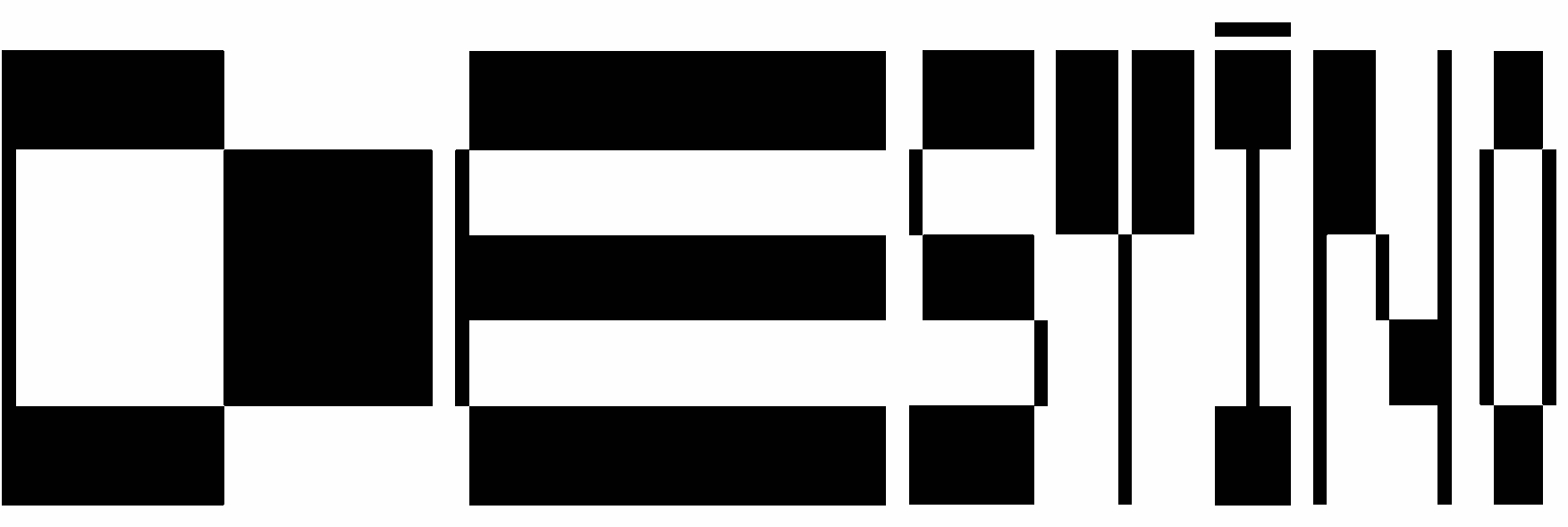
21 Display
21 Display (21 as 2 Men and 1 Destiny – Dos hombres y un destino) is a variable display typography with a pixel and glitch aesthetic, in condensed, regular, and extended versions. It is a typeface with which you can find interesting contrasts and bring dynamism to your compositions.
Remember that this is a free font, a gift from us to you, so if there is something that does not work, we won’t take any responsibility. Don’t forget to share the love by mentioning the type designer and this URL. <3

Type Designer:
Ana Fegos
Ana Fegos is a graphic designer from Madrid who specializes in detailed, bold, and conceptual work. She loves taking a research-based approach to communicating complex topics through design. www.instagram.com/anafegos/
Name of Font:
Wrink
Wrink is a systemic display font that generates a wrinkling movement in the verticals of the letters. Coming in two variations, where one mimics the leaf-like component of the original inspiration, while the other stylizes it in a more brutalist approach, Wrink achieves unique and unexpected letterforms.
Remember that this is a free font, a gift from us to you, so if there is something that does not work, we won’t take any responsibility. Don’t forget to share the love by mentioning the type designer and this URL. <3

Type Designer:
Arrate García-Ardanaz
Arrate García-Ardanaz is a graphic designer from the Basque Country, although she is currently based in Barcelona. She graduated in Graphic Design and Communication from I·DARTE, the School of Art and Design in Vitoria-Gasteiz. She is very curious, and loves to research and analyze, providing original solutions using design and creativity as tools for social innovation. www.instagram.com/arrategardz
Name of Font:
CABLE
CABLE, a display typeface, draws inspiration from the architecture of Barcelona’s Gothic Quarter, named after the metal cables used to ensure building stiffness. With a condensed style, it reflects Gothic typefaces with thick, rectangular strokes simulating pen inclination. Balancing modernism and Gothic characteristics, CABLE honors its inspiration from the neighborhood it references.
Remember that this is a free font, a gift from us to you, so if there is something that does not work, we won’t take any responsibility. Don’t forget to share the love by mentioning the type designer and this URL. <3

Type Designer:
Angela Hernandez Moron
Angela is a Venezuelan-born designer currently residing in Barcelona. Her passion for architecture and spaces has always been a significant influence on her work. Although she initially graduated as an interior designer, she later transitioned her focus to graphic design. Angela is characterized by her enthusiasm and optimism. She thrives on understanding the broader context of her projects and enjoys envisioning the bigger picture.
@angeladhernandez
Name of Font:
Sewer
Sewer Typeface is a typography that seeks to highlight one of the systems that we least appreciate but that is essential within the city of Barcelona, water sewerage. By analyzing the graphic identity of the sewers we can appreciate the intrinsic fluidity of water but also the rigidity of its conductive system. The typography is based on a grid inspired by the sewer, starting from the circle as a fluid element between the characters.
Remember that this is a free font, a gift from us to you, so if there is something that does not work, we won’t take any responsibility. Don’t forget to share the love by mentioning the type designer and this URL. <3

Type Designer:
Cléo Sulem
She is de Graphic design from Frrrrrance, she likes weird composition, offbeat layouts, vibrant colors, and typography but overall she likes good memes. www.cleosulem.com
@graphic_electric
Name of Font:
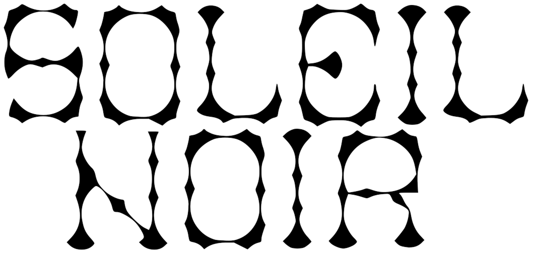
Soleil noir
The soleil noir (black sun) typeface shows an appearance with full and empty spaces, like a fragile structure. This structure made me think of the moment when we are between waking and sleeping, where we are still dozing and things are difficult to distinguish.
Remember that this is a free font, a gift from us to you, so if there is something that does not work, we won’t take any responsibility. Don’t forget to share the love by mentioning the type designer and this URL. <3

Type Designer:
Emma Maalouf
Marhaba! I’m Emma Maalouf, a Lebanese graphic designer from Beirut, Lebanon, currently based in Barcelona. Driven by a passion for enlightenment and perspective, my work reflects to deep research and artistic versatility. My design embrace boldness and multidisciplinary flair, infused with vibrant and impactful creativity. https://www.instagram.com/emma_maalouf/
Name of Font:
CABLE
Introducing Cornered, a monospace font. Cornered defies conventions with rounded edges and a strong interplay of negative spaces. The negative space create a visual impact in title displays and text layouts. Designed on a square grid, its stems stand out against crossbars, defying traditional typography norms.
Remember that this is a free font, a gift from us to you, so if there is something that does not work, we won’t take any responsibility. Don’t forget to share the love by mentioning the type designer and this URL. <3

Type Designer:
Federico Sánchez
I’m Federico Sánchez (F), a Colombian graphic designer in Barcelona. I’m driven by the belief in impactful ideas shaping positive experiences. Design, for me, is a creative perspective on life, allowing the creation of solutions for unforgettable experiences. My focus lies in using color, type, and rules to craft clean, robust, and flexible design systems.
https://federicosgo.com
@by_federico
Name of Font:
DUAL DISPLAY
DUAL DISPLAY is a font inspired by Barcelona’s sewer grid, symbolizing the concealed “DUAL” City. Crafted from the modular sewer features, it mirrors symmetry, inviting exploration into the hidden city elements through its design rooted in duality.
Remember that this is a free font, a gift from us to you, so if there is something that does not work, we won’t take any responsibility. Don’t forget to share the love by mentioning the type designer and this URL. <3

Type Designer:
Arrate García-Ardanaz
My name is Francisca Cortés, I am a Chilean graphic designer currently in Barcelona. For my projects, I like to draw on fundaments that add depth and meaning to each aspect of them, as well as explore and apply different techniques and textures, whether they are digital or analog.
Name of Font:
VAO
For the creation of this typography, a creative process was followed based on a photograph of a pattern in the city of Barcelona. The form was abstracted from the photograph to create different modules that shaped the structure of each letter. This resulted in elongated forms that reference the architecture of the city.
Remember that this is a free font, a gift from us to you, so if there is something that does not work, we won’t take any responsibility. Don’t forget to share the love by mentioning the type designer and this URL. <3

Type Designer:
Gonçalo Salgado
Gonçalo Salgado (aka Olasnog) is a self-taught graphic and motion designer. He likes the intersection of music and design.
https://www.goncalosalgado.com
https://www.instagram.com/olasn0g/
Name of Font:
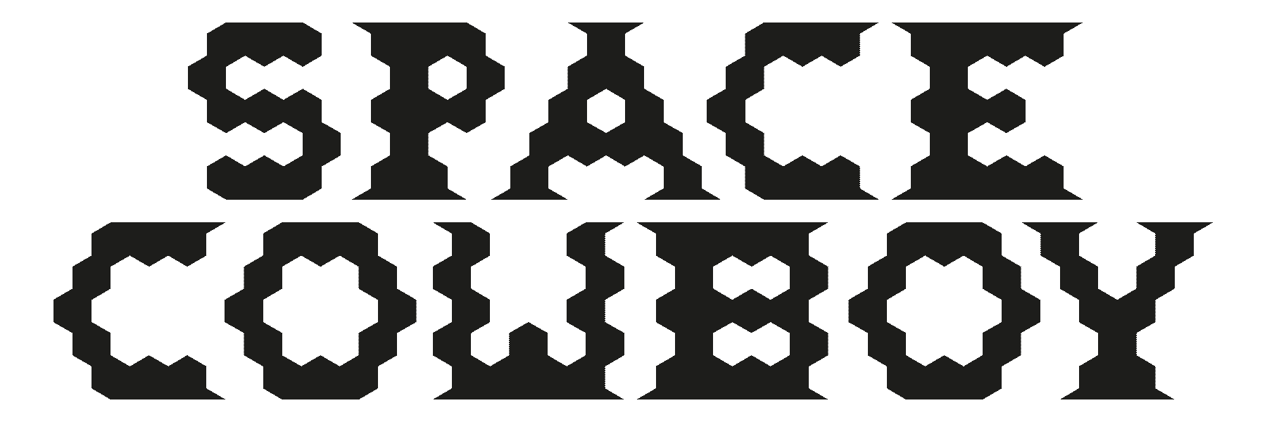
Space Cowboy
Futuristic slab serif font which comes in four different styles. Yeeeeehaw!
Remember that this is a free font, a gift from us to you, so if there is something that does not work, we won’t take any responsibility. Don’t forget to share the love by mentioning the type designer and this URL. <3

Type Designer:
Inés Acero Carrión
Inés Acero Carrión is a visual designer currently based in Barcelona, Spain. With a background in art — under the internet username @myartisticmundo — her work is rooted in experimentation and research, exploring the intersection of design, culture, and nature.
Name of Font:
Jarama
Jarama is a geometric monospace display typeface. It features a modular system established within a square, with diagonal intersecting lines as the foundational structure. The rounded letters version evokes the dynamic curves of Madrid’s iconic race car circuit, el Circuito de Jarama, from which the font gets its name.
Remember that this is a free font, a gift from us to you, so if there is something that does not work, we won’t take any responsibility. Don’t forget to share the love by mentioning the type designer and this URL. <3

Type Designer:
Julia Gontier
Julia Gontier is a Brazilian Graphic Designer, currently based in Barcelona. With a Bachelors Degree in Graphic Design she also posses some brief experiences in Architecture and Fine Arts, which directly affects the way she practices design. Considering herself an interdisciplinary designer, a curious mind that engages with creative thinking, always speculating the world around us. https://www.instagram.com/jugontier/
Name of Font:
RISE
Inspired by the angles of the roofs in Barcelona. When we walk we tend to look ahead, at our path, but what if we direct our sight another way? Not noticing things from a frontal point of view but rather searching for new perspectives. Finding new angles to look at the ordinary. Looking up can be a simple way of doing such, not a very comfortable angle but a surprising one. The regular irregularities, contrast, angles, and things you don’t notice often are what inspired the Rise Typeface.
Remember that this is a free font, a gift from us to you, so if there is something that does not work, we won’t take any responsibility. Don’t forget to share the love by mentioning the type designer and this URL. <3

Type Designer:
Lola Mallue
I am Lola Mallue, a graphic design student who comes from Belgium. I did my bachelor’s degree at Saint-Luc in Liège. I love to experiment with typography, and I am always curious to discover new things (related to design, or not!).
Name of Font:
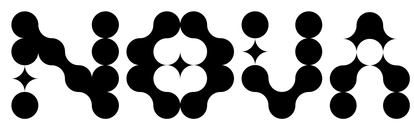
NOVA
I created the font “Nova” during a workshop with Martin Lorenz in November 2023, drawing inspiration from a snapshot of urban bars in downtown Barcelona. The font’s name, “Nova,” pays homage to the star symbol, a prominent feature within the typeface. Its underlying structure is formed by a grid comprising circles and stars. This font creation was part of my endeavor within the Visual Design Master’s program at Elisava in 2023.
Remember that this is a free font, a gift from us to you, so if there is something that does not work, we won’t take any responsibility. Don’t forget to share the love by mentioning the type designer and this URL. <3

Type Designer:
Mallo
Mallo is a graphic designer and illustrator from Peru. Shines in the world of digital design and branding projects. With a special fondness for 2D animations. Brings a genuine and heartwarming touch to art and design, skillfully capturing both the beauty and rawness of humanity.
Instagram: @mallo.dsg.
Name of Font:
Martyn
This systemic display typeface is a unique blend, drawing inspiration from the delicate intricacies of a stained-glass grid found in a church and the linear elegance of a fence. It endeavors to capture the versatile charm inherent in stained glass, allowing letters to seamlessly harmonize both individually and collectively. With the ability to interlock at various angles, they weave together to form a typographic tapestry, featuring both uppercase and lowercase characters. This artistic font offers a diverse presentation suitable for brand names and more, transcending conventional boundaries and proving exceptionally versatile in various applications.
Remember that this is a free font, a gift from us to you, so if there is something that does not work, we won’t take any responsibility. Don’t forget to share the love by mentioning the type designer and this URL. <3

Type Designer:
Lakis Sobyra
Lakis Sobyra is a designer with a holistic focus who above all enjoys experimentation in his creative process.
https://lakis.es/
https://www.instagram.com/lakis_sobyra/
Name of Font:
Fraktura
Fraktura is a display typeface based on a grid drawn from a broken tile. It comes in three weights: Textura (text purpose) Cerradura (separated pieces, meant for display sizes) and Separura (the pieces are even more separated).
Remember that this is a free font, a gift from us to you, so if there is something that does not work, we won’t take any responsibility. Don’t forget to share the love by mentioning the type designer and this URL. <3