INTERVIEW
Sara Londoño
Sara Londoño, also known as Nebulosa Picante, is a Shape Designer who uses form and structure to craft visuals that make complex ideas simple and direct. Her work brings together clarity, structure, and expression, treating form not merely as appearance but as a way of thinking. She creates visuals that communicate before they are understood—where function and feeling coexist naturally.
With a background in industrial design, Sara’s approach is marked by a quiet balance of intention and simplicity. She sees the world as a vast, ever-changing museum that continuously fuels her inspiration. Having lived in three different countries, her perspective on design—and on life—has expanded profoundly, shaped by the people and experiences that have influenced her both personally and professionally.
Alongside her main work, she also takes on freelance projects that allow her to explore new ideas, systems, and ways of giving shape to thought. Often described as a minimalist in both design and speech, Sara values substance above all—selecting only what’s essential in her visuals and words to make room for meaning. Her fascination with geometry, the cosmos, and more recently, flowers, subtly runs through her practice, shaping the poetic logic behind her ideas and designs.
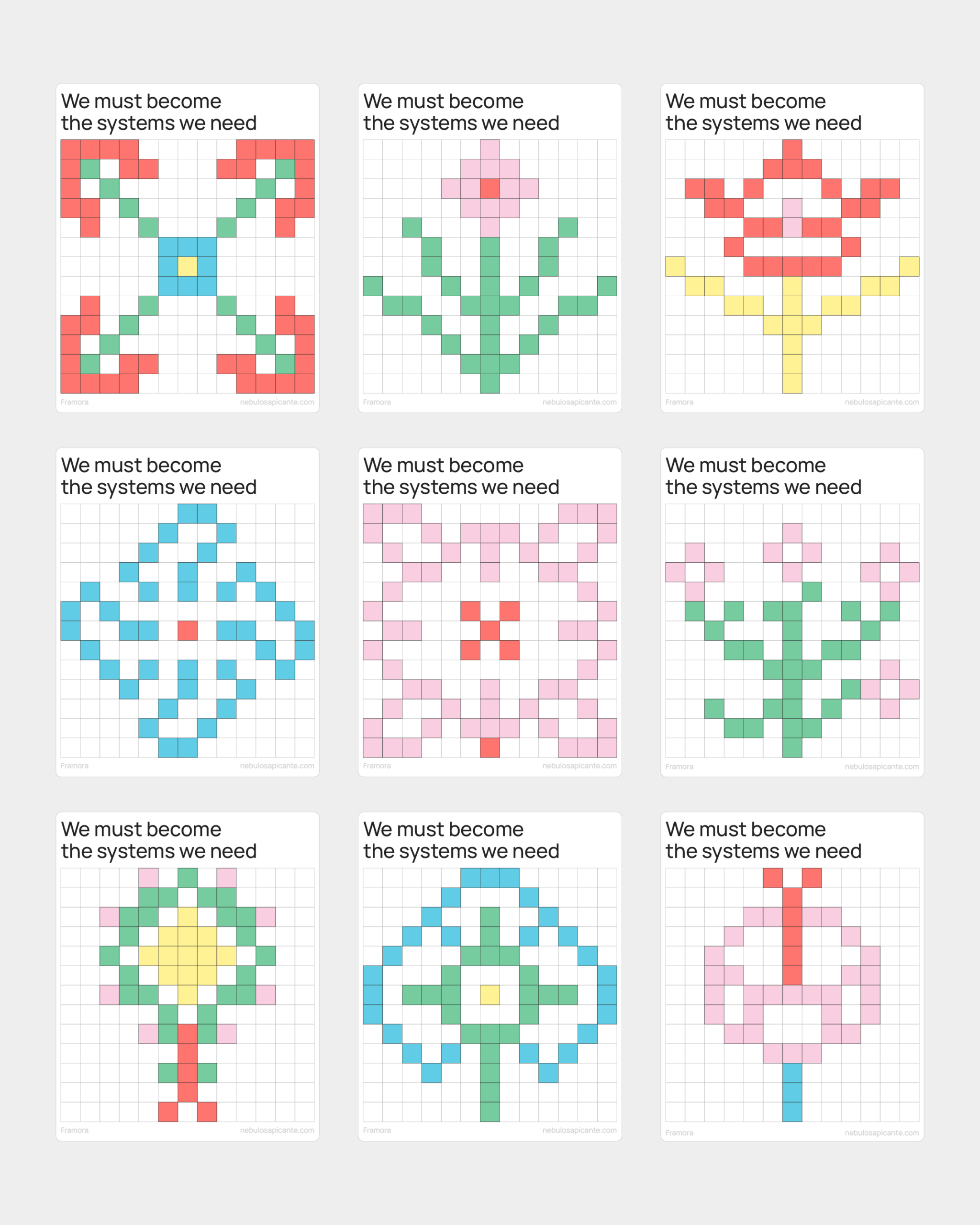
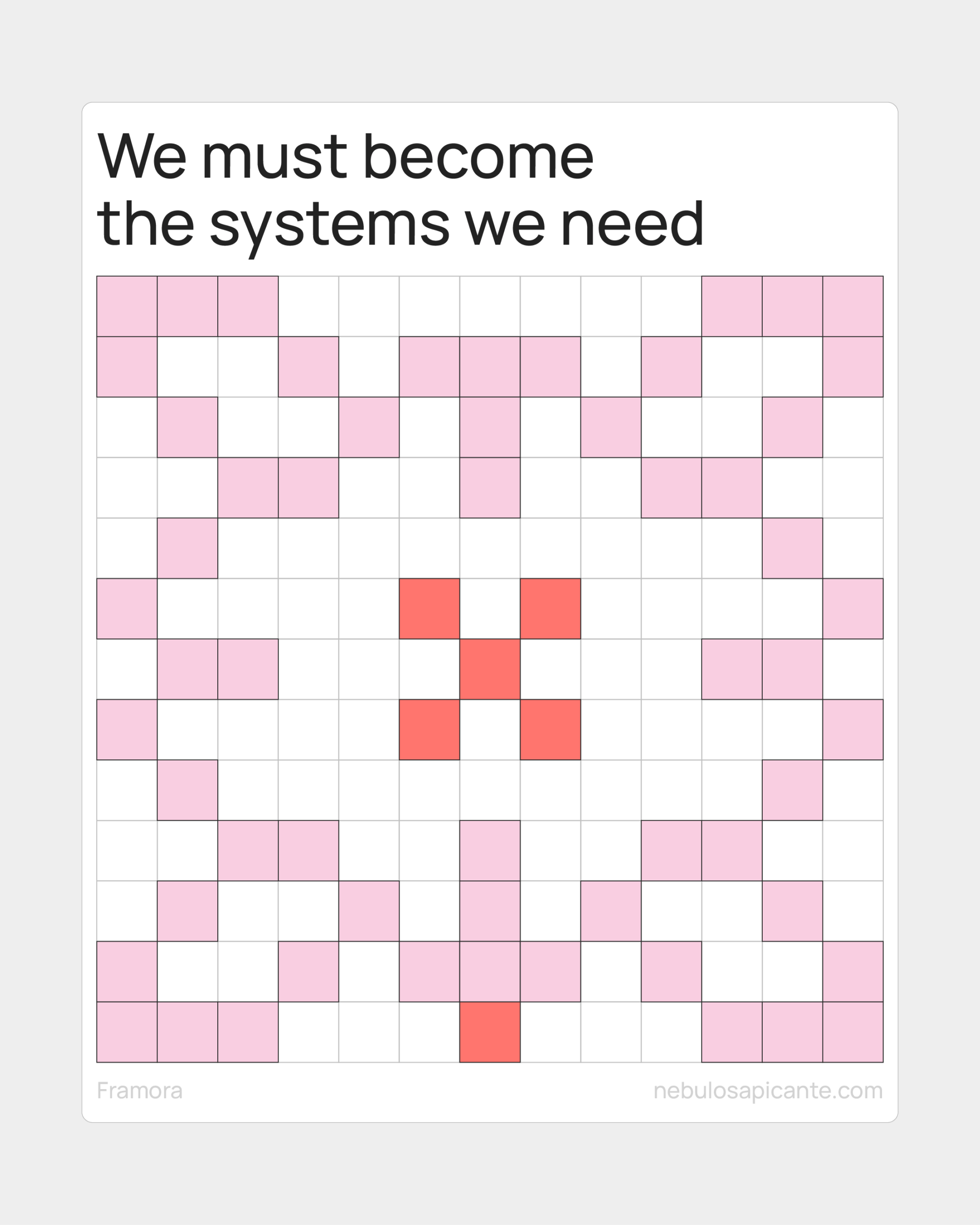
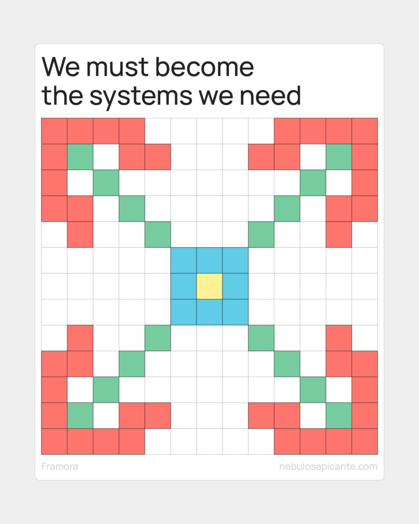
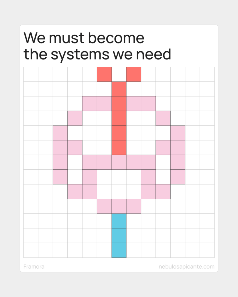
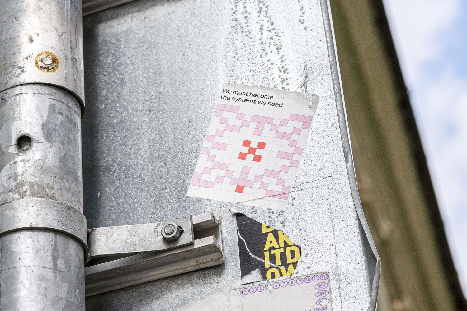
Hi Sara, so nice to finally be speaking, well writing. I shared your work “Framora” because I loved how such a simple system can feel so human. I also really liked the sentence you added: We must become the systems we need. Can you tell us a bit more about the project?
Context
It was a small project I was working on in my free time because I wanted to refresh the homepage of my website. I wanted something simple, but with a strong message that reflected what I do.
The idea of using flowers came from a manifesto for young adults that I wrote and illustrated recently. All the illustrations were flowers, and this time I wanted to explore a more systematic way of creating them.
I’m in my “flower era”. I see them as a universal symbol of beauty and fragility, but also as a quiet reminder of attention: to pause, to look, and to care for what blooms. I’m glad you mentioned that the system felt human even though it started from something so simple, because that was exactly my intention: to express the sensitivity and emotion of my work through the small building blocks that compose it.
Process
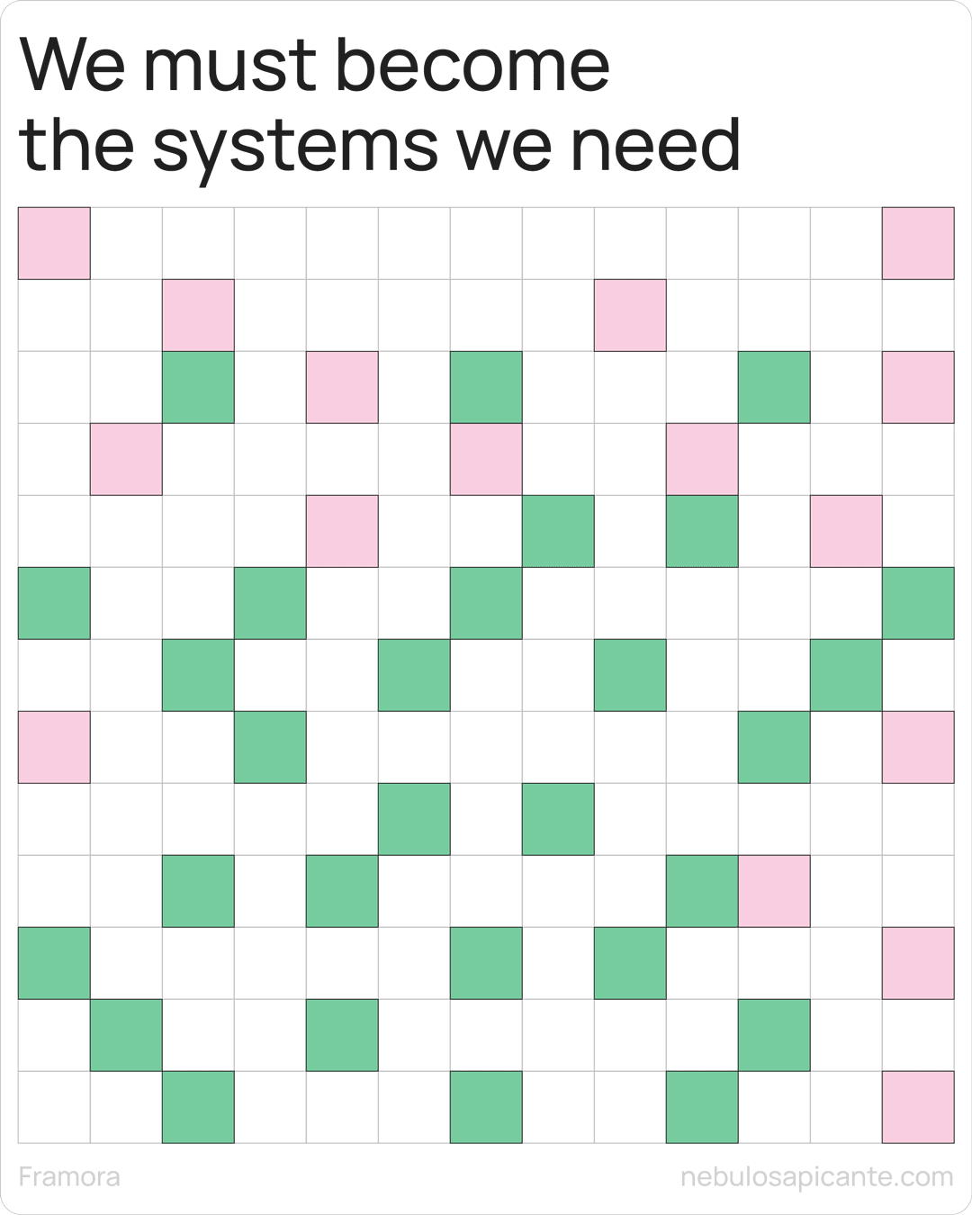
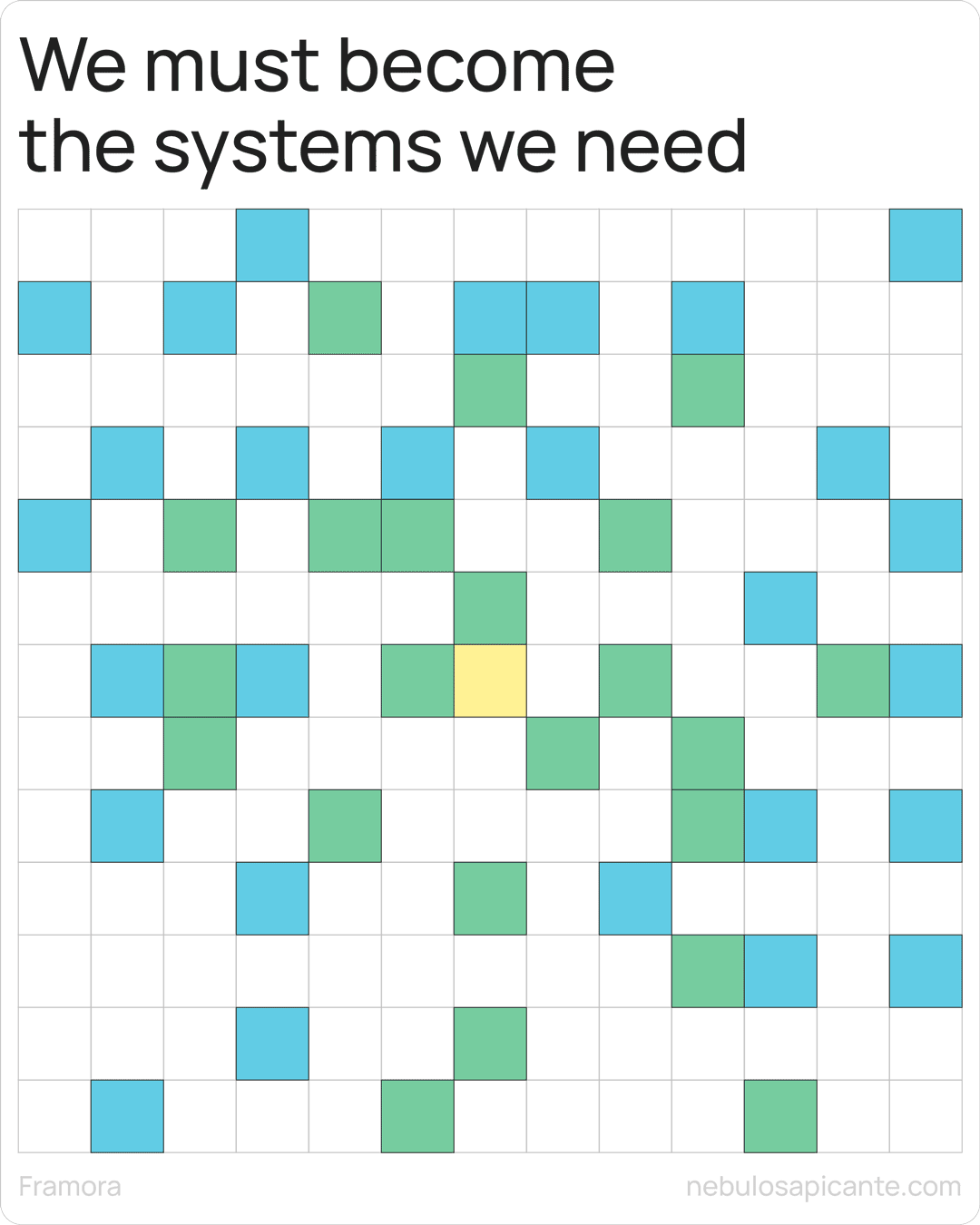
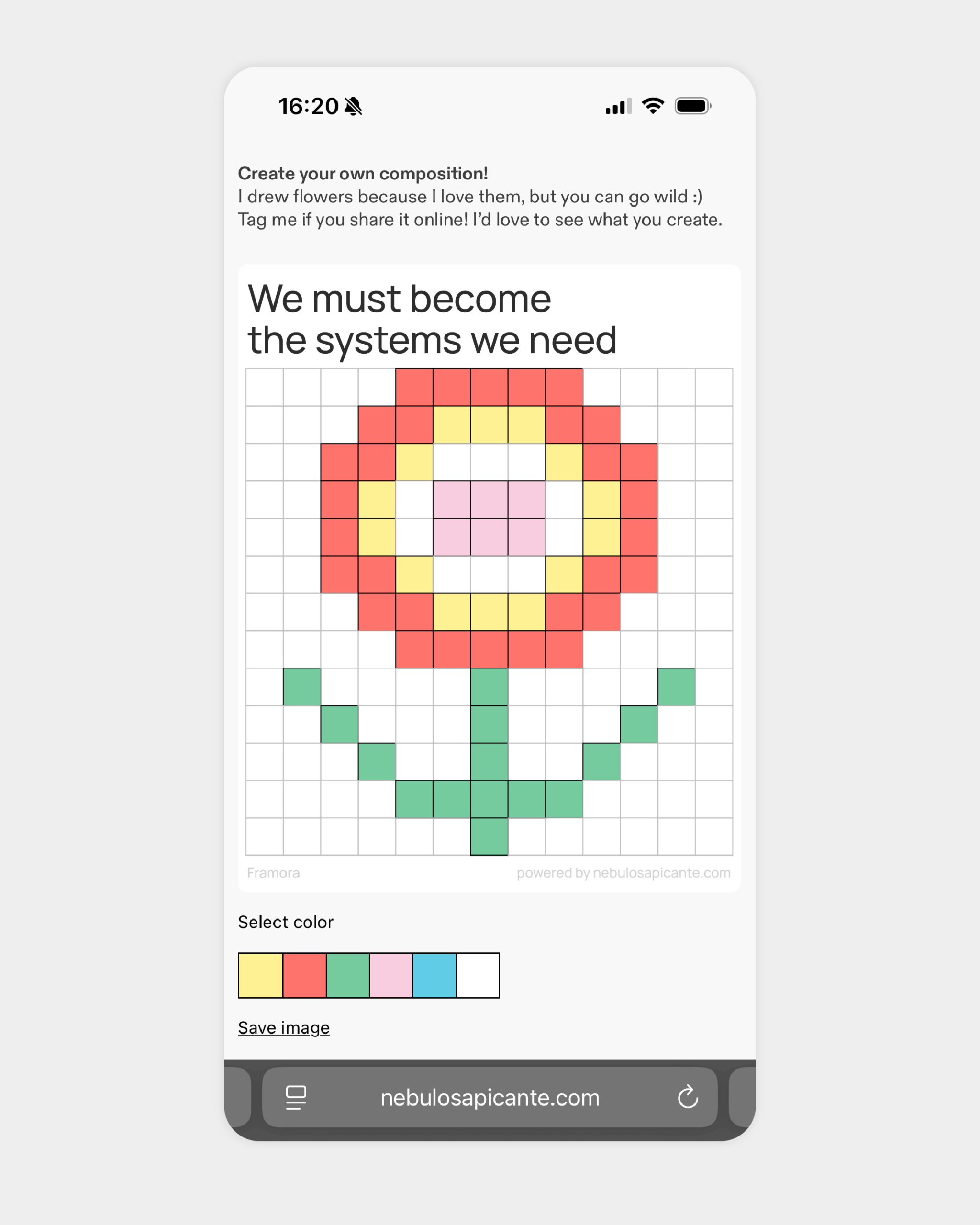
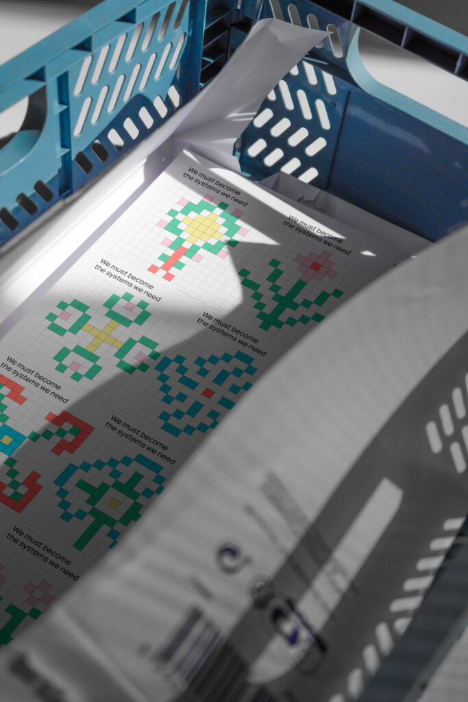
To summarize a bit, I started by drawing everything by hand. It took quite some time because I had to fill each cell, keep the symmetry, erase here and there until I found the perfect composition… I wasn’t very motivated, so I left the project aside for a while. A few weeks later, I told myself I really wanted to do it, but realized it would be better if there was a tool that could take care of the how, so I could focus on the what.
I’m very enthusiastic about creative coding and follow Tim’s courses closely. Based on some of them and other tutorials, I built a tool that made the process much more enjoyable. I decided to focus on flowers, but the tool’s own limitations help me train my ability to think abstractly. I’ve used it for other projects too, and several people have sent me their own versions of Framora. I almost feel embarrassed sometimes because their creations are better than mine.
Intention
In my personal projects, I usually pair visuals with a phrase. I like that it gives the viewer a sense of the intention behind what I do, while still leaving room for interpretation, since my work tends to be abstract.
In this case, one of the ideas that I keep closest from my manifesto is the eighth principle:
Reshape reality.
The world is malleable, you don’t have to accept things as they are.
I’ve always said that if we all agreed on it, tomorrow could be Friday. It sounds like a joke, but that’s pretty much how the world has been built. Someone has an idea, it slowly gains acceptance, and eventually it becomes reality for a lot of people.
It’s happened with calendars, language, traditions, diets, religions… And without going that far, we also have the power to shape our own lives using the building blocks of our daily choices. What routines do I want to keep? What beliefs, people, attitudes, hobbies?
We must become the systems we need
A system doesn’t exist “just because,” nor is it an isolated entity; it’s made up of small parts that share a common language and purpose. In other words, the system as a whole is the result of the micro-actions of the elements that compose it.
Life at home is more harmonious when we share similar values, a company works when its people are aligned, and a society thrives when its citizens respect each other, collaborate, and care for the common good. It’s a complex network of education, empathy, communication, justice, and shared purpose.
If we have a vision of the kind of society we’d like to live in, each of us has to be a living example of that philosophy. It’s happened, for instance, with the vegetarian movement: at first it seemed like a small group couldn’t make a difference, but persistence proved otherwise.
“Soft and radical,” I saw it somewhere online, and I think it describes this kind of transformation perfectly.
In your response to me sharing your work, you mentioned that you promote the FVS framework at your work and that it makes “things” coherent and meaningful. Where do you work, and what does coherent and meaningful mean in your context?
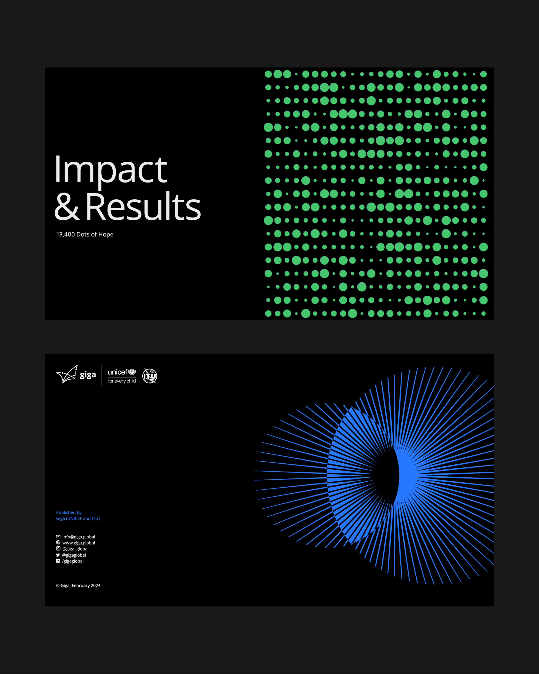
I work as a graphic design consultant at UNICEF, specifically at Giga, a joint initiative by UNICEF and ITU that aims to connect every school in the world to the internet. We have a platform where you can see, in real time, the level of connectivity of each school. Each one is represented by a dot on the map, whose color changes depending on its connection level.
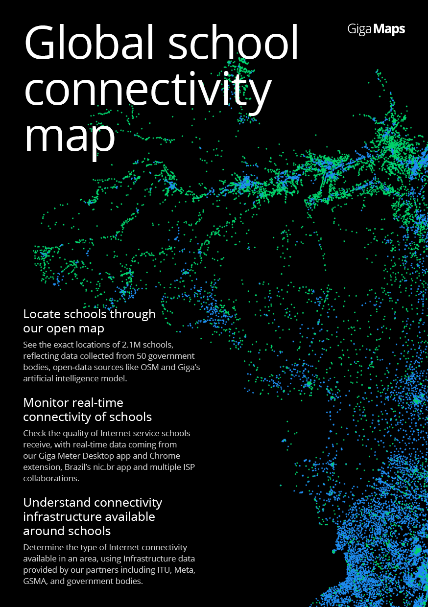
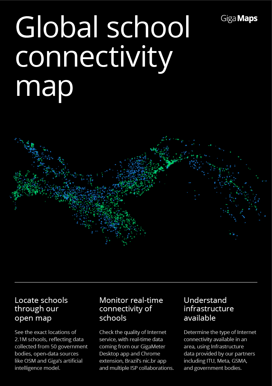
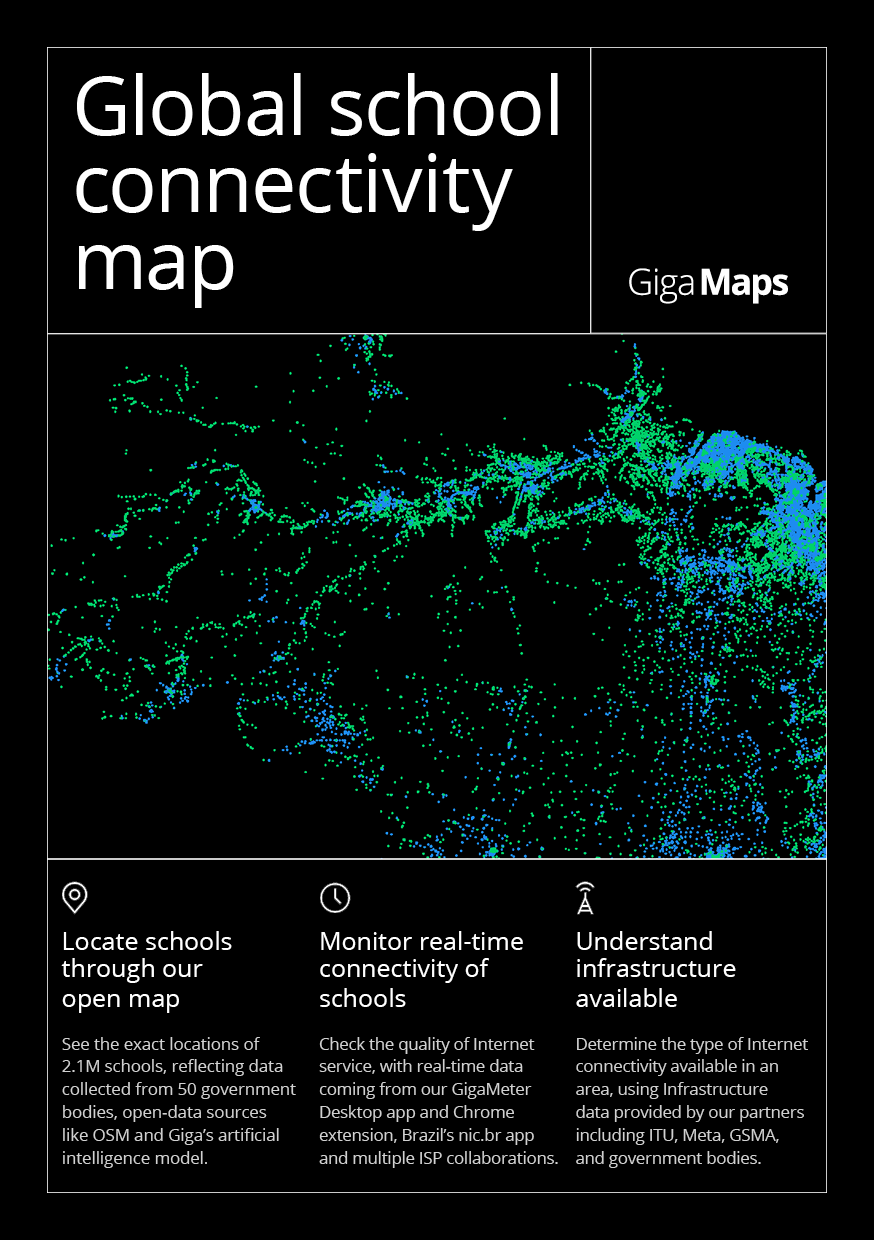
We decided that this dot (or circle) would be the central visual element of the entire identity, because it not only represents a geographic location but also access to information, opportunity, and choice. A dot that shifts from red to green (from low to high connectivity) marks the beginning of a more equal and accessible world for everyone.
The circle appears throughout our visual identity, and not only in its simplest form: it transforms depending on what we want to communicate. We use arcs for more contemplative compositions, lines to symbolize connectivity, and we make use of the patterns emerging from the map as living elements that reinforce our visual narrative.

By giving symbolic value to this geometric shape, the essential building block of the system, the whole gains meaning. And by carefully defining how these blocks can transform, we ensure that everything remains consistent, balanced, and recognizable. This coherence is not only visual but also conceptual: every element carries the same intention, and together they build a language that unites function with emotion.
When design manages to connect an idea with an emotion, it stops being just form and becomes an honest, living conversation.
Thanks, Martin, for the space and for giving me the chance to put into words and share some of the thoughts I’d been carrying around.