INTERVIEW
Liad Shadmi
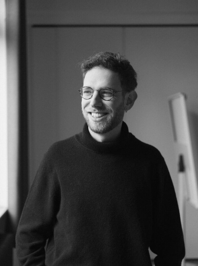
When designer and researcher Liad Shadmi set out to piece together the story of Eli Gross, he was embarking on a journey to uncover a forgotten chapter of modern design history. Though Gross played a pivotal role at the legendary Dutch firm Total Design, contributing to iconic identity systems like the Nederlandse Credietbank and the adaptable honeycomb logo for Rotterdam, his name and career have remained largely overlooked. In this interview, Shadmi discusses his book project dedicated to Gross, shedding light on the designer’s move from Israel to the Netherlands and back to Israel and the personal resonance of a life lived across cultural and geographical borders.
Martin: Hi Liad, you’re currently running a Kickstarter campaign and looking for a publisher to release a brilliant book about a designer I had never heard of: Eli Gross. Looking at his work, I immediately asked myself why I hadn’t heard of him, especially since we crossed so many paths. For starters, Gross also studied at the KABK, learned from Noordzij’s principles, and was influenced by the Bauhaus, De Stijl, and Swiss typography. His work fits perfectly into the 1960s of north european design. What can you tell me about Gross’s early professional years?
Liad: Gross was first exposed to graphic design through a meeting with Louis Karst Zwart in Israel—the son of the iconic Dutch designer Piet Zwart. It was Zwart who recommended that Eli study in The Hague. Unfortunately, we still know very little about the early years of Gross’s career. I found some correspondence at his sister’s house confirming that he worked in the Netherlands as a freelance designer and did some illustration and design work. After graduating, he joined a Dutch design and advertising company called HBM as a freelancer. The company is relatively unknown in design history today, although it was quite large and significant at the time. It was only in 1969 that Gross officially joined Total Design, where he started working as an assistant designer to Wim Crouwel.
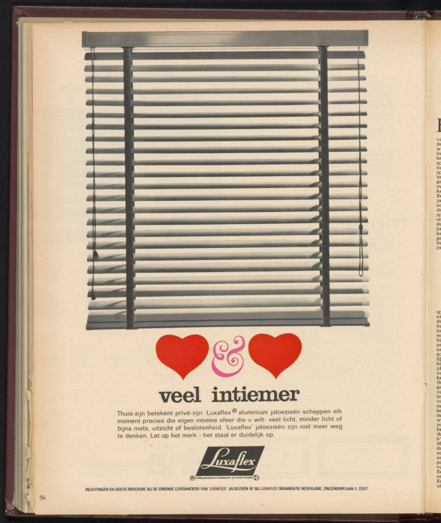
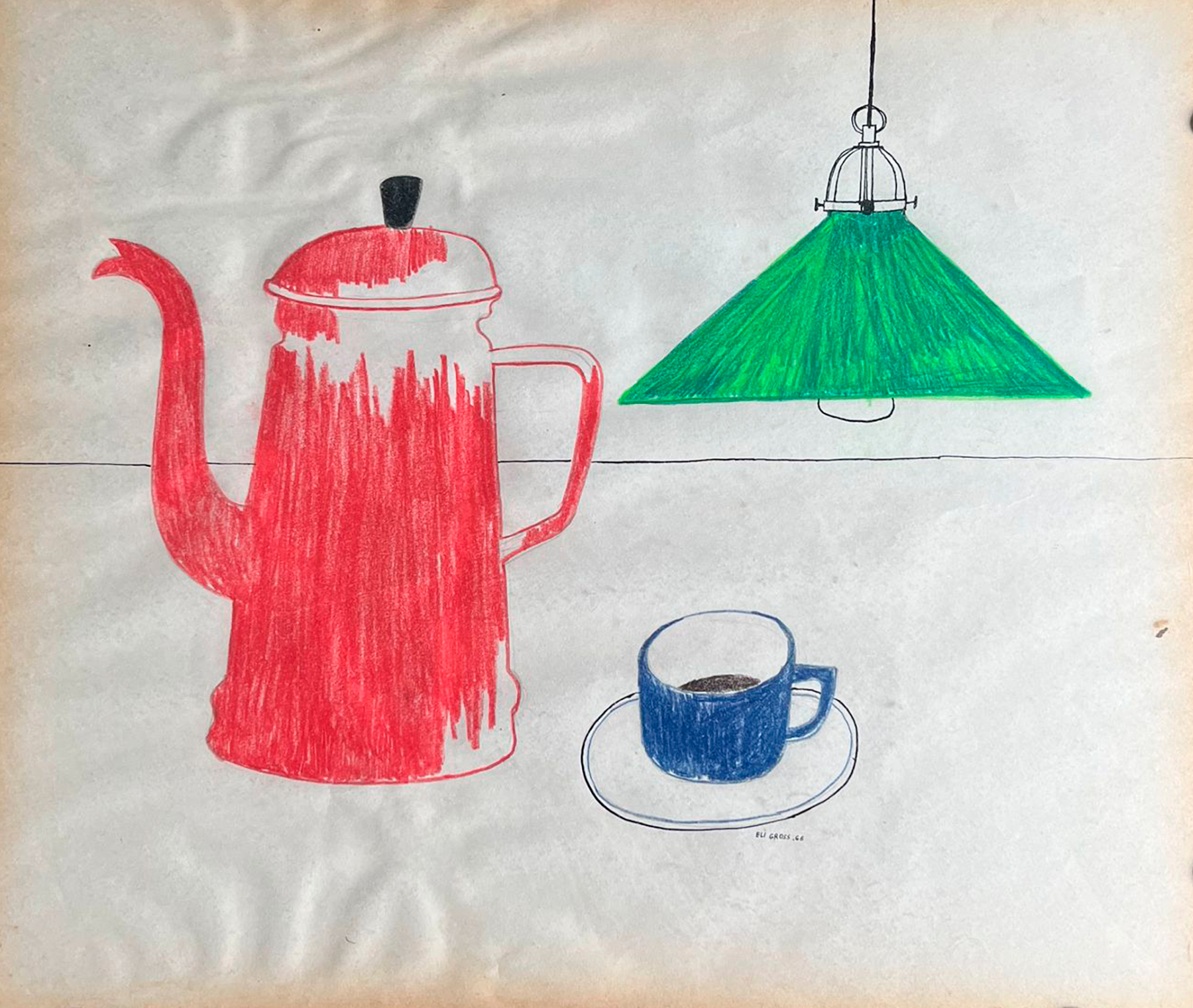
Martin: In these two images, you still don’t see the systemic approach necessary to do the kind of work Total Design was doing. When and how do you think Gross moved from image-making to system-making?
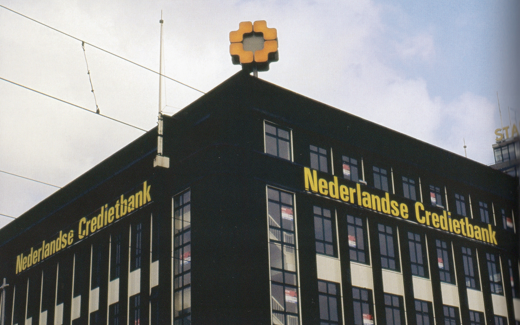
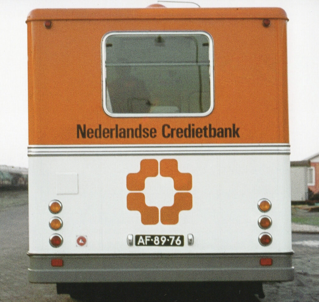
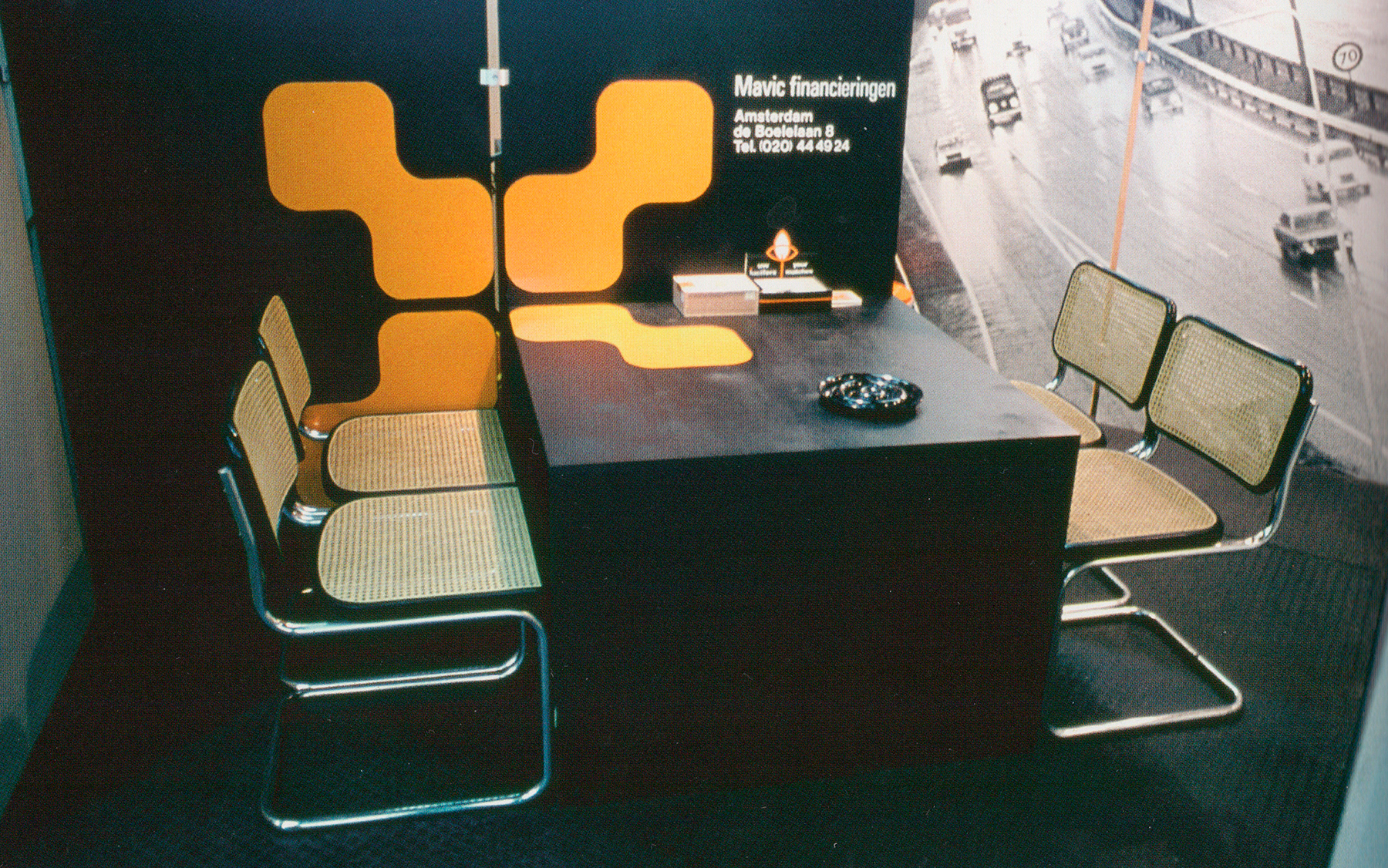
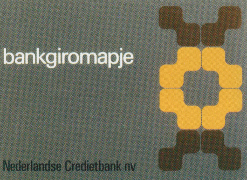
Liad: Yes, these are very early works, very bauhaus and playful functionalism inspired. The systematic approach of Gross was developed mainly in Total Design, We can see it in the corporate identity he designed for the ‘nederlandse credietbank’ together with Jolijn van de Wouw and Wim Crouwel. where the Logo of the bank becomes an adaptable dynamic element of the identity.
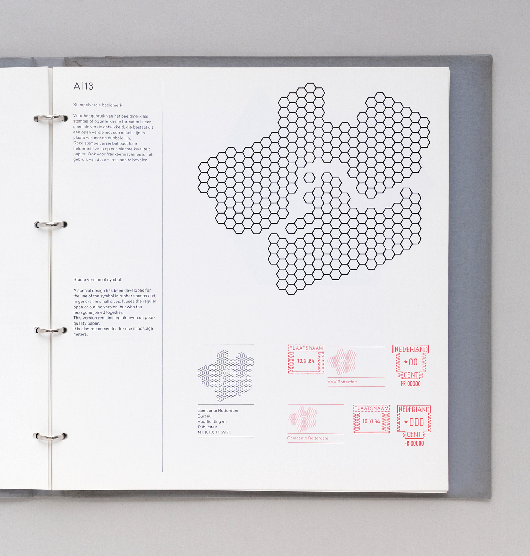
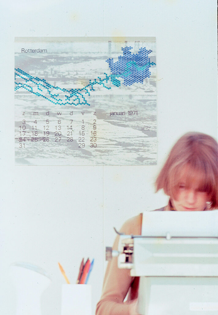
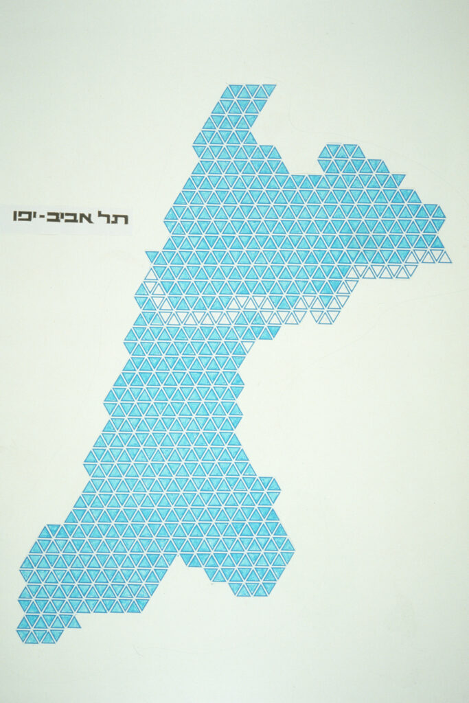
But the work most closely associated with Gross and his time at Total Design is the honeycomb logo for the city of Rotterdam, which also demonstrates a dynamic, systematic approach to the city’s identity. First and foremost, the logo is an abstraction of the city map, allowing it to grow and accommodate additional “hexagon shapes” as the city itself expands. Secondly, the logo is adaptable, with two versions: one incorporating the river of Rotterdam and one without it.
In certain applications, such as calendars or posters, the logo could be used in a more playful manner. On letterheads and other official formats, it appeared in a more condensed and compact form. As Ben Bos wrote in TD 63–73:
“Rendering the entire shape of the town with ‘honeycomb’ shapes was a good way to future proof the identity: it could easily be adapted in response to any future developments of the town’s borders and harbours. Eli Gross played a prominent role in the design of the symbol.”
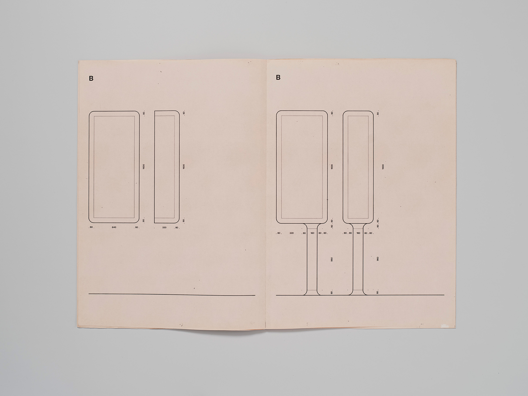
Martin: In your essay on Dutch Graphic Roots, you also mention a bus stop design in Tel Aviv. Gross seemed to have had a wider understanding of identity systems than we have nowadays in our digital-first world, expanding from 2D shapes to 3D objects. I am interested in the context that shaped this approach.
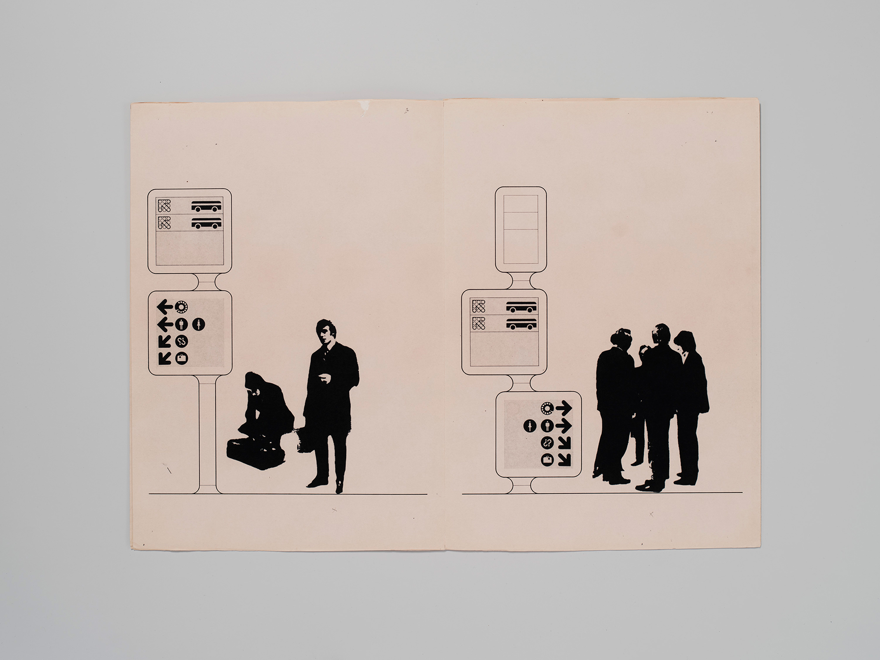
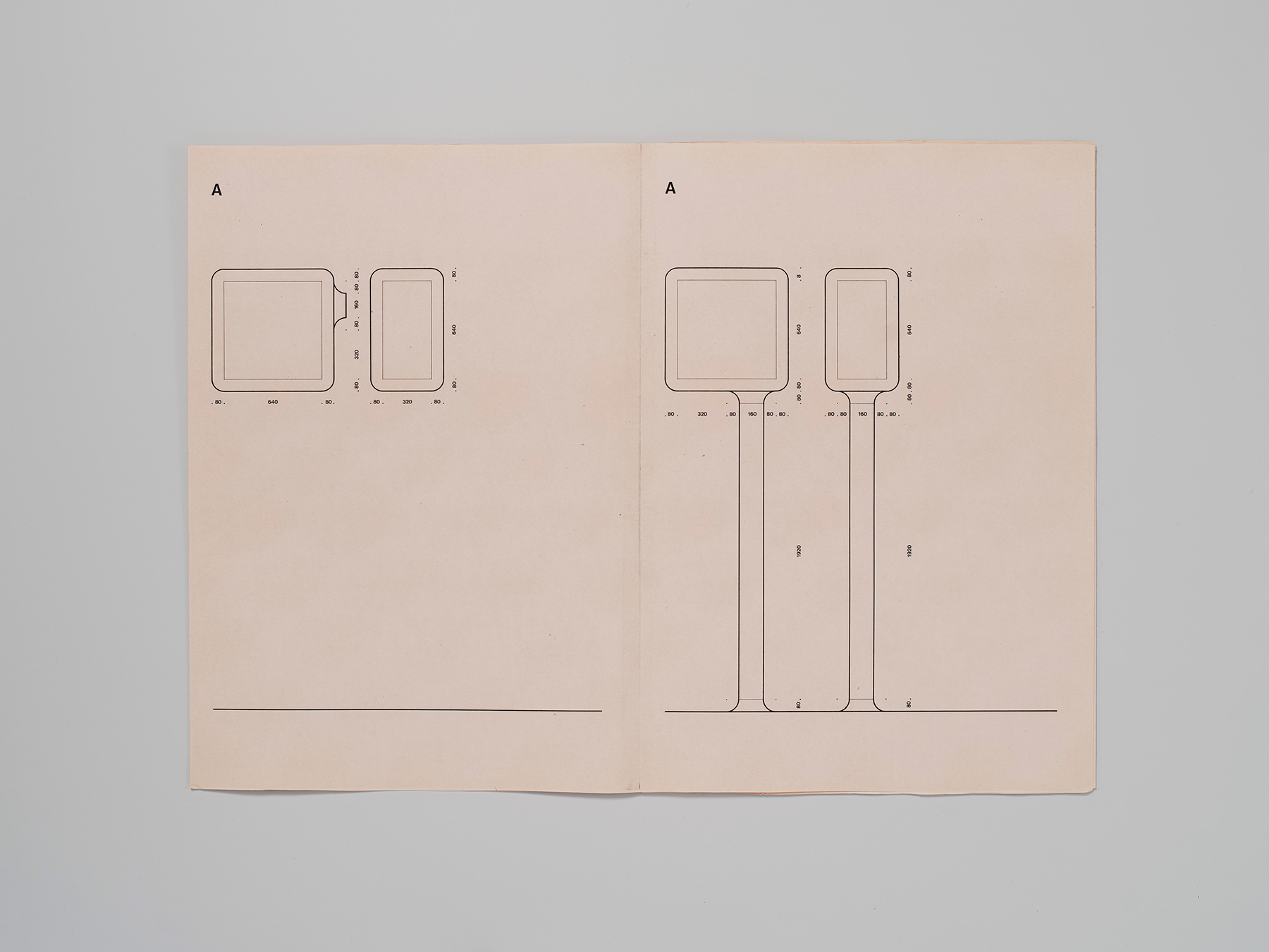
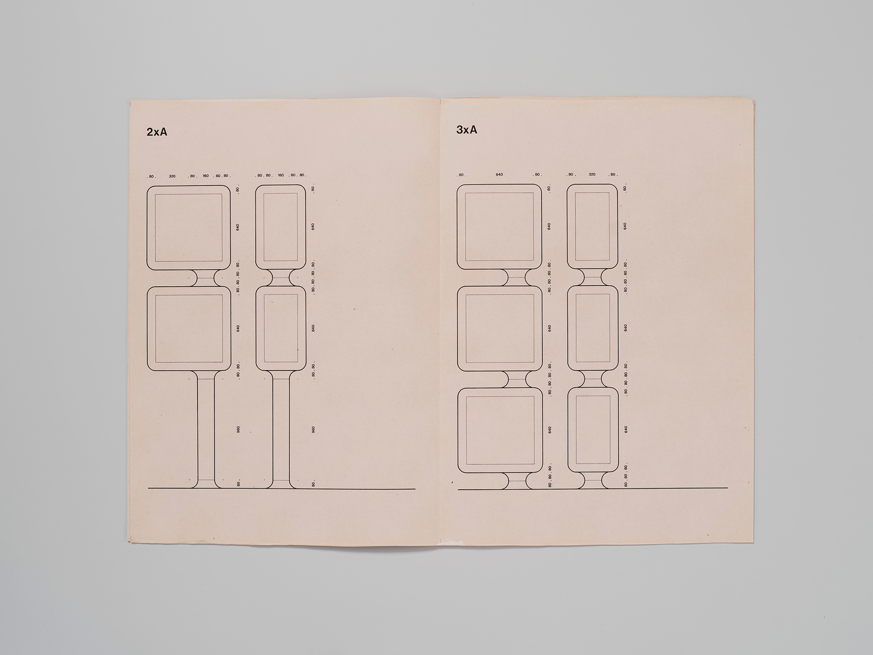
Liad: I think this approach came much from working on the Tel-Aviv bus stop signage with Benno Wissing. I talked with Dutch designer Roger van den Bergh who did an internship in Total Design under Benno Wissing and told me: “Benno was able to put everything into context. Designers tend to think only about design, but design is just one part of the whole. Benno understood how to see it within the larger context.”
I found in the archive of Benno Wissing the original proposals of the wayfinding including a text written by the TD team and a summary of a meeting with the architects. The TD team took also in consideration many things like advertising and the balance between advertising and wayfinding and how do they should work in Synergy: “To solve this puzzle one could either evade competition by banning advertising from the traffic areas or one could try to find a solution in which traffic and advertising information would happily live together, each having a different character.
Now one can hardly expect the advertising to have a defined character but if certain reservations would be made, we think it possible that a highly defined character of the traffic information carriers themselves could keep them from blending into whatever the surroundings are.”
Furthermore they had the idea that the furniture would not only just ‘carry information’ but rather fill a certain function: “Or it can contain such a service itself: telephone booth, waste basket, postbox, mirror, drinking fountain.”
Martin: It sounds exciting to speak with so many eyewitnesses and explore forgotten archives, each offering a different perspective on Gross’s influences and the evolution of his work. Did you ever feel that, through your research, you came to know Eli?
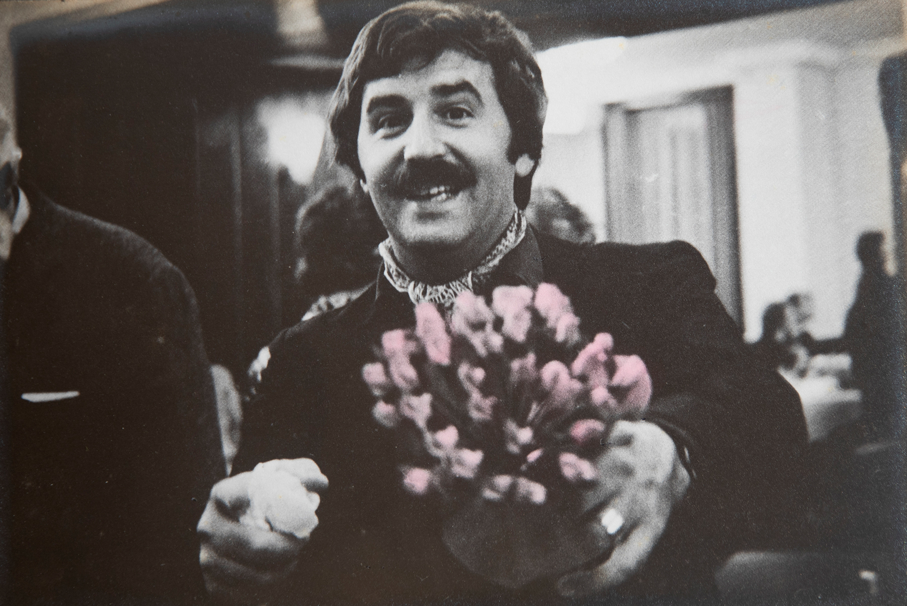
Liad: He was not an easy person, by all accounts—very dogmatic and uncompromising! But also very funny, sarcastic, and witty. I think I feel quite personally connected to this story because, in many ways, it connects to the idea of the “wandering Jew”: moving between countries and continents, absorbing influences and bringing them back and forth.
Eli was born in the British Mandate of Palestine in 1939 and moved to the Netherlands in 1961 to study at KABK. He stayed there until 1972, and then brought the knowledge and influences he had absorbed back to Israel. This contrast, and the somewhat bi-polar nature of his story—moving between places, bringing ideas and inspirations back and forth—is something I personally relate to.
I moved to Germany in 2019, before the pandemic, because I wanted to experience life somewhere else and learn a third language. During Covid times, I started my MA at HAW Hamburg. I became very inspired by what we might call “contemporary European design,” while still maintaining very strong, collegial, and personal connections to my home country.
So there is this constant mix and match—being somewhat torn between two places, but at the same time feeling that both are home. In that sense, I think Eli’s story resonates with me on a very personal level. That design is an international language, it has no borders and we can get inspired by anything, anywhere.
Martin: I can relate to what you’re writing, having lived in Germany, the Netherlands, and Spain. Yet I sense another dimension to your feeling of being torn between places. You mention the “Wandering Jew.” Could you elaborate on what this metaphor means to you?
Liad: The “Wandering Jew,” or “Eternal Jew,” is a figure from a medieval Christian folk legend that became a metaphor associated with Jewish life. In the legend, a Jewish man is condemned to wander the world without ever finding rest, stability, or prosperity until the return of Jesus. His constant movement is tied to exile, instability, and the fear of having his identity discovered. Over time, the legend has been subject to many different interpretations, particularly around ideas of exile, belonging, identity, and perpetual wandering.
In the case of Eli Gross, I like to connect this metaphor to his own experience of moving between different cultural worlds. He was never entirely understood in Israel: he brought a modern, forward-thinking Dutch design philosophy into a very different cultural, political, and linguistic environment. His ideas and designs were not always easily accepted or understood within the hot, expressive temperament of the Middle East. In a way, Gross was trying to introduce not only a new visual language, but also a different, more secular, democratic and systematic approach to design and to society. This makes his story particularly interesting to me in relation to the idea of the “Wandering Jew”—someone constantly moving between places, carrying ideas and influences from one world to another, but never quite belonging entirely to either.
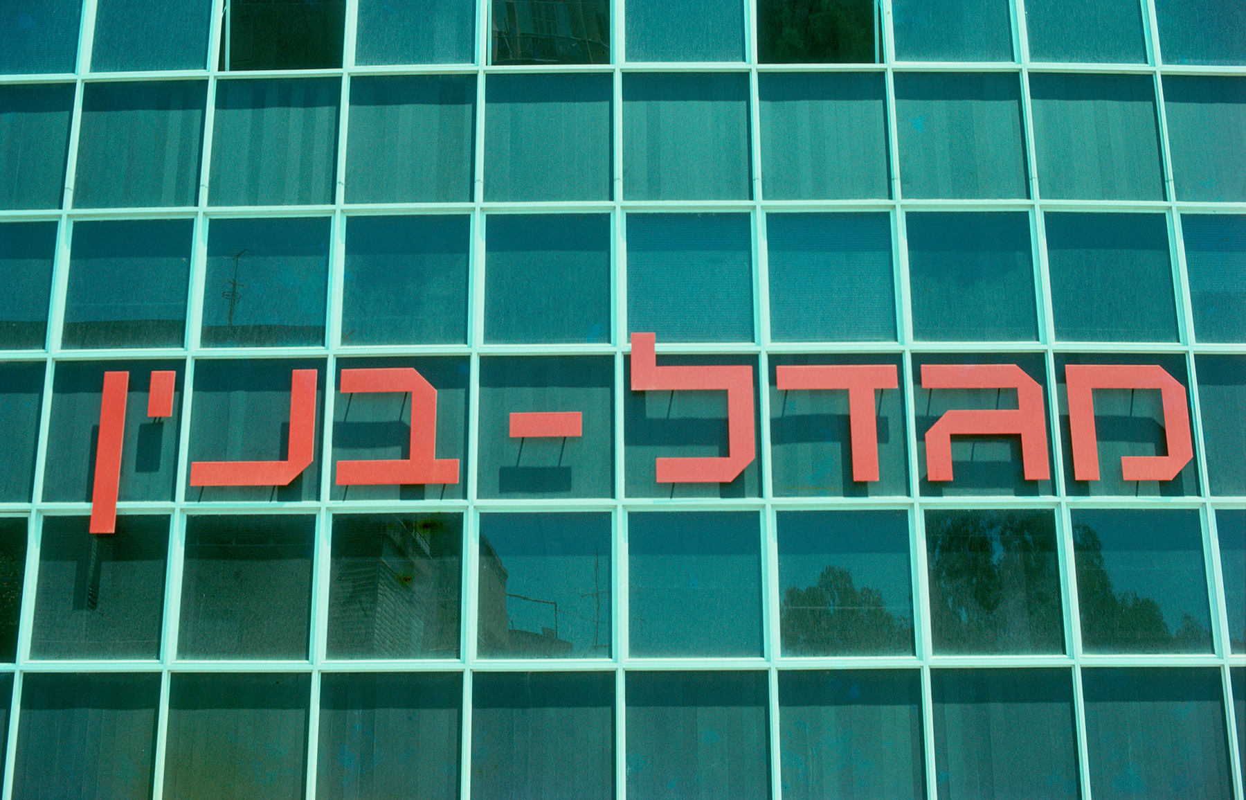
This ambition is already evident in a letter Gross wrote to the photographer Aliza Auerbach on March 15, 1966: “I want to come to Israel quickly and start working in the country, open a studio, and teach classes at Bezalel. I believe I can do and develop something in graphics in Israel, as the field is hundred years behind.”
This book does not try in any way to look at the reality of the country through rose-colored glasses. In many ways, Gross’s systematic way of thinking did not resonate with the environment around him, and I try to understand and analyze the reasons for this. The country was being built at an incredibly fast pace, with things that needed to be designed, organized, and implemented quickly. Against this reality, Gross’s highly systematic, rigid, and, to some extent, utopian design vision was not always easy to implement. It is a critical analysis of his work and the implementation of it in Israeli society, also another question is raised that I’m not yet sure I can answer, is this just a ‘copy and paste’ from what he learned in the Netherlands or is it a new dialect that is born? and also: why was his legacy so largely forgotten?

Martin: Gross says “I believe I can do and develop something in graphics in Israel, as the field is hundred years behind.” What is it that you hope to “develop” with your book?
Liad: I’m glad you asked. I hope the book will have an impact, particularly on how we think about what graphic design can be.
There is a renowned debate that took place in 1972 between Wim Crouwel and Jan van Toorn. They discussed many subjects, but one of the central questions was whether design should be expressive and convey a particular message or political position, as Jan van Toorn argued, or whether it should strive to be informative and objective, as Crouwel proposed. In the decades that followed, the expressive approach became very influential internationally, and design is often expected to communicate emotion, opinion, or a particular point of view. When I studied my BA in Israel, I was constantly asked what “message” my design was conveying.
I think that in this postmodern age, design can—and should—be both. Modernism is a tool we can choose to use, or not use, depending on the context. Design can be objective or expressive (or both); it depends on the situation, the brief, and what the design is actually supposed to achieve. With this book, I hope to widen that discourse rather than limit it—to show that there are different ways of thinking about what design can be.
There is also another dimension to the book that feels particularly relevant today. There is a lot of polarized and undifferentiated discourse around Israel and Israelis. Gross’s work offers a different perspective: he was a designer with a strongly democratic and human-centered approach, and his designs were intended to be international—to be understood regardless of religion, culture, or language. He built his career by moving between Israel and the Netherlands and by bringing ideas from one place to another. In that sense, I see this book as an attempt to build bridges based on old ones: to show that design can function as an international language, that it can be human-centered, and that it has no borders.
The response to the Kickstarter has also been interesting in this regard. Currently more than 60% of the backers are from outside Israel. For me, that demonstrates that there is an international audience interested in this story and in engaging with Israeli design beyond the political headlines surrounding the country today.
Martin: Thank you, Liad, for this conversation and the wonderful book you are about to publish. Here’s to building bridges.
You can read more about the book here and pre-order a copy in the next few days until the campaign ends on October 1st!