Interview with
Benoît Bodhuin
«The system tells its own story and can contribute positively to legibility, and its expression will determine the leeway I allow myself regarding legibility. Nothing is absolute.»

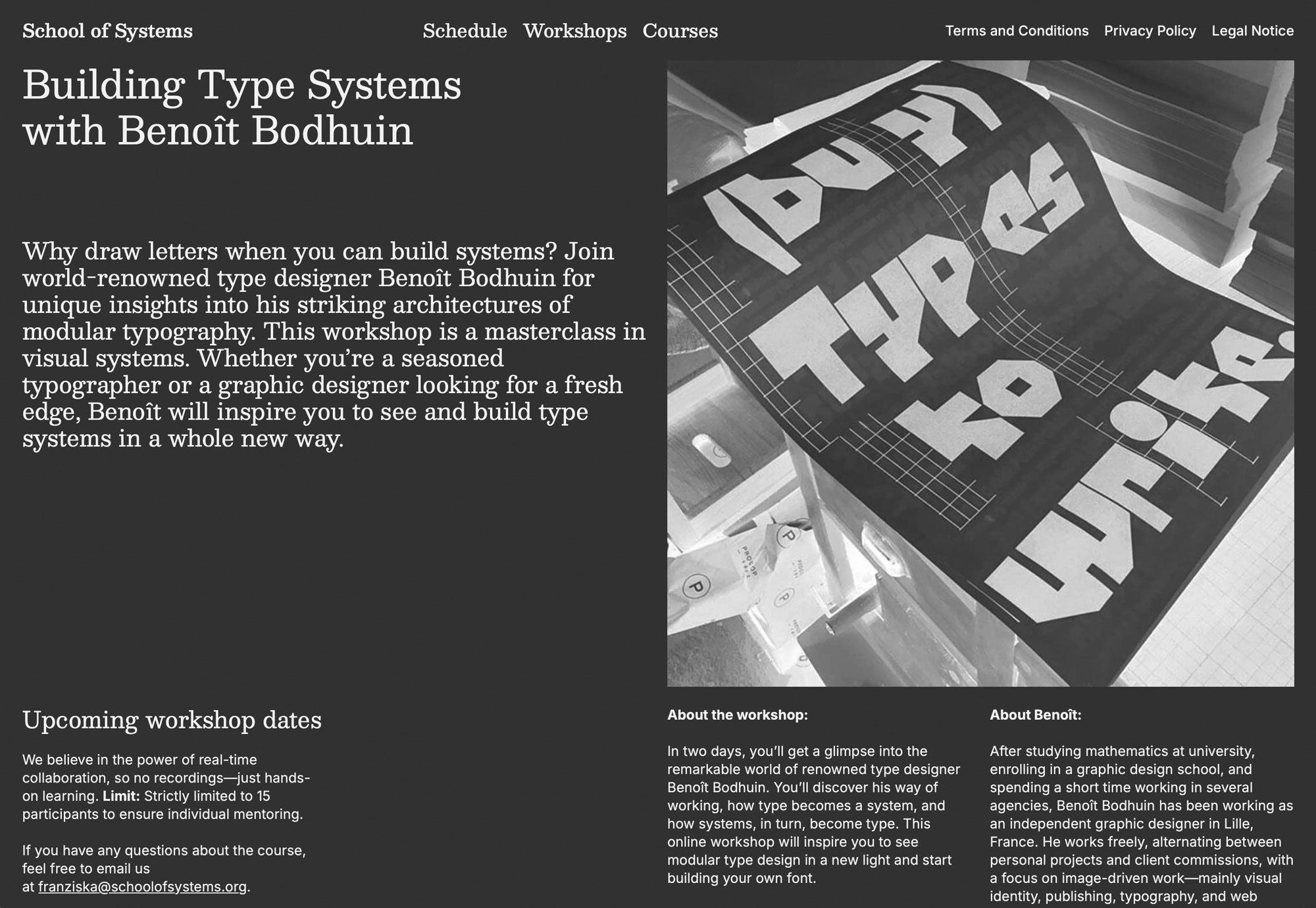
Why draw letters when you can build systems? Renowned type designer Benoît Bodhuin gives us insight into his wild architectures of modular typography. After studying mathematics at university, enrolling in a graphic design school, and spending a short time working in several agencies, Benoît Bodhuin has been working as an independent graphic designer in Lille, France. He works freely, alternating between personal projects and client commissions, with a focus on image-driven work—mainly visual identity, publishing, typography, and web design. On the 17th and 18th of April he will be giving a workshop for the School of Systems, revealing the method behind madness.
Martin: Hi Benoît, it is a pleasure to have a conversation with you and an honor that you accepted to give a workshop and course at our recently founded School of Systems. I already confessed that I am a long-time fan of yours. You prove how systems don’t need to be boring. What is a system to you?
Benoît: Hi Martin, it’s a shared pleasure. A system is a means to an end, a tool. Typography, by its very laborious nature, invites us to find efficient systems, and this often leads to a certain radicalism. A system allows us to become an observer and work on the system itself rather than each individual letter. It must be flexible enough to adapt to the diversity of designs and robust enough to create expression and coherence. And sometimes the system is the initial intention 🙂 for the sheer pleasure of discovering its expression.


Martin: Oh, there is so much in your answer. So much that you could apply to any kind of system design, even beyond design. It is interesting that you say that a system allows us to become observers. It is a meta layer that creates coherence. Still, we have to make sure we are not just in the meta but also in the matter, or the letter, and make sure it expresses its nature to become readable. In your workflow, what comes first: the system or the letter?
Benoît: Yes, the material, the typography, and therefore legibility, are essentially the rules of the game, the starting point, with its specific characteristics, its history, and its use… Legibility is therefore essential for me; I rely on it like a sculptor on their stone. But this legibility is relative: it depends on each individual, on the use, and on the system. The system tells its own story and can contribute positively to legibility, and its expression will determine the leeway I allow myself regarding legibility. Nothing is absolute 🙂


Martin: Right, context matters when designing a letter. A shape that might be hard to read on its own becomes legible in the context of a word. Do you have an example where the system plays a role in the legibility? Where you don’t just see single letters, but a composition of various letters, making the system visible?
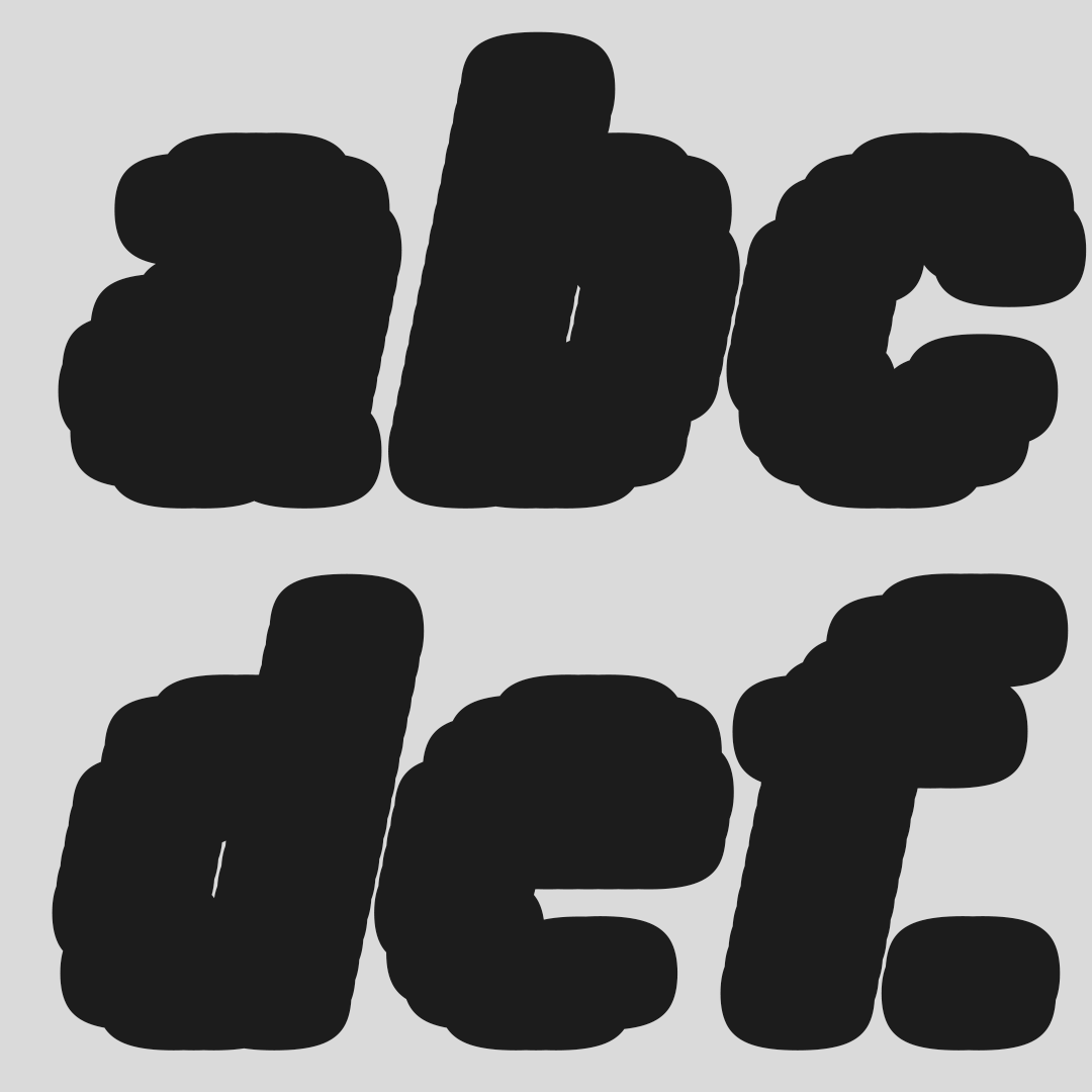
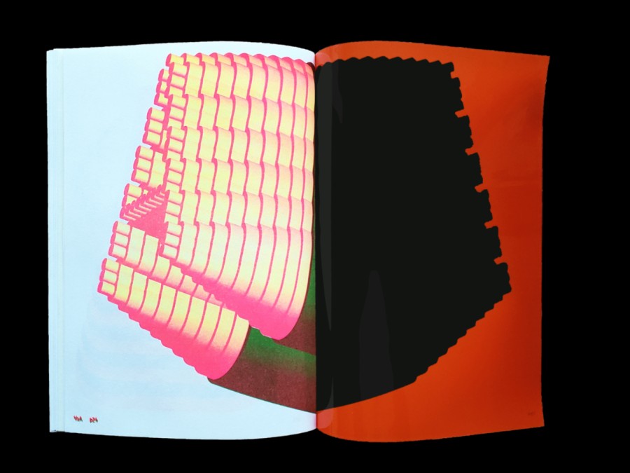
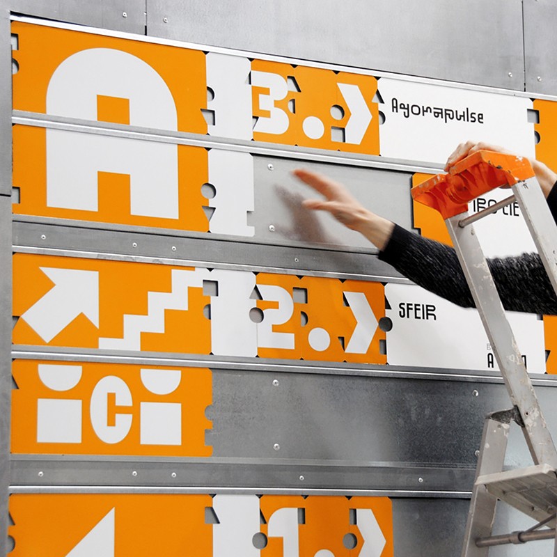
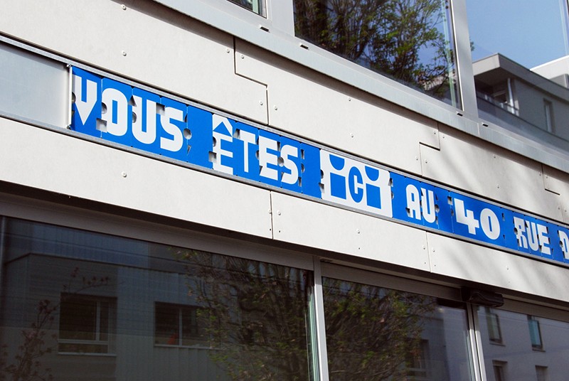
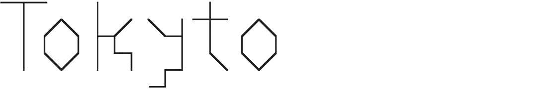
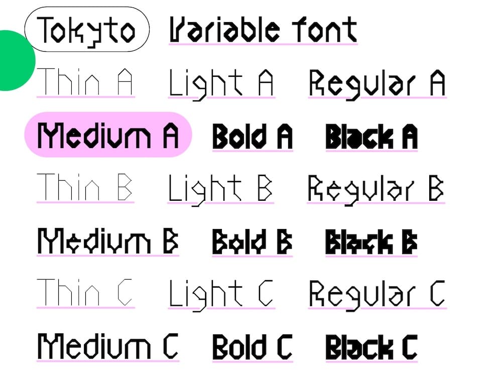
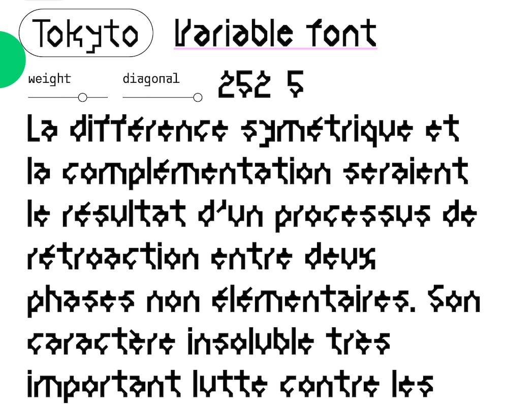
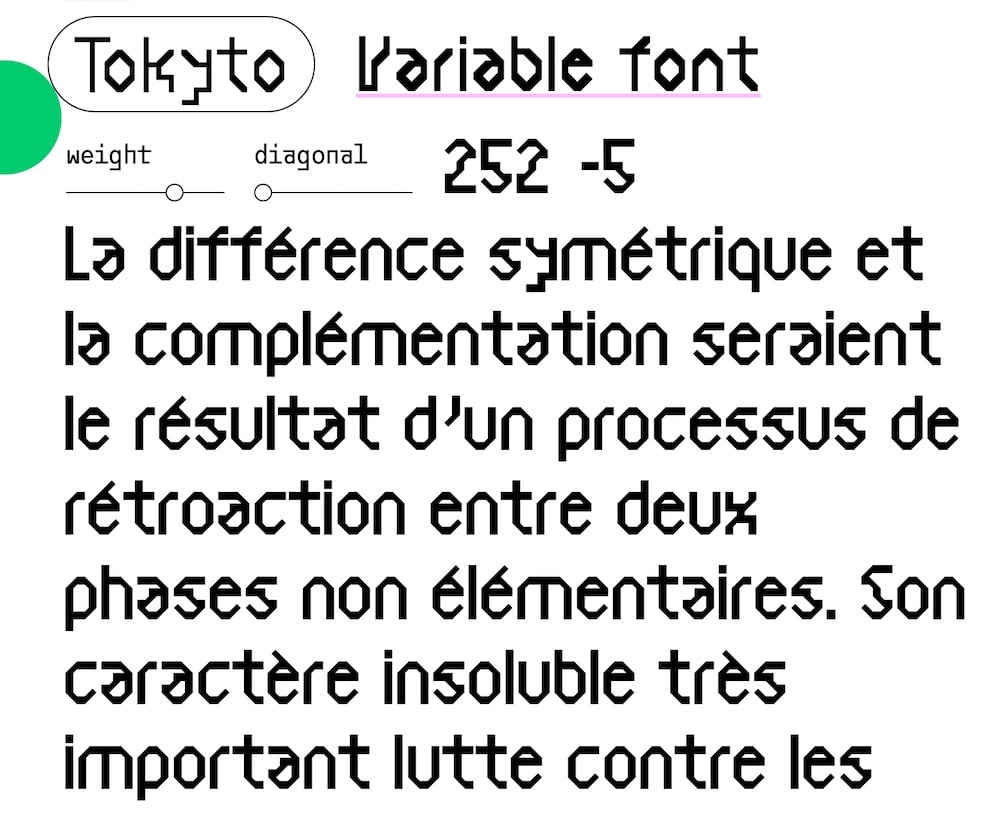
Benoît: This is the case with highly restrictive systems like the grid, for example; it leaves a strong imprint on the drawing (on the form but also the proportions). This imprint contributes to legibility by allowing itself to be interpreted by the reader. Tokyo, for example, can fall into this category. It is a typeface designed according to a grid that varies according to the weight, associated with the idea of ”degradation of the design”: horizontal and vertical lines are unchanged, diagonals become stairs and curves become straight lines at 45°. This scenario, intuitively assimilated by the reader, contributes to the unity of the typeface but is also a guide to reading it.

Martin: Let’s talk a bit about your upcoming workshop for the School of Systems, which I am really excited about. What can people expect?
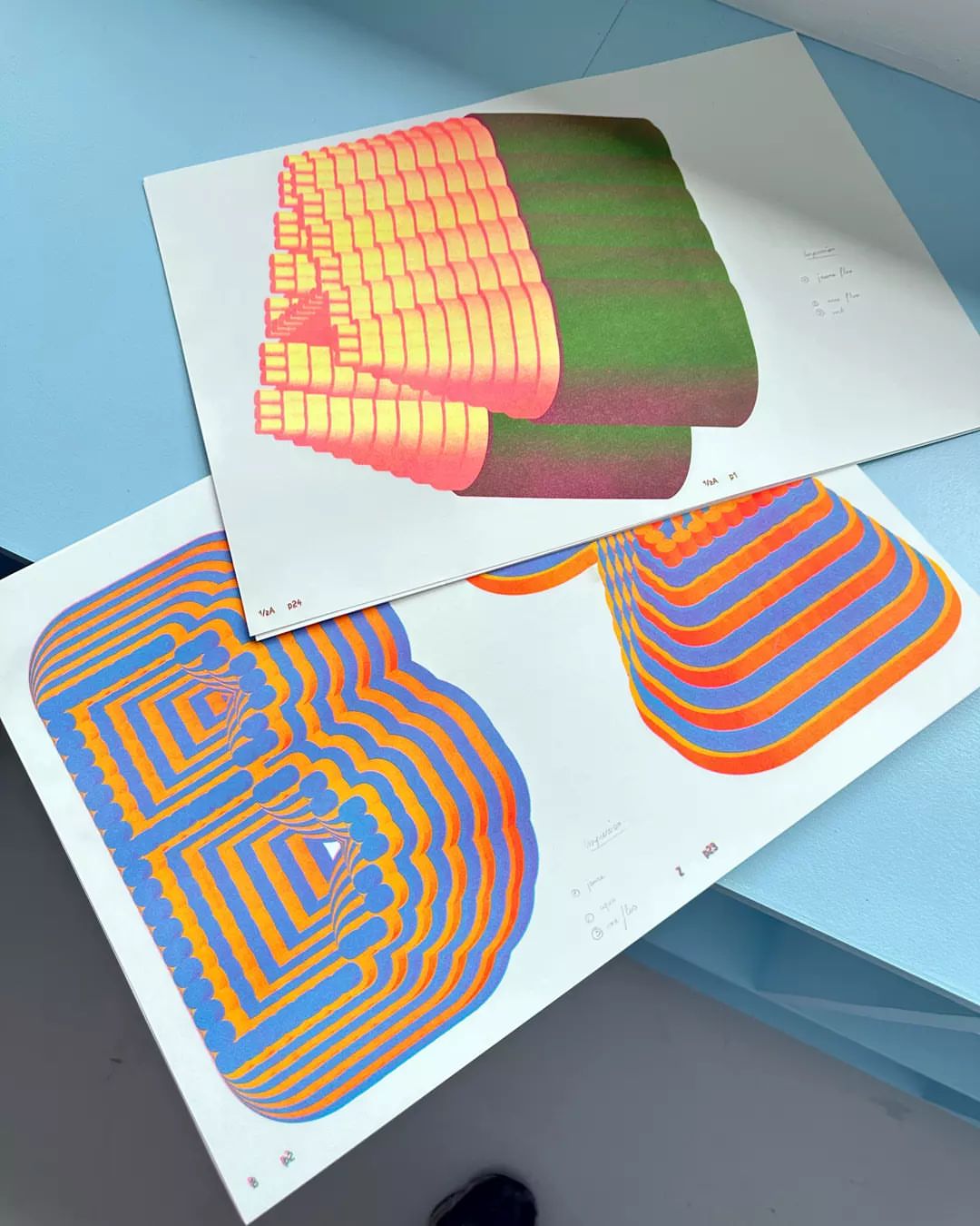
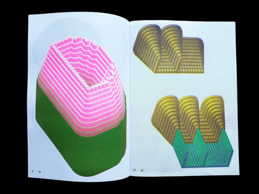
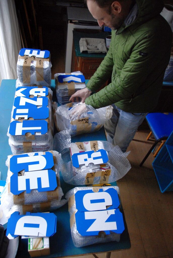
Benoît: People should expect to stop “drawing” and start “building.” In this workshop, we’re going to have a look at the architecture of modular typography. It’s a masterclass in type systems where we use strict grids and simple geometric modules to see how they resist and adapt. I want to show participants how to find a fresh edge by looking at type as a structural puzzle.
Martin: The workshop is going to give a taste of the longer six-session course in September. Can you give a rough outline of what is going to happen in your course?
Benoît: This course is going to be a deep dive. I don’t really ‘draw’ letters, I build systems. For this course, I want to invite people into that sandbox; it’s a rare chance to experiment with simple mathematical rules and see how a rigid grid can actually become a playground for ‘joyful logic.’ We’re going to knead shapes like dough and look for that specific moment where a systemic ‘mistake’ becomes a beautiful design detail. It’s not about perfection, it’s about the process, finding the character within the constraint and coming out with a font that has its own weird, rhythmic soul. Going to be fun.