From Flexible To Contextual
Kunstuniversität (University of Arts) Linz, 2026
“The kind of attention we pay actually alters the world:
we are, literally, partners in creation.
This means we have a grave responsibility,
a word that captures the reciprocal nature of the dialogue we have with whatever it is that exists apart from ourselves.”
Ian McGilchrist
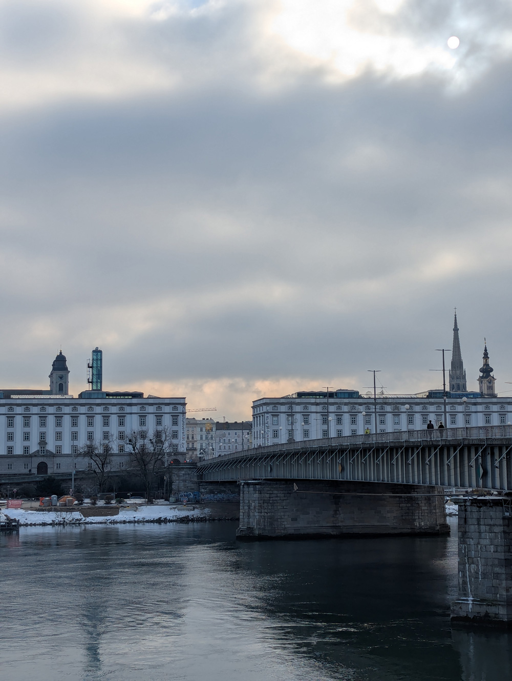
The new year started in a very lovely way. The brilliant visual artist, designer and professor Tina Frank invited me to give a lecture and workshop about Flexible Design Systems at her Department of Visual Communication at the Institute for Media of the University of Art and Design Linz, Austria.
Having given a couple of talks about The FVS Atlas a few months earlier made me realise that FVS isn’t this big fight that still needs to be fought. The FVS Atlas showed me that pretty much every young design studio embraced the system approach. What could I offer the smart and talented students in Linz that would be a new challenge for them? What would be the next desirable step for FVS? What if the thought “From Flexible to Contextual” could become a new fight? A fight for design with a societal purpose?
I started with a very simple supposition. If identity is created through constants and flexibility through variables, how come we reduce the variables to adaptability to size, dimensions and devices? Why is the public space where our design is shown and the citizens it is shown to not a variable? How would contextual design empower conversations rather than overpower them through communication? *
Jeremy Traun: Crosswalks
www.jeremytraun.com
@jeremy.traun
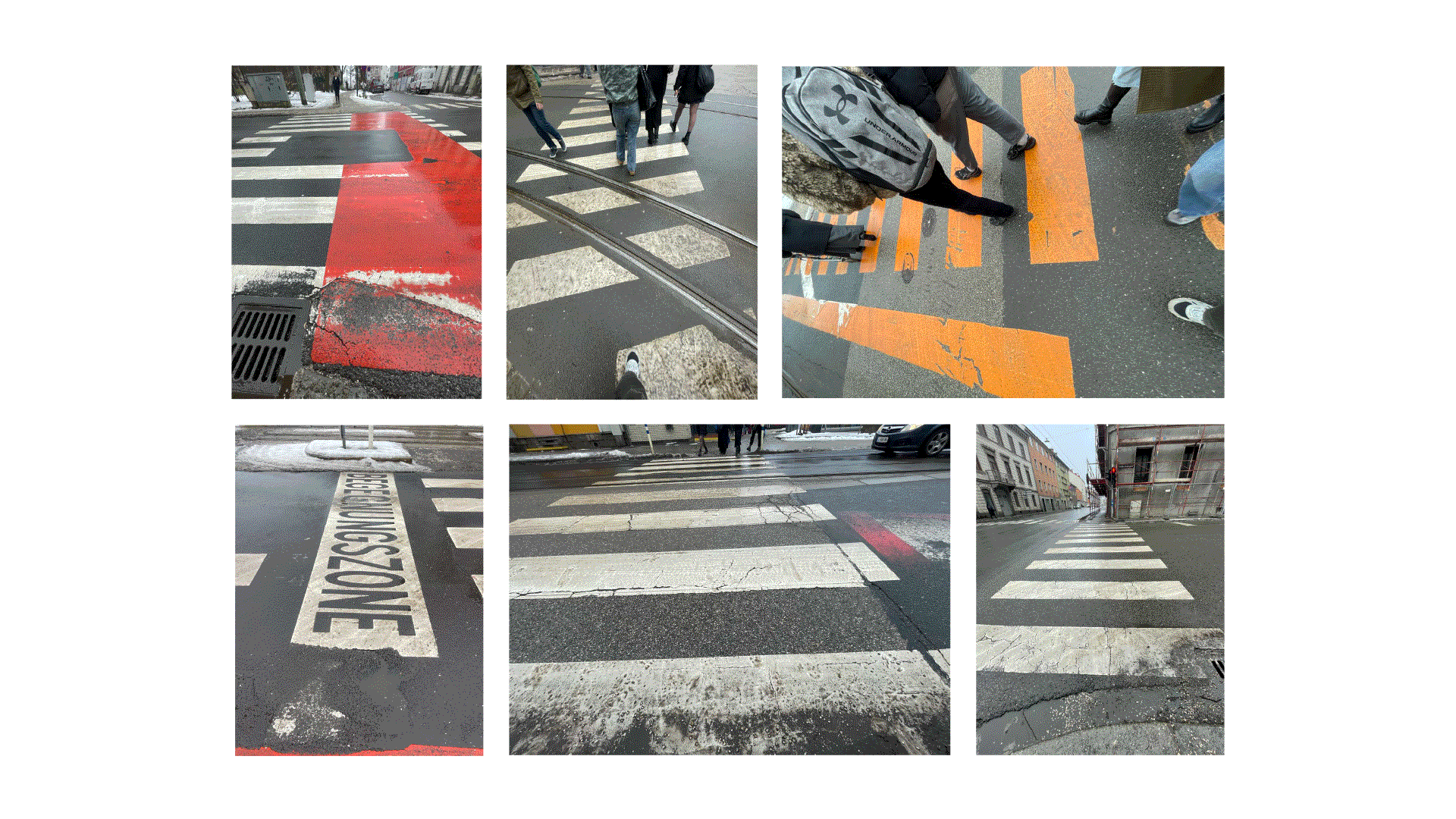

The idea was to generate a visual identity for the punk band “The Crosswalks”, who are radically anti-car in the city.

I looked for a traffic-related form in the urban landscape that is as simple as possible. Crosswalks let pedestrians stop cars at any moment, and they are visually reduced to evenly spaced white, sometimes yellow, rectangles. That pattern became the foundation of the identity.

For typography, I chose Dinamo Typefaces’ Asfalt, because its reverse contrast and elongated shapes echo road lettering. I added a thick outline to bring the wordmark back into a rectangular sign-like form.


The logo combines the crosswalk motif with a cross, inspired by X-shaped pedestrian crossings.


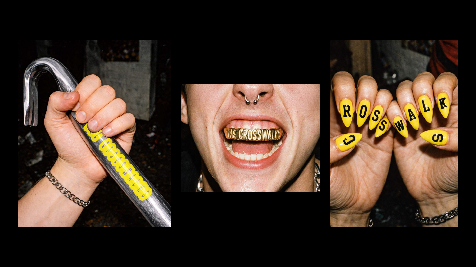
I defined rules for using the crosswalk pattern, including how it can be distorted, shifted, and rotated, so the system can scale quickly across many use cases.
The images were generated with ChatGPT. I built a JSON file to replicate a night-time analogue point-and-shoot look, which let me generate different subjects and formats while keeping a consistent aesthetic.

The workflow was simple. Start with a black background or a photo in the defined style. Add the crosswalk pattern or logo in yellow or white. Distort the pattern or rotate the logo. Set the typography full-bleed, using Asfalt for headlines and a regular mono for body copy, both framed by a bold yellow or white outline. Done.
Louis Bartscherer
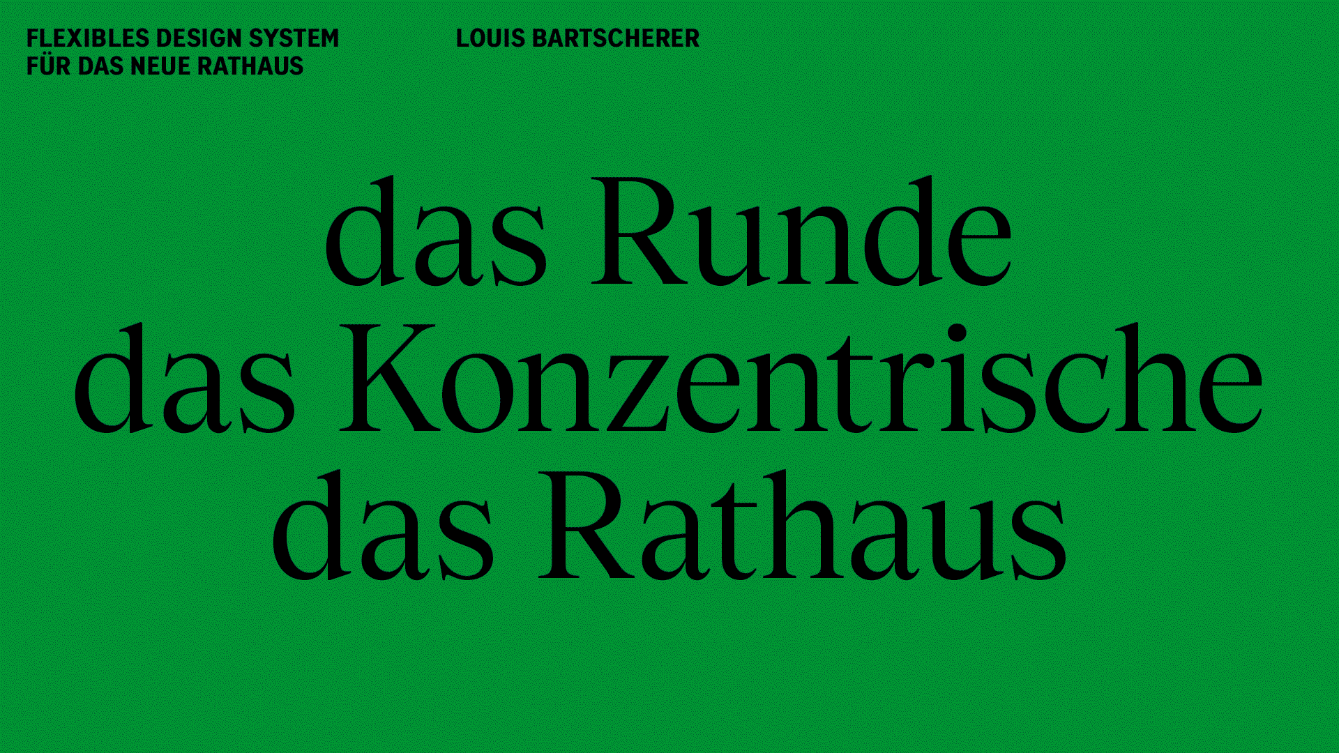
Proposal Flexible Visual System for the Neues Rathaus Linz.
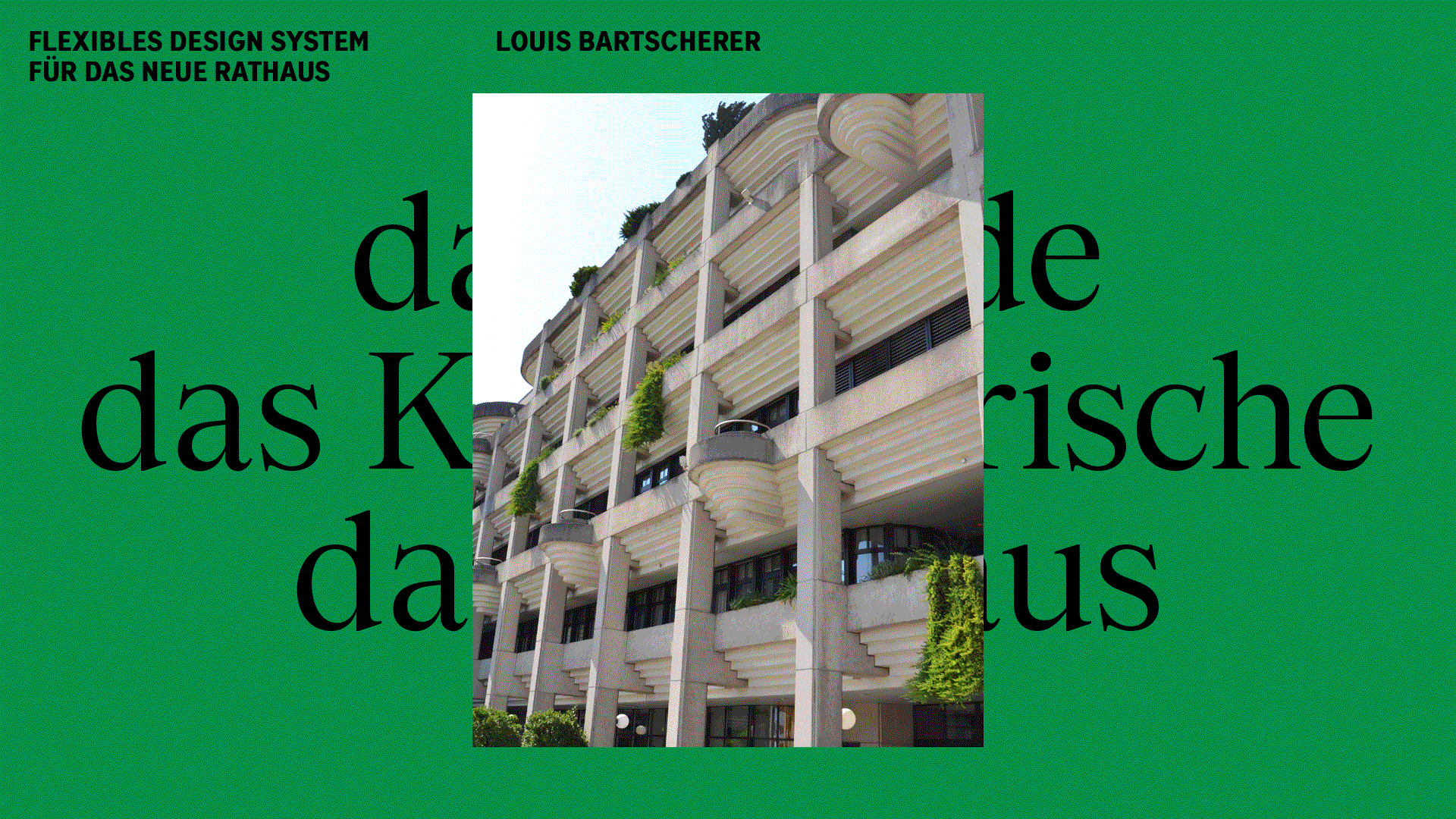
Photo of the city hall. Note the unique architecture.
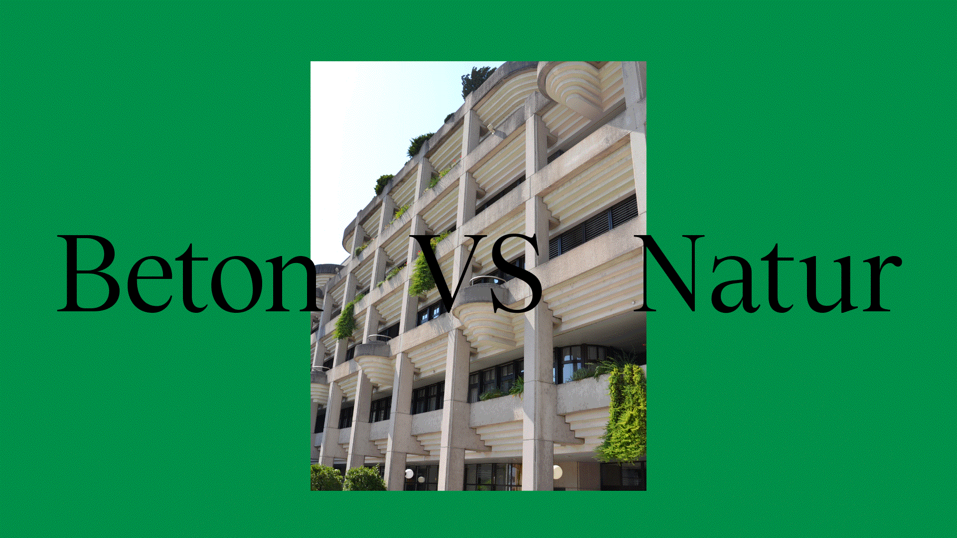
The city hall combines urban concrete architecture with the greened terraces (similar to eco-brutalism). This combination, together with the concentric architecture, inspired this system.

The design language reflects the building’s concentric architecture through stylised shapes. These can easily be applied to any format or medium, following simple rules (see last slide).

Strong, attention-grabbing colours represent the town hall, its confidence and approachability.


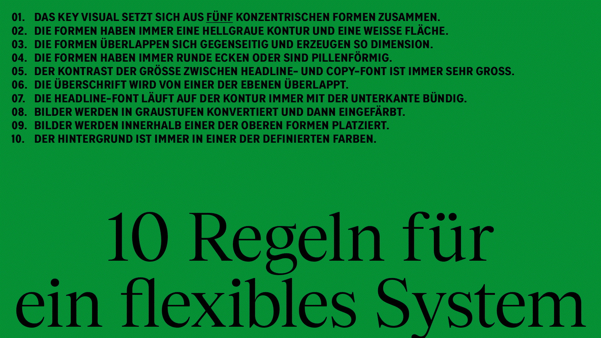
10 rules for a flexible system.
I want to thank all the students participating in this workshop for their hard work and brilliance. The only reason I didn’t showcase everyone’s work here is that it would have made the page too long.
* How would contextual design empower conversations rather than overpower them through communication? That question, which seems almost casual, received a whole new dimension when the student Lea Trathnigg made me aware that the building of the University where the workshop took place was part of Hitler’s “Führer city” Masterplan.
The university writes on their website: “The two buildings at Hauptplatz 6 and 8 used by the University of Art and Design Linz were erected as part of Adolf Hitler’s prestige project to transform the city of Linz into a “Führer city”. The buildings were constructed from 1940 onwards, but were not completed until after 1945. In order to realize the construction project, expropriations were carried out, including of Jewish residents. Forced labor was also used.” Source
There is an interesting reflection by Oliver Vodeb that I wrote about in “Is Branding Just a Term?” In it, he argues that the visual identity for AEG by Peter Behrens was not actually the first example of branding, and that it is the branding of Nazi Germany that truly meets the standard features of contemporary branding. Branding is understood as one-way communication from an entity to a mass of consumers or followers. Consequentially there is no democratic branding. Democracy requires conversation.
The question remains: how can we reframe old spaces of communication into new spaces of conversation?